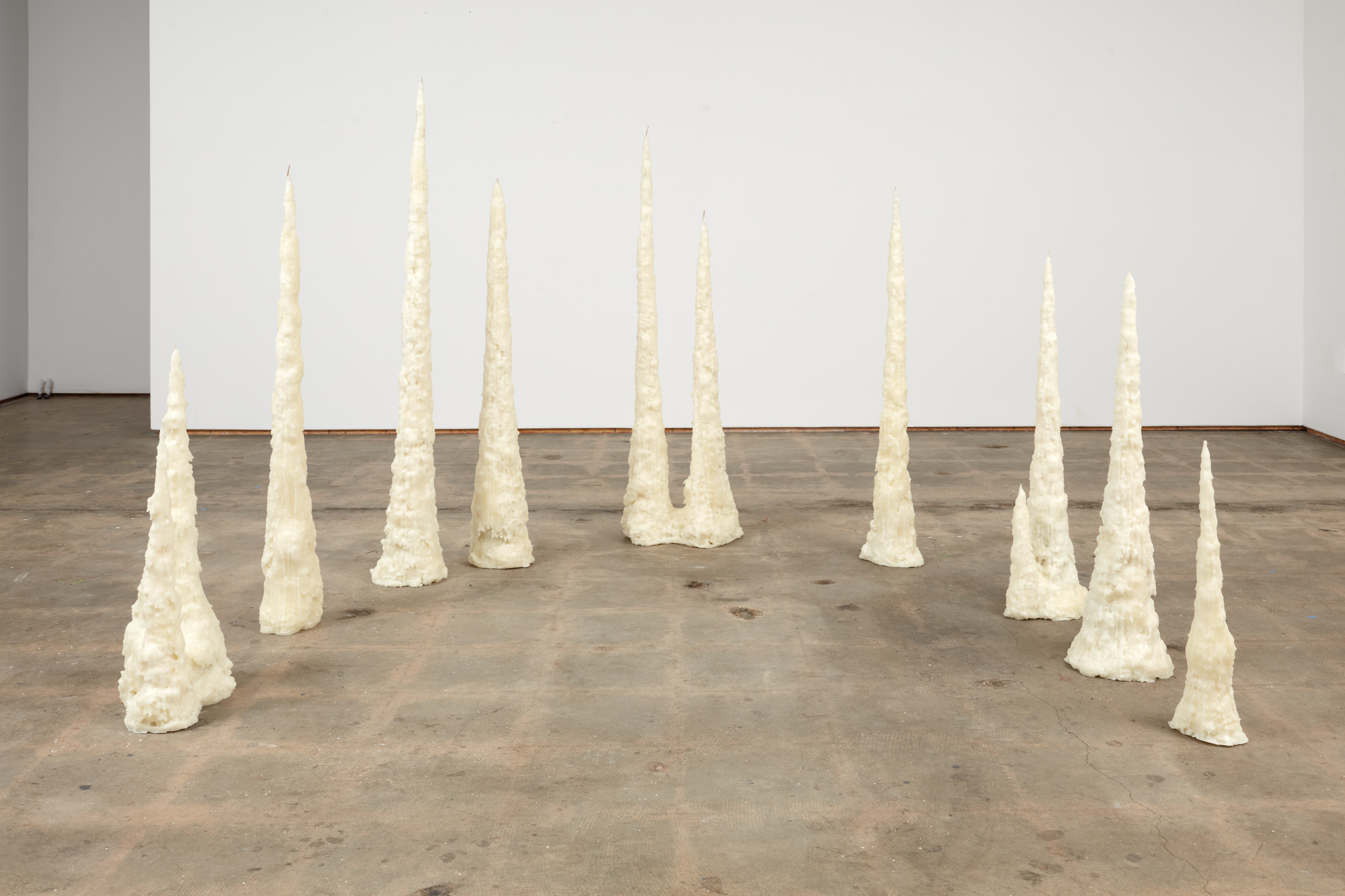
The Artist and the Cigar Box: Civil Pleasures
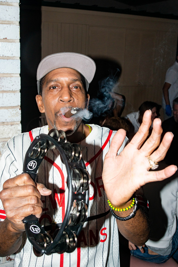
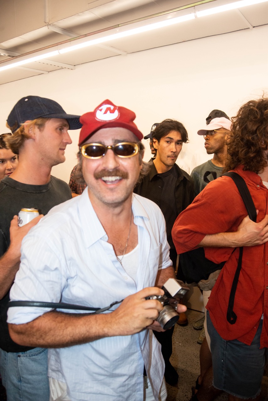
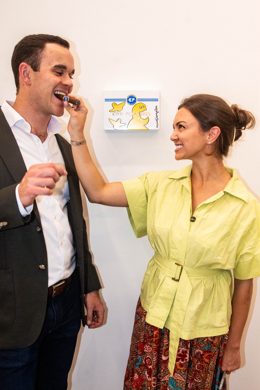
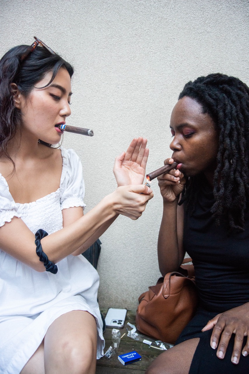
Check out photos from the opening night below and put your bids in here. The Artist and the Cigar Box online auction.
The Artist and the Cigar Box is on view online through June 30th.
Stay informed on our latest news!

Check out photos from the opening night below and put your bids in here. The Artist and the Cigar Box online auction.
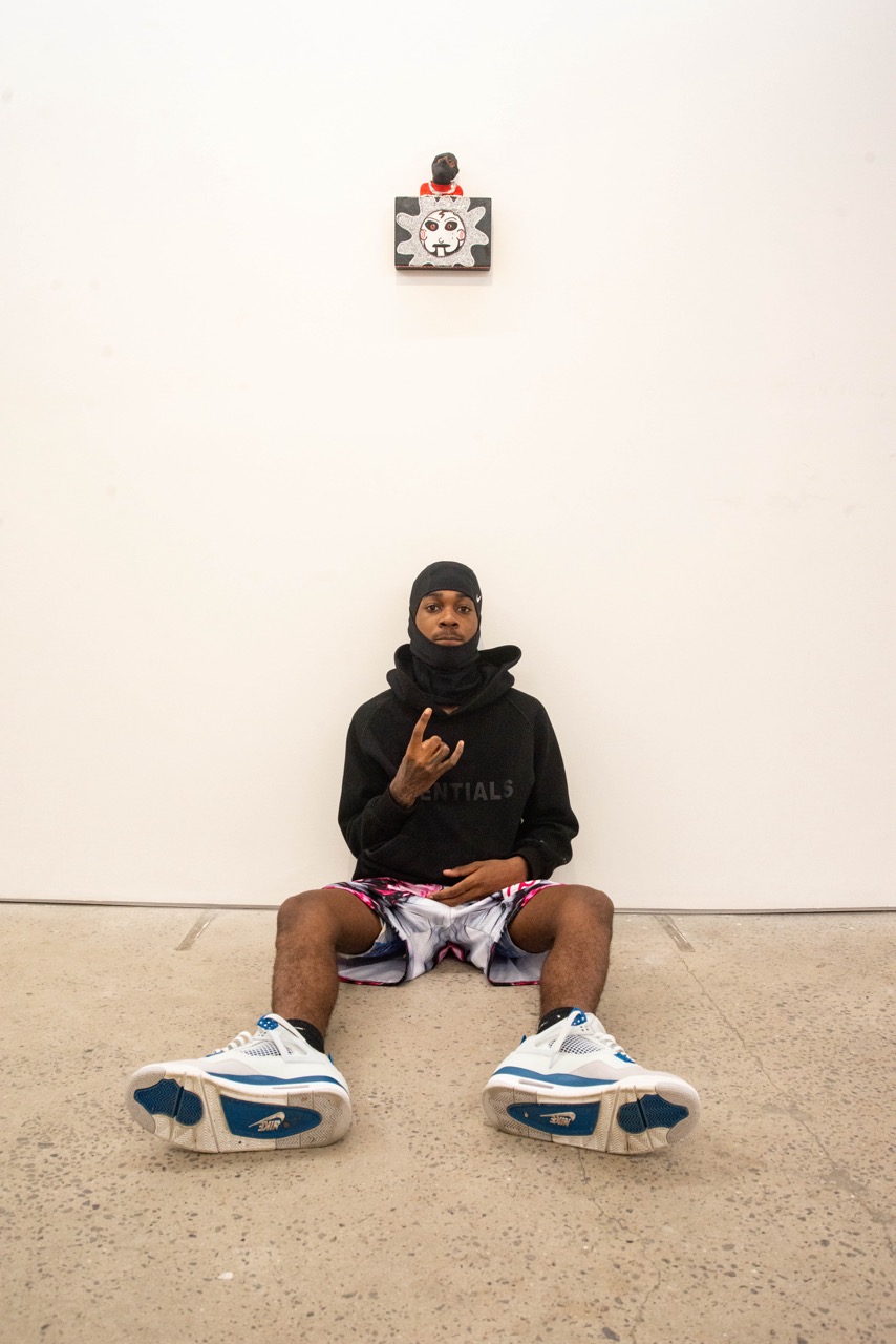
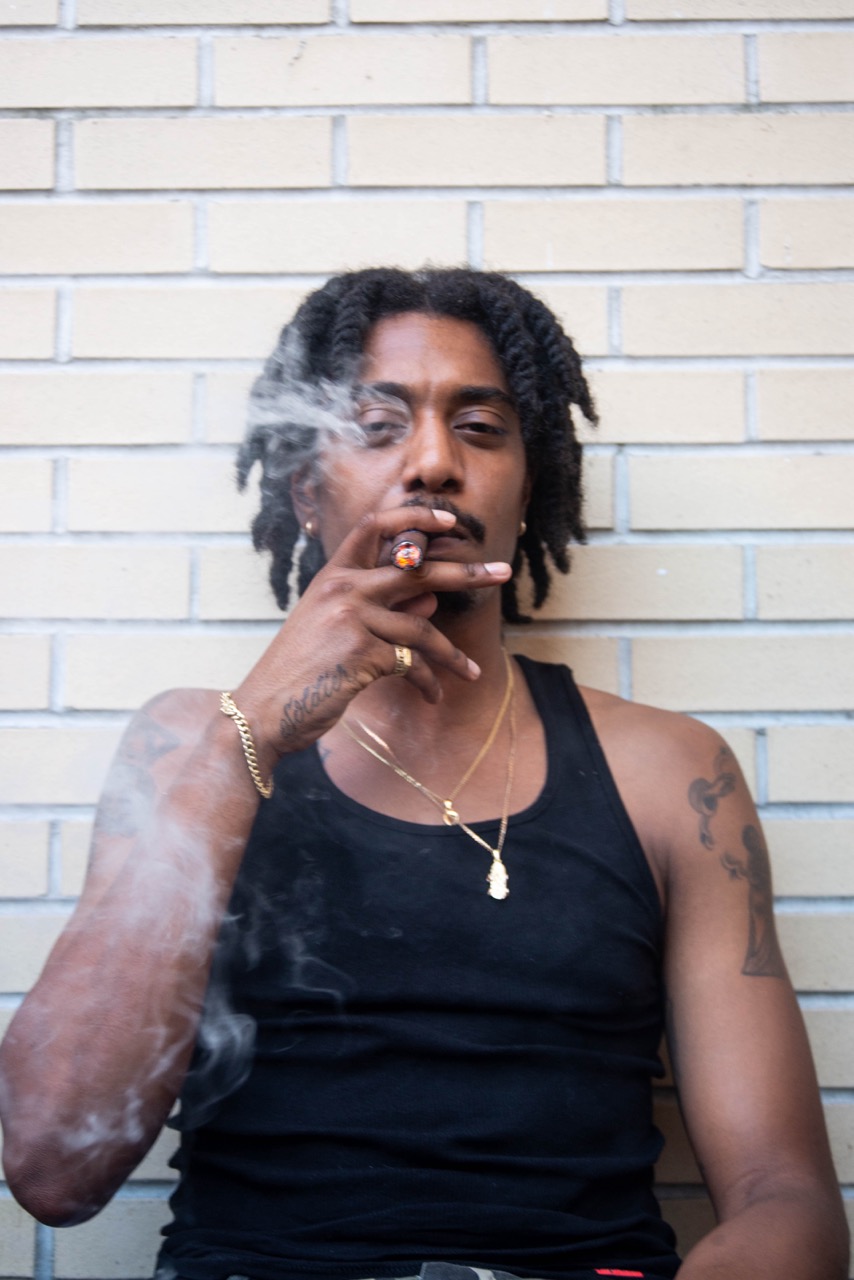
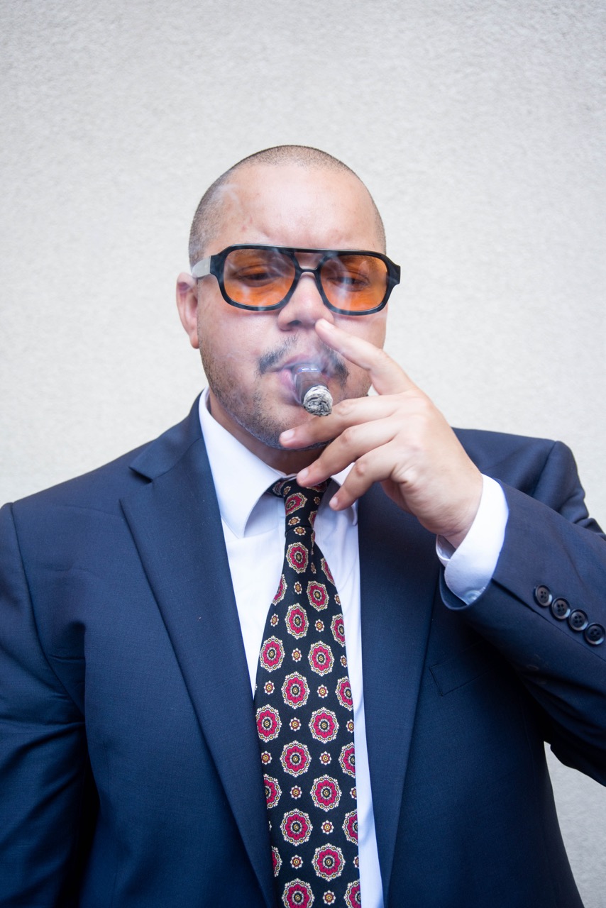
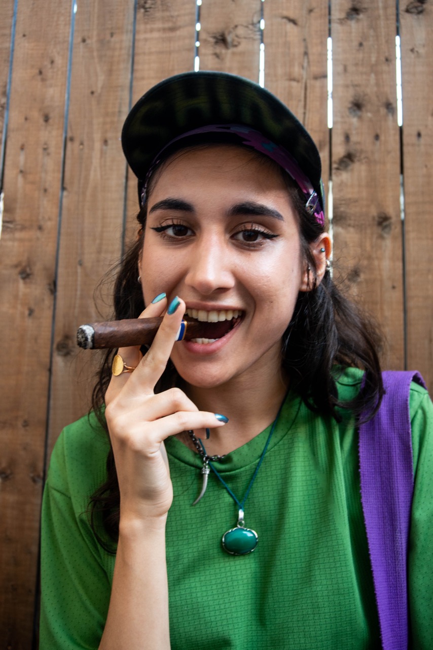
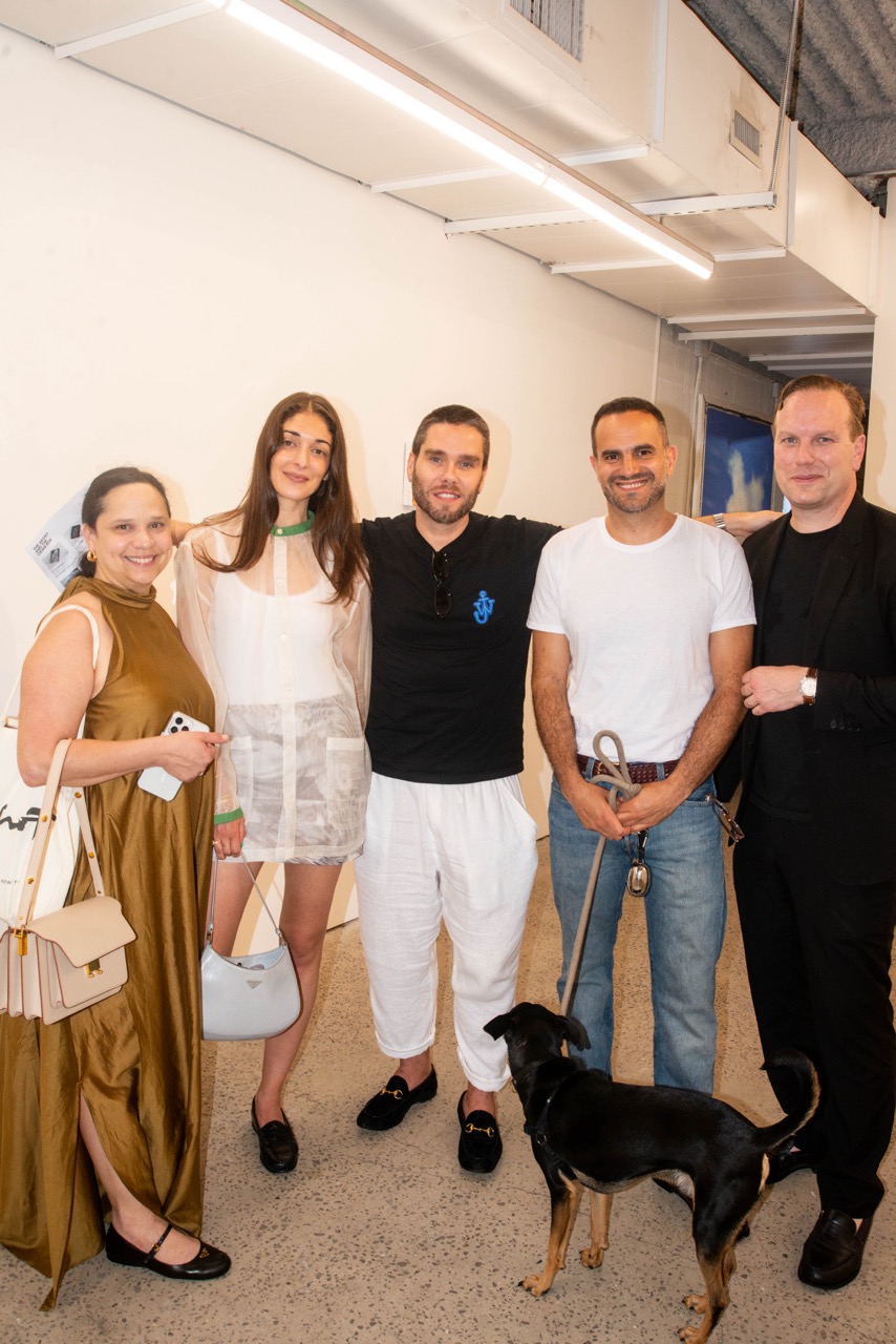
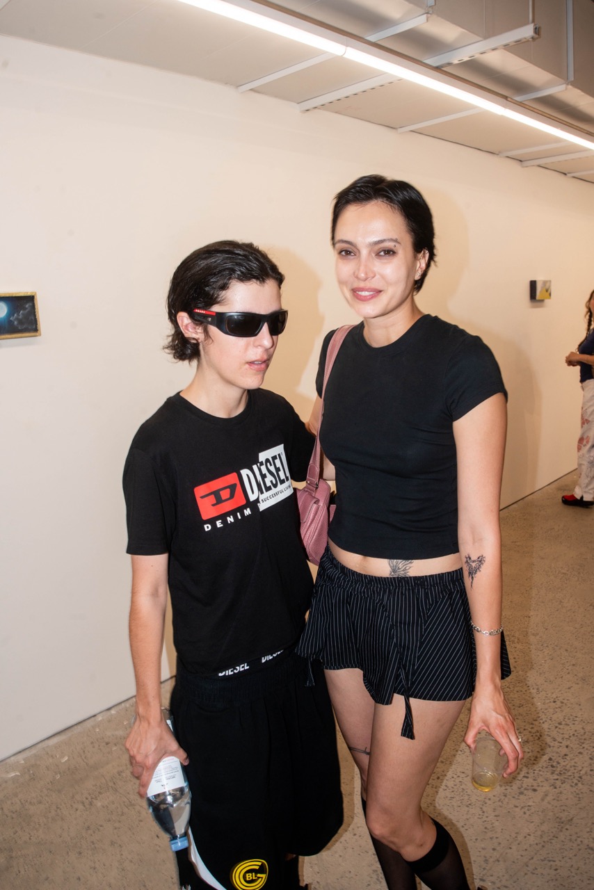
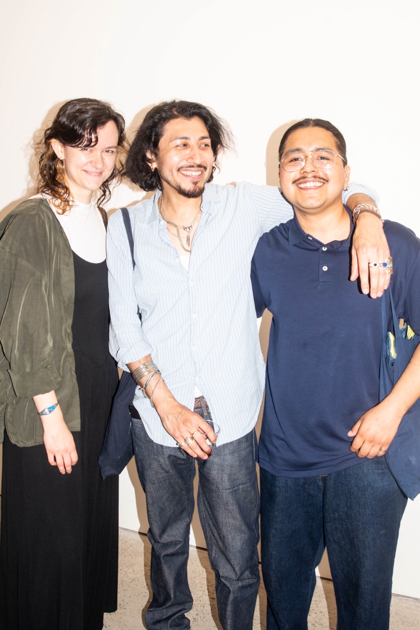
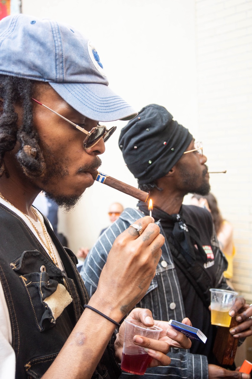
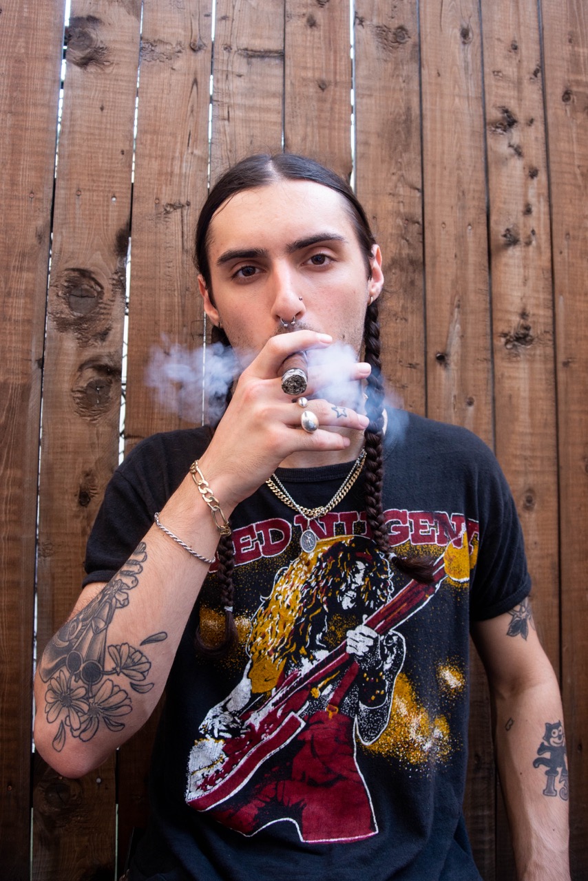
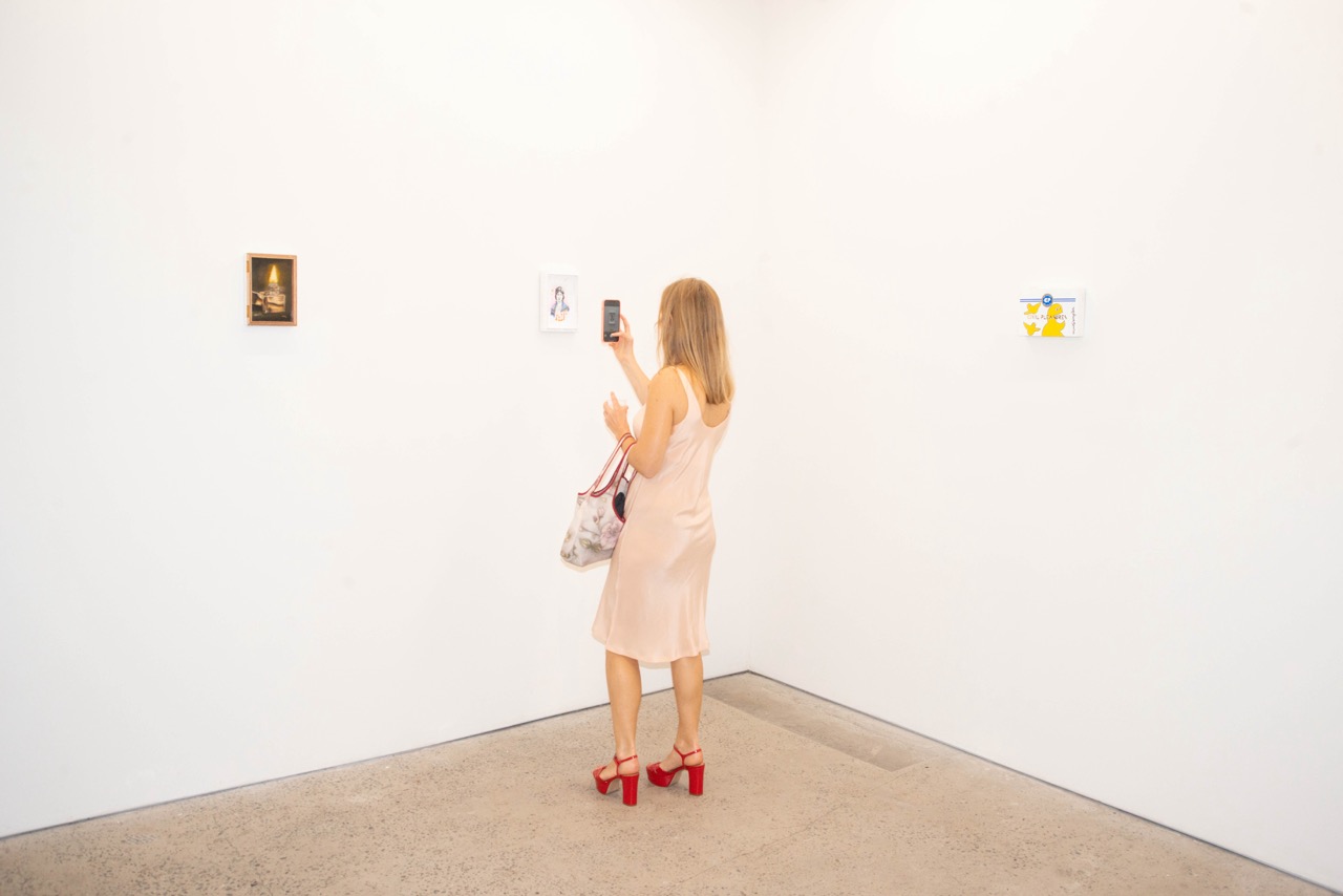
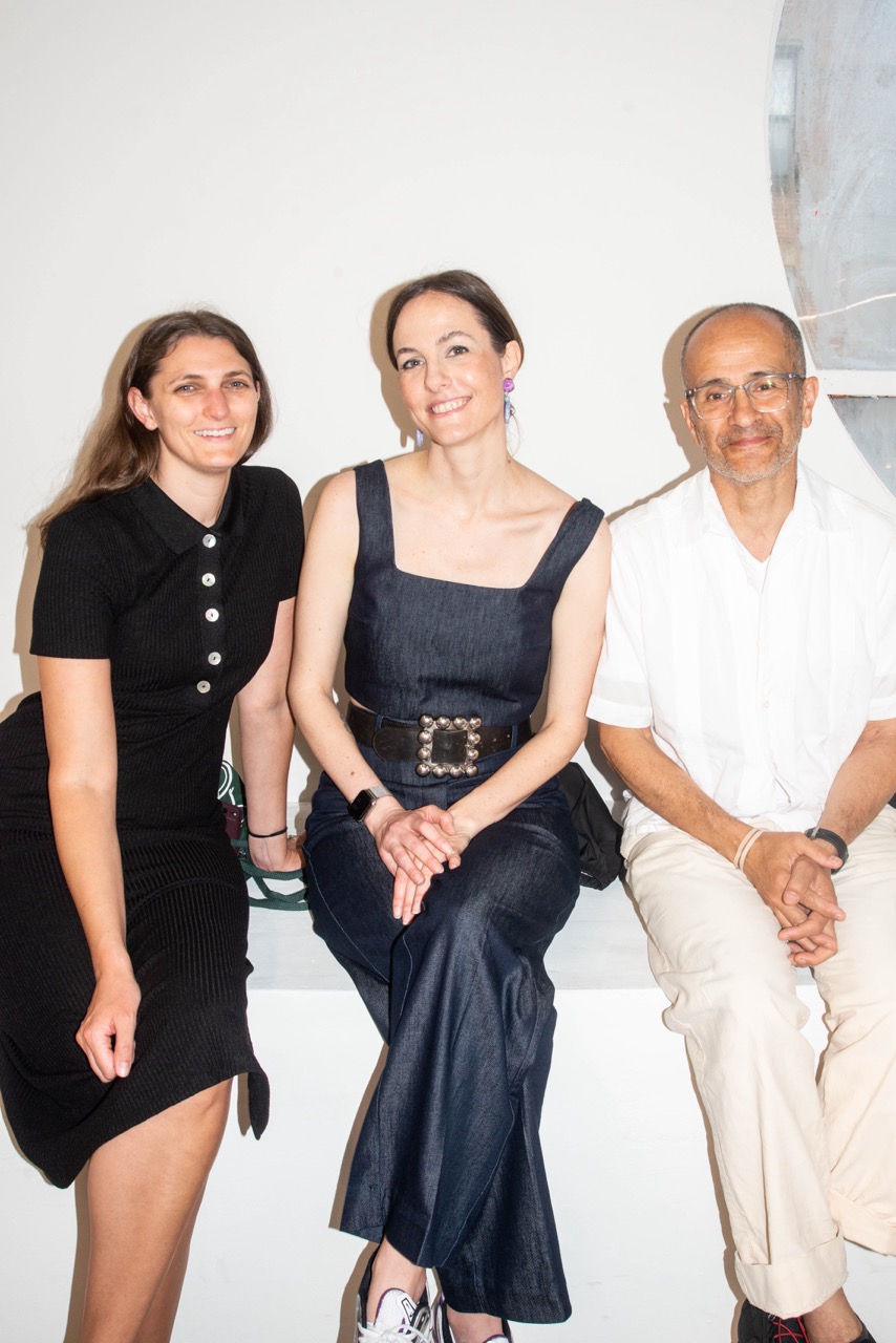
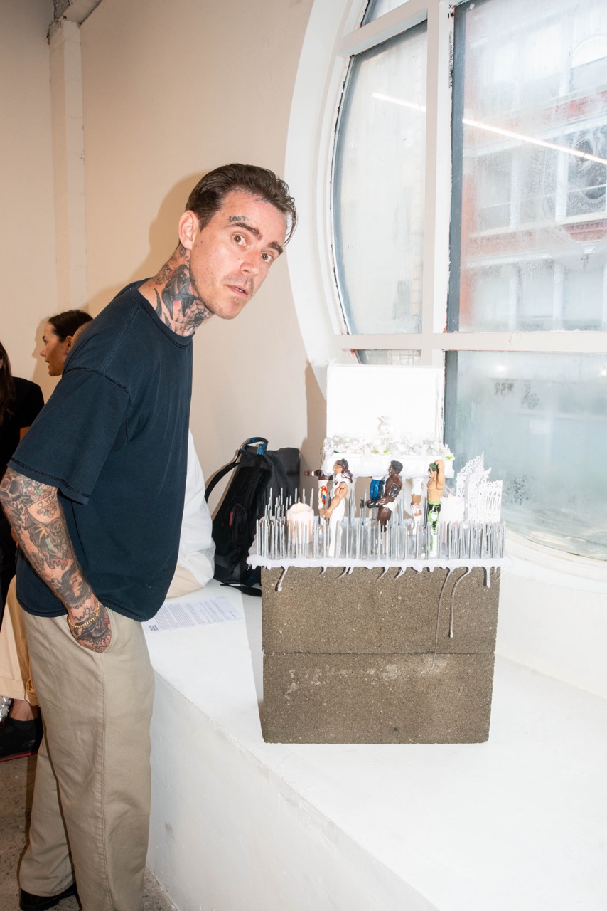
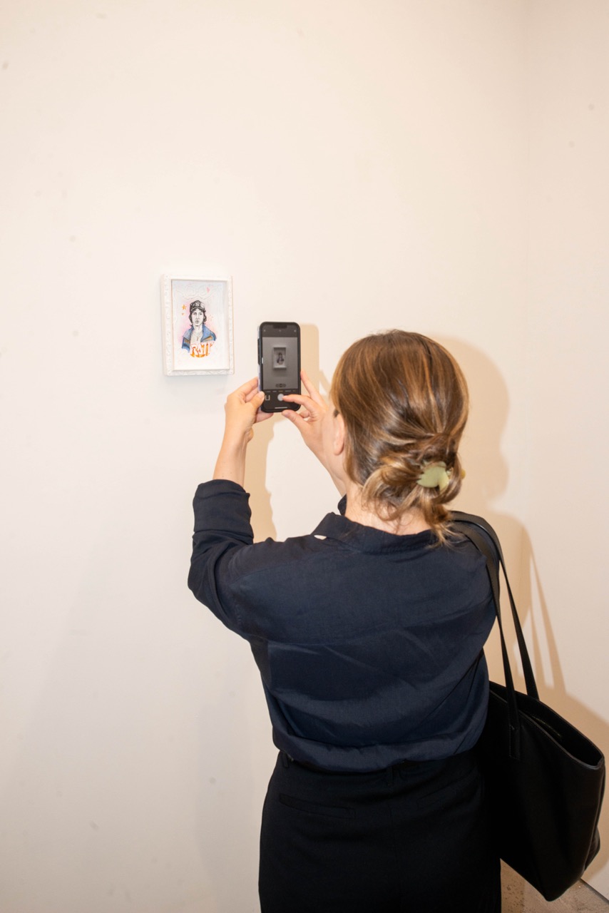
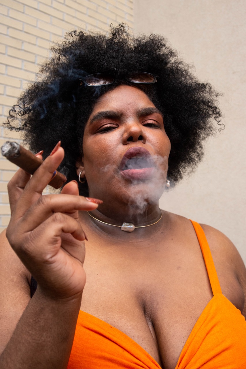
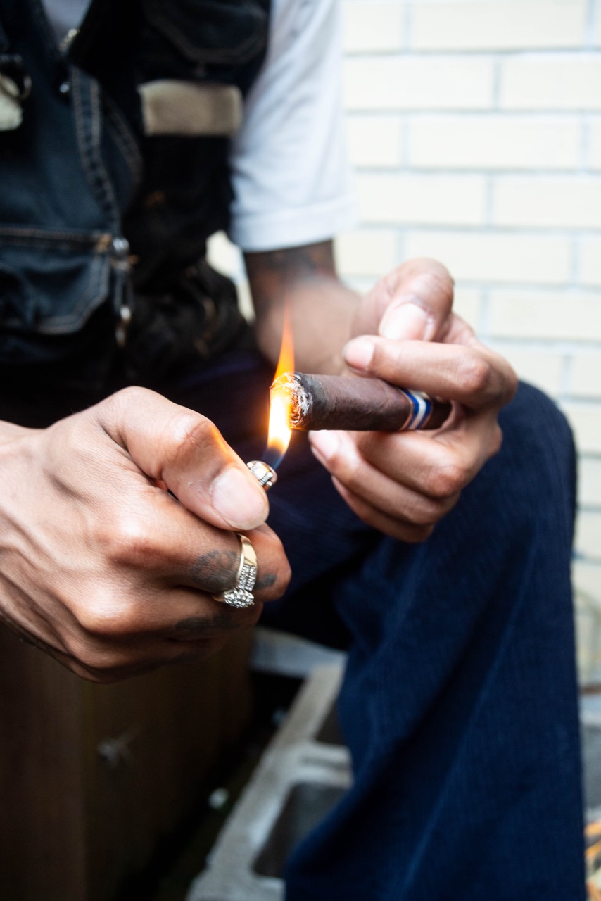
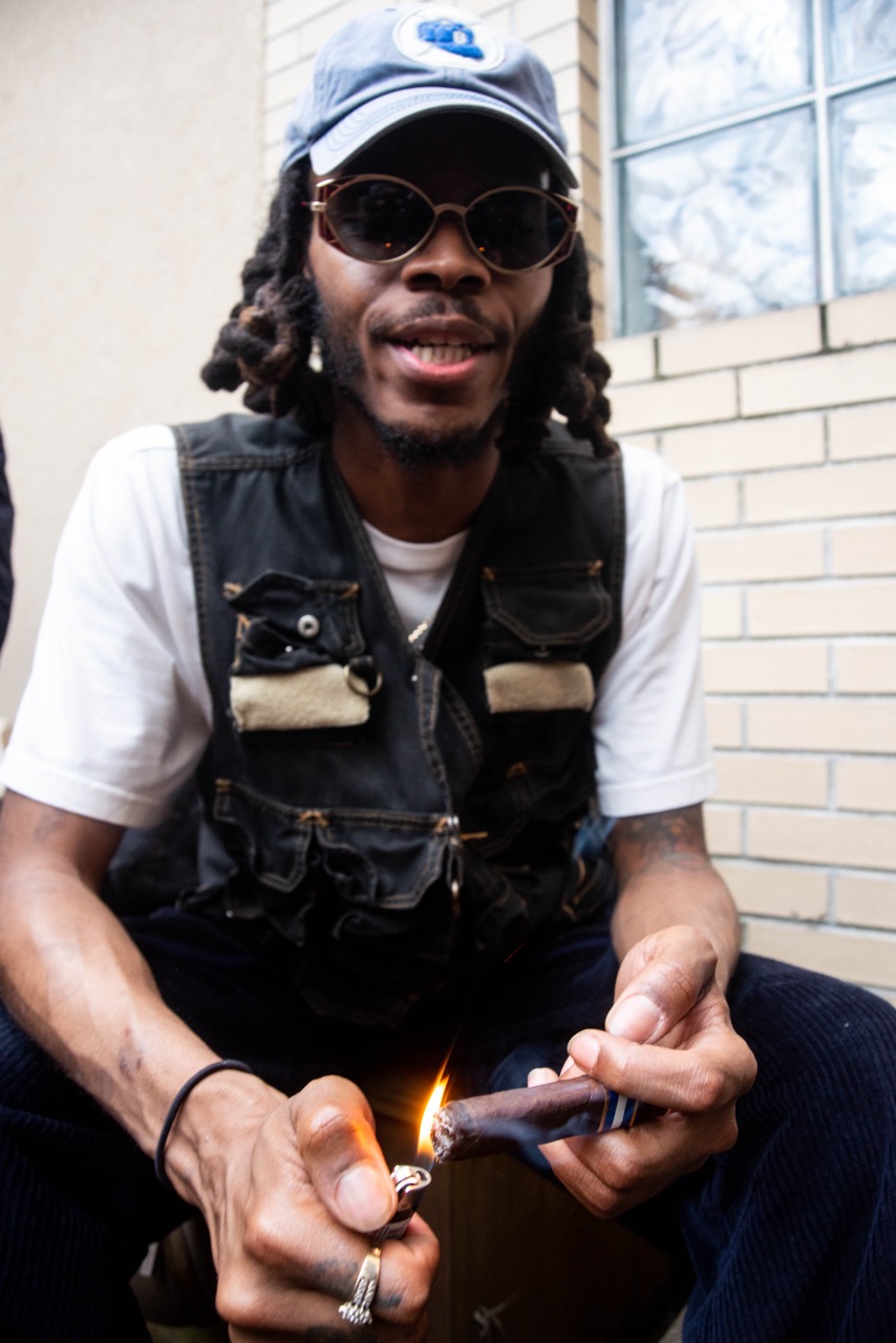
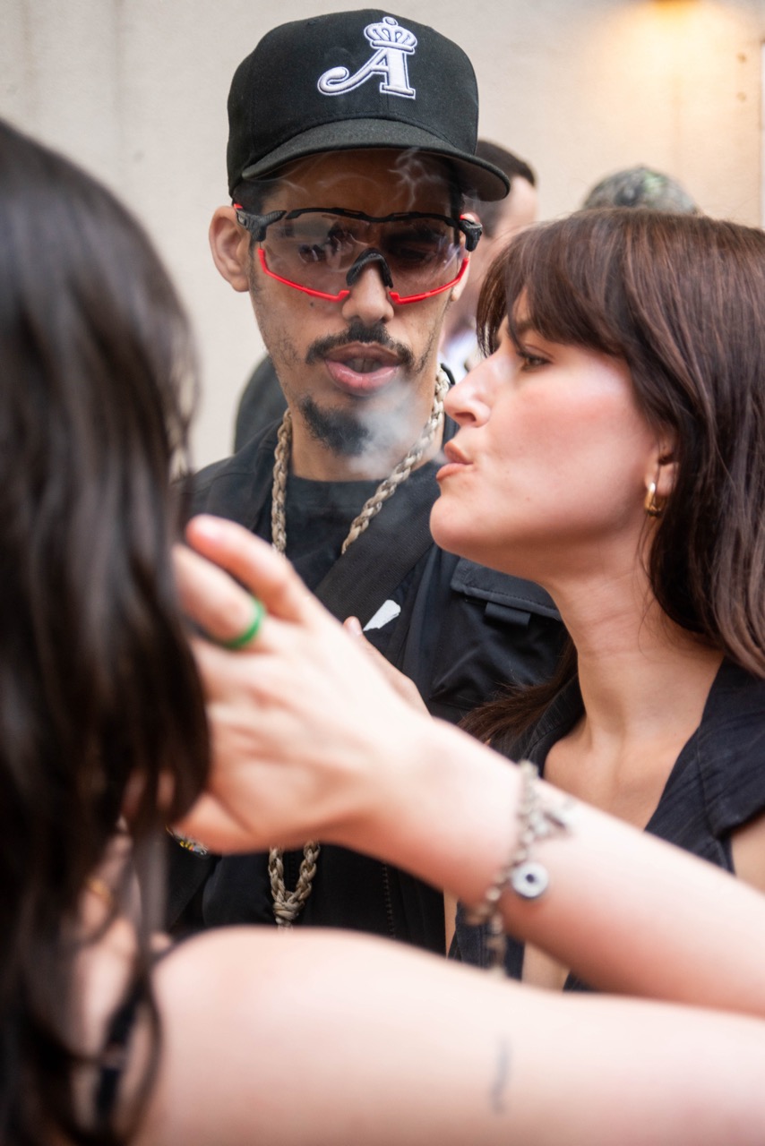
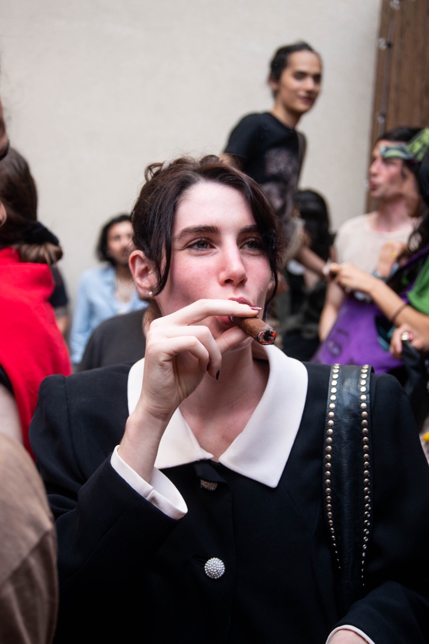
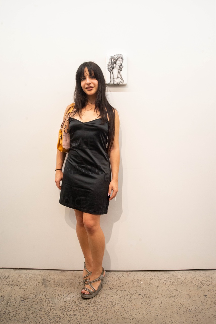
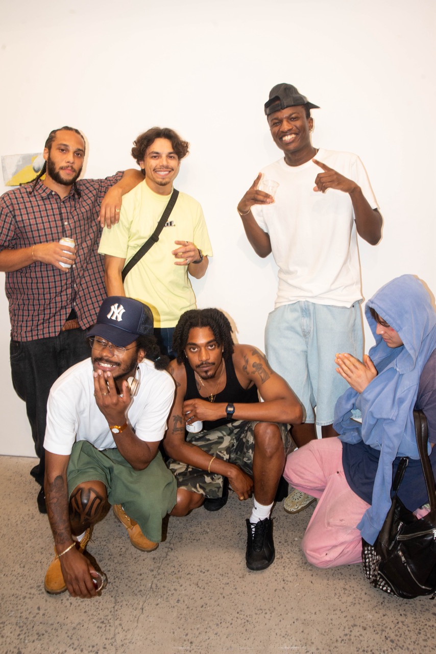
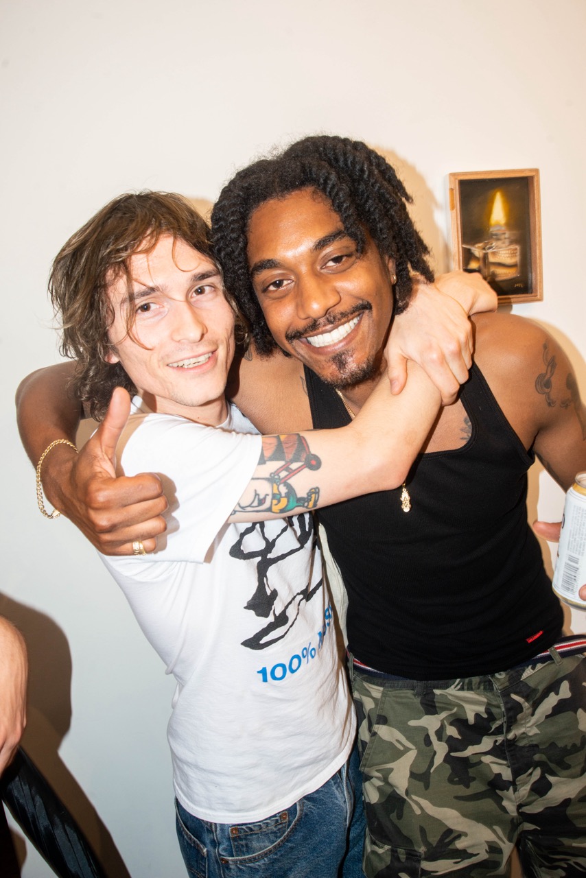
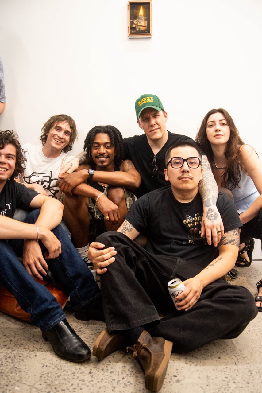
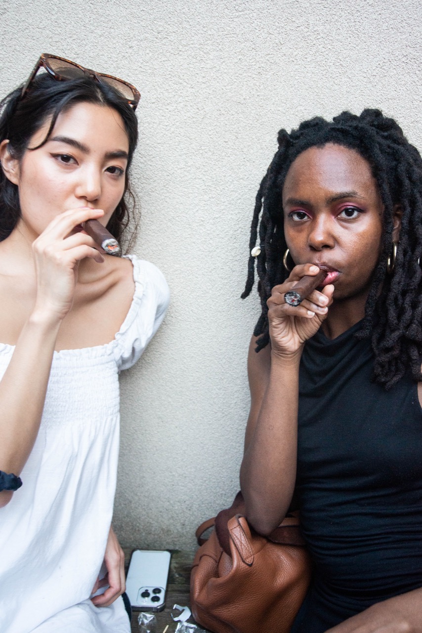
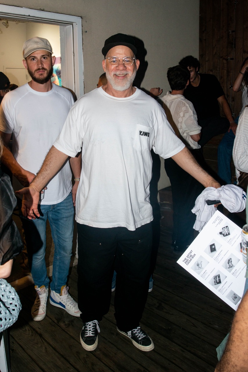
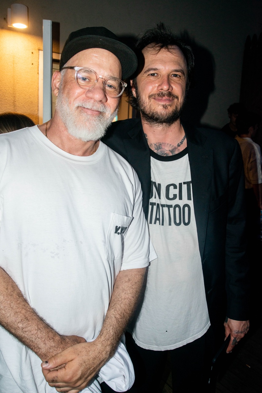
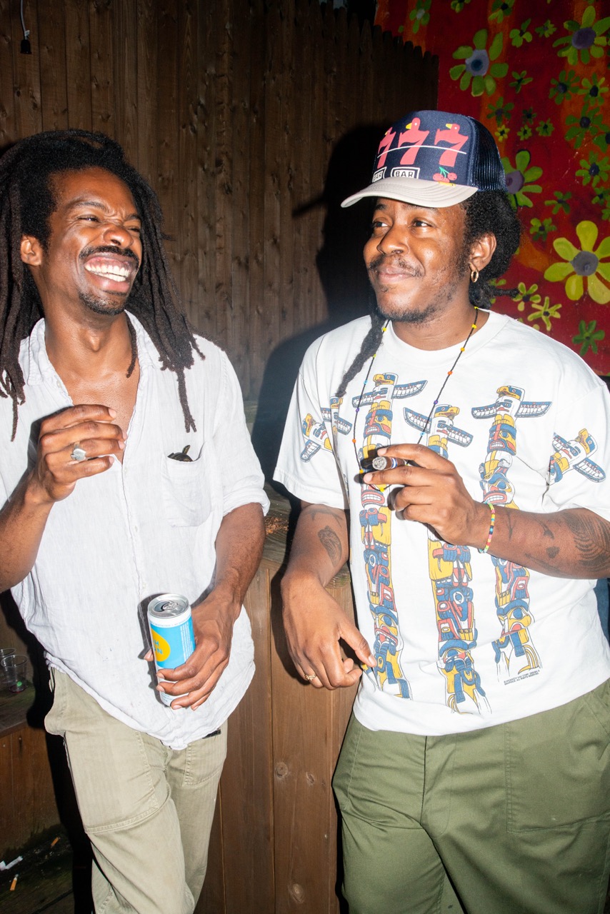
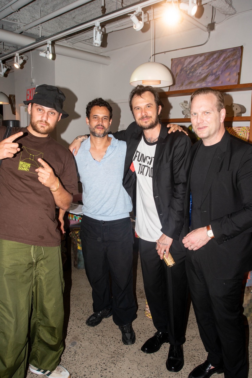
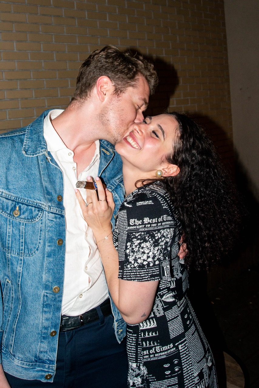
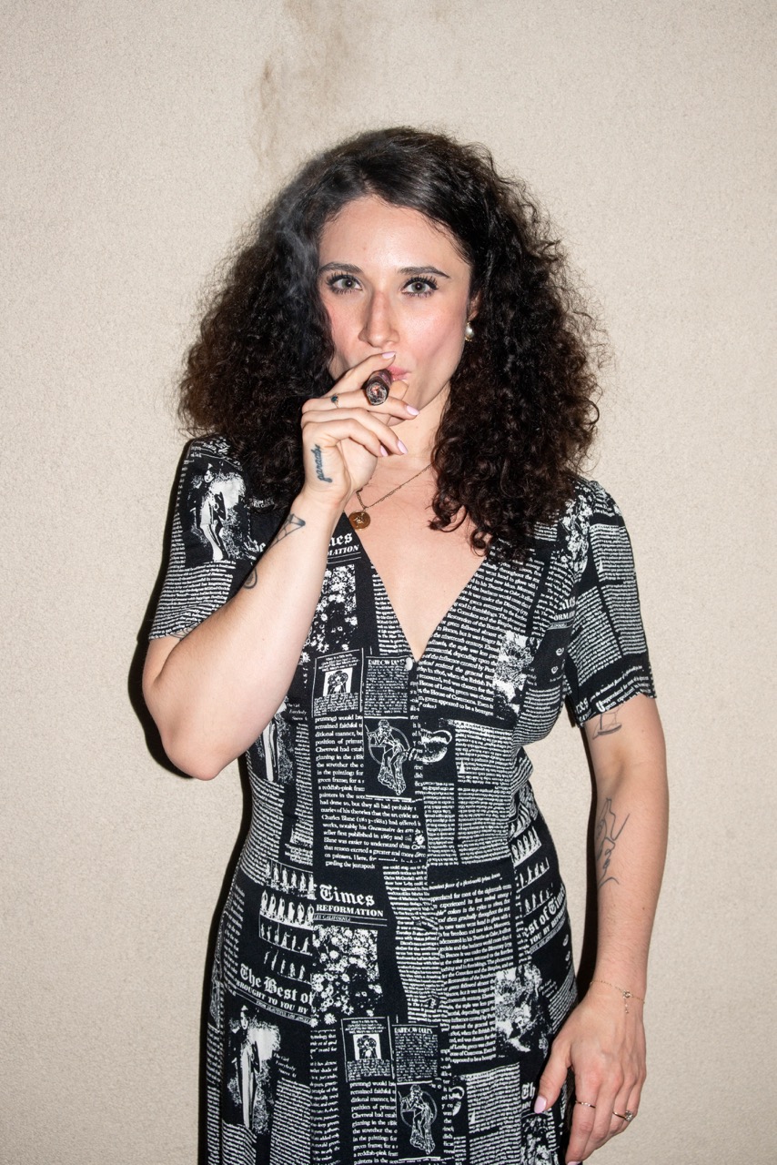
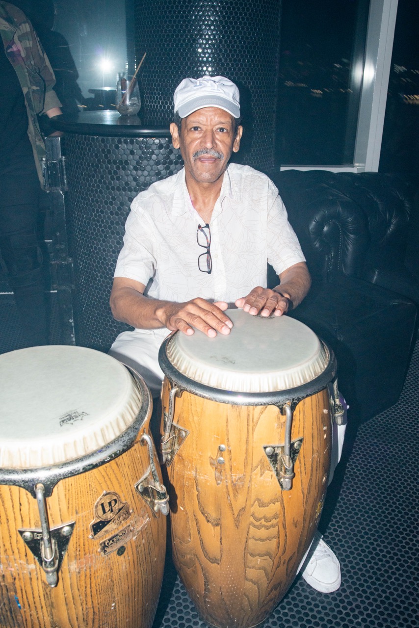
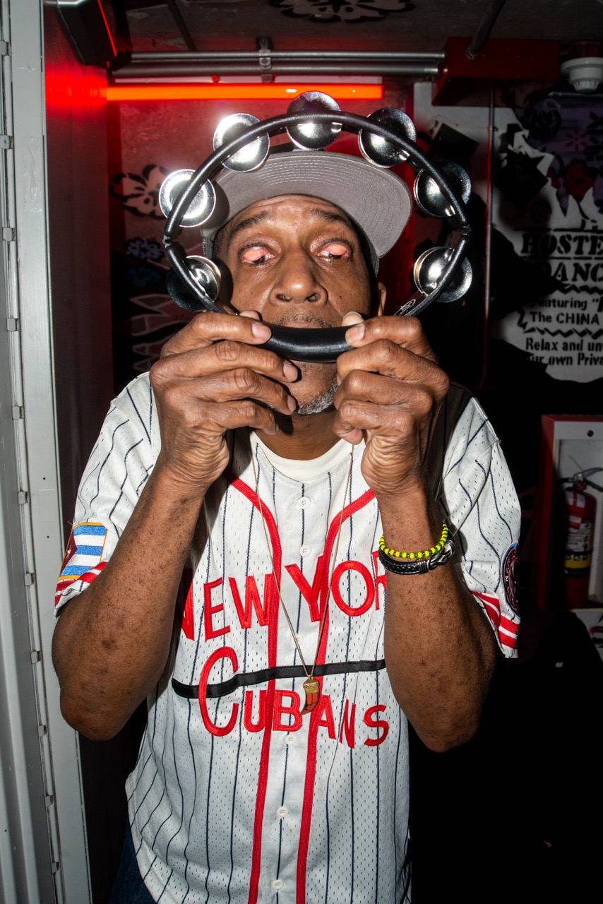
The Artist and the Cigar Box is on view online through June 30th.
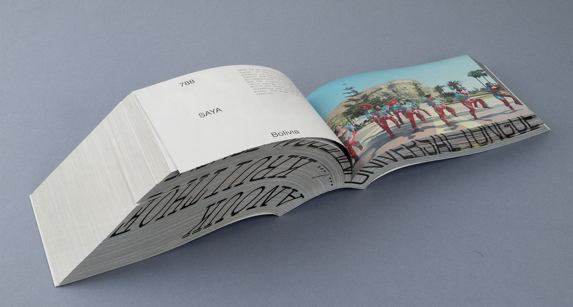
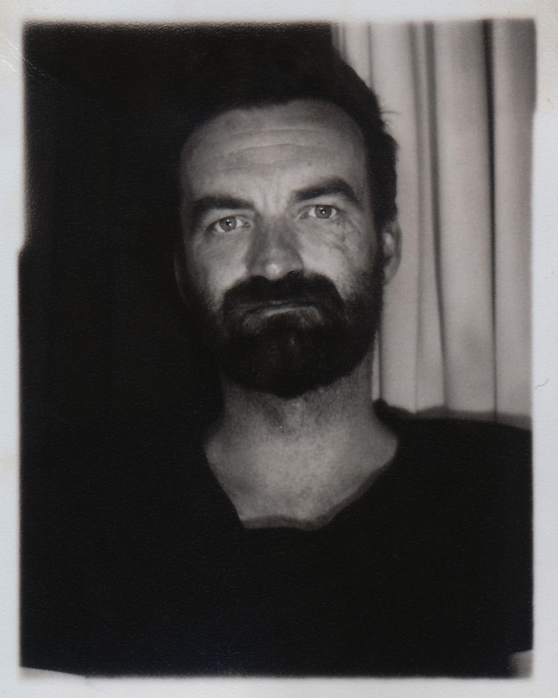
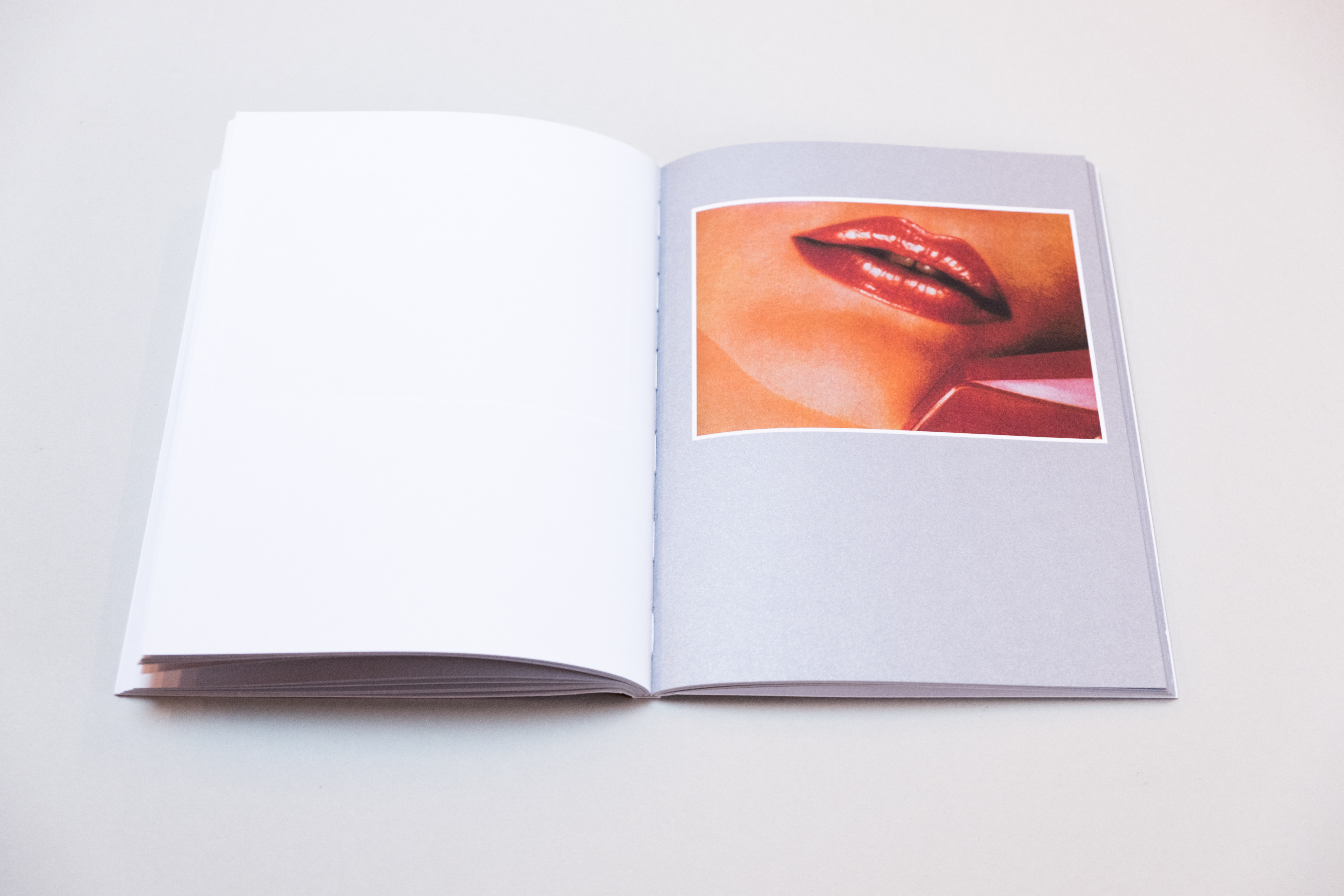
Since 2010, Jurgen Maelfeyt of Ghent-based design studio 6'56" has been independently publishing books through the platform he founded, APE (Art Paper Editions) and more recently, Monogram. An APE book is a feeling, a system created in hindsight, guided by instinct. It is a response to a body of work, not its calling. Viewing the book as an exhibition space, Jurgen had developed long-standing relationships with some of the industry’s most beloved artists and photographers including the likes of Carlijn Jacobs, Camille Vivier, Richard Kern, Paul Kooiker, and John Yuyi. His books are acquired by institutional libraries such as MoMA, Centre Pompidou and Macba amongst others.
As a teacher of graphic design and self-published photographer himself, Jurgen’s understanding of the publishing landscape has been shaped by nuance and instinct by way of firsthand experience. He’ll be releasing his next book Toy on APE platforms soon and will be in New York for the NY Art Book Fair next week: booth C28. office chats with Jurgen about why something wouldn’t need to be published, the editing process and why you shouldn’t produce work with an end product (a book) in mind. Hint, hint.
Lindsey Okubo — Hey Jurgen! So nice to meet and chat. Know you founded APE in 2010 and I’ve been following your work for some time now so let’s take it from the top! Can you tell us about its early beginnings, motivations, etc.?
Jurgen Maelfeyt — In the beginning, I was producing zines on my own and APE actually started somewhat by accident because I didn't have a publishing house. There was a curator that needed to put my name on the colophon for some publication and he quickly asked if I could officially be the publisher because he couldn’t be and I was like, Okay, let’s take the chance. That same year, I was invited to Offprint in Paris and it was a huge success. I brought some suitcases of books with me, I went to all the shops and I came home empty-handed, I sold everything. It was fun from the beginning especially because you got to meet so many people at the fairs. I grew with the fairs as I then went to New York, other places, etc. We grew from just being a graphic design studio into distributing worldwide. To stay independent we needed to scale up and by that I mean we needed to produce between 15 and 30 books per year so that I could hire the necessary staff. We switched over from one distributor worldwide to several, we have now eight different distributors globally and they know the shops better, it’s more local. It’s not a machine that's behind it all but it's a system. For every publication, everyone plays an important role in the process. The goal as an independent publisher is not just to make the book but to spread the book all over the world. That's our goal. Also we have a personal approach, it’s always me that the artists are talking to so that's a huge difference.
Amazing! It's interesting because there's seemingly been a rise in self-publishing, people doing books, printed matter, what have you. The same way that “everyone is a photographer” now, everyone is also becoming an author in hopes of finding new ways to immortalize their work in the age of the doom-scroll. When you make a book, you think of it as being forever and how much of that is related to things like vanity and overplayed nostalgia?
I get many book proposals and there are two questions I always ask myself when reviewing them: does it attract me or not? I have to feel something, it's a very personal approach. I also ask: does it need to be published? I think there’s an overload nowadays where not everything needs to be published. If you look at the proposal from the viewpoint of the artist or the photographer, you want it to be published, of course. But my point of view asks if it adds something to all the books that are already out there — that makes a huge difference.
What are some of the qualities that resonate with you that would warrant something being published? And why would something not need to be published?
That's a very difficult question to answer because I try not to focus too much on one category. I do love fashion myself and I'm very connected to that world but not every fashion photographer is an art photographer. Most of the fashion photographers that I work with come from art backgrounds first and then have gone into fashion. Another example is that normally I do not have a thing for documentary photography but sometimes it's so good that I still do it, the same goes for landscape photography. I did landscape once but in 99% of the cases, I will say no because it's just not my thing. If it's not my thing, I have difficulties designing or editing the book so that's mainly the reason why I don't do it. It’s all very personal.
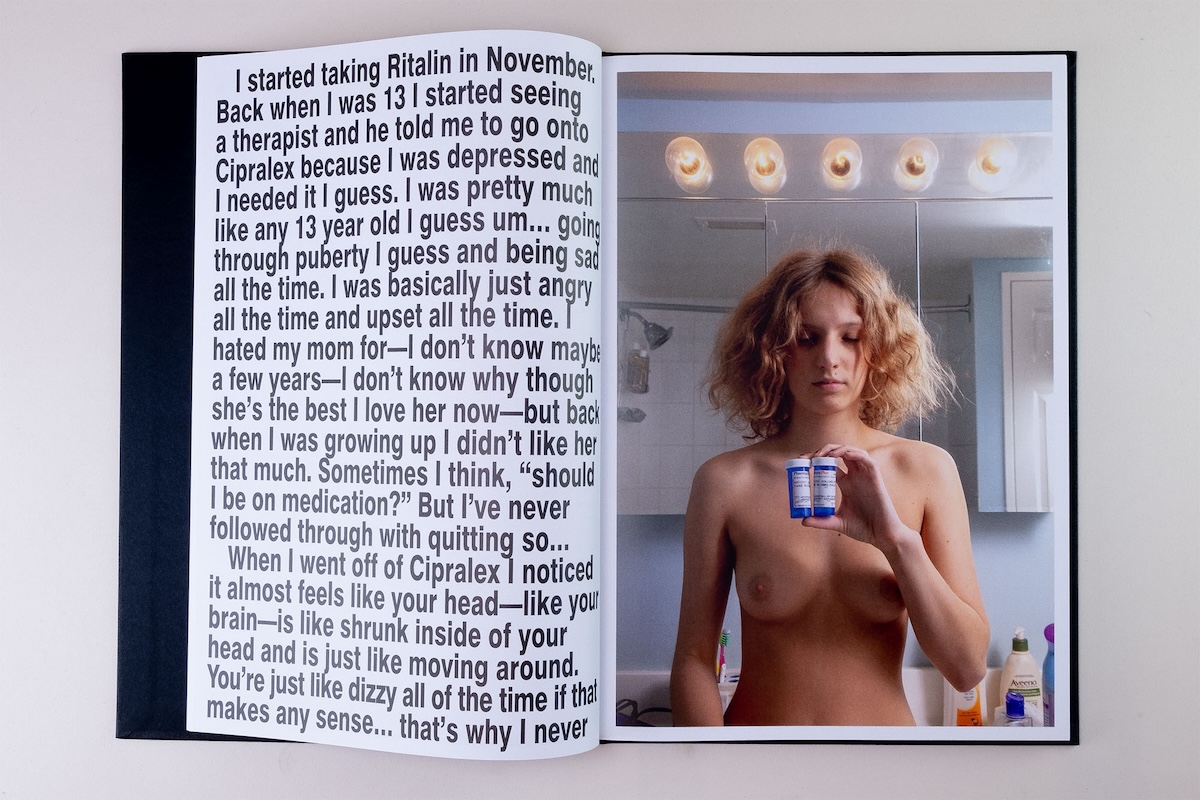
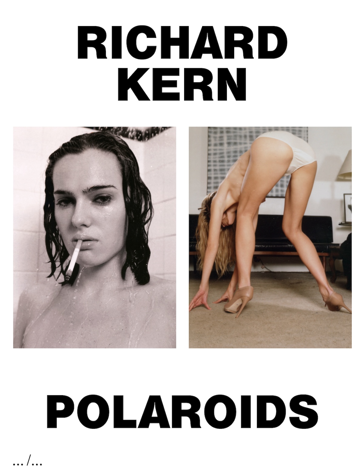
When you're talking about the differences between fashion and art photography, does that have to do with the speed at which things are produced? With fashion, it moves in trends and cycles which essentially become predictable.
The thing with fashion photography is that there's a lot of copying going on. You have to be careful because fashion photographers are used to working with mood boards and those mood boards can kill photography sometimes. Mood boards are supposed to inspire people to photograph something but then the client comes in and they want exactly what's on the mood board so people start copying things. Also, fashion photographers sometimes think that they want to produce an art book but they see it as an editorial, and it's not. The line is very thin and when I work with fashion photographers, I just try not to grasp that bit of fashion in them, I try to see the other things that they have. I just worked with John Yuyi on a book and she works in fashion but what she does in art is so different but it's very valuable.
Right and circling back to the word I mentioned earlier, “vanity,” which I know invokes an ugly context but publishing a book does add this level of acclaim to one’s work which could explain the confusion. It’s interesting that publishing nowadays has become a stamp of approval or validation in a way that a blue checkmark could never.
That goes for photography in general too. If you're not published as a photographer, you don't exist – is what they say but I don't think it's true, there’s still a lot of hidden talent out there which I hope to discover through books.
A book is meant to be timeless in that whenever you’re picking it up, it exists in that moment, no matter if it's this year, or five years from now but it’s interesting to think that so much of the editing process is about looking back. When you're editing, how are you ensuring that the images you’re selecting will be narratively strong regardless of when someone views them?
When people send me images I'd rather have 1000 images to choose 20 images from rather than having to pick 20 from 22. The editing is very important and it's different from making selects when you’re making a book. I don't know if the images will stay relevant but I’ve made some books 10 years ago that are now classics, I call them APE classics. In most cases, how the editing process is done is to find a system in editing.
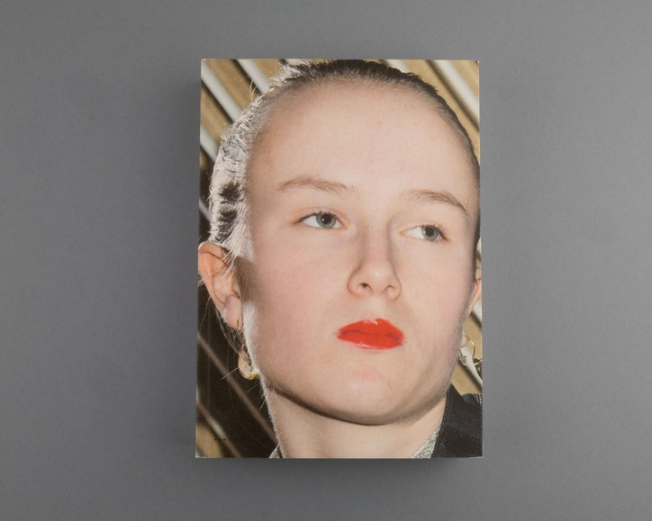
For example with Liv Liberg’s book Sister, Sister, we found a system where we did it in chapters of months. She had photographed her sister for 15 years and we could’ve done it chronologically but that would be adding in another storyline of her sister growing up and we didn't want that. We wanted to see it as her sister being a muse and dressing up, that was the whole point. What we did is to put the images in folders by month: January, February, March etc. All the images from January were selected and put at the beginning of the book no matter what age her sister was and on it went from there. It was a methodology on doing things to make sure you avoid certain stories that you didn’t want to tell in the book. I will never use that system for another book. Every book has its own way of editing.
Right and I know the way you describe APE is that you see the book as an exhibition space, is this methodology of creating a system what you mean by that?
I see the book as a sort of architectural product itself because you build it as an object. It needs some things to structure it and it becomes a book when you bind it. Otherwise, you have loose sheets. If you do architecture, you have to make sure that every wall stands, every floor supports the whole of the building so it doesn't fall apart. With books, it’s the same.
Right and we kind of forget about the actual process of making a book, where it literally comes in folios, you have to consider the thickness of paper, proofs have to be physically shipped etc. These aspects make it sacred and almost ritualistic. I know another word you use and consider when making a book is “balance,” how are you defining that word?
90% of the people who are editing or even photographers editing their own work start from the beginning of the book and work through to the end. But if you are at a book fair and you look at the people browsing through the books, you will see that not everyone opens the book from its first page. Some people open it from the back, some people open it from the middle — and that's how I also edit books. I want people regardless of how you’re going through the book to have the same feeling throughout it.
And when we’re using the word narrative, the consumer landscape as of late requires every product, every thing, to have a story but do things always have to have a story? Do beginnings always have to stem from an epiphany?
No, no, no, it can also be just the images.
Do you find that purer almost?
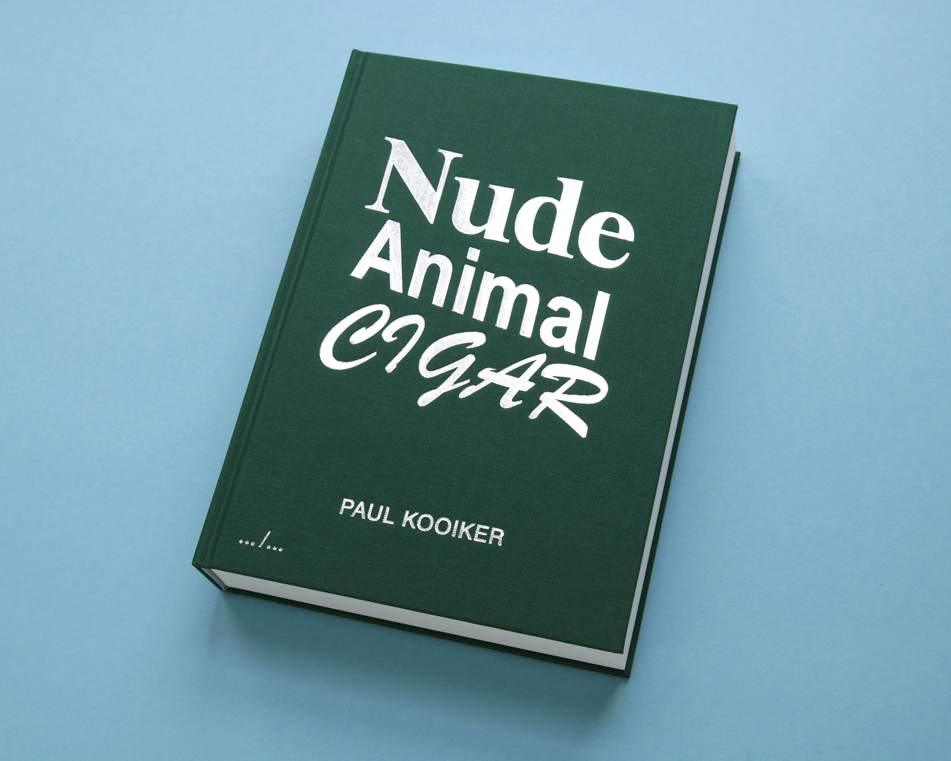
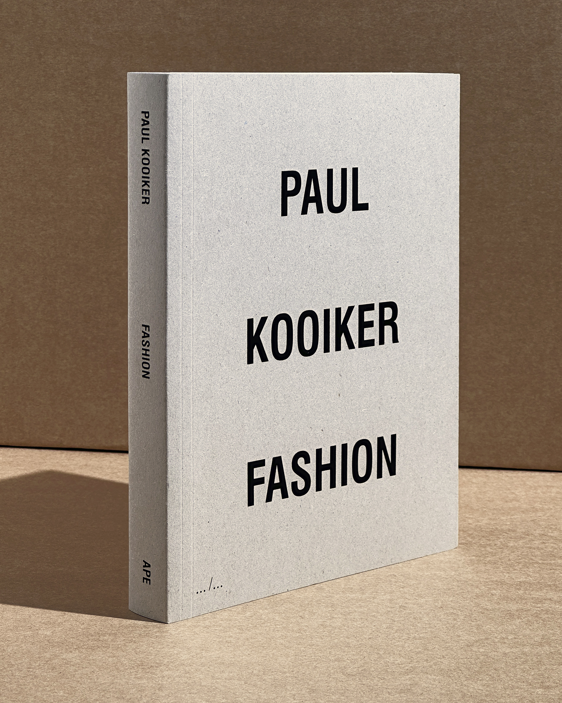
Yeah, I think so. My own books do not have a narrative at all. It's the title and the images, that's it. For example with Paul Kooiker, there's never a narrative, never. It's always the title and the images. The first one that we really did together was Nude- Animal- Cigar so that’s what he photographed. You don't have to think of a story but it was the only way that it all fit together, it had to be those three things because nude and animal had like a weird connotation, animals and cigars didn't make sense, and nudes and cigars had the wrong connotation. That was the whole story behind the book.
You’ve been publishing your own work for a long time too and I’m wondering how your own relationship with photography shifted or was impacted by keeping that former process in the back of your mind while shooting?
When I find the time or when I think I have an idea, I make a book. That's the process. I've been doing this for years so there's no real strategy behind it. The next one, Toy, is ready, and will be out soon and I don't have any clue what's next. [laughs]
Right and it’s kind of the same with writing too; where if you know you’ll be editing your own work, it becomes a challenge to just write freely. You end up self-censoring a bit. Does that ever happen with you while shooting stuff? Do you think people should shoot or produce work with the product in mind though? That feels like a slippery slope.
Yeah but for me, everything is made for books so there's no thinking of other things than making a book. If you're a bookmaker, it's easy. I don't think photographers should be thinking about the kind of paper they’ll use while they’re shooting but for me, that's what happens.

Jurgen Maelfeyt Toy (April 2024)
Interesting. And in publishing someone’s work, you’re really able to understand and be a part of an artist’s growth and career trajectory if you establish a regular publishing cadence. It’s refreshing because magazines nowadays won’t do it, they’ll be like, oh we covered them a month ago, we're not going to do a story on them now – I think that’s a huge miss.
Oh yes, I have good relationships with many artists and photographers and I’ve published many books with them and I’ll publish many more. When you build a relationship with artists it's a very personal relationship. I'm not their agent or anything but they trust me with their work. The more I know them, the more they show me the work before it's even edited down which I think is fun. I like to talk a lot about books so with many artists, that’s what we talk about even before we start selecting images or thinking about paper, etc.
Right and when you’re talking about trust, there’s a huge sense of that when someone is publishing something because it’s autobiographical, it can be revelatory. But when it’s done, it’s done. You can’t change its contents, it’s sitting on someone’s shelf. Identity isn’t fixed and we have to keep in mind that a book won’t always represent the artist, they will change but they trusted you in that moment with whoever they were and with their work.
Although I start each product from scratch actually, I do feel APE has a sort of identity. It’s not a visual identity, I cannot explain it, but people come to me and say, oh, it looks like an APE book. I'm not sure what they mean by that all the time but I think the straightforwardness of our books is one of the main characteristics of them.
Nowadays you go online, you see a website, an Instagram profile, a magazine layout and everything has seemingly been made in the reflection of the other. There are distinct aesthetics that render something marketable or relevant and an adaptive mimetic sense of conformity has settled in. That being said, it’s indeed a feat to be celebrated when someone says your work is actually distinguishable.
I know about the trends because and now it's through social media but it started out with the Internet. 20-30 years ago, every country had its own visual language. Now it's switched where everybody in the world has the same visual language. I don't change what I’m doing and sometimes they're in trend and sometimes they're out of trend. There's two types of designing, you can design with a certain personal identity, which means that you always have a sort of grid or template in mind that you’re fitting things into. But if you design from a content perspective, you ask what the content needs in order to be translated into a book. I try to design from a content-perspective. I also teach graphic design so methodology is a topic.
I didn’t know you were a teacher! How do you think artists can maintain their sense of autonomy or purity? As you’ve said before, everything is indeed a copy or you’ve randomly seen it before, it’s kind of this subconscious absorption of content and aesthetics.
I think even with AI’s newfound prominence, you can ask the same question of what is original and what is not? It's going to be a question that will be answered in the next few years. The people that are really authentic are the people that are not using all these moodboards, they aren’t using Instagram as inspiration or Pinterest or whatever. It's also very interesting to research this question.
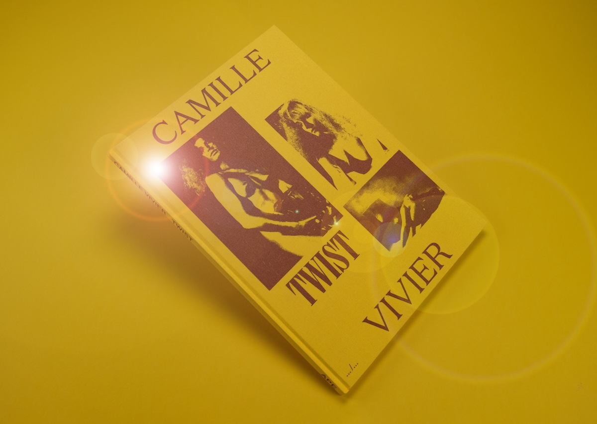
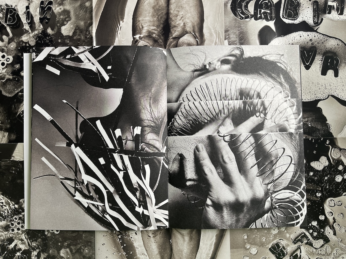
Camille Vivier Twist (June 2019) / Katie Burnett Cabin Fever (2021)
When people are researching or going through archives, they often end up using the same sources of information too. And if it’s not AI, your point of genesis is the self and it’s all essentially influenced by one’s own experiences. Intuition is innate but it’s also developed. What are some of the experiences you’ve had that have shaped your eye?
Yeah, that's the difficult part because the online resources or archives are all the same. What the eye sees as valuable is also a learning process, now I see it faster because I have experience from the past that lets me know if something works or doesn’t work. When I’m researching I can now easily dig into something and know if it’s going nowhere and when to change directions. It's a process of years, time past and experience.
How do you know something is quality? That’s a feeling, no? It’s the mark of an editor.
That's pure instinct. I'm very visually oriented. I recognize things very quickly if I’ve seen it before and sometimes I cannot describe what I've seen, but I recognize it.
Right and in that sense of remembering references, it kind of invokes this idea of collecting things mentally, collecting books, whatever it is. It can feel very physical or burdensome sometimes, do you feel like a collector?
I am not a book collector but sometimes I buy books. I have two reasons to buy a book, I love the work or the artist or because it's a very well made or well designed book, but I find this to be the case less and less. Sometimes these things don't match up either. I’ll find a book that's not very well made but it's beautiful work, the design is very relative in that case.
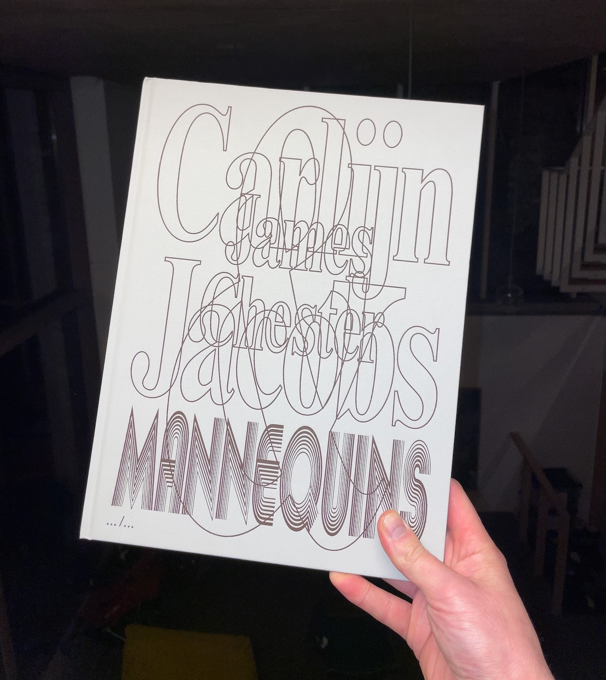
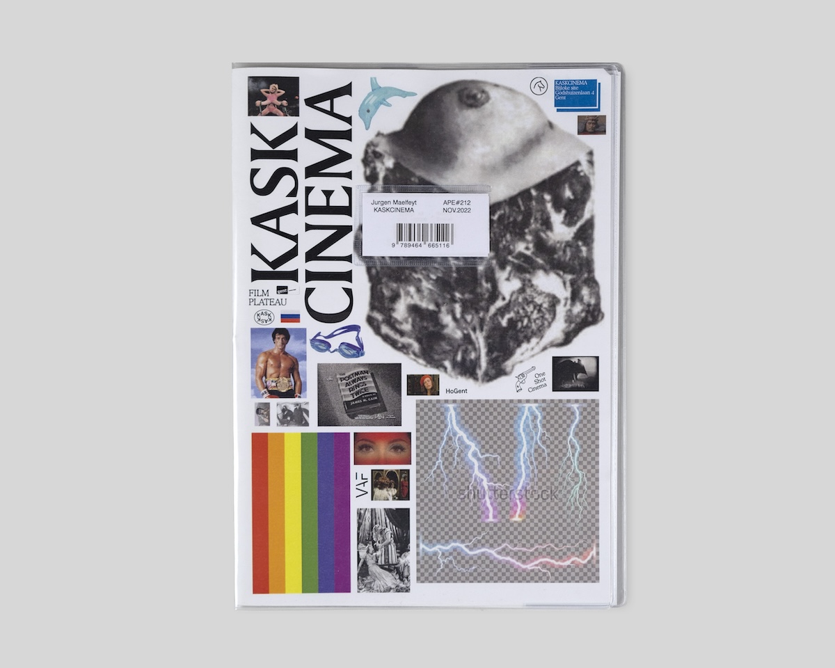
Carlijn Jacobs & James Chester, Mannequins (February 2021) / Jurgen Maelfeyt, Kaskcinema (November 2022)
I know you have Toy coming out soon. Do you want to talk a little bit about that?
It’s the same as Wet and Furs but the only difference is that Toy is more suggestive, less a literal translation of the title.
Have you always been shooting or how did you get into photography?
I don't consider it like fully photography because it's like re-photographing things. I call myself more of an image maker than a photographer. When you call somebody a photographer, I always think of somebody who's running around with a camera all the time, right? I'm not. I use a camera when I have an idea.
I know you also do Monogram and earlier we talked about editing with a system in mind. For Monogram there’s a certain prompt for the artist, a certain scale they’re working with etc. Perhaps it can seem limiting but in reality, I can imagine it helps to apply a uniform thought to artistic process.
The first idea for Monogram came from wanting to commission an artist to make a monogram. I decided to fix the size of the work but left the design to be free. I wanted it to be something that was not a magazine, not a book, but something in between, more like a zine. It would be fast-paced all around, especially in production so that's also why it's stapled. Because it's stapled it cannot have more than 64 pages. If you had a project that was too small for a full book but wanted to make the work nonetheless, you could make a Monogram. For example, Yuji’s book In memory of… which documented her nose job. One artist, one project, fixed size, free design.
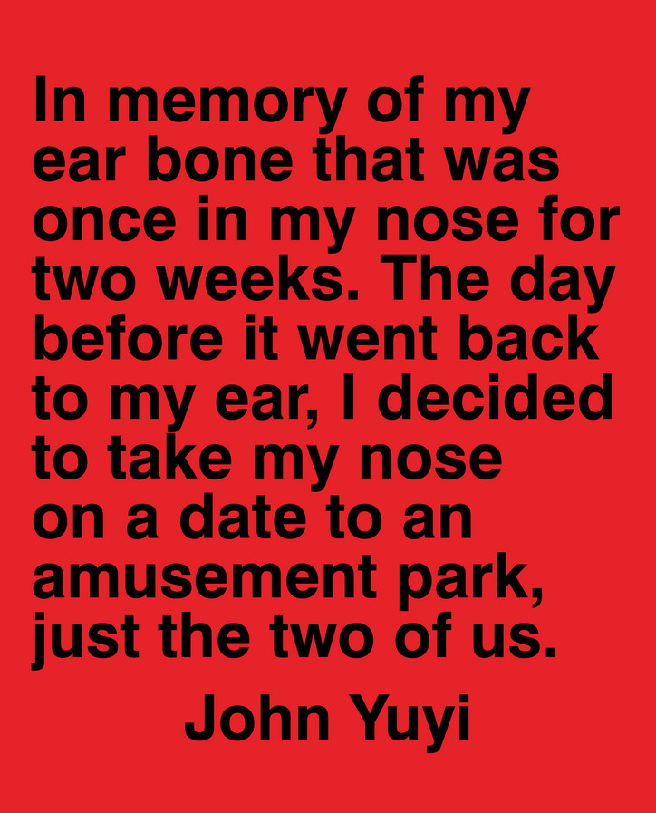
Monogram 5: John Yuyi, In Memory Of... (December 2023)
Got it, so what do you think is the difference between a book and a zine? Obviously size but more so just conceptually.
I think of something more as a zine based on its content. The feel of a zine content is a very fast paced thing. I think of fanzines which are very quickly produced and if it fits that, it can fit in Monogram. I haven't worked on a Monogram for months but I could do a Monogram each night for example, that’s how quickly it can happen. They’re all limited to an edition size of 500 whether you’re famous or not.
As it should be.
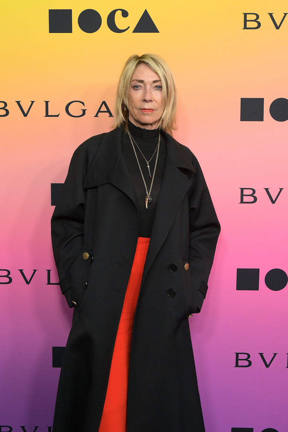
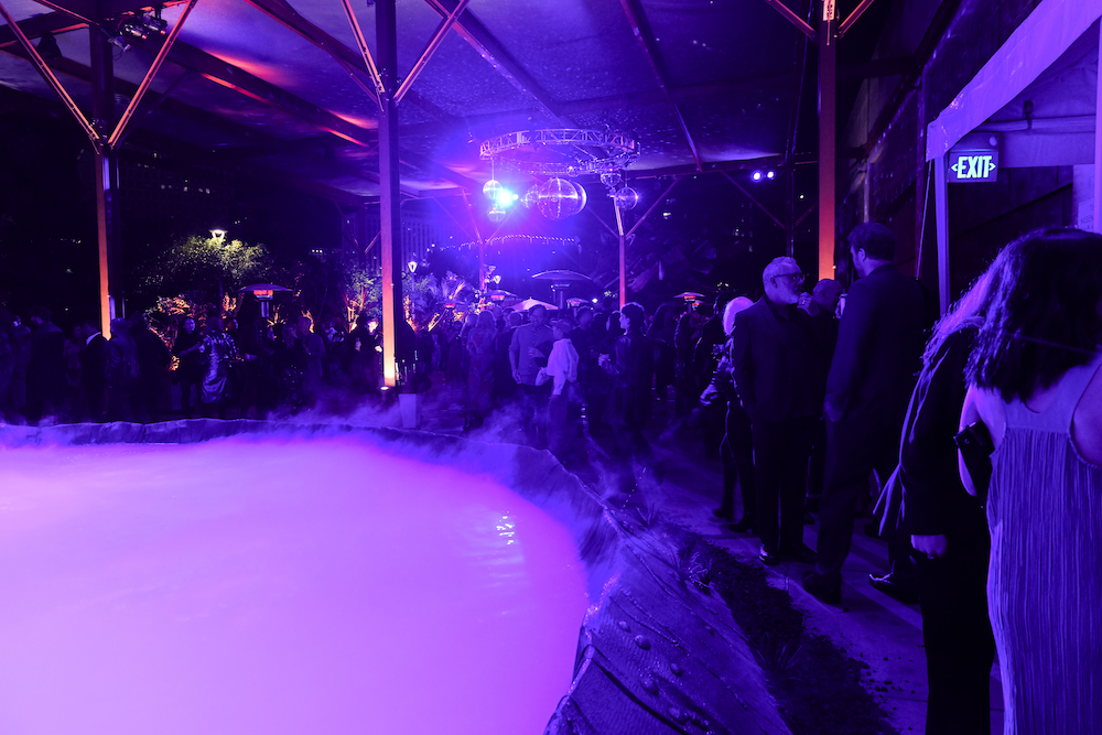
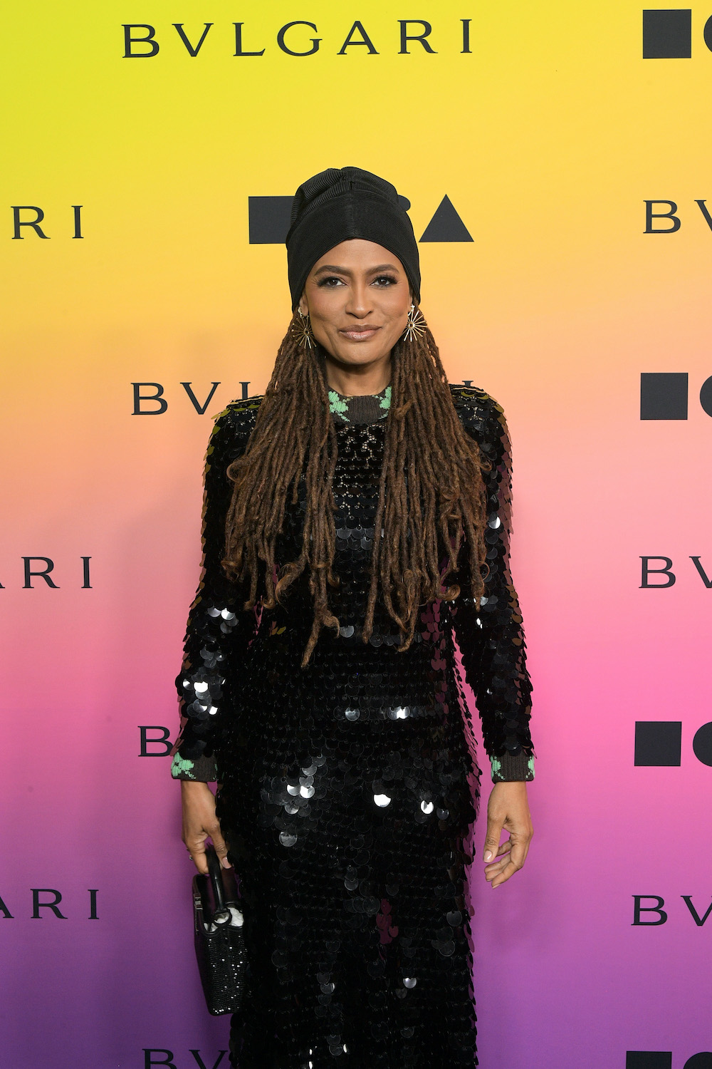
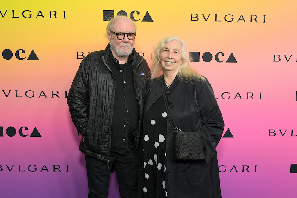
Esteemed guests such as contemporary artist Paul McCarthy, rockstar Kim Gordon, and director Ava DuVernay were in attendance, where the dinner kicked off with a captivating performance by the rhythmic beats of the Makoto Taiko Japanese drum ensemble. The museum was adorned with fantastical installations and mesmerizing projections, transporting attendees to underwater realms and lush garden landscapes. Notable among these were Schneider's enchanting Dendrite Bonsai and Tide Piepool sculptures, adding an extra layer of allure to the ambiance. While guests shared space MOCA's Board Chair, Maria Seferian, remarked on the importance of the night. "Max's presentation asks us to look beyond the maudlin and instead consider the miraculous. Returning to the artist-designed MOCA Gala is an idea about a relationship between artist and museum, not intended to privilege or position any one artist, but rather continuing a conversation rendered mute without each of them."
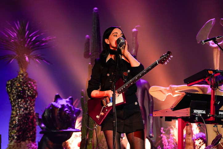
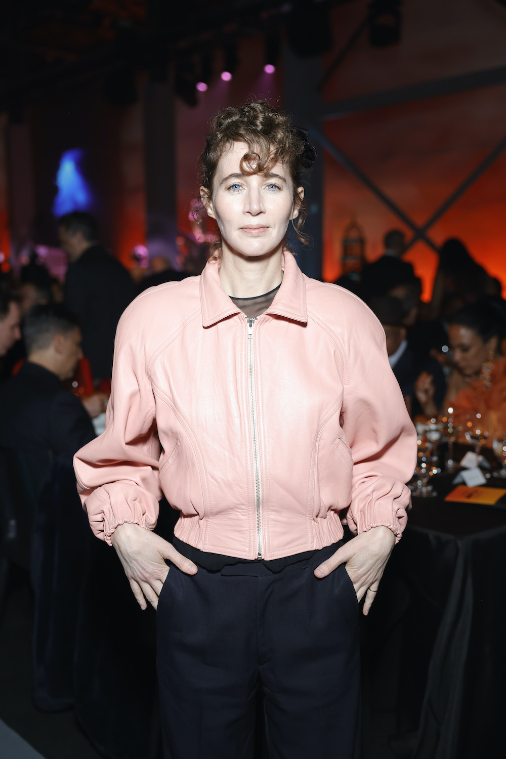
As guests mingled and finished their dinners, multi-Grammy nominee St. Vincent commanded the space with a beautiful performance. The atmosphere in the room bore witness to the profound significance of the arts and the invaluable contributions of MOCA within the local Los Angeles community and the global artistic community at large. "Artists serve as both mirrors of the present and portals to other futures," said Johanna Burton, The Maurice Marciano Director of MOCA. "With Max's radical transformation of our Gala and St. Vincent's incredible performance, the night allowed us all to come together around art and artists as some of the most powerful messengers of our time. It represented the heart and soul of what MOCA is about."
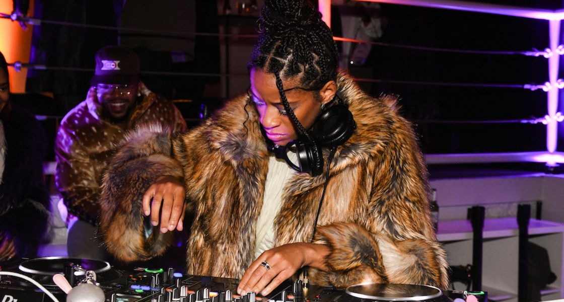
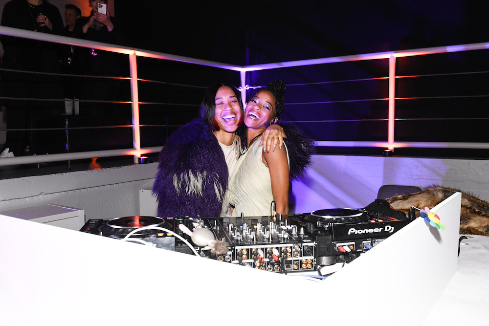
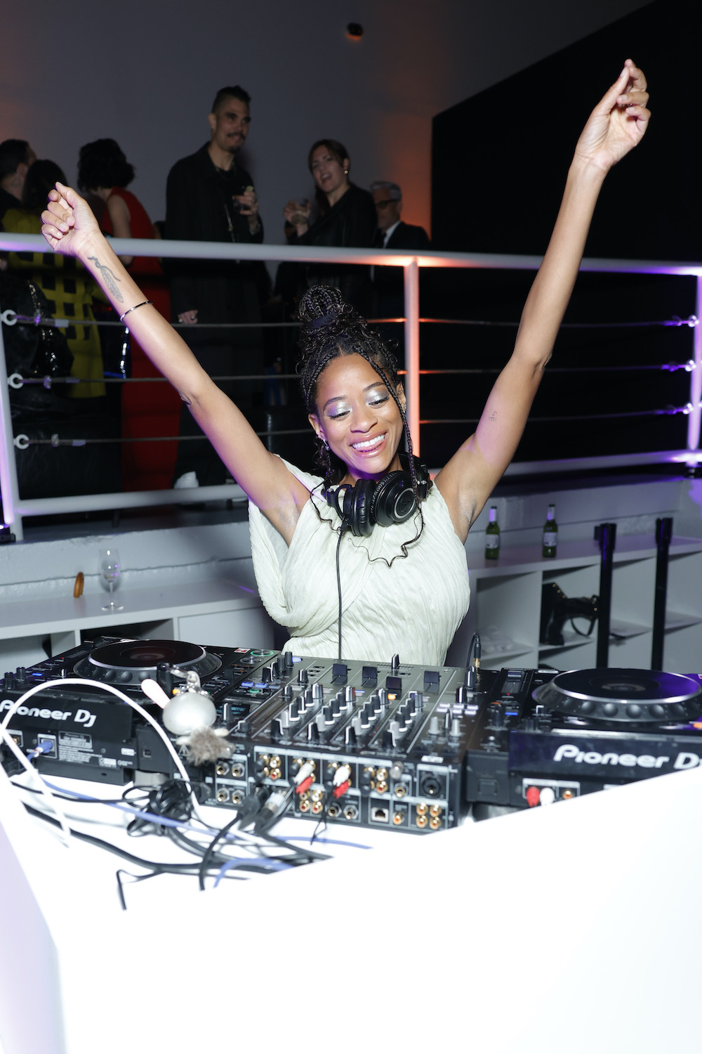
After the dinner and performances, the festivities continued with the After-Party, where musicians Kilo Kish and Kitty Ca$h took over the DJ booth, keeping the night alive with their beats. A post-dinner snack of petite burgers and fries circulated, providing a delightful late-night treat for partygoers. Laughter filled the air as guests danced and enjoyed each other's company, marking the joyful conclusion of MOCA's annual Gala.
Explore the night below and make sure to visit MOCA the next time you’re in LA.

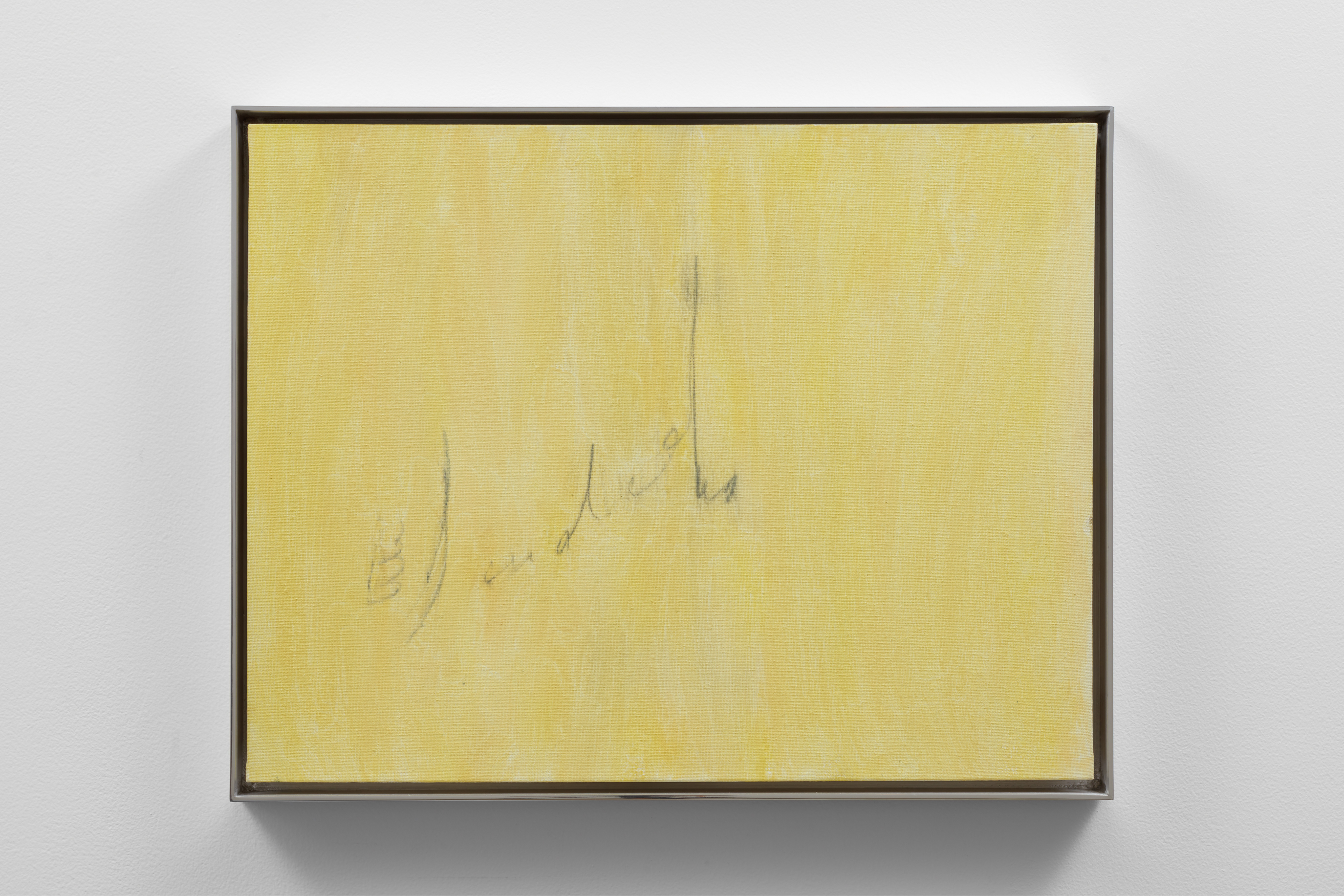
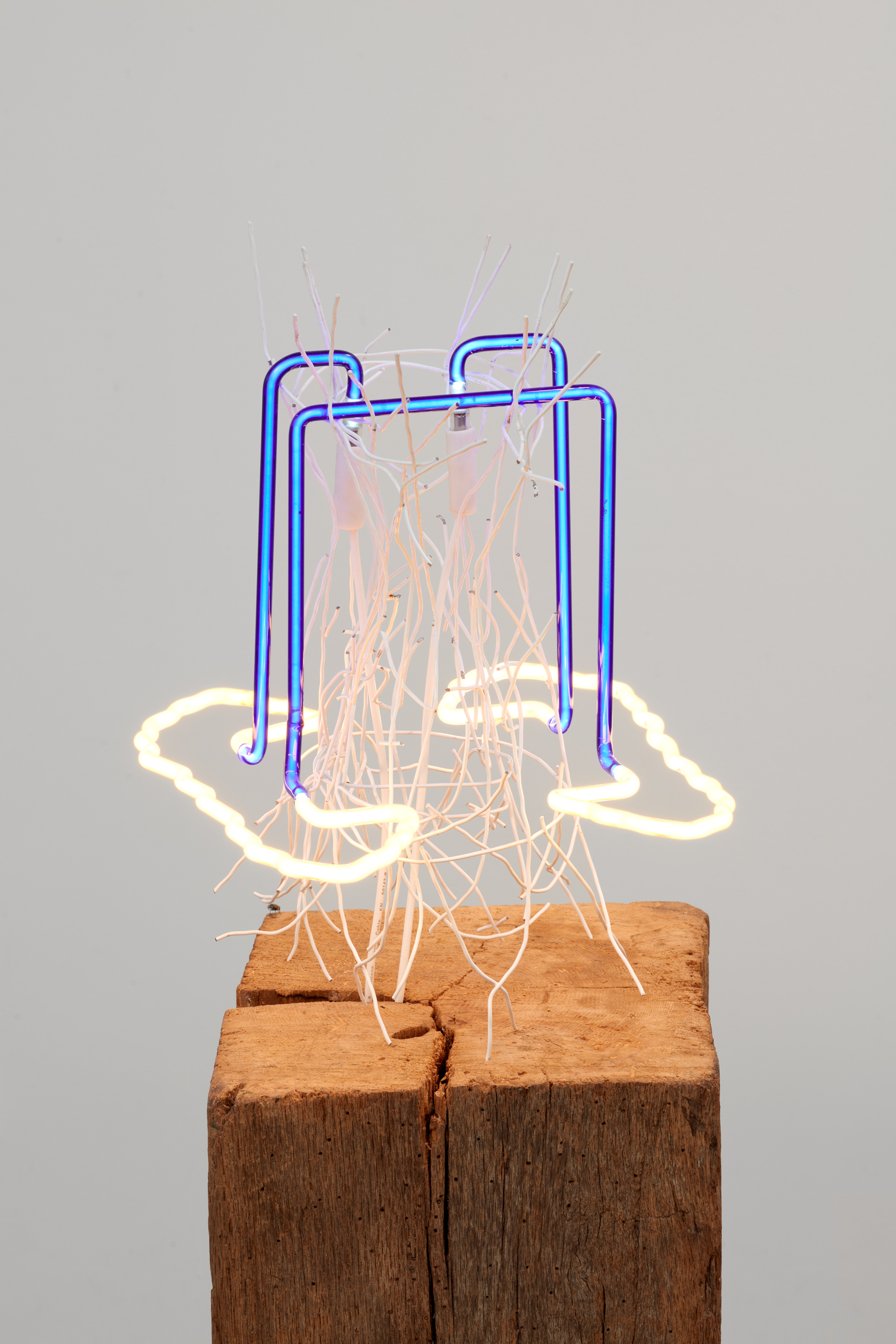
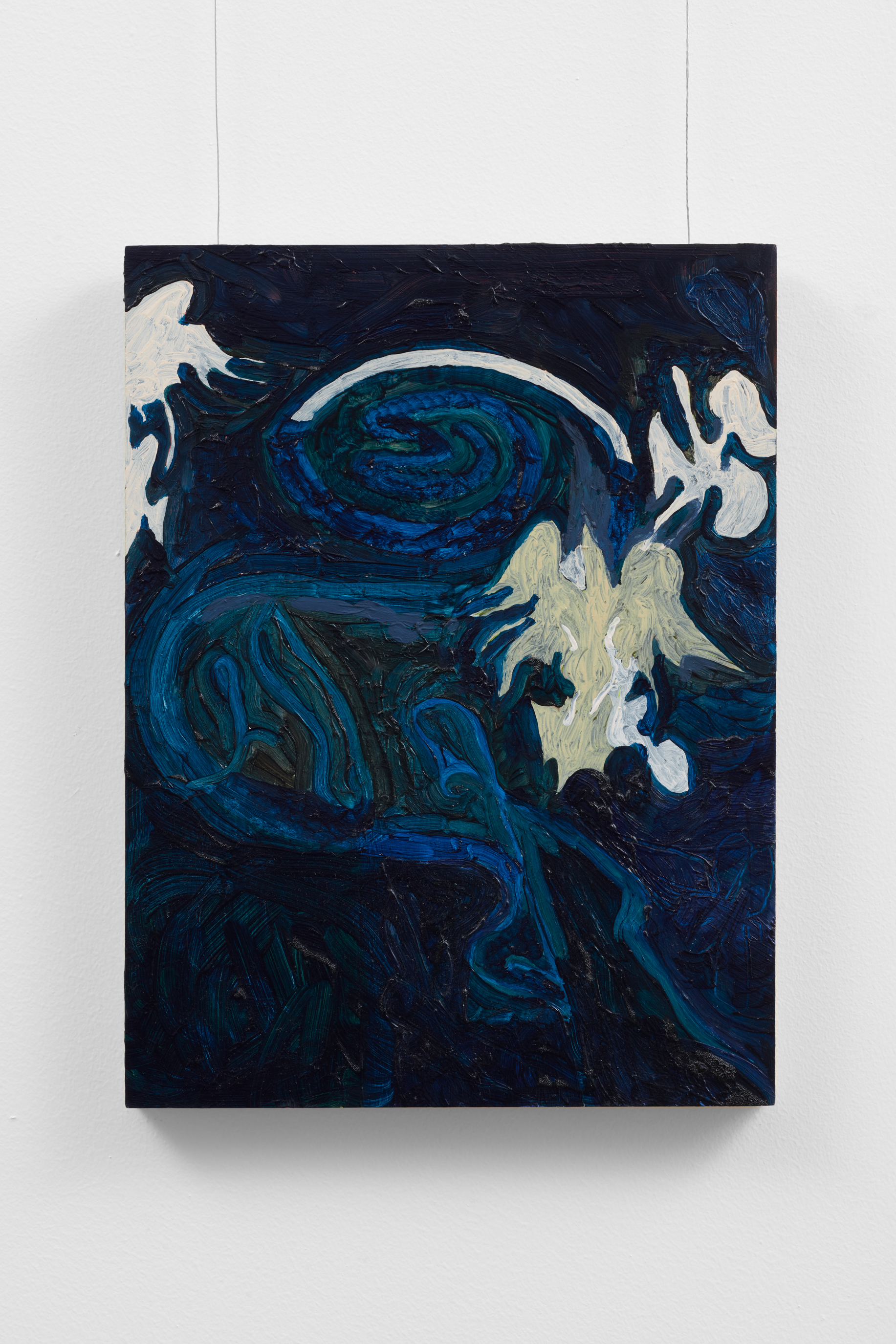
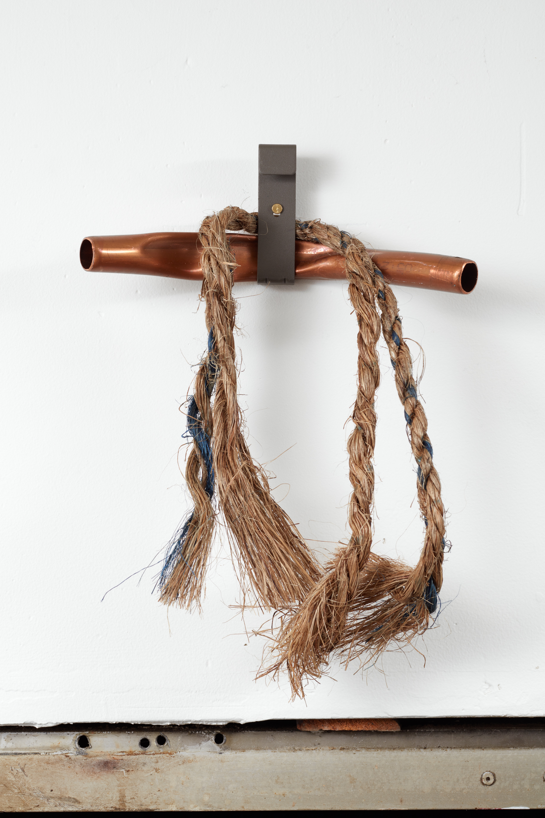
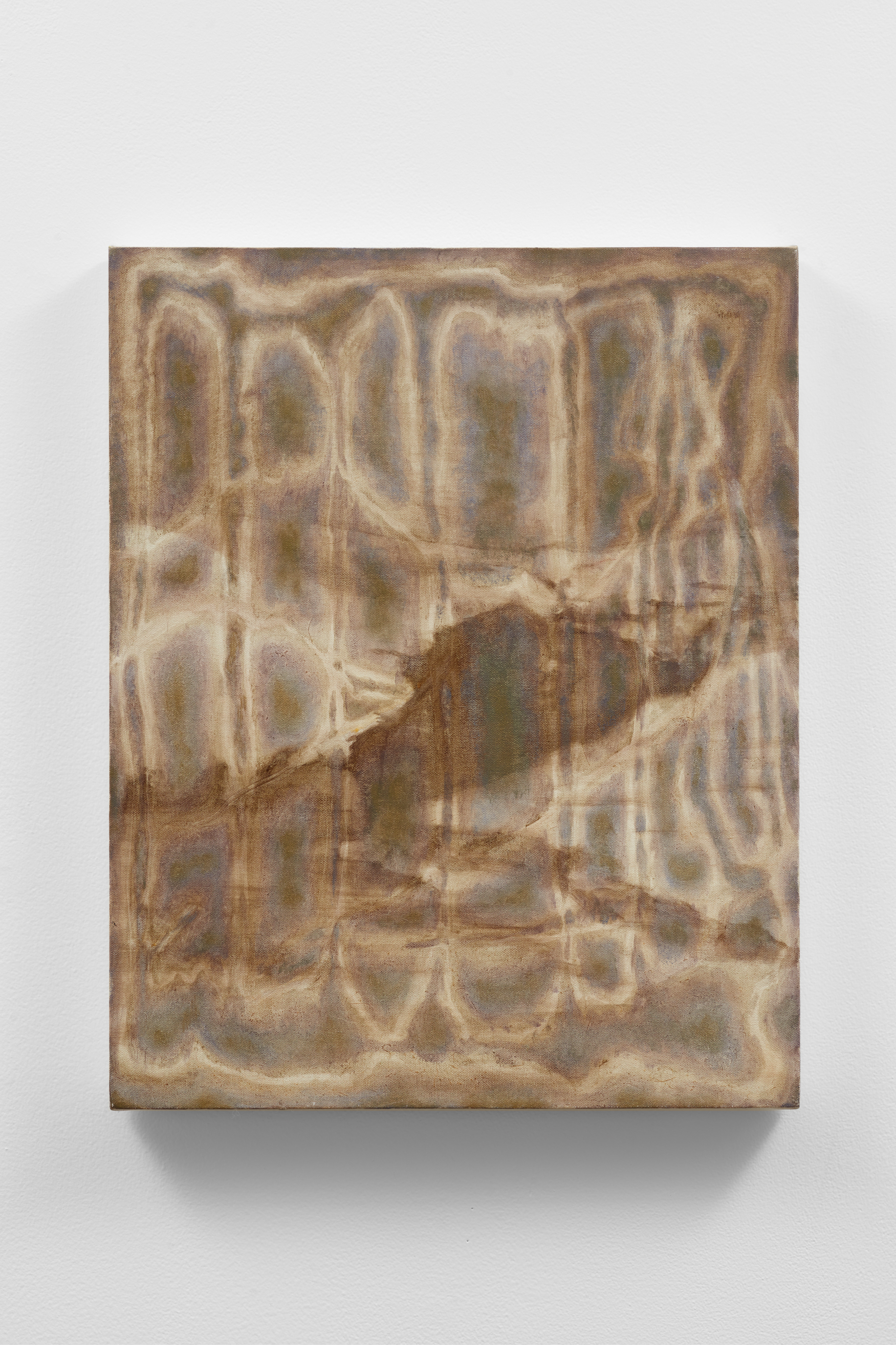
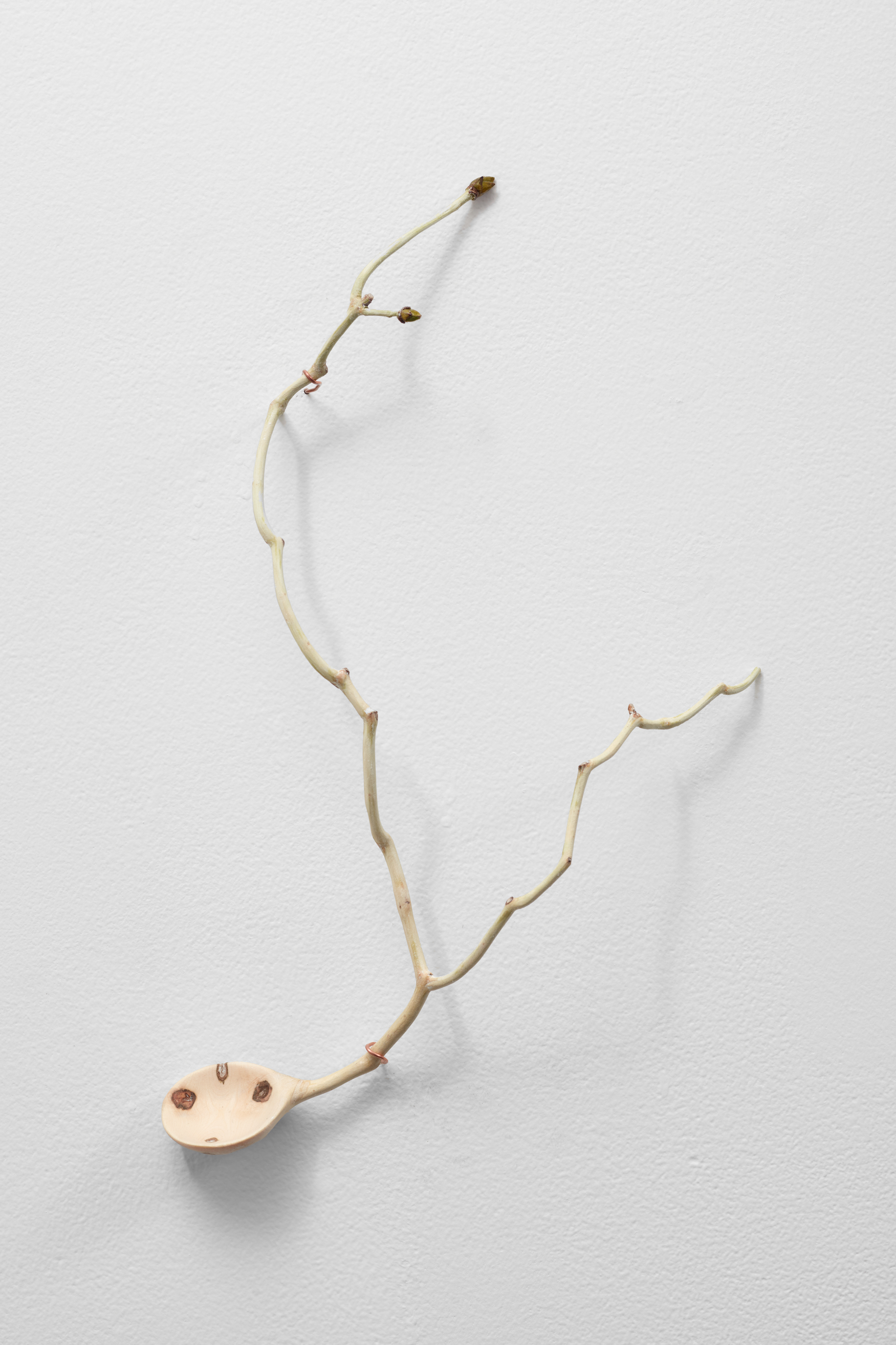
The group show is many things. Its minimal installation belies a sense of brevity that can also be found in the rather esoteric press release. Simultaneously, there is an aftermath to viewing the show that lurks nearby. A militant intention that cannot be easily resolved, if you will. Z. Susskind’s plexiglass installation Gloves (2024) which spells out ‘gloves’ in all capitalized letters embodies such militancy well. Through its black reflective surface, one sees the still industrial landscape of the neighborhood. Pop meets opacity here. Another Susskind work Time, the Old Cashier (2024) more casually plays with weight and lightness, gesturing toward unseen physical acts. Phil Davis’s C-Print photograph Ciara (2003) points to the uncomfortable gap between self-fashioning and the real, a gap that exponentially explodes in Carmel Ni’s Pilgrim shoe (2024). Elsewhere, paintings by JPW3 (Patrick Walsh), Sara Gernsbacher, and Kate Mosher Hall all enjoy varying degrees of raciness, bordering a frenzy in some cases and presenting more subdued qualities in others. Still, words cannot do justice to the feel-good line-up — rising stars and superstars who are friends of both galleries fleshing out fundamentals of their practices without a care.
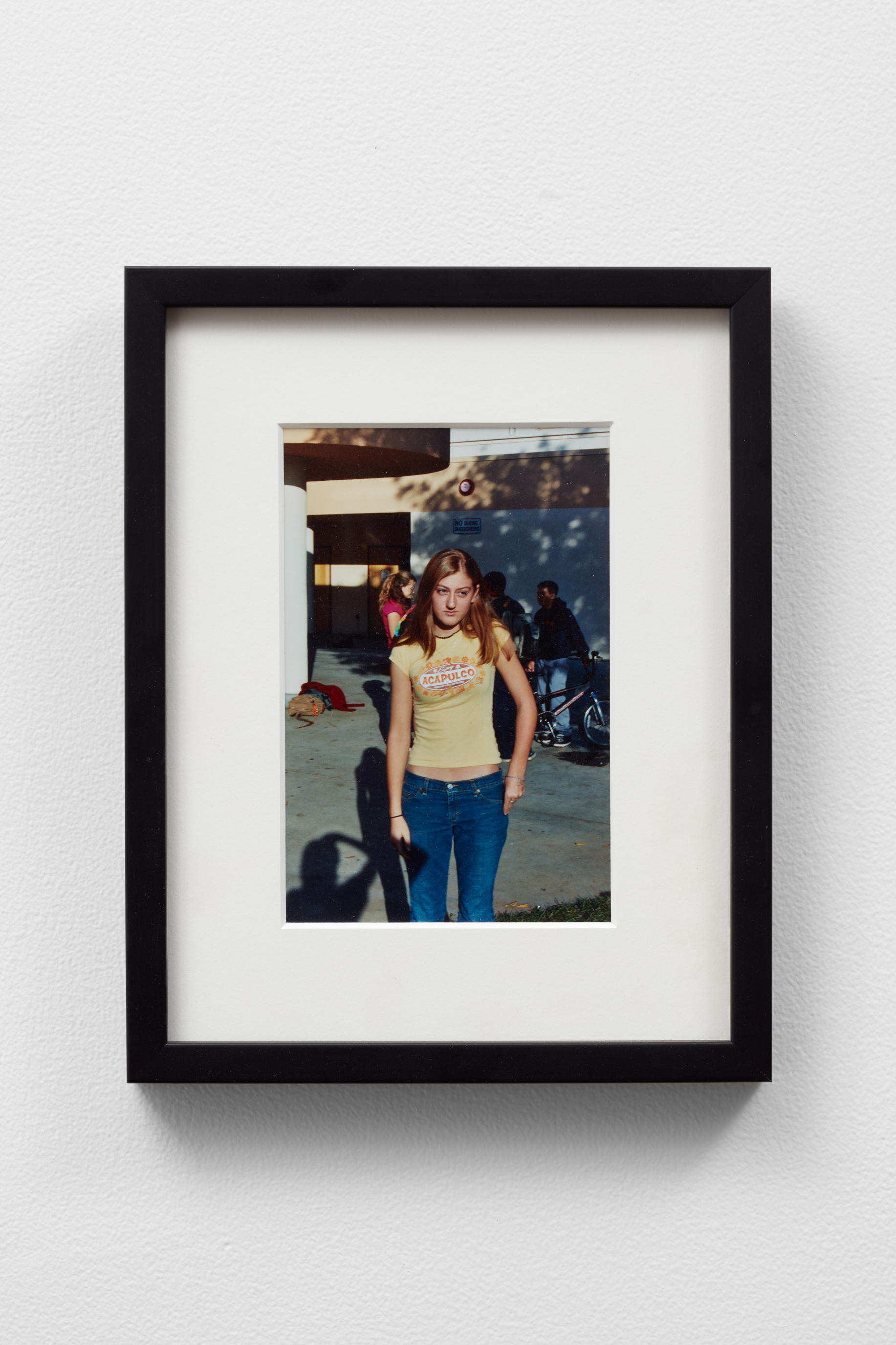
- Phil Davis
- Ciara, 2003
- C-Print
- 7 x 9 in
Congratulations on The Devil’s Chestnut to both of you! I heard the opening was a buzzy success, tell us more about how this exhibition came to be!
Louis— I was always a fan of Phil Callery, even though I had never actually been there. Phil and I were very close friends in New York. And I’d always dreamt about going to a Phil Callery opening and there’s no better way to go to an opening than putting on a show there. In terms of timing, Entrance was heading west for Felix, which is our first operation on the west coast. This little window of opportunity opened, and we decided to sneak a show in there at the same time.
Phil— Luckily, I held on to the space, as a sublet for friends’ studio space. It was very easy to jump back in.
Louis— The mission behind Entrance, in a way, ran parallel to what I recognized was happening at Phil Callery, even though our timing was a little different. Now Entrance has grown into a gallery with a rigorous program, the need to do fairs internationally, and the want to help artists grow. The same ethos of making room for experimentation and new voices and honoring an artist’s practice is still at the foundation of both of those galleries.
I heard that, leading up to the exhibition, you two took a weeklong road trip from New York to LA. What was the road trip like?
Louis— It was incredible, both functional and fun. In the art world, it's very hard to get any time off, so we decided to take a little bit of extra time across the country. We took Route 66 and visited artists and a lot of old-school American roadside attractions along the way. Many people visit land art when they’re traveling, but we wanted to visit the world’s biggest mailbox.
We were also picking up artworks along the way for The Devil’s Chestnut. It was an adventurous treasure hunt. We visited some friends in Pittsburgh that run a project space called ROMANCE, and visited one of Phil's best friends, the artist Zach Armstrong in Dayton, Ohio. Every day, we would only decide a certain amount of driving time and what to have for dinner that night. We had burgers in Tulsa and barbecue in St. Louis. It’s good to get perspective away from the coasts and know that culture and art exists across the United States.
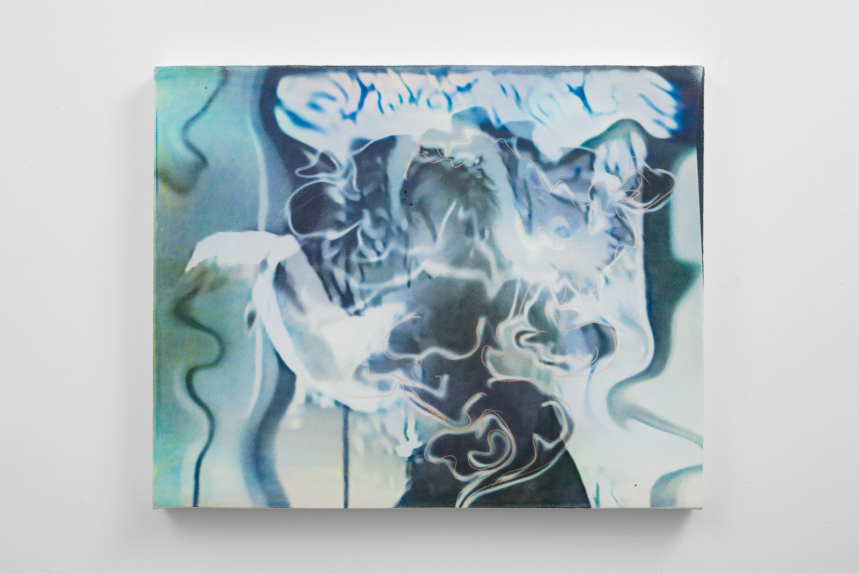
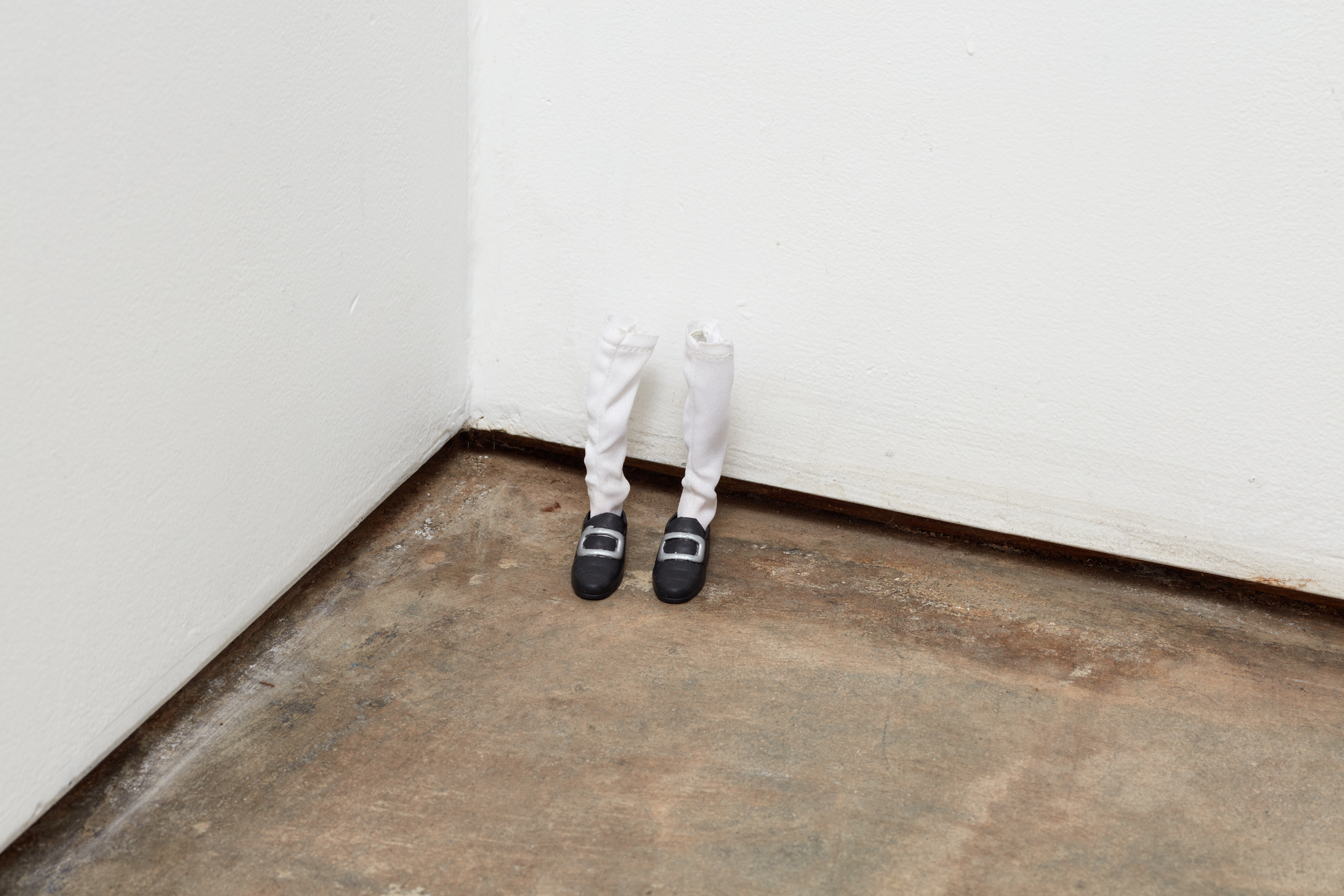
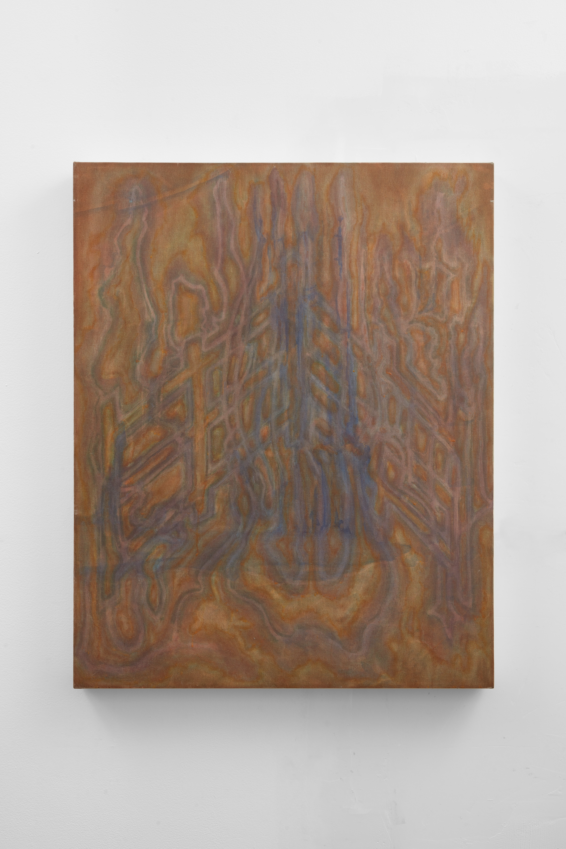
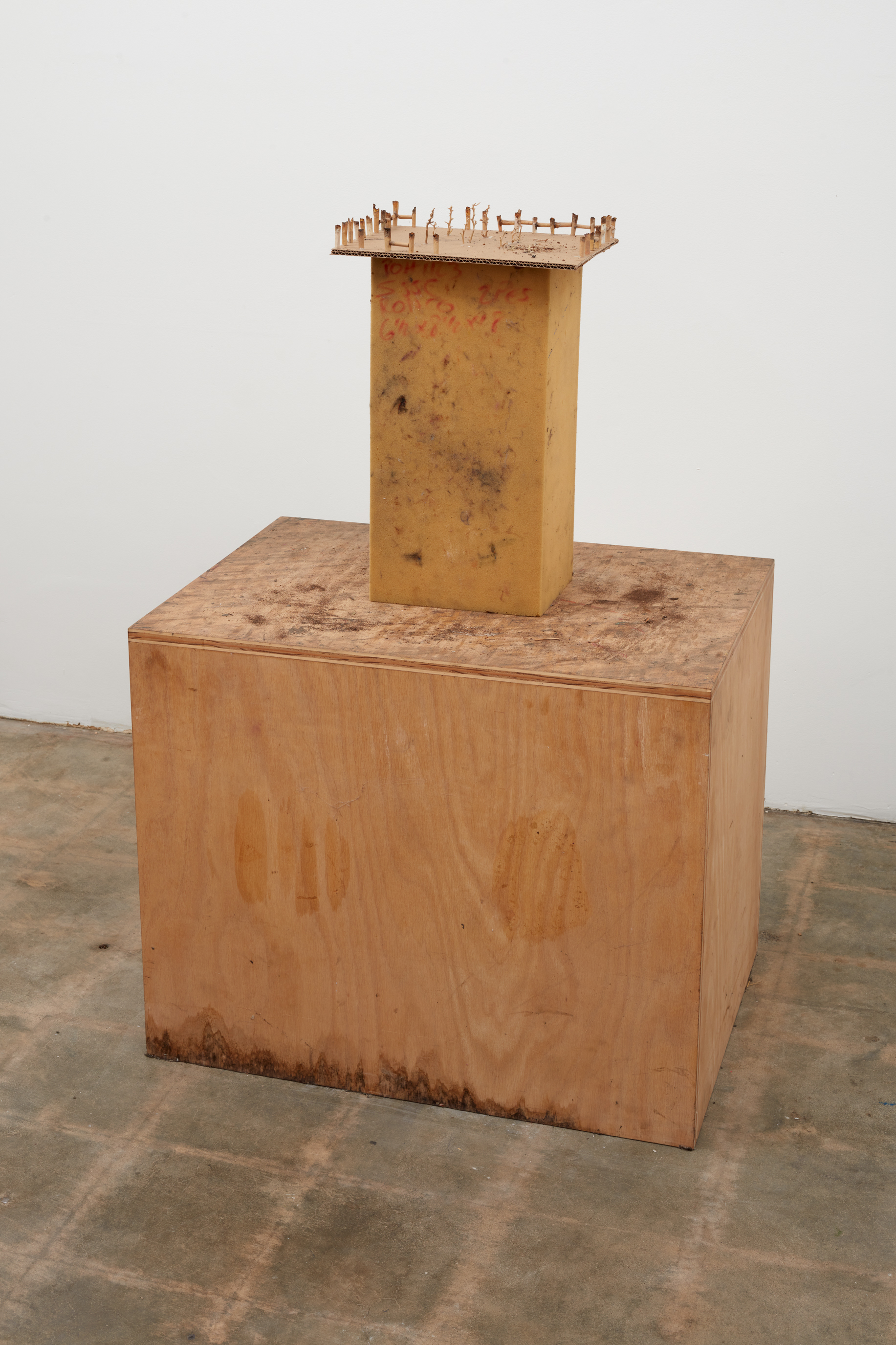
The Devil’s Chestnut felt like a homecoming journey that intimately revisits both galleries’ history. How does it feel to mount a very personal presentation exhibition, while two major art fairs were happening.
Phil— The installation process was intense for me, because I had to figure out how to accurately use this very intimate space, which almost became part of the exhibition. Things calmed down afterwards. Louis, while you were deep in the art fair, I was tucked away at the gallery, which functioned as a little rest stop away from the fair chaos.
Louis— The Devil’s Chestnut is a hometown group show that celebrates new voices and the history of the space. Phil Callery has always been an inviting space that mixes high and low. On the opening night, the biggest movers and shakers in the Los Angeles art scene and customers of the taco shop next door were at the gallery. The gallery originated in a very definitive moment in the Lincoln Heights, Chinatown area, where a lot of artists had their studios, and where a lot of people would visit after work. Night Gallery was founded right next door to that space, which has now grown exponentially to a real force in LA.
What are some of your observations about the neighborhood Phil Gallery is in and LA’s art scene?
Louis— There's a lot of camaraderie between artists, which I really appreciate. Artists tend to go to each other’s shows and studios a lot more. Also, by nature of having so much more space, LA attracts artists who have a lot less fear about working at a larger scale.
You two met a decade ago in New York, while Louis was a member of the downtown collective Luck You and Phil was visiting underground concerts. Can you tell me a bit more about that post-Great-Recession moment of participating in the art scene in downtown Manhattan, where a lot of cheap real estate was readily available.
Louis— I just came out of high school when I joined Luck You and some members of our collective were still in high school. We were really focused on what people were making locally and we weren't thinking about the larger art world. We were just trying to put our friends’ projects on. We started in what is now the lower-level gallery of Entrance, back then it was really a clubhouse. We would also use abandoned spaces in the neighborhood to put on shows. I don't think we were necessarily aware of an economic downturn in the neighborhood, which was mostly food distribution and clothing shops. The collective did our best to respect the community that was immediately around us. We would work with our neighbors, invite them to shows, and respond to their noise complaints. Then, the art world seeped in, as we all sort of grew up out of the collective.
The collective wasn’t really interacting with anything outside of our local neighborhood community. Sometimes people would pluck us out and drop us into centers of the art world, because we had a story that can be told. The collective insists on art as a way of living rather than a job and I still live by that to this today.
Phil— Phil Callery started as my studio. I was just having friends over every night drinking beer and playing dice. One day, I decided to give my friends shows in that space. The gallery just came out of that need. At the same time, I was visiting New York frequently, as Night Gallery’s preparator installing their art fair booths. That's how I met Louis, it turns out I went to high school with his then roommate.
Now, many of the artists in The Devil’s Chestnut are superstars showing with powerhouse galleries in LA. Both Entrance and Phil Callery are spaces of experimentation and collaboration for emerging artists. So much labor is embedded into being an incubator, but often such labor is under-appreciated, as we live in a cultural moment of “bigger is better”. Tell us more about how you keep up with this spirit of experimentation with integrity and good faith.
Phil— For me, the goal was never to get to a place. I was just thinking about what I can do that’s interesting, fun, and stimulating. It’s hard for me to even take credit for any kind of integrity that may exist there. I’m just wired to just have a good time and keep doing interesting things.
Louis— Authenticity seeps out when you’re doing the next right thing. I love running Entrance, because I believe that the mission that I started with is scalable. A lot of the artists that I am working with had never shown before, and now have a career as artists and can make work for a living. I am always trying to make room for new voices. My favorite thing is when I meet older curators or gallerists, who have been in the industry for say 50 years and are still excited when they walk into a room and see something new. They're not jaded and have stayed curious. And I think that curiosity is scalable, in terms of elevating voices that matter. Phil and I got that curiosity from our days of touring in bands, where we witnessed so much craziness.
Phil— Entrance is like almost the sustainable progression of what Phil Callery could have been?
Louis— Right, how do you take a gallery to the next level without basically becoming like some stock exchange and selling out? I never worked at a big gallery and have retained that sensitivity to the community around me. So has Phil Callery. If you mentioned Pill Callery in LA, everyone always remembers good memories of shows they have seen or the time they spent there. You can't ask for much more than that in this world.
