PRESENTE CONTINUO: the intimate ties between then&now

Starting May 30, PRESENTE CONTINUO will be available to purchase on presentecontinuo.com, cpcompany.com, and at the C.P. Company flagship store in Milan, Corso Matteotti 7.
Stay informed on our latest news!

Starting May 30, PRESENTE CONTINUO will be available to purchase on presentecontinuo.com, cpcompany.com, and at the C.P. Company flagship store in Milan, Corso Matteotti 7.


What inspired the Sunnei x Media series?
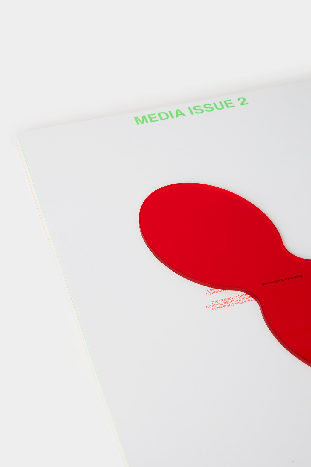
Media Issue 2 x SUNNEI is a collaboration that emerged in a completely spontaneous way. The SUNNEI team showed interest in our early publications and asked us to start collaborating, which aligns perfectly with the theme of the magazine: collaboration as a relationship and bond. Thus, it started a dialogue and exchange that led us to the realization of this third issue.
What do you think people should change their perspective on these days?
It might sound quirky, but we believe that people should change their perspective on the concept of perspective itself. We should step away from the unidirectional narrative of the fact and the falsely absolute concept of truth. There are always multiple points of view, and a single topic can be explored in ways that are radically opposite, yet equally valid. Being able to move away from a single vision of reality helps to open up to discussion and dialogue, allowing for exponential enrichment.
Is two really better than one?
Regarding the concept of relations, we believe that in some ways two and one are overlapping concepts. To be “one” implies having a strong relationship between the subcomponents of the “one”, which is a strong coherence of the multiplicity building us to be considered as one. Therefore, the interesting aspect of multiplicity and connection, doesn’t lie in the concept of “one” or “two”, yet it lies in their exchange and their continuous vibration.
Why green and red?
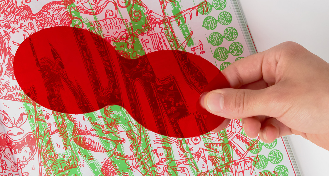
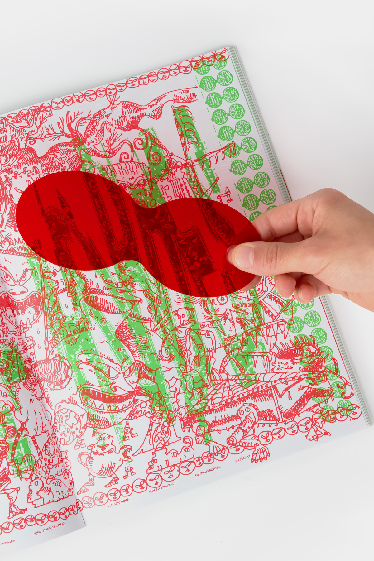
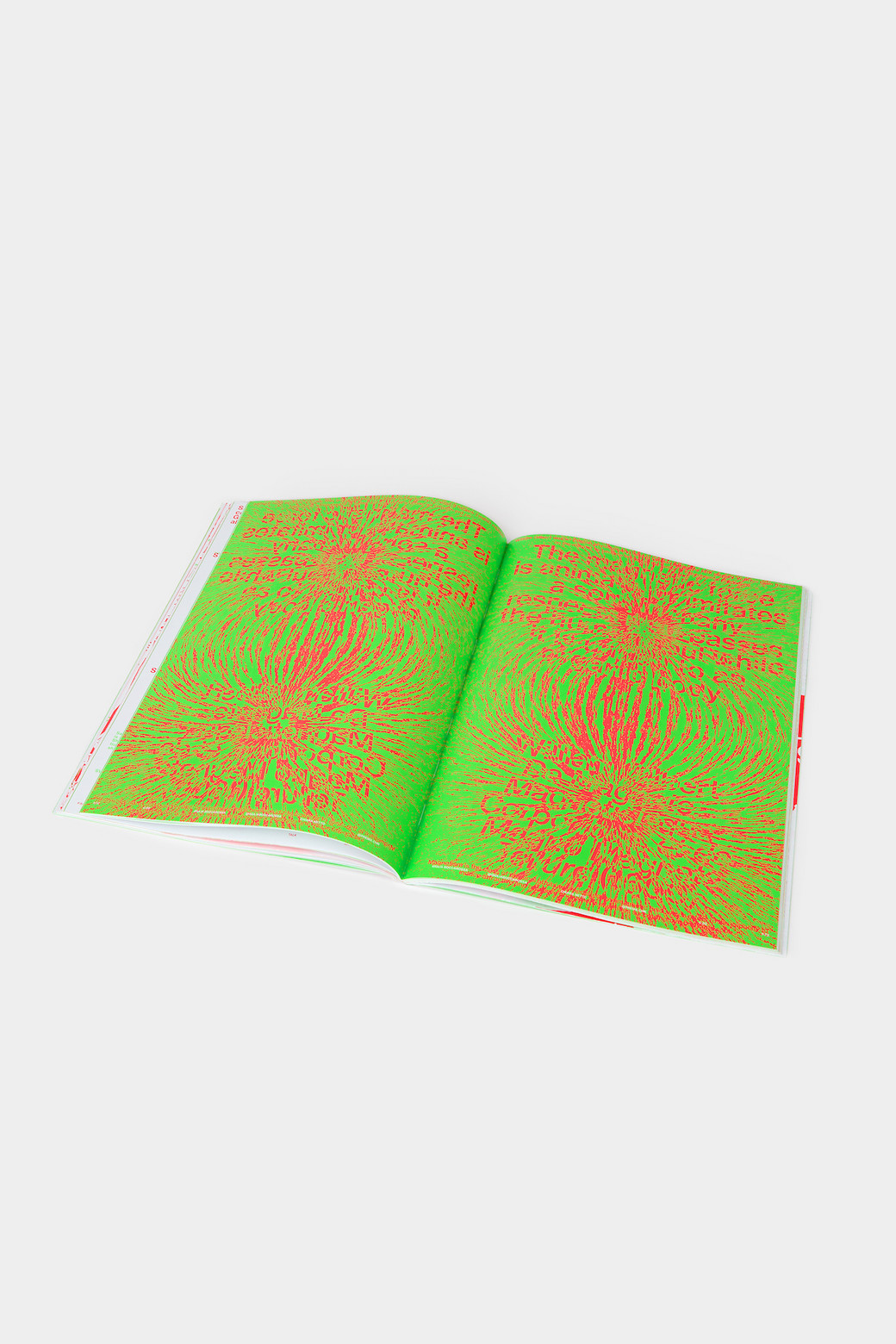
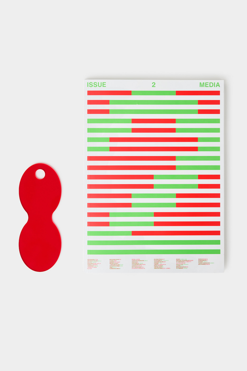
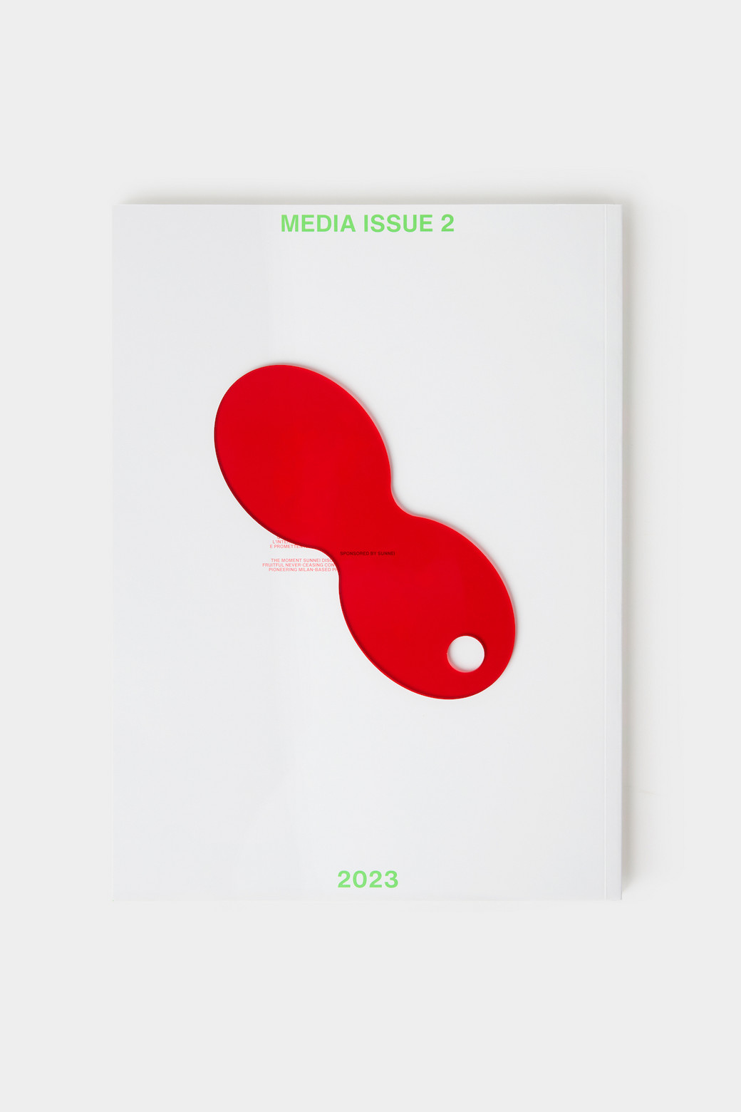
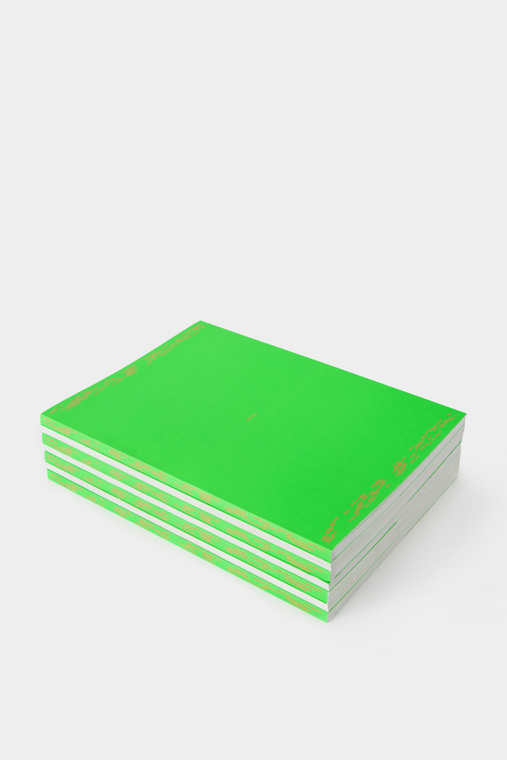
Rather than focusing on specific colors we decided to limit the palette to two colors, for an aesthetic value partially. Additionally, “2 colors for Issue 2” made sense, like the terms of a relation, this double creates a sort of dialogue. The theme of this issue is the relation, understood as a bidirectional interaction between two distinct poles that either sustain or mutually influence one another. Hence, we chose to use only two colors, green and red, and place significant emphasis on their interaction with the aim of creating an active experience. For this purpose, we created the ROSSOVISORE, an acetate tool that hides or highlights illustrations when overlapped. The final illustration is not the one printed in the magazine, not even the one seen through the ROSSOVISORE. It lies in the transition, in the oscillation between the two.
What topics does this installation cover? Why?
The topic of this publication, as we said, is the idea of relation, connection, bond. This theme can be found in several aspects of the magazine. First of all, it was clearly at the base of the design phase, where we had a continuous exchange with SUNNEI. The theme resurfaces in the illustrations, as each artist was invited to produce their work collaborating with another visual designer of their choice, with the idea that every part of the magazine could contain a collaboration, including texts. In this regard, we chose to develop texts as conversations between Media and guests, inviting them to discuss the idea of connection and relations between humans and various other counterparts. In this way, the theme of the magazine is embodied once again in the form of dialogues. Lastly, as already mentioned, the concept of relations is reflected in the way the images are experienced, as they can be modified and viewed in different ways using the ROSSOVISORE.
Describe the interplay between the publication and clothes, if there's one at all.
Well, there is an interaction with SUNNEI on the cover, which features their striped pattern, and the idea of the ROSSOVISORE it’s fun if you consider that it can be worn, kind of. However, there hasn't been a direct correlation between the clothes and the publication. Still, we believe that what unites us is the care for the finished product and the attention given to each phase of the process. For us, today a book is not just a medium. It becomes, in some way, an object. In a world where information is predominantly consumed on screens, a book is a tangible element, and this is something we greatly value. We choose paper, and we consider the tactile aspect of the reader's experience.
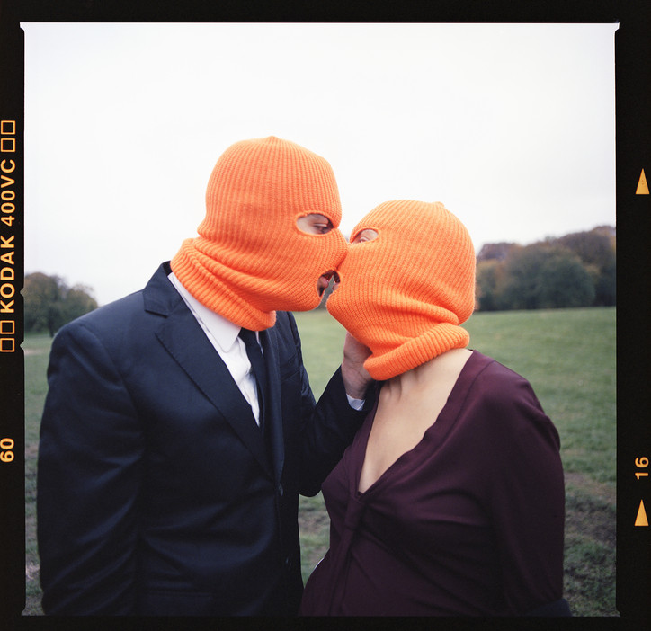
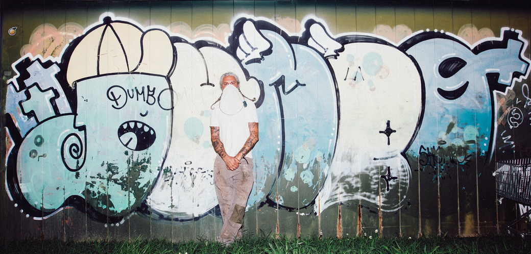
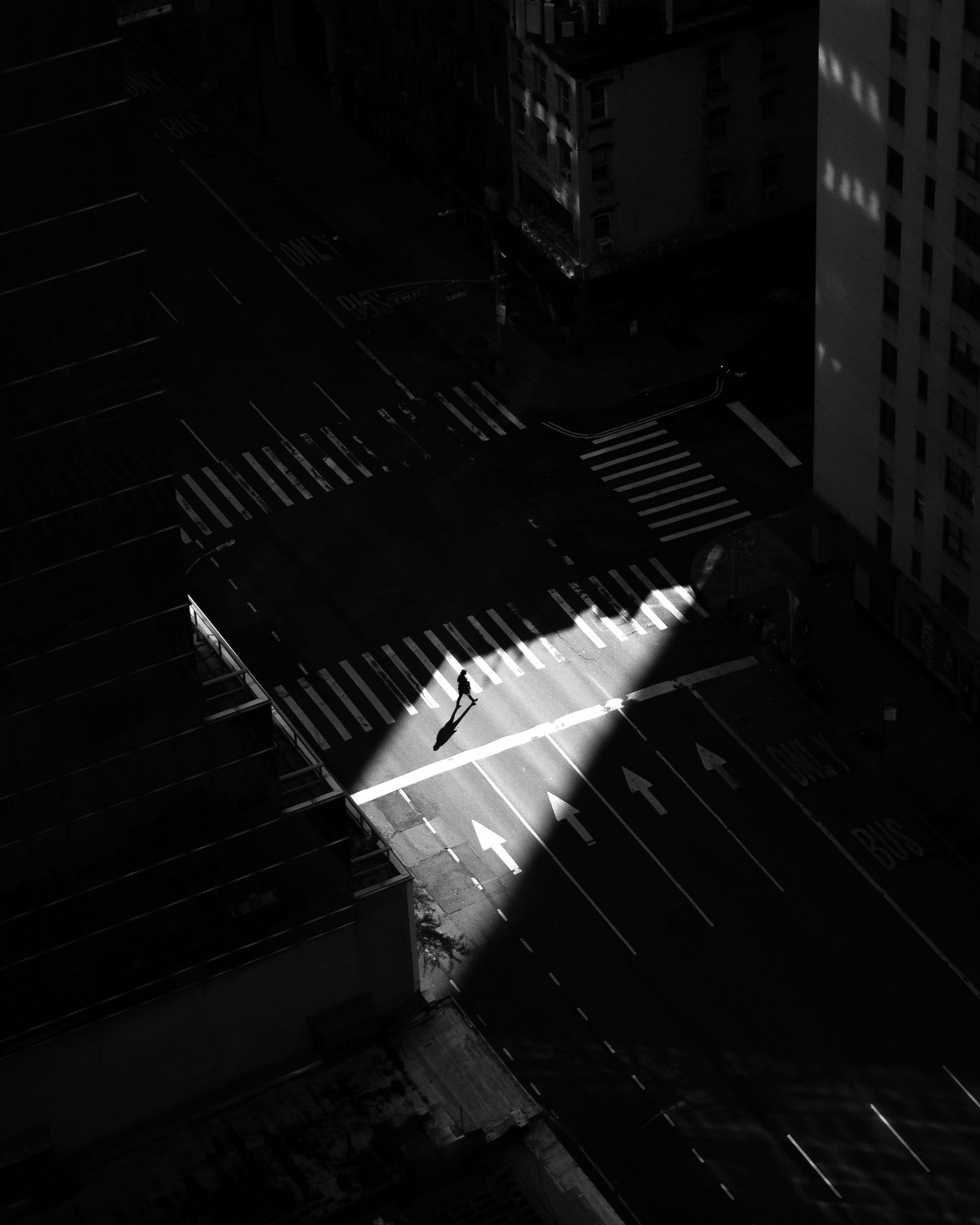
office sat down with AP to discuss everything from his street photography, which is both natural and lively, to his organized work and beyond.


You went to school for film right?
Yeah, I went to Western Michigan for film and video media and dropped out when I was a junior. Then I accidentally moved to New York.
What do you mean accidentally?
I came to New York to visit my uncle, went to a bar called Smithfield Hall, got black-out drunk, and somebody offered me a job, which I allegedly took.
How did you make a name for yourself in New York?
Well it’s been a long process, like 8-10 years, but I really made a name for myself during the pandemic with the NewYorkNico photo competition that I won. Shoutout to all the losers, [laughs] I’m just kidding (I’m really not though). Then I shot a NY magazine cover – shoutout to Daniel Arnold for putting me on for that job. That’s kind of how I became more notable but I have been taking photos of the streets for a long time, have done a lot of jobs, and worked with a lot of photographers and collectives over the years.
What is your inspiration?
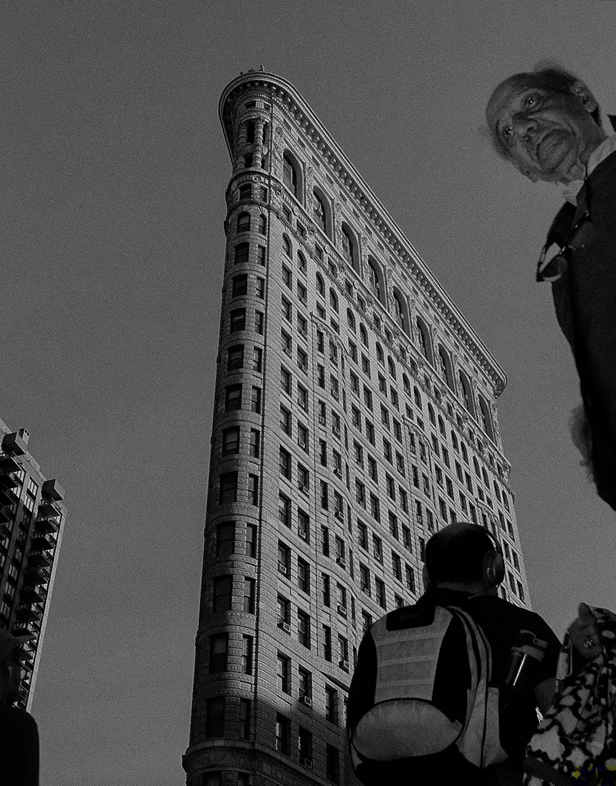
I usually go out looking for light, shadow, and minimalism. I guess the balance between things draws me in but sometimes I like to shoot color even though I am primarily a B&W photographer.
Has B&W always been your preferred style?
Over the years I became more of a black-and-white photographer because I think that without color there is less distraction in the photo. It’s more about the story. Color can be used for symbolism and different moods. B&W just gives the photo a timeless feel.


What is your day-to-day routine?
I really don’t have a plan. I really have just been kind of winging it. Back when I was young and ambitious and just trying to get it, I was just shooting every day, but I have certain days now where I like to get up and go shoot. If it’s a rainy day I will go shoot from eight in the morning to 2 o’clock. However, I spend most of my days going through old work and putting together projects like my book.
Do you ever bring your camera when you go out at night to the club?
Oh yeah, I pretty much carry a camera all the time. If not my main camera, then I buy disposables. Right now, I have like 30 rolls I need to develop.
Is there a song you’d use to describe your work?
I don’t really listen to music when I walk around and shoot, I like to hear the actual vibe around me. There’s a lot to hear, it’s almost like music. If I had to choose a song, I would choose the natural sounds of the universe, but if I have to pick one, I would say Son Shine by Sault.
Who would play you in a movie about your life?
I would play myself or I would choose John David Washington but it just wouldn’t make sense.


How did you end up shooting people like Snoop, A$AP, or Lady Gaga?
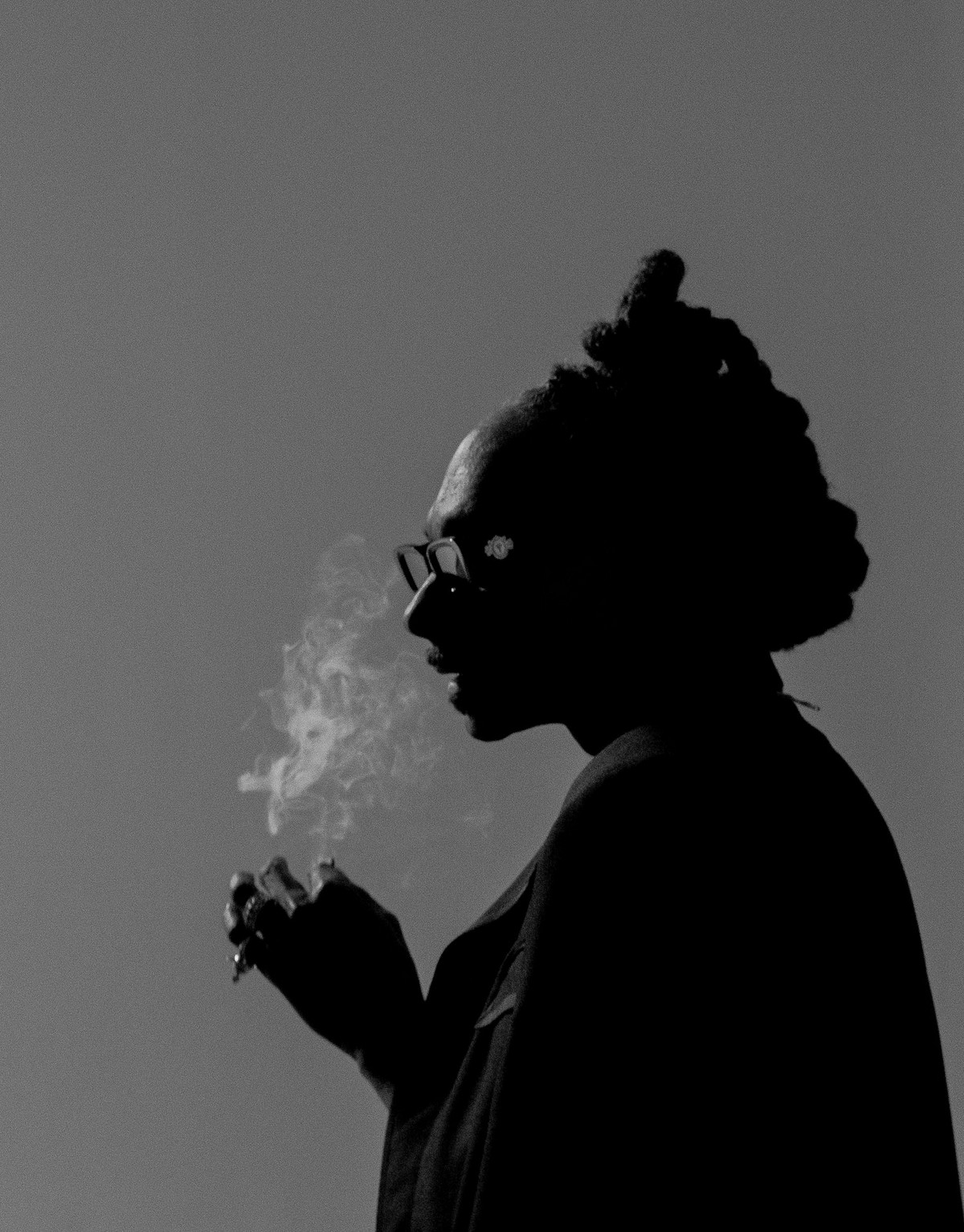
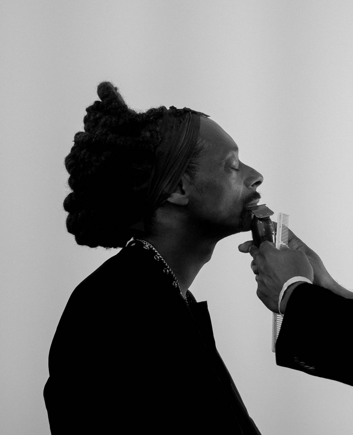
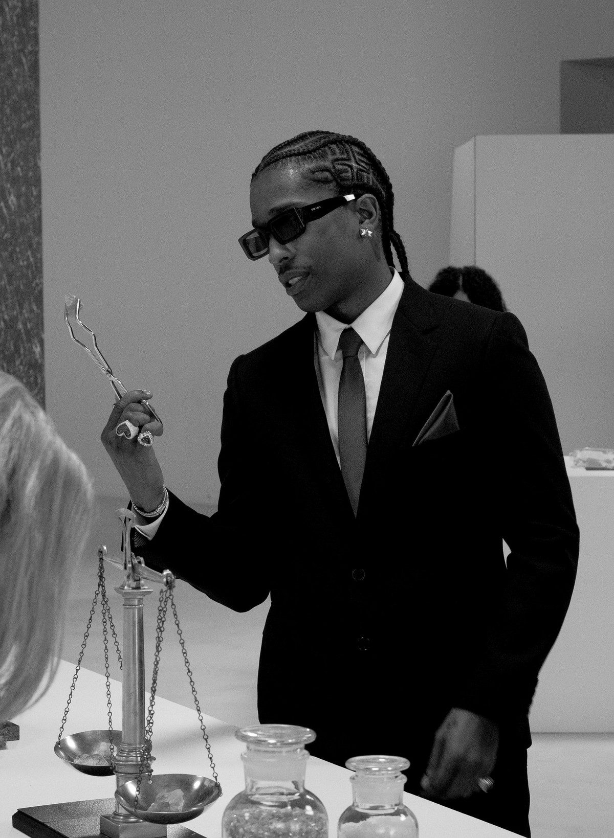
Working with A$AP – that story is crazy. I basically had to do a job in Arizona and my manager at the time was like oh you aren’t going to go. Then, my boy Luke called saying that he needed a BTS photographer in LA so I went to shoot and hang out with my friends. At the time, I didn’t know that they were going to use my photos. One day I just saw it on a magazine cover, and now, it’s everywhere. My dad even saw it in Chicago. For Snoop Dogg, I got hired by GQ - they hit me last minute for that. I fell asleep on set for like three hours but I took all the BTS shots.
What about Lady Gaga or Woody Harrelson? I know the stories but tell the people.
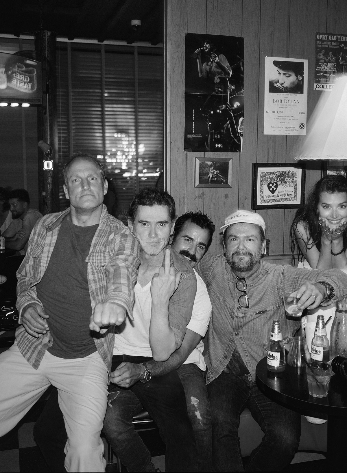
I guess shoutout to Carlos and Ray’s. I hang out with Justin [Theroux] a lot and one night we got with Woody Harrelson and smoked like 7 joints. By the end of the night, I was like “Dude I have got to get a picture.” Then a couple weeks later, Lady Gaga was just there at their wrap party at Ray’s while I was taking photos.
I would say you are the coolest photographer I know.
I would say that’s pretty accurate. I wish I was the most paid photographer though.
What has been the best part of capturing the streets and life in NYC?
New York is structurally super beautiful, a big part of the reason I wanted to move to NY was because of all the movies I watched. I always thought it would be cool to take photos like that. The way New York is built is really cool, how the light hits all of the buildings; there is always a character walking through the photos. I take photos of everything but what I like to photograph are natural moments. I think capturing a moment in time is the most brilliant thing, it’s so cool to stop time and wait for all the elements to align. New York is the best playground to make a really good picture or moment. I do take pictures but I prefer to call them moments.
How did you get the name AP the Angel?
I actually don’t remember. AP the Angel comes from this idea that everybody has this journey on earth, where they have to come to the realization that they are inevitably going to die. You’re already dead. I don’t know how to explain it and people will think I’m crazy but I am an eternal being who is already an angel on earth. I am already living and I am already dead because time isn’t real.
Checkout Ap's work on his website.

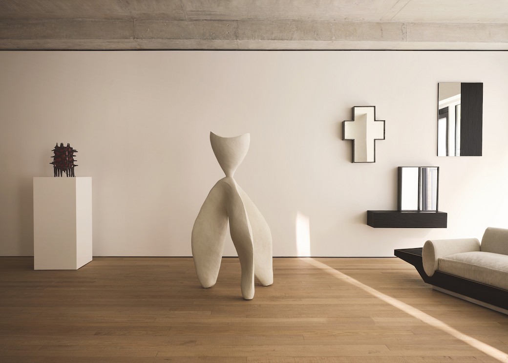
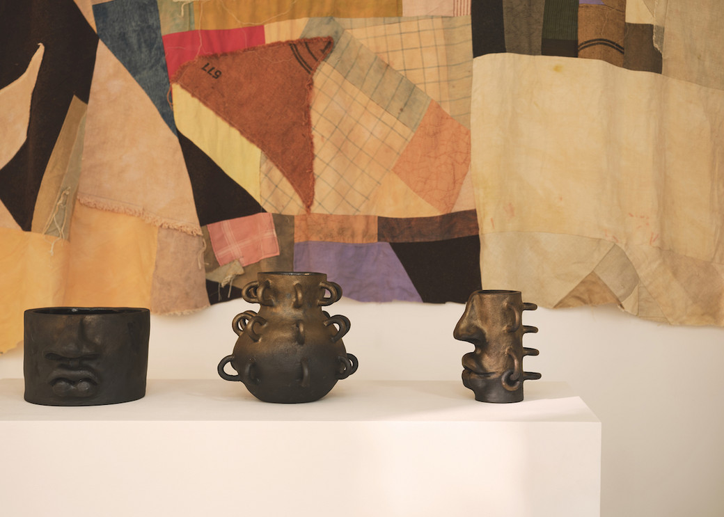
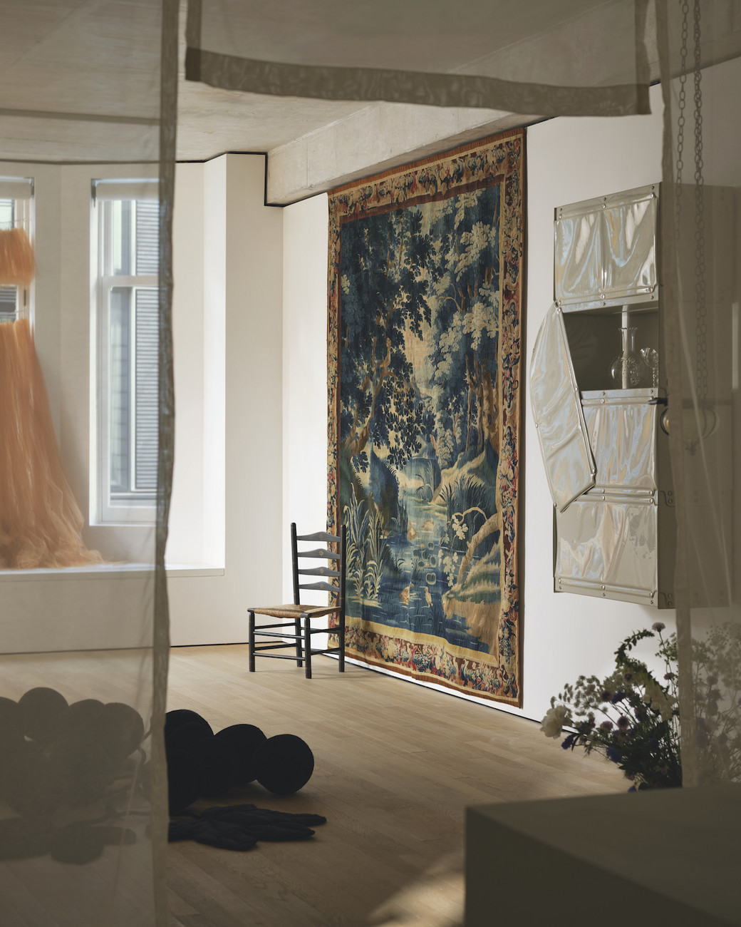
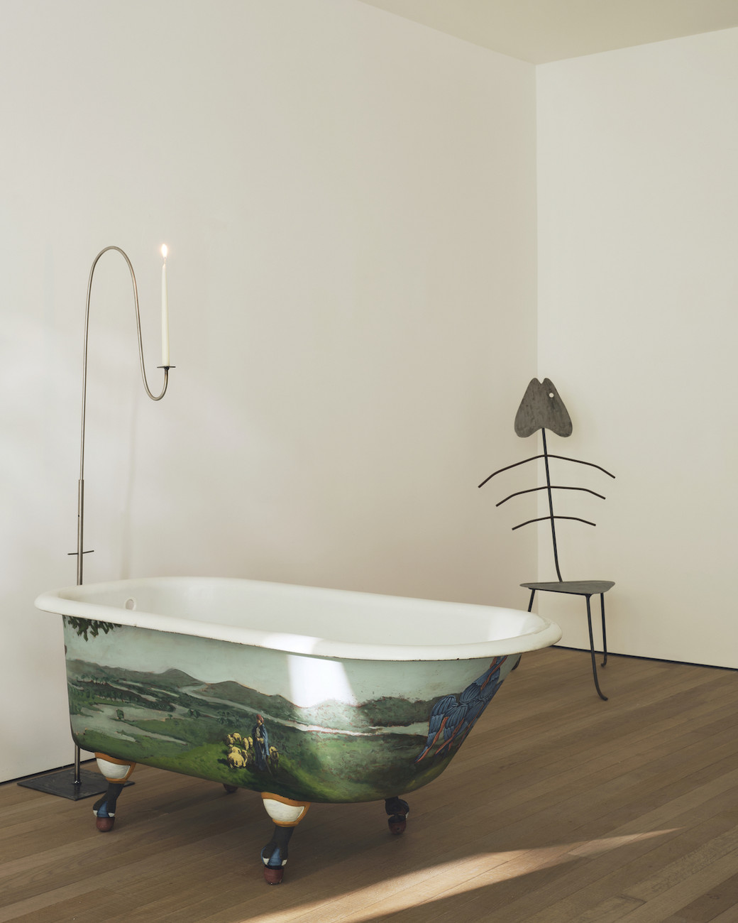
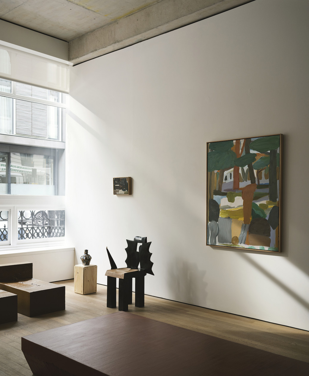
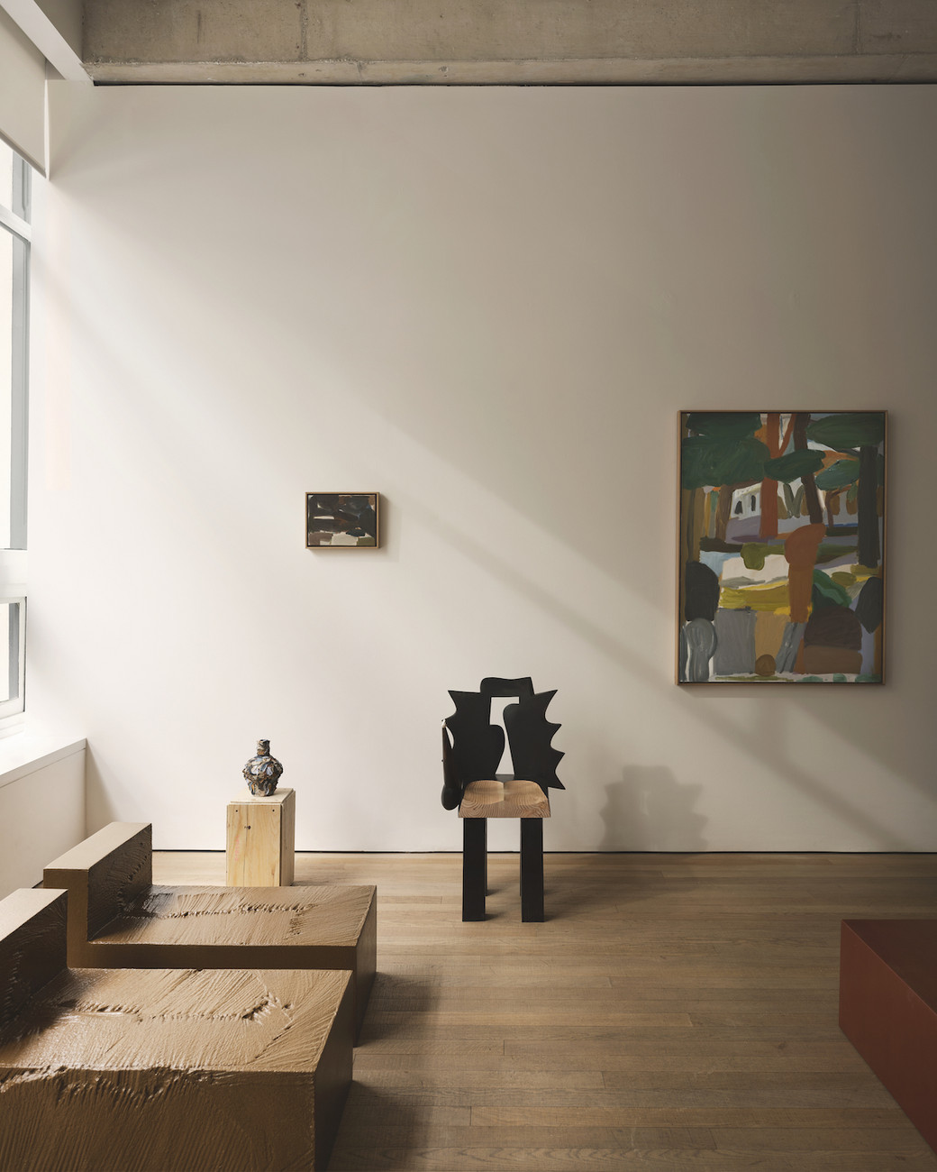
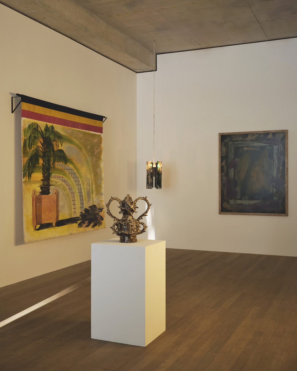
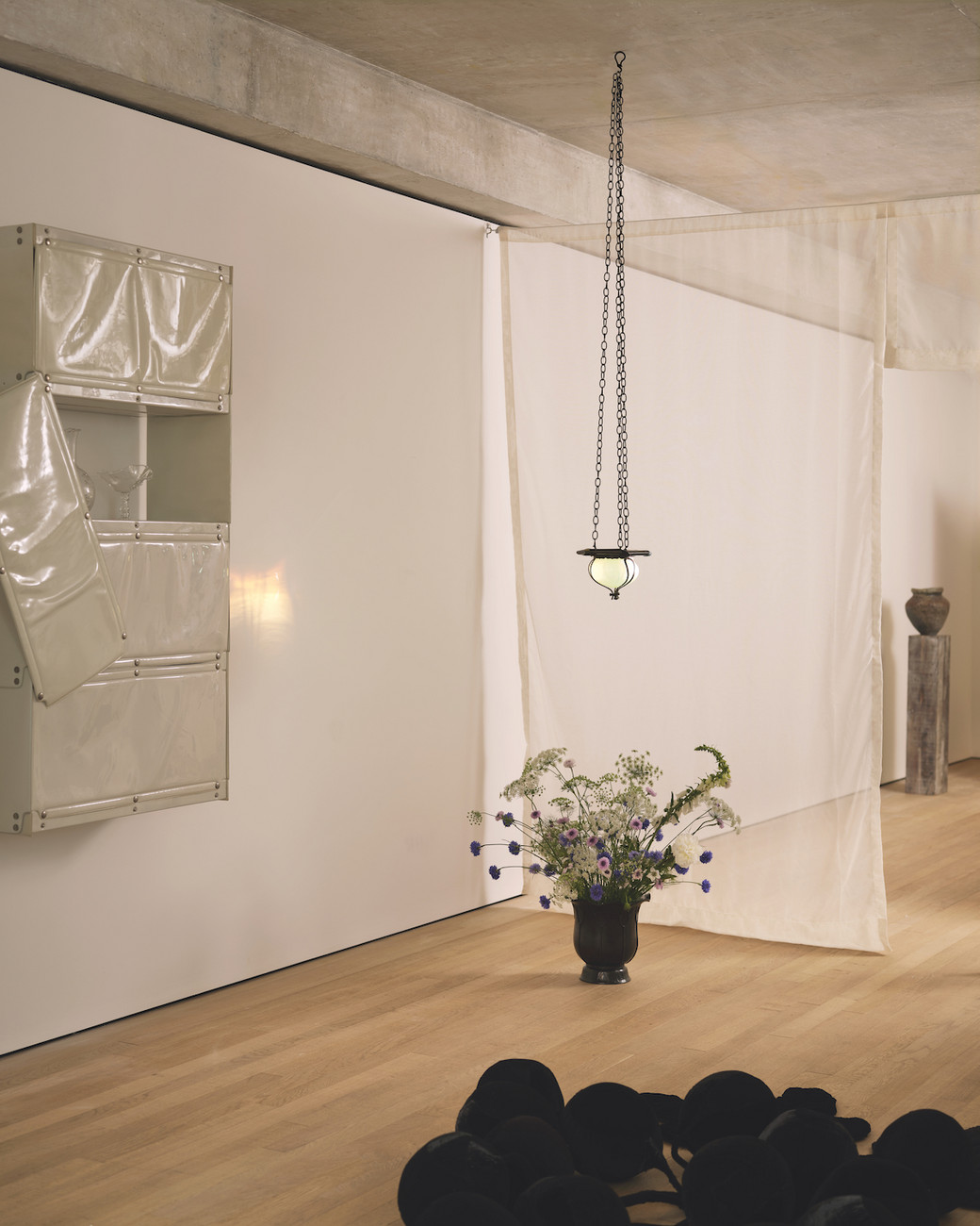
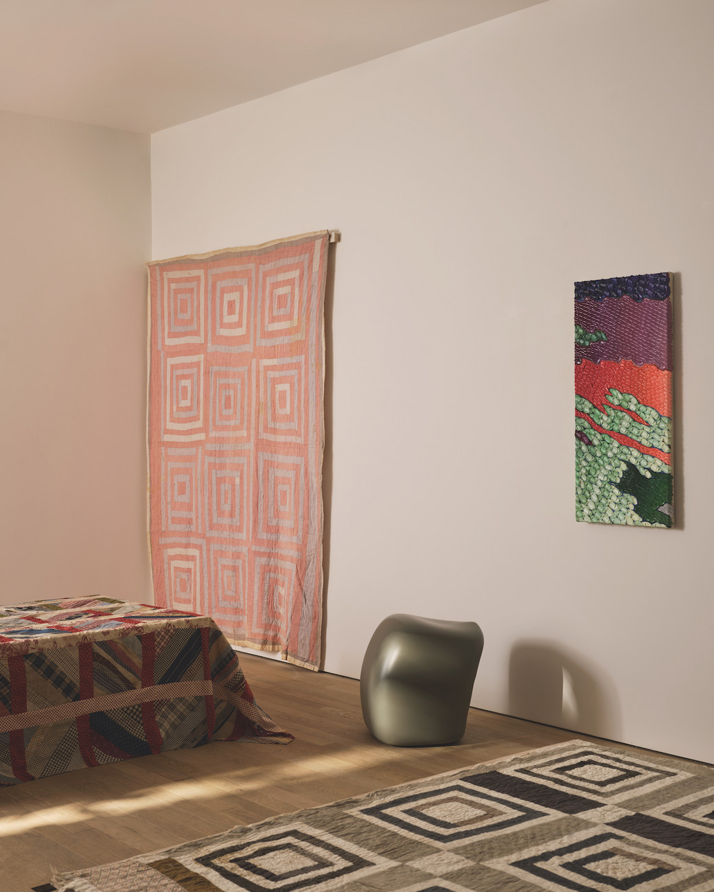
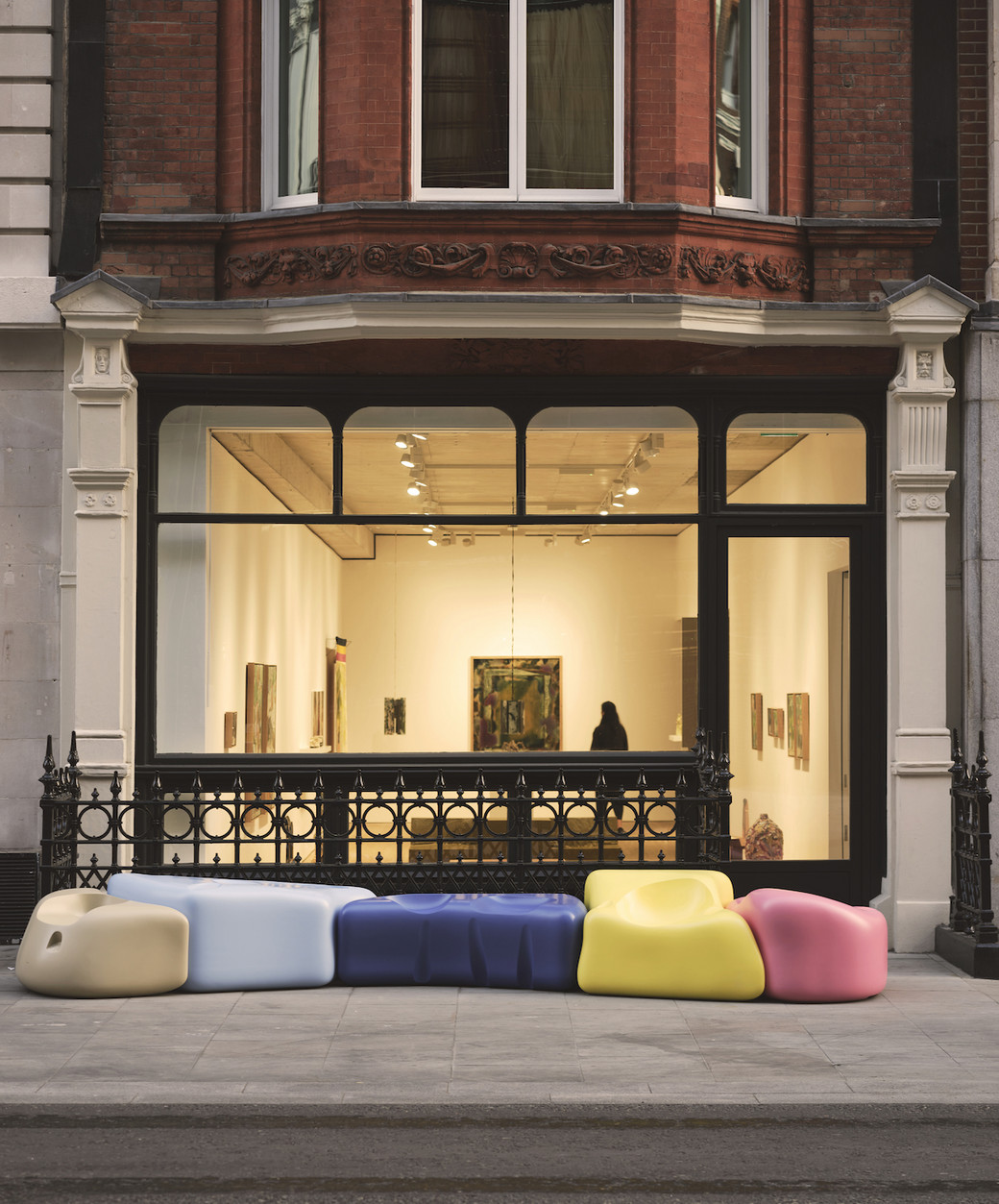
Bruises Gallery, Emma Scully Gallery, Jacqueline Sullivan Gallery, OF THE CLOTH, Studio IMA, TIWA Select, Marta and NOON Projects will reside at Frieze’s No.9 Cork Street Gallery from June 22 through June 24 for The North American Pavilion. Inside, the exhibition features over 40 artists, and the space is divided into eight sections for each gallery, and the gallerists are allowed full discretion as to how they utilize their space to express their unique take on North American narratives and cultures. Curator and gallerist Alex Tieghi-Walker has selected these young galleries to explore the cultural messages emanating from each gallery’s geographical setting in North America. To expand the reach of this message, galleries were also selected since ‘they all straddle design, craft and art which made it easier to choose,’ says Tieghi-Walker, allowing for audiences to read the works in a variety of mediums and states.
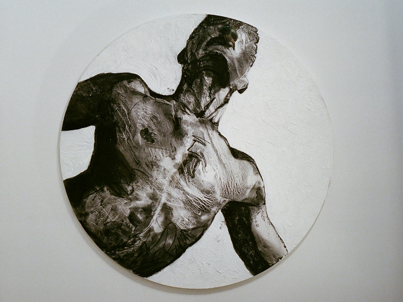
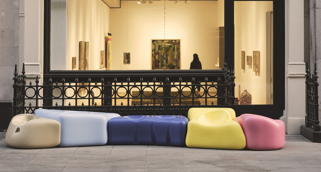
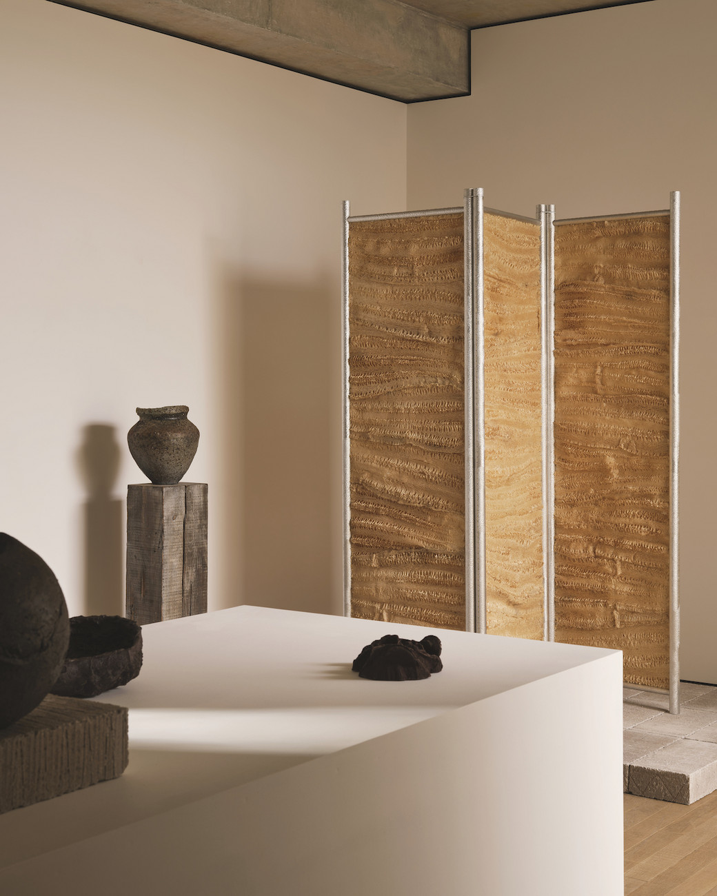
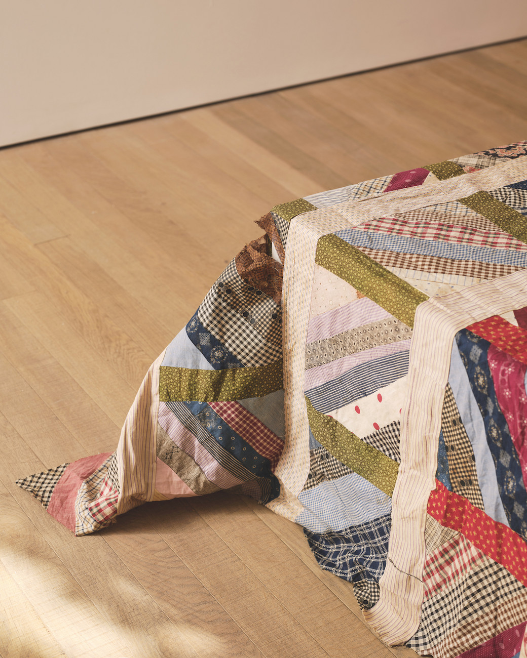
The element of storytelling comes through in various ways, developing a palette which shifts to differing tastes and different substances presented. On the first floor Minjae Kim’s sculptural furniture appears foreign and certainly not what you’d expect to find behind the glass of a cobblestone street in Mayfair. But that's the point, the pieces are meant to feel alien. A painting (Ben Borden’s excavation, residue, 2023) grows on one of the walls of NOON Project’s space, facing the Marta Gallery section where Kristen Wentrcek and Andrew Zebulon’s Small Bench I & II (Hamburger), 2021 sits, looking right back. Upstairs, Elliot Camarra’s Grape Soft Sculpture, 2023 splays across the floor of New York’s Jacqueline Sullivan Gallery room. Behind a diaphanous white linen sheet, Mexico City’s Studio IMA loads up on brilliant clay vessels and tactile ceramics while Fernando Laposse’s Luffa Divider, 2020 (made from real Loofah Fiber) edges into the corner like the unused dressing screen that it in fact is based on. The smooth white walls of OF THE CLOTH’s room is struck by day from Mayfair’s renowned Cork Street, yet in one corner Henry Rolnick’s Angel, 2023 (made from a combination of textiles and threads) occupies a top corner of a room like a silk and cotton cobweb sprayed by light. Alex Tieghi-Walker of TIWA Select curated the exhibition, and his own gallery sits at the back of the first floor. The day before opening he entrusted the gallerists to ‘do their thing’ and spent his time laboring away at installing the works for his gallery. The hands-on-deck reality of an installation of this scale is frightening. There are many moving parts and many people involved. ‘Everyone has their own little army’ says Tieghi-Walker. But the outcome is boundless. His gallery is showcasing embroidery, quilts and weavings, a medium with a rich history in the United States, such as Annie E. Pettway’s Housetop (Nine-Block Variation) 1930, which has the same textural elements and focus on geometric pattern as the early Amish quilters from the 1870s.
Like siblings in a new home, the galleries (all of which are under five-years-old) settled into the space, molding their profiles and perspectives as North American galleries in their own way. They come from Los Angeles, New York City, Atlanta, Montréal and Mexico City. Some of the artists they represent haven’t exhibited overseas before, while for others it is their first time exhibiting with their gallery.
In the hectic world of art and its constituent galleries and artists, there is hardly a moment to spare between exhibition openings and gallery storefronts ramming your eyes like swallowed oyster down a fearful gullet. Sometimes, they work, but sometimes they are not that great (and perhaps a bit too tangy and metallic). However, The North American Pavillion allows an audience to experience galleries without the mayhem of a fair. It is cohesive and precise, and the galleries and their constituent artists have the space to flourish on this side of the pond, telling their stories to a world unexposed to the immensity of America’s past.
Rather than a feast, the show is an amuse-bouche. It’s delicious, intimate and succinct, but keeps us hungry. Regardless of their differences, each of the eight galleries have put on a show that works in unison with each other, inspiring viewers and triggering desire.