Get Creative like Cakeboy

What got you started with Cakeboy— what inspired it?
The first issue profiled three people I knew whose work I loved, plus a poem. It was really just to see what print could look and feel like. I shot everything and did the interviews myself. For the second issue I raised $5,000 on Kickstarter and reached out to a few different contributors, but kept things small. What inspired me then is very different from what inspires me now, and the project reflects that.
How do you feel you stand out from other queer magazines and zines?
It's a gay mag and it's not a gay mag because "gay" and "male" aren't Who I Am™. I know that sounds super nebulous, but that's the point—that's why it feels a bit different than a straightforward magazine about gay men or for gay men. OK, a men's magazine is a construct, your masculinity is a construct, your gender is a construct... How do you fuck with that?
You seem to be doing most of it yourself, and from home! Does it stress you out, and how do you deal with that?
Last year I was so concerned with how to achieve bigness, but this year I'm kind of like, fuck bigness, fuck "scaling" a "brand". I'm not there yet, but I'm working on it... It's always going to be a bit stressful, but anything worth doing is, right?
You collaborate with a lot of amazing artists and photographers, many doing some risqué content. Any interesting stories from behind the Cakeboy scenes?
Ha—behind the Cakeboy scenes is mostly me, at a laptop... It's funny because I'm always tip-toeing around "risqué" content. There's just already so much "sexy" gay content out there that it's hard for it to not feel done, or just cheesy. And like, I get it, but really how many here's-the-guy-I-slept-with-last-night's-cock or just cum-all-over-everything-but-its-art zines do we really need? That being said, I did rub baby oil into our very naked cover star and like, styled his pubes on set.
The typography and design is fucking amazing. Has that always been an interest of yours?
I'm pretty obsessed with the way text and images can work together to create impactful moments. I think a great magazine spread can kind of hit you like that. This issue is the first time I really tried to channel that more explicitly, kind of took the kid gloves off a bit. I really love the challenge of designing the magazine myself, rather than being like... how do I make my Instagram pretty? Like, what the fuck is an Instagram grid? It's Mark Zuckerberg's dick is what it is...I think so many indie zines are affected by this and end up with design [based on] about how prettily the one object sits next to the other object, increasing the chances that the consumer will consume both. But consumption is boring and capitalism isn't the point! Which is a long way of saying that I became really interested in grids as a construct, of how we appear in them, all these boxes we put ourselves into and how we break out of them.
Did you read magazines from an early age? What design influences do you most attribute to your strength in graphics?
I like a strong point of view, and print can be so compelling in that way. I think Fantastic Man was one of the first magazines that made me say, oh, this object has a very specific viewpoint, down to the captions. They manhandle every square inch of that magazine, pun intended... [Also I am inspired by] bold colors, aggressive typefaces, nude nail polish and [again], grids.
What item of clothing makes you feel the most confident?
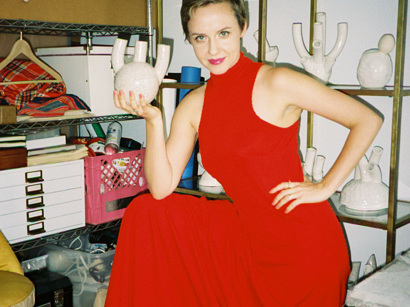
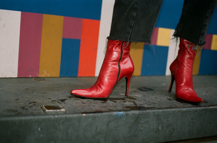
I do love a good boot, but I have to say a high-waisted pant makes me feel the most confident and sexy. And I wore both of them for this shoot!
