Miu Miu M/Marbles
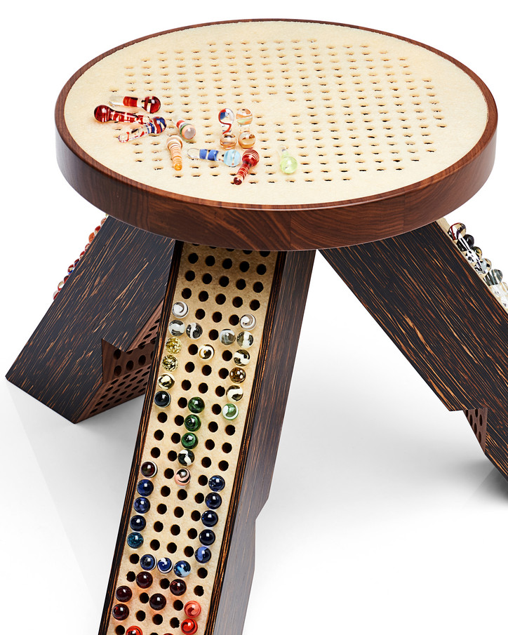
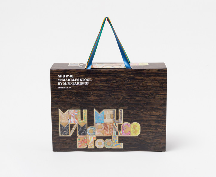
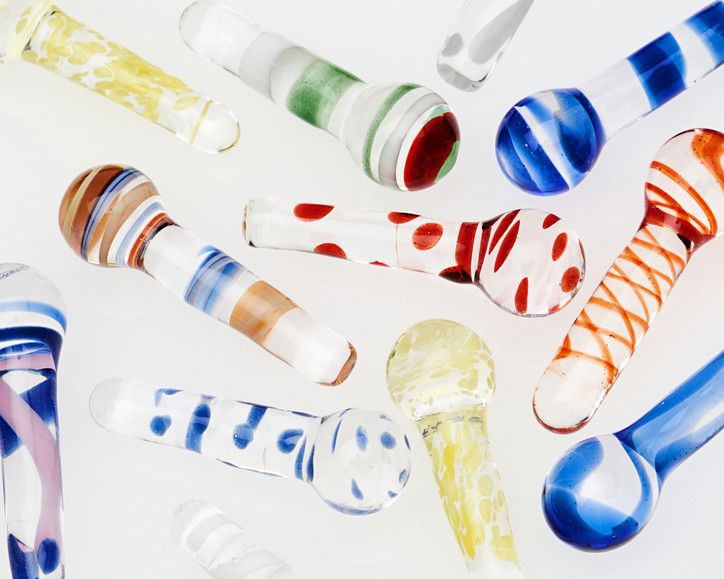
The Miu Miu M/Marbles Stool is available for purchase exclusively at the Miu Miu Miami Design District boutique and miumiu.com.
Stay informed on our latest news!

The Miu Miu M/Marbles Stool is available for purchase exclusively at the Miu Miu Miami Design District boutique and miumiu.com.


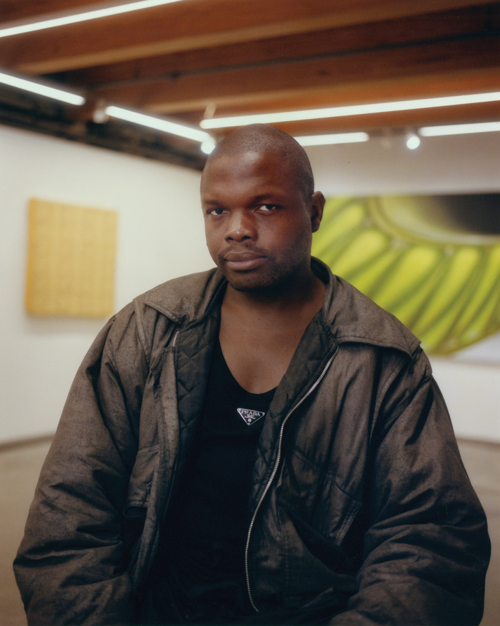
anonymous gallery owner and founder Joseph Ian Henrikson was an early supporter of Nnamdie’s community-based, abolitionist approach to creating arts programming. The friendship between the two spans nine years, and Nnamdie began as a project director at anonymous but quickly became involved in curatorial decisions and event productions, officially becoming the director of the gallery in early 2022. “I like to approach artists that leave me dumbfounded, in ways that I am kind of mystified by,” Nnamdie said of their curatorial practice. They prioritize works that require a slower pace of consumption and consideration, like “time-based media, video, long durational performance, text work, conceptual painting and sculptures.”
For this issue of office, we asked Nnamdie to speak to a group of artists whose work they admire. “These are artists that I feel are rooted in longevity in their practice,” Nnamdie explained. ”That's always interested me, not only as a curator but with Restaurant Projects as well. Hospitality should be rooted with longevity. And these four artists are really hospitable with their practice and how they share it with us all.” Nnamdie’s conversations with New York-based artists Georgia Gardner Gray, Blake Rayne, Jesse Gouveia, and Elliot Reed spanned everything from their artistic inspirations and creative processes, to the polarizing effect of religious paintings and the purpose of art itself.
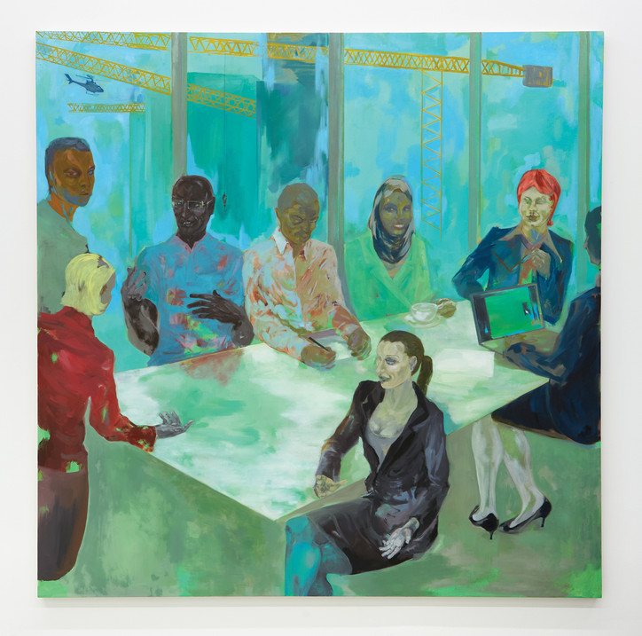
GEORGIA GARDNER GRAY
Learn English, 2023
Oil on canvas
64 x 64 in.
© Georgia Gardner Gray.
Courtesy the artist and Sadie Coles HQ, London.
Photo: IAIN EMALINE
GEORGIA GARDNER GRAY
K. O. Nnamdie— Hi Georgia, thanks so much for making the time to do this. What’s going on in your studio?
Georgia Gardner Gray— Well, I just finished some works for Basel a couple of weeks ago. I just did my first painting of Jesus for Basel, which felt kind of monumental. I was thinking about what kind of art belongs in an art fair the least. Jesus seemed to come to mind. Now I'm working on a show coming up Sept 24th in New York at Reena Spaulings, which I am really looking forward to.
KN— I love that! One of my favorite works of yours is titled Learn English. There's a truly amazing expansiveness about this particular painting. Can you kind of talk to me a little bit about where maybe even the title of the painting came from?
GG— The title comes from an advertisement I saw on the subway for learning English. I was attracted to that idealized version of what an immigrant experience would be. Come to America, learn English, get a great job in a developing industry.
KN— I really love that most of the painting is a balance between male figures and female figures. No one seems more powerful than the next person next to each other, which was really interesting.
GG— I feel like it really presents more of an iconography than a specific image. It's somewhere between more of a stock image, and almost this religious ideal.
That image carries so many loaded symbols that we all immediately read in a certain way — we all place our values in it very quickly. I like images like that, that summon up all your preconceived notions. And then to push that notion even farther, to make it more of a stylized icon.
KN— A standout detail for me is the shoes of this person who's at the computer, the only person in the room that has the computer.
GG— I always shy away from putting computers in my paintings because I don't want to be like, “Look at this contemporary world we're living in.” I like to be a little bit more subtle… I don't want my paintings to feel like they're reporting on something. But in this situation it was perfect to have the laptop — and it's more of a square, older laptop.
And then the shoes — there's a recurring shoe theme I have. It’s a nod to ubiquitous shopping — which for me is emblematized by women and shoes. I did a whole painting of a shoe store in my last show.
KN— What do you feel that this painting, Learn English, or your work generally, comes in contact with, speaks to, or aligns with?
GG— Well, you cannot choose what art you make. You kind of are just compelled to do it. I rub up on things the way you do all the time in your daily life. I really want to leave things open ended. I don’t have an agenda or a personal truth I am trying to reveal. I'm looking for something a bit more universal. Something that maybe takes me out of the equation and appeals to a shared … lightning strike of some kind. That's more what I'm going for.
KN— Would you be open to sharing an inspiration?
GG— I really love old stuff. At the moment I am really into characters from Commedia dell’arte. It’s a form of comedy theater from the 16th century. I also write and direct plays, so that is how my interest started. The characters from Commedia dell’arte come up in paintings all the time, you might recognize them: Pierrot, Harlequin, Scaramouche or Pulcinella. I wrote a play called Pigeon Feather Stick that I performed in NY at La Caverna that was loosely based on Pulcinella. He is my favorite. He has a hunched back and wears a black mask with a hooked nose.
I like the way these characters are eternal. They are reused in different scenarios but they are always the same character, and the audience already knows them.
KN— I love these colors that you continue to use in your work. They are so earthy and airy. Where does this palette come from?
GG— When I studied in art school I learned about color theory. I had a great teacher who taught, for example, how Delacroix turned an object using opposing colors rather than shadow. In a way that's the subject matter. I'm really a colorist. I have no preference — no “this color should go with that.” I use classic oil paints, but I like to mix in some synthetic, chemical colors too. I like both equally.
KN— What do you listen to while you’re painting?
GG— I mostly do podcasts or books on tape because music is usually too affecting. I have been listening to this iconic radio show called Desert Island Discs, that asks famous people about their favorite music throughout their lives. It is super candid and personal.
I keep it calm and even. Music gives you so many emotional highs and lows, and it gets you in too many moods. Usually when I'm in my most focused state I can just be in silence and not even notice.
KN — How are the paintings feeling in the studio right now?
GG— Things are going well! I am still on this iconography bend. I am mixing modern images with religious iconography, especially the imagery of the stations of the cross. It is one of the most painted things in history and I am really excited to get into that whole area.
I am aware of the resurgence of Jesus talk in Dimes Square, and it’s funny because Reena [Spaulings] is geographically right in the middle of all that. I just felt like it's this huge subject in the history of painting that nobody touches. It just felt like the moment — Jesus needed to be back. The violence, the corporeality of those images … I just, I can't resist it.
KN— New York City needs Jesus!
GG— And also it happens to funnily coincide with kids downtown. It seems to me like people want to find some kind of belief system. I think belief is subliminally a part of every painting.
KN— I strongly agree. I wonder why you feel the art world may have such a disinterest in seeing paintings of Jesus?
GG— Well, I think there's just a bias against it. If you painted Jesus, you're going to look like one of ‘those’ people. I always want to think about who are ‘those’ people. That flip side of the coin is always where I'm drawn — and not because when I make art I need to spell out and accurately express who I am. Artists are free to see all sides, it’s great. It's like a mental exercise. And I also just can't help myself.
KN — Can you share what your process is like for starting a painting?
GG— Well, every time I start making a painting, it's kind of a ridiculous and funny thing to be doing. And I think you have to question things a lot. There's still this total modernist in me that has to question the very premise of the whole thing every time. And then question the questioning, which in the end yields the best results for me.
KN— When I first came in contact with your work, I felt like you were using painting to talk about something far more important than painting itself.
GG— I think there's a definition of art. It's not even a matter of “is it good or bad art?”. It’s just art, or not even art at all. And there's plenty of amazing art being made. There are great artists working today. But I think, especially if you're a figurative painter right now, you've got to stake your claim in that way because there's just so much figurative painting, and some of it is incredible, you know, and some not. There's a glut of it.
KN— I’m looking forward to everyone seeing your solo show at Reena Spaullings, and also looking forward to that after party as well.
GG— Yeah, for sure. It's gonna be a fun one.
KN— It always is, and Jesus will also be there with a plus one.
GG— Amazing.
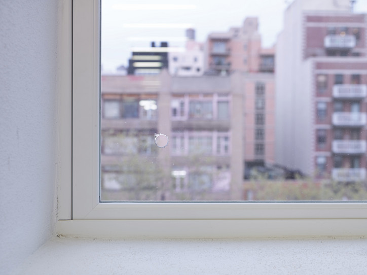
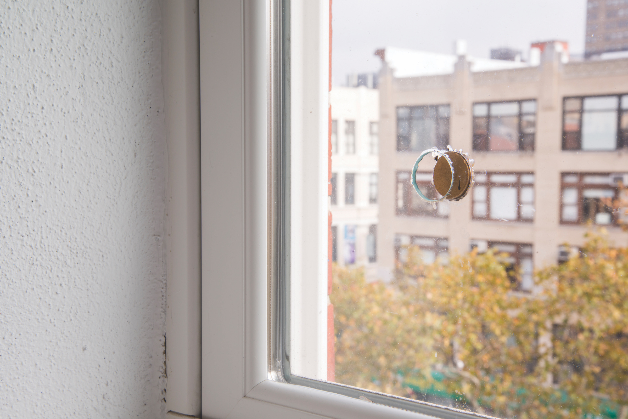
BLAKE RAYNE
Title TBD [1] detail, 2014
Removed glass
12/16 in.
BLAKE RAYNE
K. O. Nnamdie— It's really nice to meet you.
Blake Rayne— Nice to meet you.
KN— I have come in contact with your work quite a bit — of course, I would see the exhibitions at Miguel Abreu, but I also would go to that window in the corner and found it really peaceful. Can you tell me a little bit about that show in 2014 that you did?
BR— Yes. Well, I think at the time when I was invited to stage a work … a dominant model in the art world, that everyone was subject to in a way, was to expand or die. Miguel, who has always been attentive to the dominant scripts of the art world, but also with an interest in running his own model, had just opened up the space on Eldridge Street.
So it felt like there was some interest in making a work which would draw the line between the Orchard and Eldridge Street spaces. The idea was to extract a piece of glass, dip it in gold paint and then reinsert it. Originally, I didn't realize that it was two panes of glass when I was thinking about the piece. And so I inserted the disc in the second pane, the outermost pane of glass, which left that aperture in the front. I took the single clear piece of glass and I gave it to someone as a locket.
That open, kind of vitrine space between the disk and the gallery space was the first pause, maybe a little stutter in a way.
Just after the show, there was a couple that was fighting on Orchard Street and crashed into the window, so the window broke, so that piece was destroyed that way. Sam Lewitt kind of stuck a piece of fiber optic cable in that hole during his show. But then just someone else also put their finger through the hole and poked the disk out. So it goes all the way through now. And then it started collecting flies, dust spiders, coins and it became something else. It was interesting seeing how it became different things, you know.
KN — Beautiful. I like that there’s a “stutter” — that you mentioned that word.
BR— I’ve often been interested in staging the friction between installation strategies, questioning what counts as painting, factura and these things.
KN — I really love the title of that show in 2014, On Fridays We Have Half Days. Where did the title come from? I was thinking a lot about labor. The artist's labor is sometimes very present in the work, or mental labor, emotional labor.
BR— Yes… we wanted to figure out how to put acid in the water cooler, or to create joke spaces in the hallways, so that we could expand and dilate our ability to waste time and do a kind of on-site strike. It was more about how to keep expanding procedures of non-productivity and really confronting this constant script to be good, to be productive, to be efficient.
Instead we have kind of poetic models of blurring and wasting time, problematizing the efficiency of language or of the name. You know, all bad things for making a good career.
KN — Can you tell me a little bit about your work in Porto, Portugal?
BR— After that show, Half Days, and making work for a long time that was really interested in tarrying with efficiency demands, I was really trying to shoehorn some time into this situation. After that work, it was difficult to find the conversation.
It was a really politically heavy moment. You could feel the demand for bumper sticker logic, like this Twitter kind of logic where the only thing that could be heard or seen were things that were able to properly fold into that formatting. It could often be heard at that moment that no one cares about shows anymore, in the auction house art fair system. I was also done teaching at the university, and that was my main thing and I was an artist. For me, all of my artistic heroes were full-time teachers. So at that moment, it really did feel like 1989. It really felt like the only thing that made sense was to stop painting.
And the way to do that was to eliminate any kind of compositional interest, any kind of technical interest, any kind of performance of a bad painting, which would somehow indicate that I know what counts as good, but then also not to perform any kind of good painting. To really use the deepest of cliches and to be methodical in the production of dead labor, and just produce Neanderthal skull paintings.
In Porto, doing the second chapter of the skull run which is called Carbon Days, two weeks before the show opens, the board says there's a huge kerfuffle with the Mapplethorpe show. It turns out that two of the same pictures from ‘89 were being held up again. They threw out those two works and I said, “OK, I can take them.” So I took one that they threw out and I reprinted it as the primary image in my work. I made this wallpaper then sent it to the third iteration in Los Angeles. I did outdoor works, I posted them around Porto. It was such a tense scene because the authoritarian regime has only been gone for 35 years in Portugal.
And so it was nice because at the show all of a sudden people were taking selfies in front of the two dudes involved in water sports. Then we had a nice public conversation about censorship in the arts, without really coming to a conclusion — I mean, I have my own personal feelings about it — but clearly having conversations is the way forward.
KN — I'm curious what drives you personally. You just have such an insane drive, and I'm really curious where it is coming from?
BR— I really found my space, myself, and my family in the art world. Without being ridiculously romantic, I look back on the moment of arriving when I was like, “oh, this is the official place within the institution where the only organizational principle is art” — it's not sexuality, race, class, gender. Of course, all those things characterize, but what organizes is not knowing. What organizes who finds themselves within the art room is developing techniques of working with not knowing. There was something really intense and special about that.
I get upset when it seems that artistic practice is no longer the space for official antagonism towards the structuring beliefs of culture, and I really believe that the avant garde is the official antagonist to that. It's not about the production of utopia, it's about antagonism and questioning what we've already accepted.
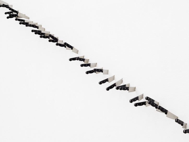
ELLIOT REED
An Occasion, 2021-2022 (detail)
69, 8-inch stainless steel knives
180 x 240 in.
ELLIOT REED
“Rhythm” at Kunsthaus Glarus.
© Kunsthaus Glarus & CE.
Photo: CE
ELLIOT REED
K. O. Nnamdie— Hi Elliot, how are you? How’s France right now?
Elliot Reed— It’s going really well. Beautiful day in France. I just finished my master's degree in choreography. I'm staying here for another week to write my thesis. I'm planning on a short mini vacation in Lisbon, then back to New York for a performance at River to River Festival. I had to give myself a little post-graduation vacation.
KN— Of course, you deserve some time off. Honestly, you’ve been busy! It's great to get to talk about An Occasion (2021-2022).
ER— Yeah. An Occasion was the version of a solo show that I had done in Switzerland at Kunsthaus Glarus. It was called Rhythm. An Occasion was the piece with the four motorcycles with MP3 audio, spotlights, and speakers inside of them. I wanted to make an animated piece, a sense of anticipation, expectation, and this blend between dread and ultimate potential, which is a space that I really like to find myself in. Not that I like being full of dread, but more the sensation of being on the cusp of doing something.
Something that a lot of people wouldn't know if they didn't see the work in person is that the motorcycles are actually breathing, and each one is playing a recorded soundtrack of my inhales mixed with digital silence.
KN— What are you working on lately?
ER— Right now, I just finished a pro-process based performance for five dancers called Pigs Milk #2 for Montpellier. This piece is part of new research I'm doing, experimenting with written scores. I spent weeks working with the dancers through a series of written movement prompts. We went on stage in the first 10 minutes of the piece and arranged the potential choreography using a set of handwritten cards that I made before the performance.
So there is a set number of options that doesn't change. However, each performer only gets six options that we write on posted notes and arrange at the front of the stage. Over the course of forty minutes, each performer works through their own row of dance prompts. They take a break, come back, and start with the next performers list.
This continues in order and it's interspersed with light cues, which are spoken numbers that we actually yell out from stage to the tech booth in the back. All of the sound cues are letters that we write on sheets of paper. And any time you finish a piece of dance choreography and have a sound cue, you would write the queue down, walk it up to the back of the booth and physically hand it to the sound person in the back of the room.
It was really a fun experience for me and a great challenge to think about ways of showcasing the bones or the backside of the process, and working in a way that is deceptively simple, but creates interesting and complicated results because of the element of chance.
And then for River to River Festival, I'm going to be doing a series of one-hour solo performances for one audience member at a time called Lotto Royale, to explore the ideas of privacy, secrecy, gossip, and hearsay. I won't share too many details about what I'll be doing with each audience member, but I'm really excited. Having a one-on-one encounter is a way for me to think critically about what it means to see, to share, and to be seen by a viewer and to collapse some of the distance that often comes with live traditional performance versus audience.
KN— I've had the privilege to experience your work in person many times. What do you imagine your work is coming in contact with?
ER— My work is circling around the nature of viewership and experience. I think both in my performance work and in my sculpture, I'm very interested in questions around visibility, order, logic, sort of tied together with a bit of sentimentality and storytelling as well.
What I like about working in sculpture and installation is the ability to express an idea or a story with an audience member in an environment where every detail is something I'm able to control, from the color, the sound, the light, to the size of objects. Whereas with performance, working in a linear way in time-based media, there's something more about the idea of surprise, repetition, and narrative development, that comes from seeing certain themes return from the beginning of the piece and the end of the piece.
I'm explaining both my visual work and performance work in such broad terms just because the content or the research varies from project to project. But I think these themes of viewership, potentiality, and liveness are what I'm trying to expose.
KN— I love scores, and I've been thinking about your work quite a bit as well as Ghislaine Leung, Lizzie Bougatsos and Yoko Ono. In the first performance that you did when you came back to New York from Paris, there were a lot of pop elements. Could you share what that performance was about?
ER— Oh, the piece at Kai Matsumiya — that piece was a monologue. If I were to assign a character with it, I would say that it's linked to switching channels or radio scanning, but performed in the style of a choreography. That's the language that I've been using to describe my recent performance work.
The performance that I did, there were samples of text, things that I've read, things that I've heard online, conversations that I've had with people — mixed with movement that I created based on feelings, memories, misunderstandings — and quickly cycling between these different sections of text and these different sections of movement. So that's the technical side of it.
But it manifested as samples of music video choreography, both real and imagined. Things like I've overheard waiting in line at the store, arguments I've had with myself, and other people, directly addressed to the audience. There is at one point I think I asked if anybody has ever suffered egregious bodily harm. I think that's when this guy who broke a leg in this skateboarding accident came up.
There is also this continuation of this idea of sampling, repeating, remixing, metabolizing, that sort of came with the material that I brought in that day, and then also a bit that got mixed with who or what I found in the room that evening.
KN— This repetition or stutter is also really present in the work An Occasion (2022) with 69 knives. If people hadn't seen the work in person, they wouldn't notice that there is a stand alone knife. I believe that's the 69th knife, which was installed by you with your own hands at your height. Is that correct?
ER— Yeah. I took a gesture and in a Muybridge-esque way, like referencing early film, imagined the idea of le stab and stretching it, repeating it, animating it and turning that into an image which links this idea, performance as object, object as performance.
And then the last knife that you're referencing, that's the head height, is about the artist's hand — my presence, my subjectivity, but also as a way to humanize the gesture a little bit.
KN— The way that you had accessed this gesture of stabbing was at once humorous, of course, but extremely elegant in the way that you were able to stretch it out. And there were moments where it felt like a musical arrangement. Do you think about music a lot in your work?
ER— I do. I grew up playing piano and I composed for a great portion of my life. After that, I had a solo electronic music project and I've collaborated with a lot of bands including this experimental rock band called Xiu Xiu. I also had a commission in 2019 with Jack Quartet, which is an incredible experimental string quartet, a classical music group based in New York City. I've worked with them three times.
I did a project called Succulent Rust in Central Park in the Ramble, which is the cruising area in the park, where I composed a score with the performers. We made music together in the studio, and then once they went to the site, instead of playing the notes off of sheet music, I actually attached cues to things they'd see in the landscape.
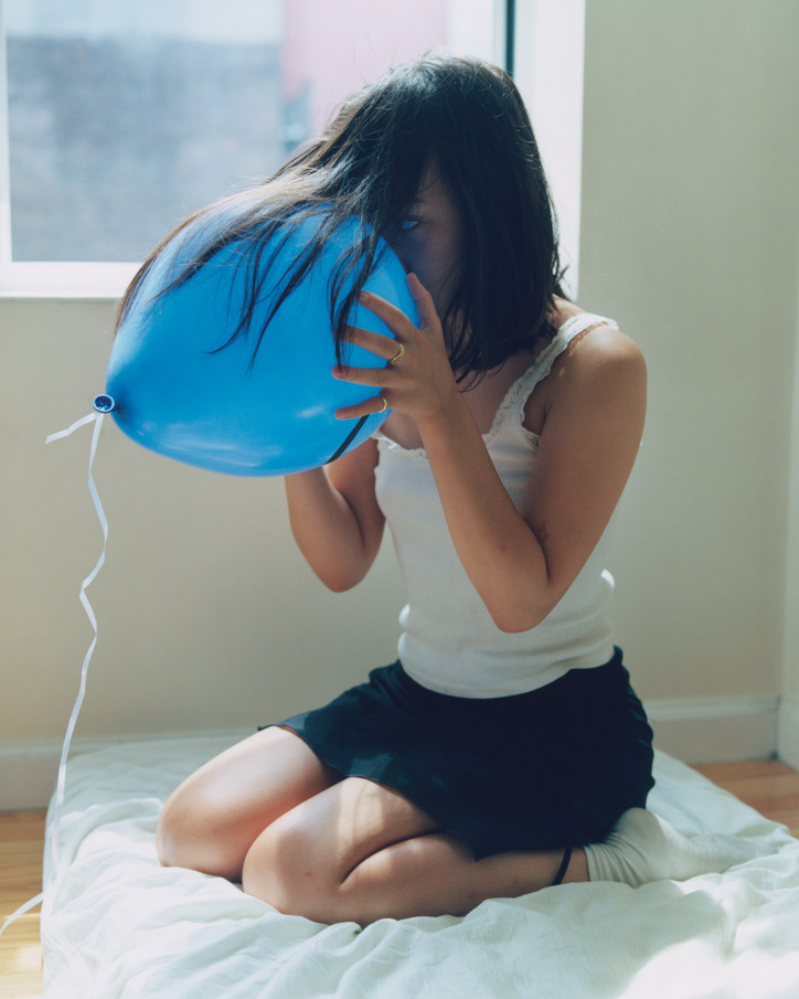
JESSE GOUVEIA
Curious and blue, 2019
chromogenic photographic hand-print
12 x 10 in.
JESSE GOUVEIA
K. O. Nnamdie— Hey, Jesse, how are you?
Jesse Gouveia— Hi. I'm good. I just got back from the park, sat in the sun with my mom. She's visiting, it's nice to be with her. How are you?
KN— That’s great. I’m good. It's nice to be in your studio right now. Thanks for having this conversation with me. We just finished a show with you at the gallery and it was really successful. We also showed you at NADA. One work that people really liked a lot was Curious and Blue. That's actually one of my favorite pieces of yours. I wanted to hear more from you about that photo, maybe something that is unknown about that work that you can share.
JG— First of all, thank you — I was excited about everything we came up with. I was happy with how it all fell into place, it felt really, really, really special.
Curious and Blue is a work I made a couple of years ago. It was actually one of the first times that I started with the concept of an object, and then this action that was surrounding the object, and I felt some sort of need to make a work about what that invoked for me. I built everything else out from there, found the subject, found the space, and it was the beginning of that practice for me, which is huge for me now — starting with an action or an emotion that relays from an action and then developing from there. That work is actually based around the idea of where we go when we're on our own. In a curious way I think the busier we get and the more the more we grow up, there's less of these times when we can just explore.
I found that when I saw a photo of my mom, kneeling next to a window and you can't really tell what she's doing, but it looks like she's kind of playing with the light. And then I saw someone with a balloon and a photo of myself with a balloon. I just kind of put the pieces together and tried to make work that felt like that naive curiosity. It's a learning experience with yourself when you play with something a pretty common object, but you're like, “Oh, what does this do?”
And that's something that you do a lot when you're a kid, but happens less as you get older; the childlike aspect to playing, the stretching of material, the looking, the investigation where there is no end goal other than the act of playing.
KN— Given the work's title, is this the first work that you have made that featured pretty much all blue tones?
JG— That's a good question. I think that was the beginning of a phase I had where I was making a lot of cooler-tone work.
KN— That tone is definitely a mechanism within your work. That color blue comes up quite often, and it's very soothing and very familiar.
JG— Yeah. It's funny because a lot of people say that and at first, I was like, “What?”
I don’t know, because I thought it was just quite a neutral picture, but when I'm printing the work I'm always running from the warm, and that makes me end up with a cooler image. For a while I was kind of turned off by orange and red and all these colors that felt more present to me all the time. I like the sky and I like this kind of blown-out, hazy feeling. That reminds me more of how I grew up, and reminds me more of clouds and open space and ocean.
KN— What time of the day do you find inspiration often strikes?
JG— Oh, usually after like 1:00 am
KN— What's one inspiration of yours?
JG— Most of my inspiration isn't coming from photography. Most of my inspiration comes from my own experiences, the playback of those experiences and the eventual distortions of memory that come with time passing. Theatrical versions of things I've experienced, or a lot of observing other people around me and their relationships, or watching people when they think when they're on their own, I think that that's a big part of the work.
KN— What do you think your work comes in contact with?
JG— I think my work touches upon people and us all experiencing quite similar things. We have chapters in our lives, and I think that there are little gateways between chapters. When I reflect on things, I'm thinking about stages of my life and what was a developing point in that. And a lot of it is when I'm alone, and the work is touching on times when you're hearing yourself. So that's why there's a lot of what could be seen as quiet images.
KN— What are you working on right now? Since we're in your studio, what do you have kicking around?
JG— I’m working on two different new bodies of work that have taken me the past almost four years to complete, and that I'm really excited about — a series of large-scale work.
The new work has a lot to do with what we have been talking about, with the different rituals we go through with ourselves. Where that contributes to mental development. I am looking at how to represent these aspects in more of a non-figurative way.
KN— It takes a lot of patience to make images, and especially the work that you've made because it is quite laborious, right? You have a process of research, as you mentioned. And then when it gets to the time to actually make that image, how long does it take to make?
JG— For Curious and Blue, I drew it out like a storyboard-type thing. The composition was based on a photo of my mom, and at that point I was doing a lot more images, because I was making different kinds of options instead of knowing exactly where and what the final would be. I think now, maybe I'm a little bit less liberal with that. There's a lot of acting going on when you make any photo, even if it's just someone taking a quick photo, we all take 1000 pictures and pick one. So when I’m trying to portray someone alone, I’m trying to erase that performance idea.
KN— Do you create these sets that the subjects are in most of the time?
JG— Yeah, often the set or the space or the location is fabricated to the likeness of the image I want to make. But if I’m lucky, I don’t. If I’m lucky that space exists, and I just go there and make edits.
KN— Can you share a little bit about your interest in cinema? You seem to have a very strong appreciation for the moving image or for memory.
JG— A few years ago, I started watching films by this Taiwanese director, Edward Yang. These are long films, some are four hours, some are longer, some are shorter. There's a certain respect for open space and long drawn-out shots.
And to me, what that is showing us is respect for what's real about life, which is that things can take time. Observing someone's patience in a movie is much different than something that moves really, really fast. A real conversation in a film, I really appreciate when it's almost painfully slow.
KN— Where do you see your work going in the future?
JG— I think because photographs are two dimensional, that can feel like the least exciting part of it for me. I've played with making spaces and then photographing them, and at the moment, my interest is in bringing the work and installation of the work into a place where the two-dimensional and three-dimensional can play with one another. And where I can relate the subjects and the subject matter in a move to a more architectural space.
I think the advantage of the gallery, or these white walls in these spaces, is that you can build off of them and all those details really, really, really stand out. So in the future, I see my work going in a direction where I can accent more on creating relationships in the work and where they're installed, and having those interact and be a larger part of how I see the work being experienced more physically.
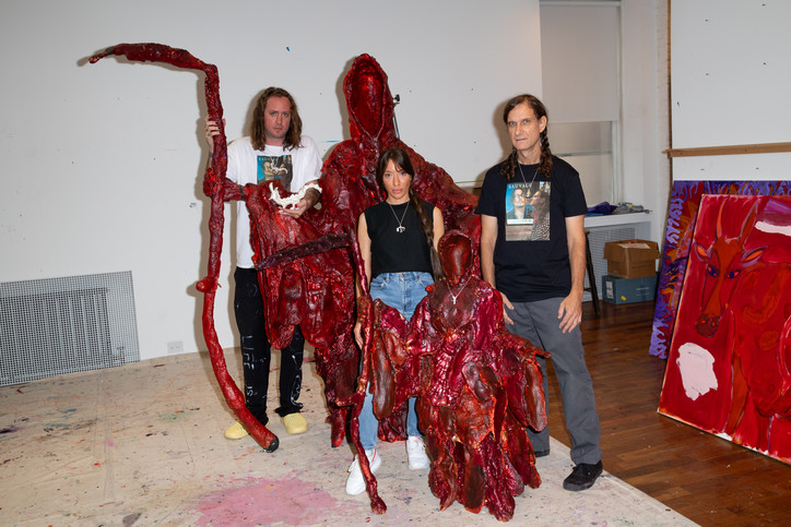
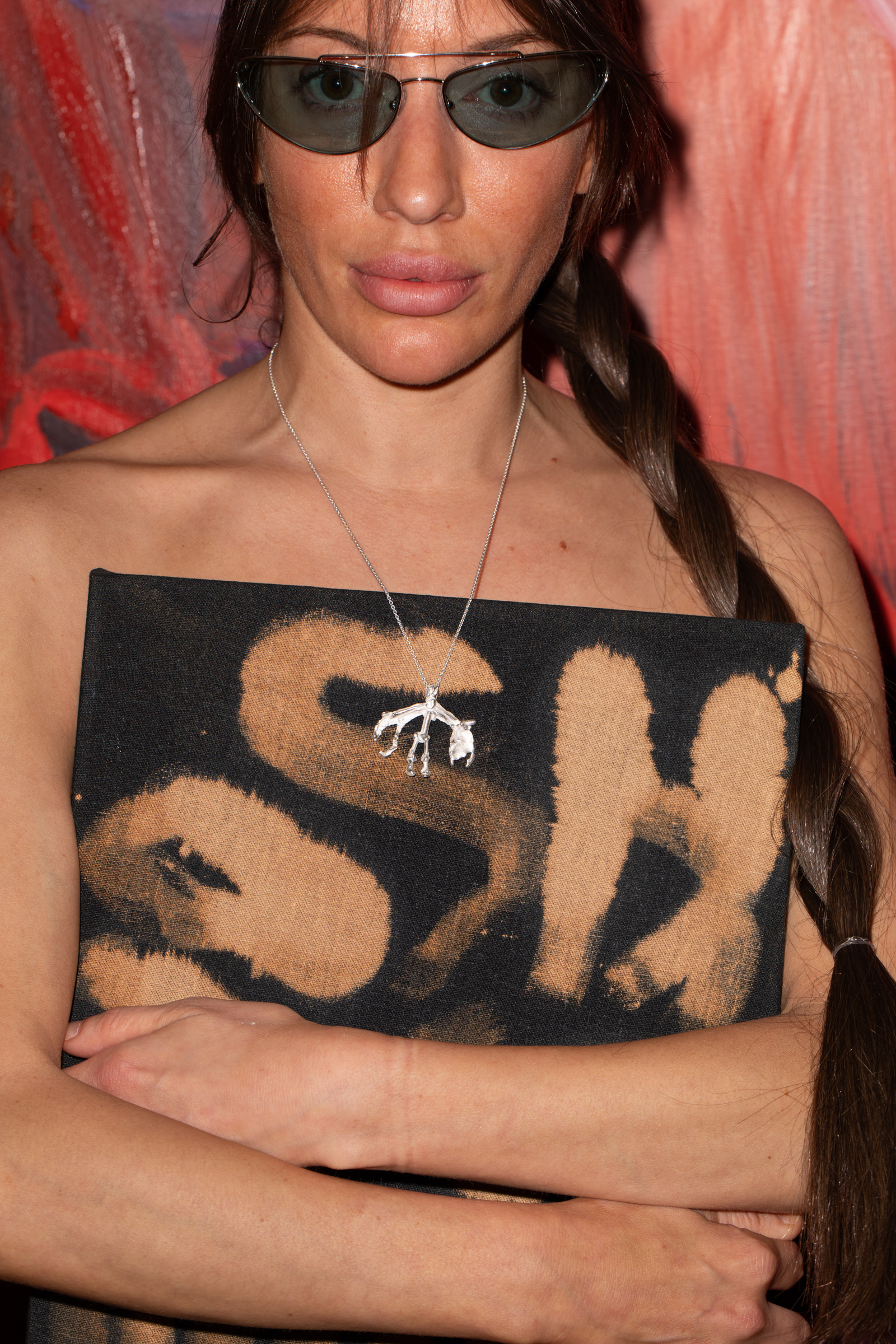
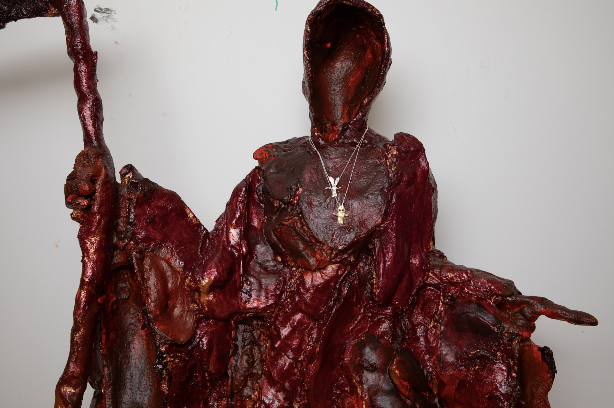
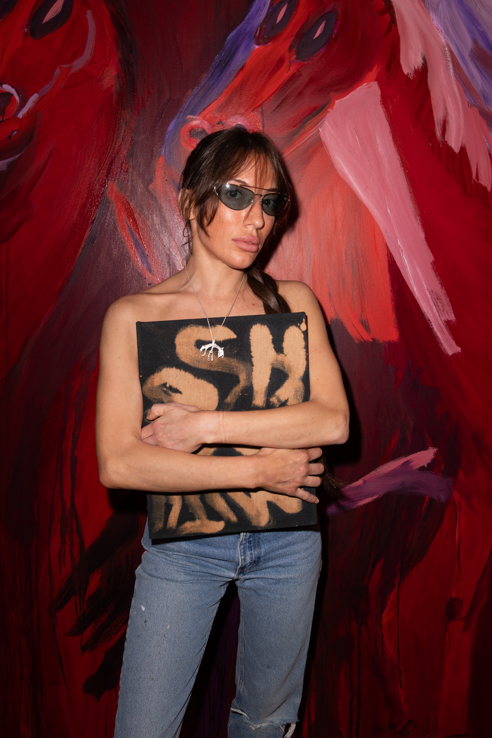
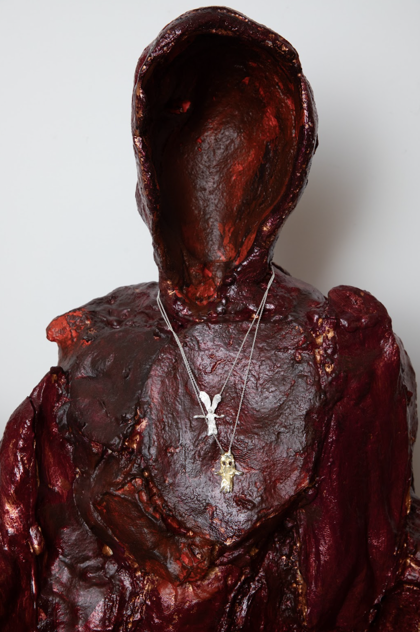
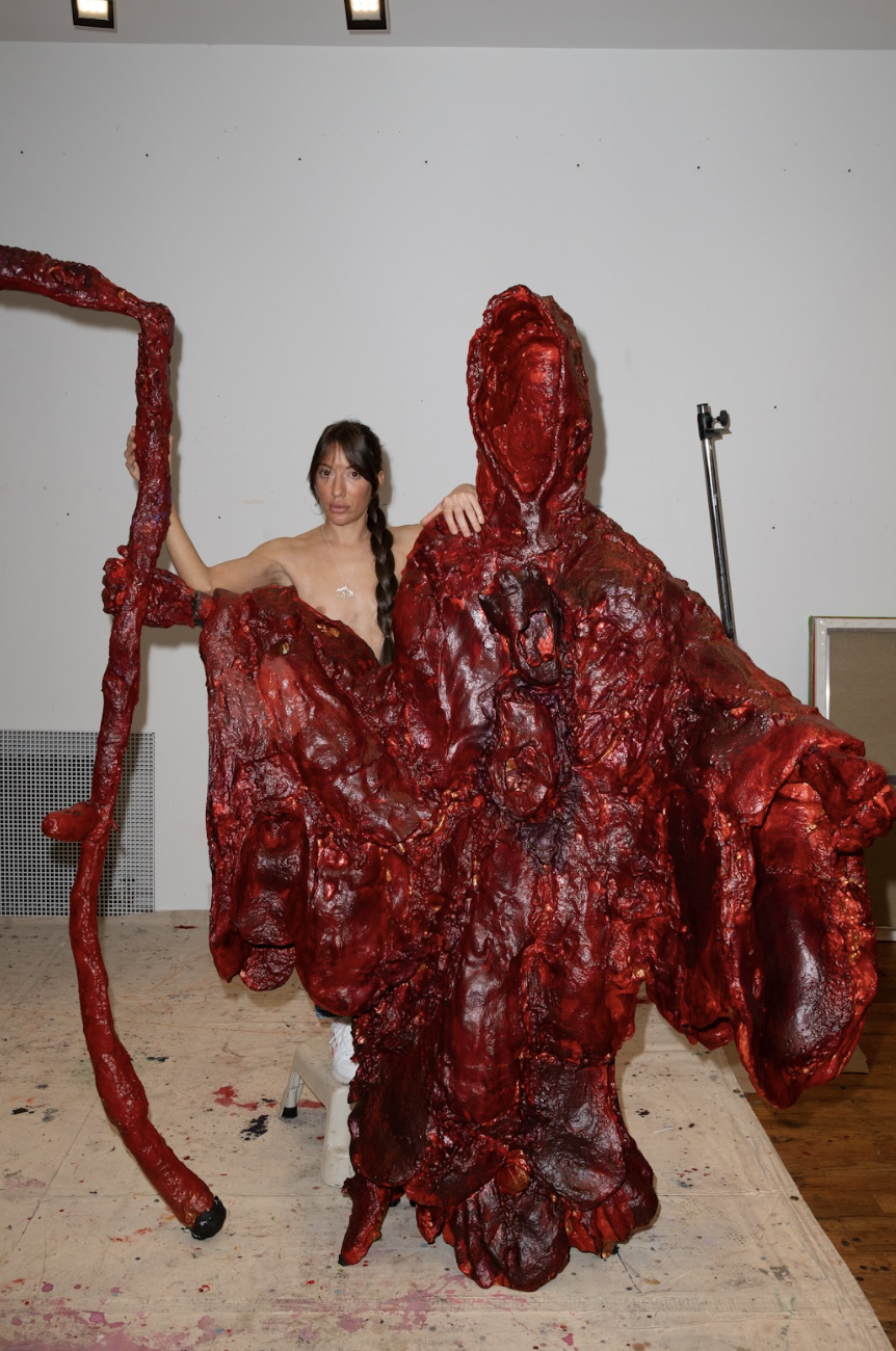
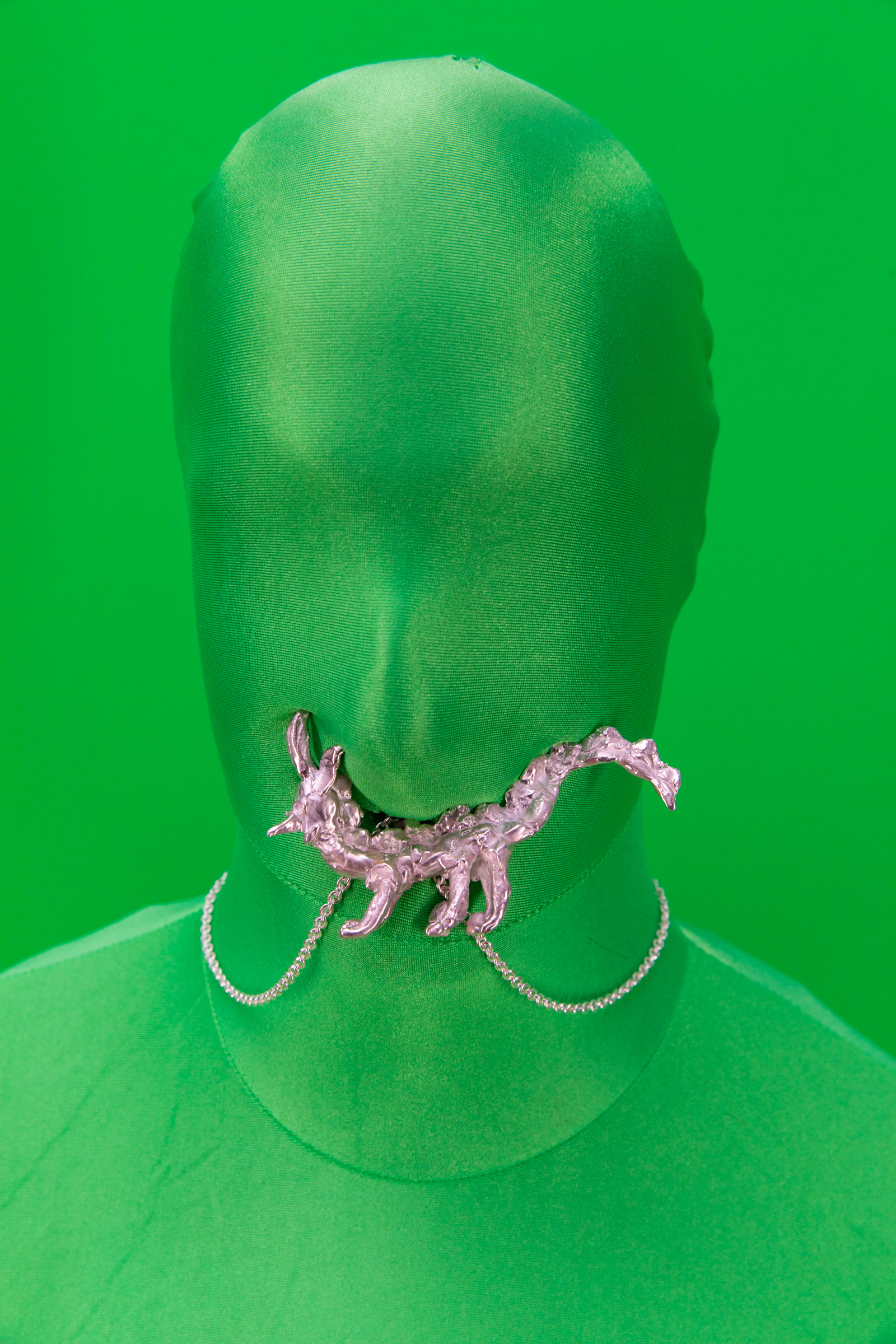
In "Studio Jewels," a collection of four pendant necklaces in collaboration with gallerist and jeweler Will Shott, Smith ventures into a new artistic medium using fresh materials. In doing so, he steps away from his familiar trademarks — bold clashes of colors and famous full-strokes — while also departing from the confines of the traditional gallery world, forging a connection between commerce and his artisanal vision. Subtleties give way to the luster of gold and sterling silver, and canvases are replaced by pendants, yet his motives remain consistent.
"Studio Jewels — it might sound a bit unconventional, but it's the best I could come up with. I've considered various options, but I don't believe the title holds great significance in this context," admits the artist on his Instagram account. Here, his art coexists comfortably alongside selfies and weekly discussions about "Emo Wednesday" (as below).
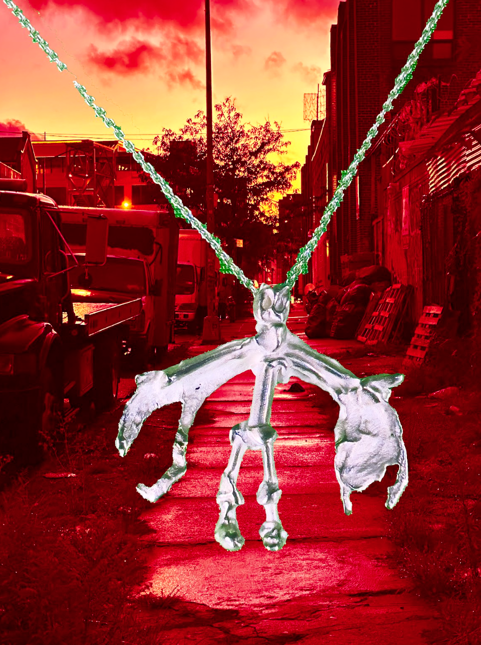
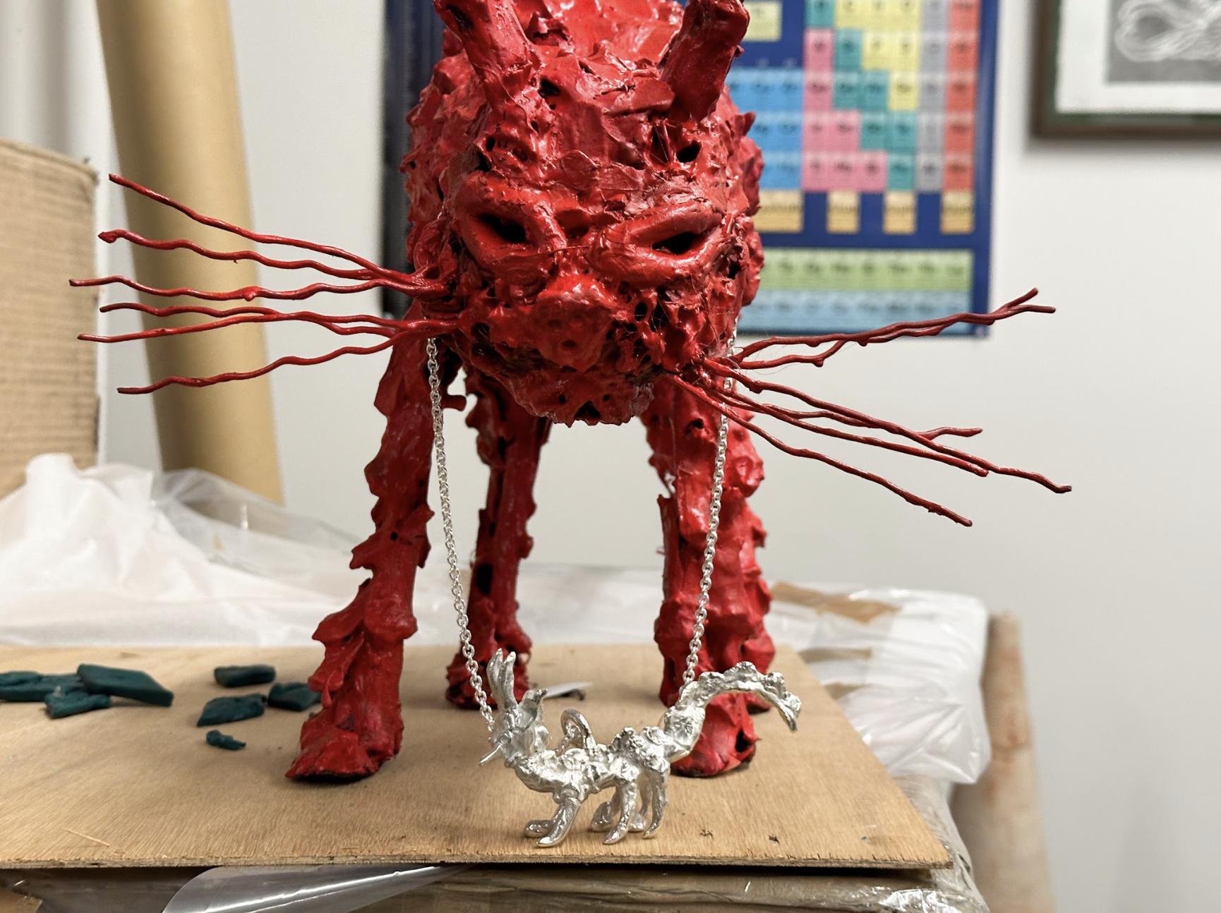
He goes on to explain that the pendants were all crafted from small sculptures constructed using a combination of resin, glue, and "natural materials." The collection features four distinct shapes and characters: Twig, Wing, Ghost Gold, and Dragon. The total production is limited to just 151 pieces, with the Dragon pendant being a unique, one-of-a-kind creation. Prices for the pieces range from $375 to $10,000 for the latter, promoting the idea of wearable art as "an extension and a more accessible new form," as Smith eloquently puts it.
All four characters carry a certain edge and a touch of emo aesthetic, yet they are infused with the same emotional depth and sophistication that Smith brings to his sculptures and paintings. The silver polish, meticulously applied by Shott, aims to give the pendants the appearance of aged relics.
Speaking of sculptures, the four motifs are set to be displayed at Shott's gallery, WWW. In the meantime, Studio Jewels is now available exclusively at Platform.
LOVEISENOUGH, whose work has been featured in Vogue, Architectural Digest, T Magazine, and more, has always been something of an enigma. Their identity eschews eponymous branding for a dreamlike title that calls to mind a line from a letter or a film script more than the title of a design firm.
And this is exactly what Daye had in mind when she first named it: “I’ve always felt so comforted behind a pseudonym like LOVEISENOUGH, because it's less of a brand and more of just a message. But it's not even original: It's from a poem by William Morris. So it's kind of invisible. It's like borrowing someone else's identity in a way.”
“Love is Enough” by William Morris
Love is enough: though the World be a-waning,
And the woods have no voice but the voice of complaining,
Though the sky be too dark for dim eyes to discover
The gold-cups and daisies fair blooming thereunder,
Though the hills be held shadows, and the sea a dark wonder
And this day draw a veil over all deeds pass'd over,
Yet their hands shall not tremble, their feet shall not falter;
The void shall not weary, the fear shall not alter
These lips and these eyes of the loved and the lover.
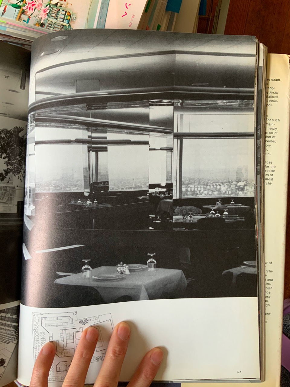
This kind of sentiment — that design can be driven by a message — isn’t new, at least in the context of design history. Highly influential historical institutions like Archizoom Associati and the Bauhaus have always been driven by a message or a feeling: larger ideas like “Superarchitecture” (Archizoom) or “Functionalism” (Bauhaus) guided their work and can be seen to this day in their enduring legacies.
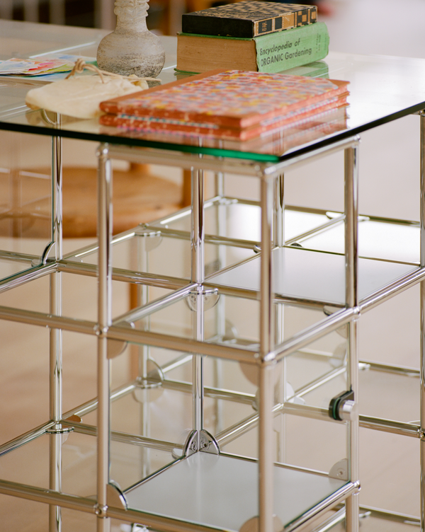
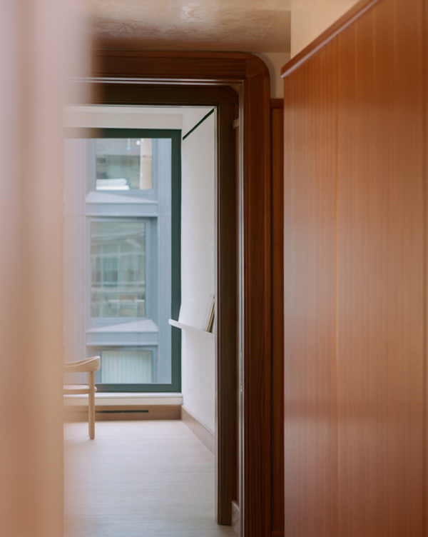
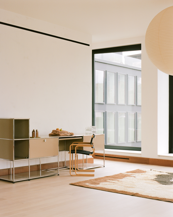
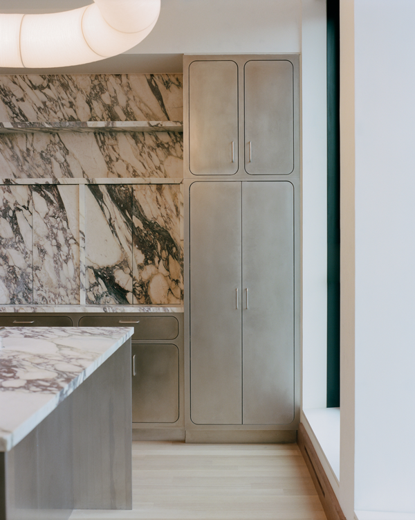
New York residence by LOVE IS ENOUGH — Photos by Marco Galloway
At its heart, design is the embodiment of an abstract concept. Its true magic lies in its ability to crystallize an idea, transforming it into a tangible entity designed for daily life.
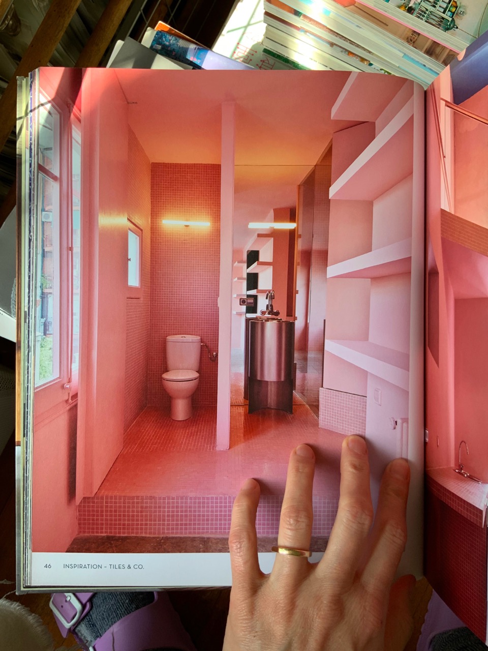
But what is this message — this idea of “love is enough”? For Daye, it seems to come down to a generosity of spirit: an orientation toward creating design that embraces the human experience and isn’t afraid to grow alongside it. One look at the studio’s work and you can see this in action: terrazzo made from discarded brick that recycles history into something new, walls that embrace their natural roughness and form myriad shadows when the light hits, wood that reveals its age like a badge of honor.
Texture in its own right is a sign of humanity, as Daye tells it. In the age of “aesthetic”, creating spaces that are meant to be experienced firsthand is something bordering revolutionary.
“If we just think about the human body, in 3D space, and all our sensory aspects of how we perceive space, you get to a deeper intuition: what feels right or wrong or what is right or wrong,” shares Daye. “These instincts have been built over hundreds of thousands of years … and that's what makes someone like Gaetano Pesce’s work [special] — and [the work of] many of our other peers and friends who are making things that are not so much in the realm of like conventional tastes, but have this textural element: you look at it and you want to touch it.”
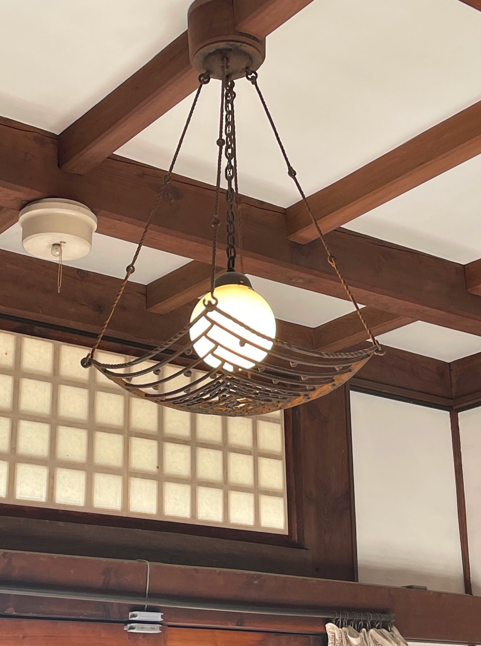
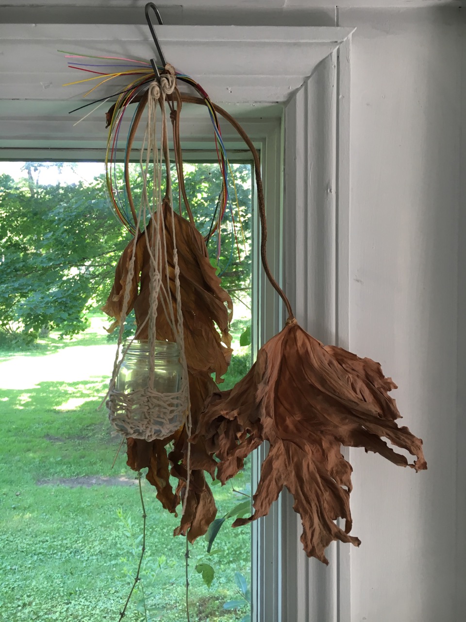
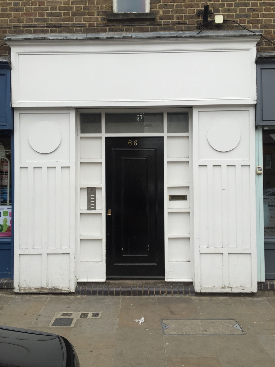
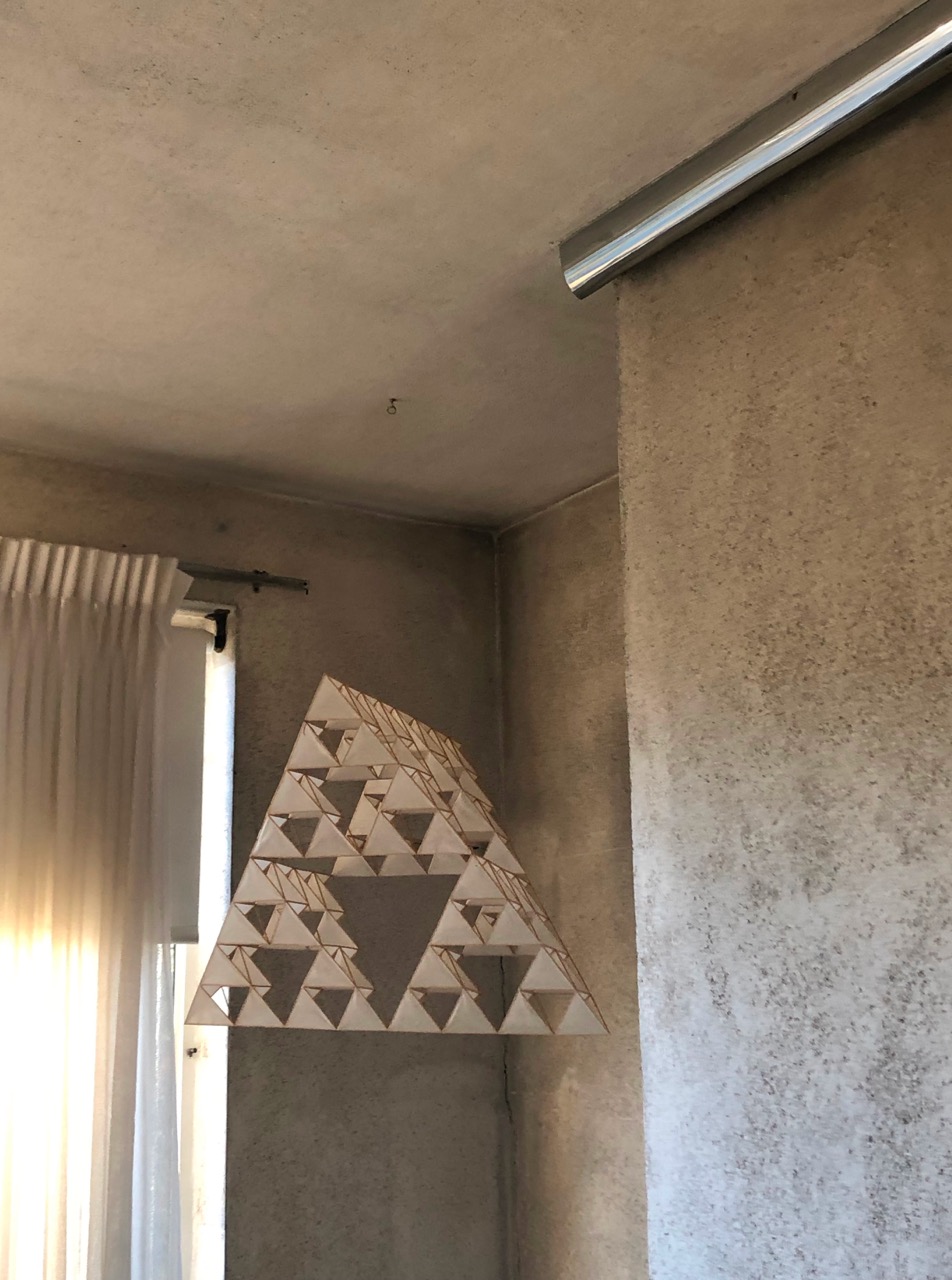
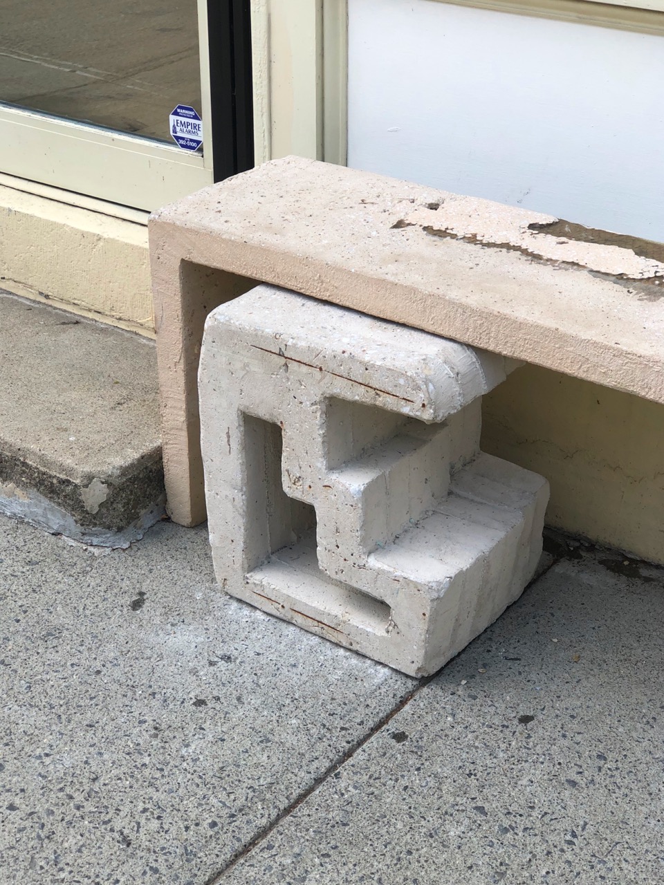
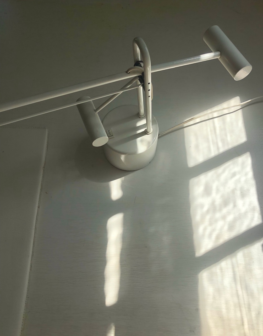
“I remember teaching at Pratt and one of the students at the end of the semester was like, ‘You know that you pick up every sample and smell it?’ And I was like, ‘Oh my god, I do do that.’”
For the designer, this level of personality in design transcends even the physical. The integration of identity as a core design principle is of high value for Daye, who views our unique self-conceptions and histories as integral to good design. “There’s so much diversity in the world — I wish there was more identity expressed in design. We could bring in so many influences if we didn't just default to the white male European [style], like just Corbusier."
At the end of the day, it comes down to challenging the status quo: having a growth mindset rather than a fixed one. And same goes for the studio itself as they undergo a kind of rebrand. “[We’re trying to] make it reflect more of the spirit [of “love is enough”]. I had made it all very cryptic when I started the studio — now we’re ready to turn a little more outwards, to be more apparently open.” For Daye and the studio, this has looked like sharing a wide range of influences on social media. But as far as the name goes, she still values the message-driven aspect of their identity. “I want to have myself for myself, and not be a commodity. It feels almost sacred to hold [my name] back.”

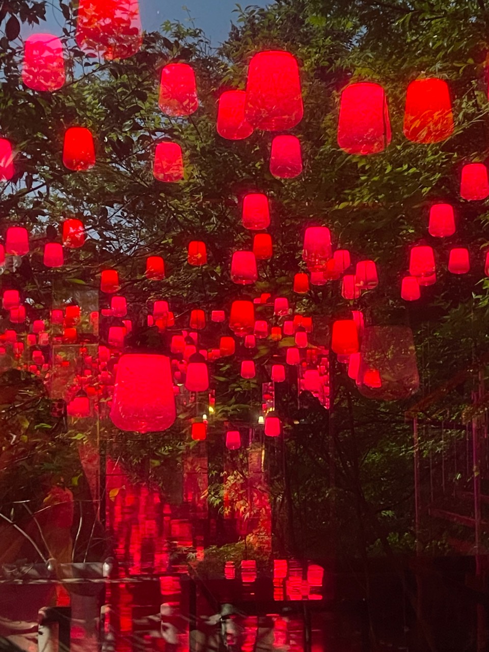
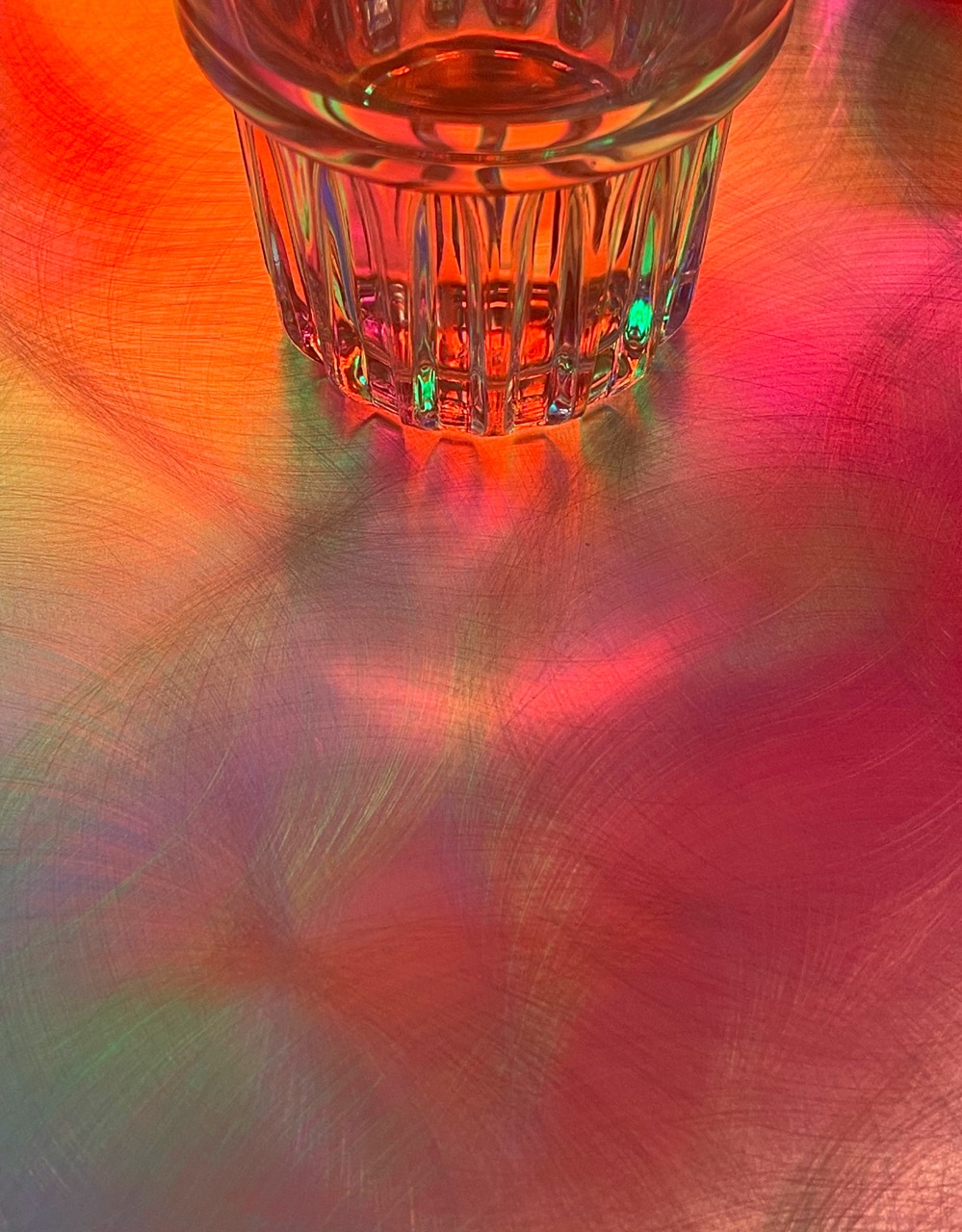
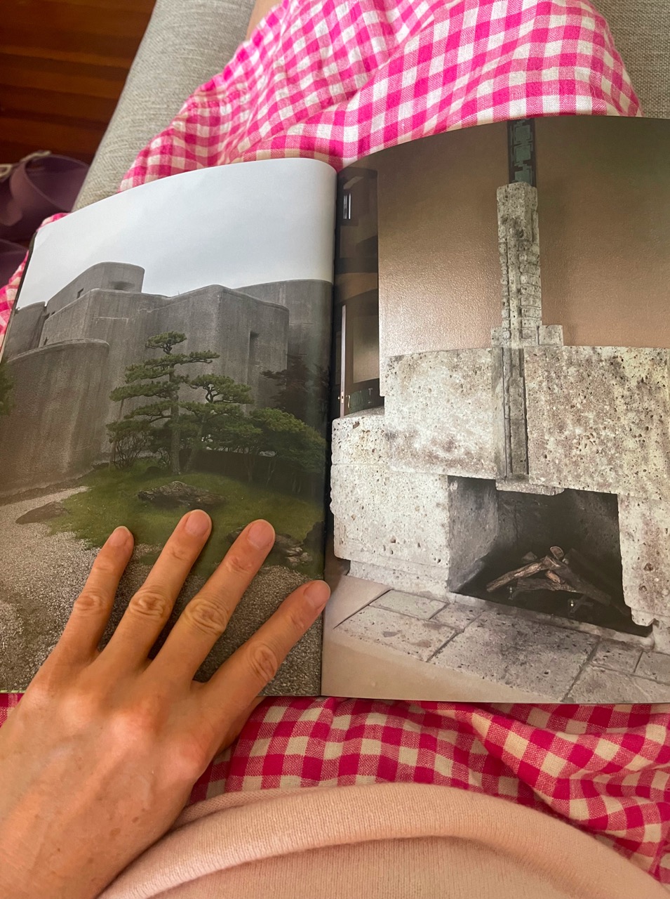
Hers is a sentiment shared by many. In the midst of all the fluff, there is a very real influx of very authentic design expression, both online and off. Design exhibitions here in New York are just as likely to take place in a Navy Yard workshop or Bushwick loft as they are in a Chelsea gallery. One of our twenty cover stars for this issue was the icon Gaetano Pesce himself. Young furniture makers find themselves invited to fashion shows and downtown parties, and makers eagerly share their DIYs on social media and beyond. The energy is infectious — the future is full of promise.
And the key to it all? Always trying something new. As Daye wisely put it, “Hey, what if I broke that rule?”