Bridge and Tunnel, 2023. Image courtesy of the artist and Tara Downs, New York. Photo: Jason Mandella.
Stay informed on our latest news!
Stay informed on our latest news!
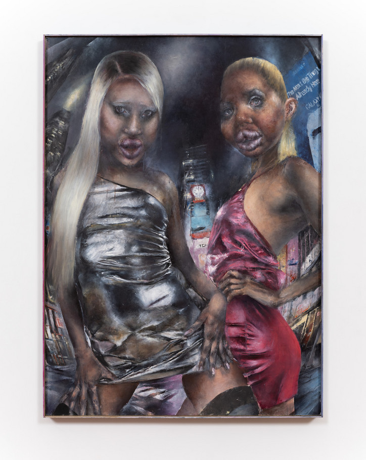
Bridge and Tunnel, 2023. Image courtesy of the artist and Tara Downs, New York. Photo: Jason Mandella.
Hi Catherine. How's your day going?
It’s ok. How's yours?
Good. Cool. Are you excited for your show?
Yeah, I'm nervous but excited. It's been a little over a year that I've worked on the pieces so it's just really intense to show them.
How come?
The studio is this safe space to get really weird and follow these stupid threads. The more time you have, the easier it is to forget someone's going to see them eventually.
Yeah that’s weird – your work placed in a foreign space, in front of an unknown audience.
Yeah, it feels like the lights being turned on or an invasion of privacy in a way.
How did you get started with your zombie figuration?
Before this type of work, I was using a lot of appropriated images, found images from the internet or stock photos. And they were being distressed with sanding and paint remover. So I was really thinking about ruins, contemporary ruins, with death and loss as a subtext. And I think these women are creatures born of that world.
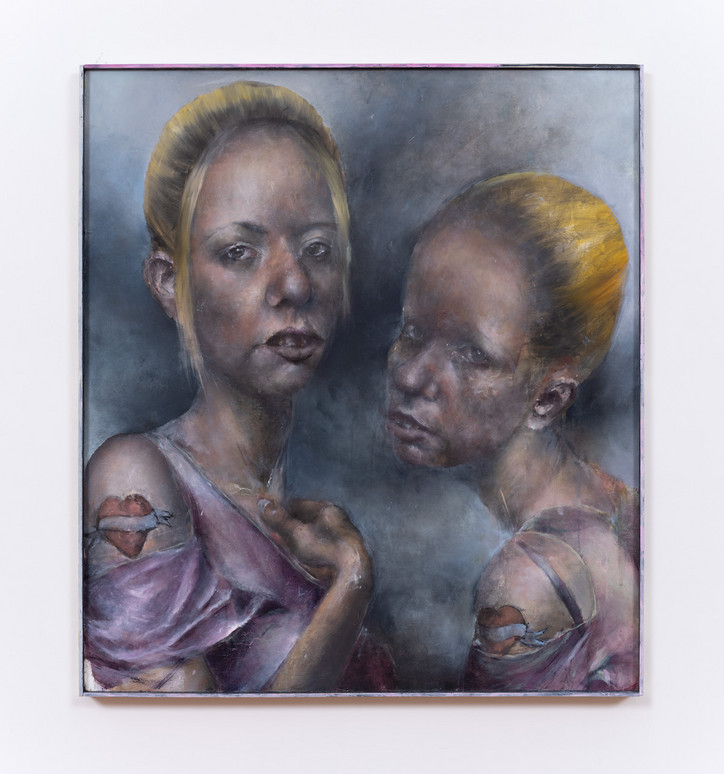
Sisters, 2023. Image courtesy of the artist and Tara Downs, New York. Photo: Jason Mandella.
I think it's interesting that you draw inspiration from a lot of pop cultural references – a distant past not so distant.
They are very labored over. They take a really long time, I guess on that point, I think about disposability a lot. So it connects these two bodies of work. Painting is this ancient, archaic practice, and it's also meant to last centuries, especially the style of oil painting I'm doing which predates modernism. There’s a way something from five years ago already feels incredibly dated, and the accelerated speed of trend cycles and technology that I’m trying to embed in the process.
How do you do it?
I make sketches, then a grid, which I follow with a lot of thin layers of paint. So I’ll use a certain color for the under painting and then modulate the temperature over time. They have this sallow jaundiced color both because of these deathly associations but also because that's really the color of an underpainting. If you look at an old painting that's decaying or hasn't been restored, you can see them being this blue-green color that would be typically painted under the top flesh layer to give it a luminous quality.
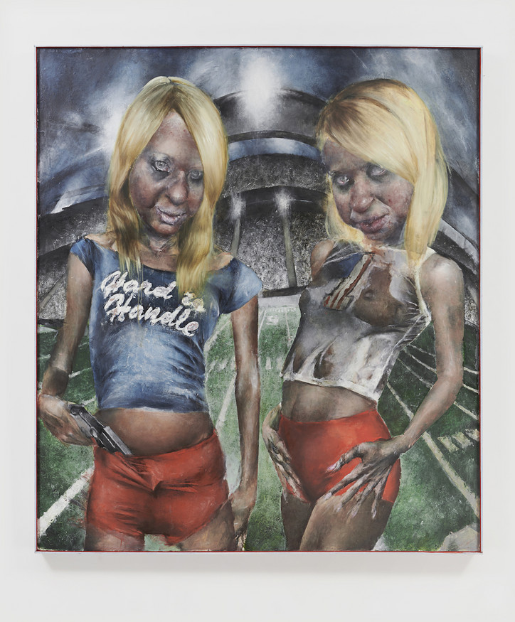
Blondes, 2023. Image courtesy of the artist and Tara Downs, New York. Photo: Jason Mandella.
How long does it take you to work on one piece?
It usually takes months. For this show, there's a few where I was very particular about the imagery. The painting with the two girls in the football field has three paintings underneath it. And I just wasn’t happy with these versions. If you took an X-ray of the painting, you would see these histories.
Would these paintings always be related to the images coming above or are you just literally painting over something and making it brand new?
They were paintings that just didn't really work for me. The figures need a certain specificity where they feel very real but also otherworldly, and there's no formula to get there. So if something feels just not right, I will paint over it with an oil ground to get a white surface again. If I end up using paint remover, sometimes you can see these other colors from past paintings coming through — it gives them a certain patina.
The figures aren’t as menacing as you’d think – being zombies.
Well, it's also a trope of horror films where sexuality is used to disarm the viewer. There will be some seductive woman or scene, you’ll let your guard down and then the menace will reveal itself or the violent action will happen. So the women are both objects and threats in the work.
I notice the facial expressions, some are more flirty, others playful.
It’s a bit playful. They are also bigger than life size, you encounter them in a gallery and it's this 1:1 thing relationship they have with the viewer. They are acknowledging you, flirting with you.
Why Bad Girls Club?
I picked that show in particular because it just felt like this purgatory. There's not really an elimination. There's no real goal. I guess it started with the intention of “reforming” the girls but it's really just a space for these chaotic women to fight, you know. That purgatory makes sense with the work too in this way. Like they're just stuck in this other third space.
Like a liminality; suspended between humanity and monstrosity, never quite here or there.
Yeah, totally. The football field is a screen saver image I distorted. I want there to be some mystique, some ambiguity about, “OK, are they actually situated there? Are they in hell or an unconscious space? Is it just pure fiction?”
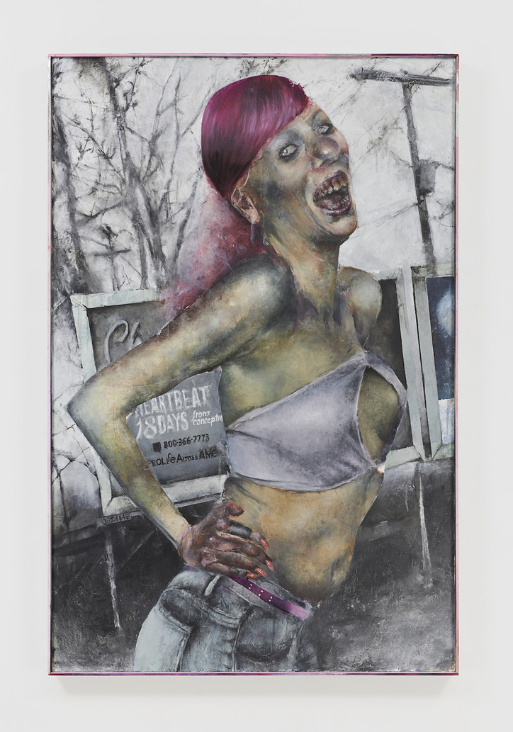
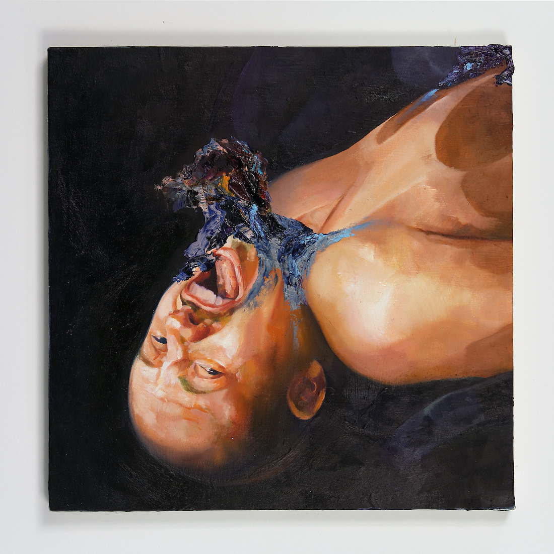
Hitchhiker, 2023. Image courtesy of the artist and Tara Downs, New York. Photo: Jason Mandella.
I really like the hitchhiker. Tell me about that one.
Oh Thank you. Yeah, that one is actually my favorite. I think it captures the feeling I want the most successfully. Her expression is threatening, but there's something ecstatic about it too. She's on the side of a highway. She has this billboard that references a pro-life organization. I don't really have an answer for why I made that decision, it just felt like it captured the current moment.
I didn’t even notice that, but I’m sure it’d stand out more on a larger canvas. This one feels like a commentary on the way we consume images and how that’s evolved in our digital age – what we wear; how we pose; how we understand beauty; how we understand ugliness.
Yeah, exactly.
How would you describe your own work?
I feel like my work is polarizing. Someone said it was like a car crash. For me, it's more important to make an image that's memorable than an image that you like or know that you like. Sometimes I've hated something at first because I had no reference point for it or it made me uncomfortable. But that's really the work that ended up forming my sensibility or making me think or see things in a different way. I'm playing with these things in a very deliberate way, ugliness and bad taste. And I want it to provoke a visceral response in people. Like a punch in the gut.
The thing about Bad Girls Club, it was hard to look away. It’s cringe but you just keep watching it, and I feel like that’s a feeling translated through your work. It isn’t aesthetically normal.
I think there's a thrill to tastelessness. I also think about how figurative painting has sort of been popular for a few years now. I see people using it in a way that seems very tasteful and restrained or affirmative. That's sort of something I want to push against.
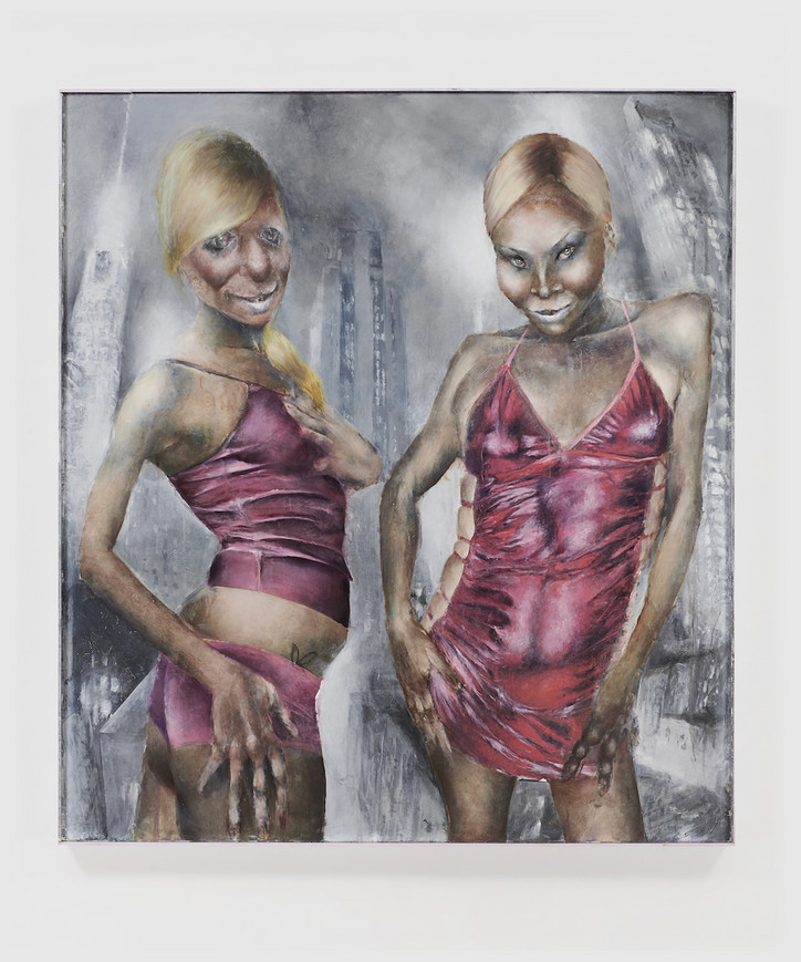
Clubbers 2, 2023. Image courtesy of the artist and Tara Downs, New York. Photo: Jason Mandella.
What are some of the aspects of figurative paint painting that you're trying to avoid?
I think because figurative painting is a pretty easily commercialized art form, people don't take all the risks they could be taking to make something that's truly weird. And whenever I feel I’m censoring myself because of that, or the market, or wanting to be absorbed into the mainstream, that's when I have to stop what I'm doing.
What stands out is this tension between art and culture.
Yeah, I mean, in general, I think art should serve a different function than the dominant culture. But it's hard when you look at who still has power.
I’d describe your work as avant garde, being one of the only art forms that directly challenges the ordinary and the normal. There’s a simultaneous absurdity and familiarity to it.
Yeah. No, actually I like that.
What drives you personally?
I guess curiosity about the world. yeah, I don't know. I feel very privileged to be able to make my work right now.
It's such an interesting time to be an artist. I love that your paintings don’t feel targeted to a male gaze similar to how the show wasn’t. Your audience could even be people that aren't into art.
Totally. Are you gonna be there Friday?
Yeah, I'll probably be there.
Oh, great! Well see you then and thank you.
Thank you too. Take care.
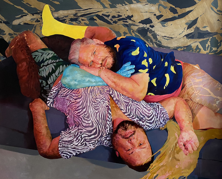
Curated by Monique Long, the show is a reflection of how the city has informed Cruz’s visual language and embraces systems of belonging and homecomings. The scope, in part, expands upon a decade-long dialogue and friendship between Long and the artist, who grew up mere blocks from each other in North Philly but only met in New York.
“That conversation evolved into talking about the ways in which we're born and raised, you know, affects the way we make and how we make,” shares Long. “ When the ICA approached me and invited me to do this project, I did have a lot of ideas, but to work with David Antonio, in our hometown, seemed like the obvious choice, and neither of us had worked in Philadelphia. So it just seemed like a proper homecoming, and in a way to sort of see the ideas manifest in a project together.”
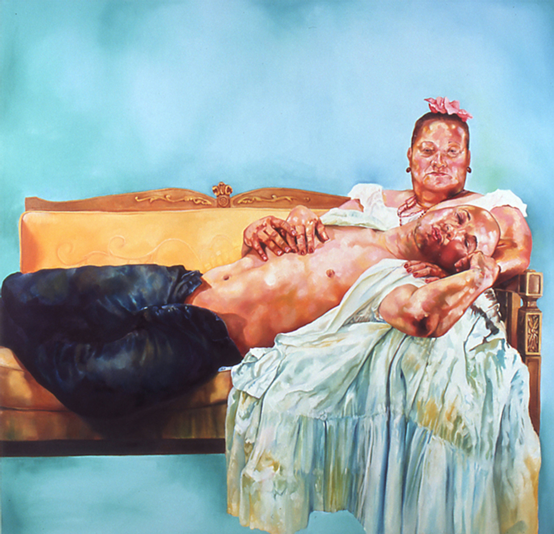
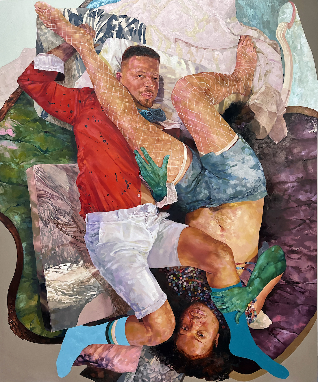
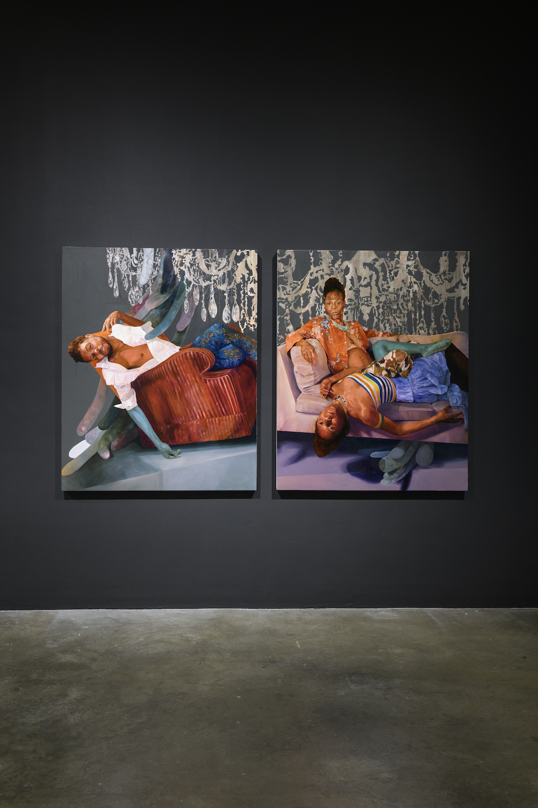
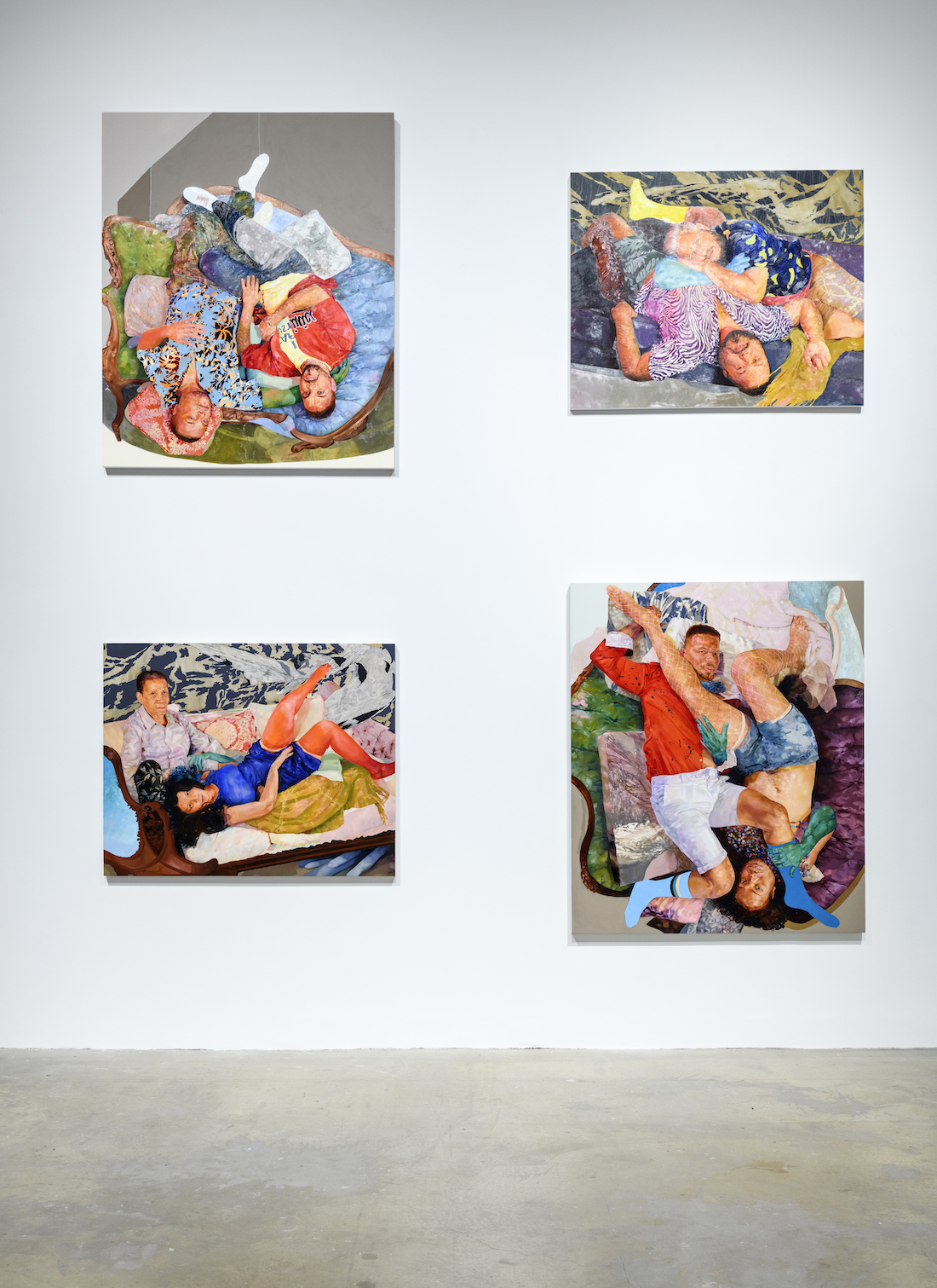
Together, Long and Cruz have created an exhibition that speaks to the artist’s ongoing commitment to community, home and joy. Monumental portraits for which Cruz is best known, offer an extensive representation of highlights and landmark moments in his career. Signifying an importation transformation in the artist’s practice, Puerto Rican Pieta 2006 is concurrently one of the first and last pieces encountered in the exhibition. The painting reinterprets Catholic iconography with tender yet forceful imagery of him and his mother. Intimacy and profound love take shape in details like their intertwined hands over Cruz’s heart and the way their clothing blends into each other.
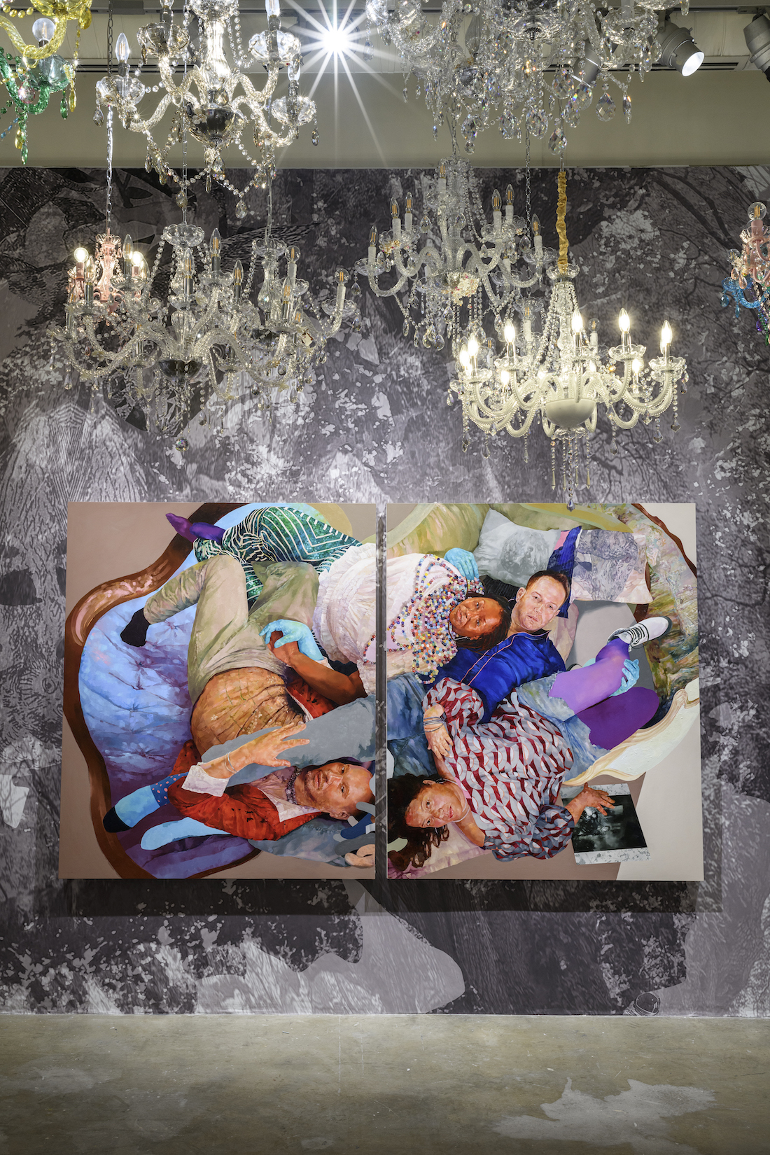
Decadent chandeliers, custom wallpaper and bespoke fabric hold space for the “Project Room.” Cruz conceptualized the beginning of the exhibition as a passage to pause and reflect through the layers of his work. There’s a sense of performance in the decor, the walls are topographical in their nods to the northern parts of the city, shadows echo throughout, and interplay with the displayed works. There lies an affectionate oil on canvas of Cruz and his childhood best friend. Conversations unfold between his art and his personal history in Philadelphia.
“I find this moment becomes about celebrating with them as much as it is about my work,” shares Cruz.
Queer peers are depicted alongside their chosen families. Cruz paints an extension of their worlds, nesting his subjects in furniture created to hold and support. In thinking about the support systems that hold him up, the artist sought to create art as a historical marker. He documents community making visible queer worldbuilding and people of color in art historical canons that historically excluded them.
“It's almost a thank you to the community in a way for that support in that sense of survival.”
When The Children Come Home will be on view through December 17, 2023.
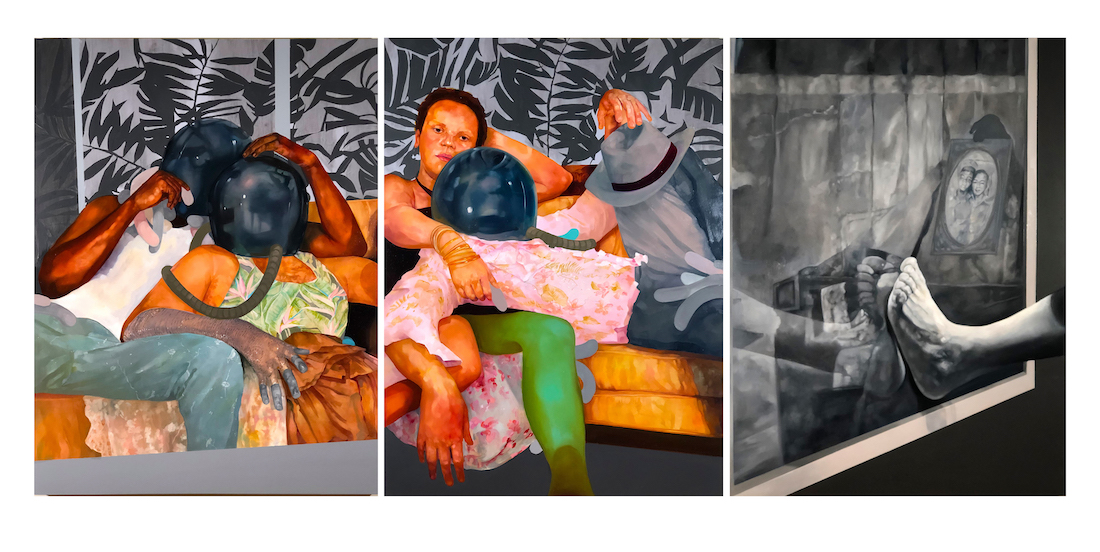

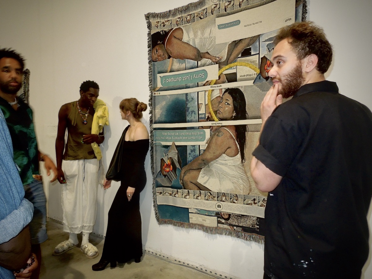
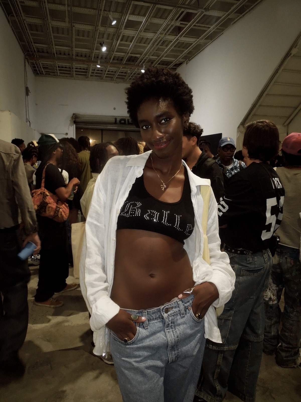
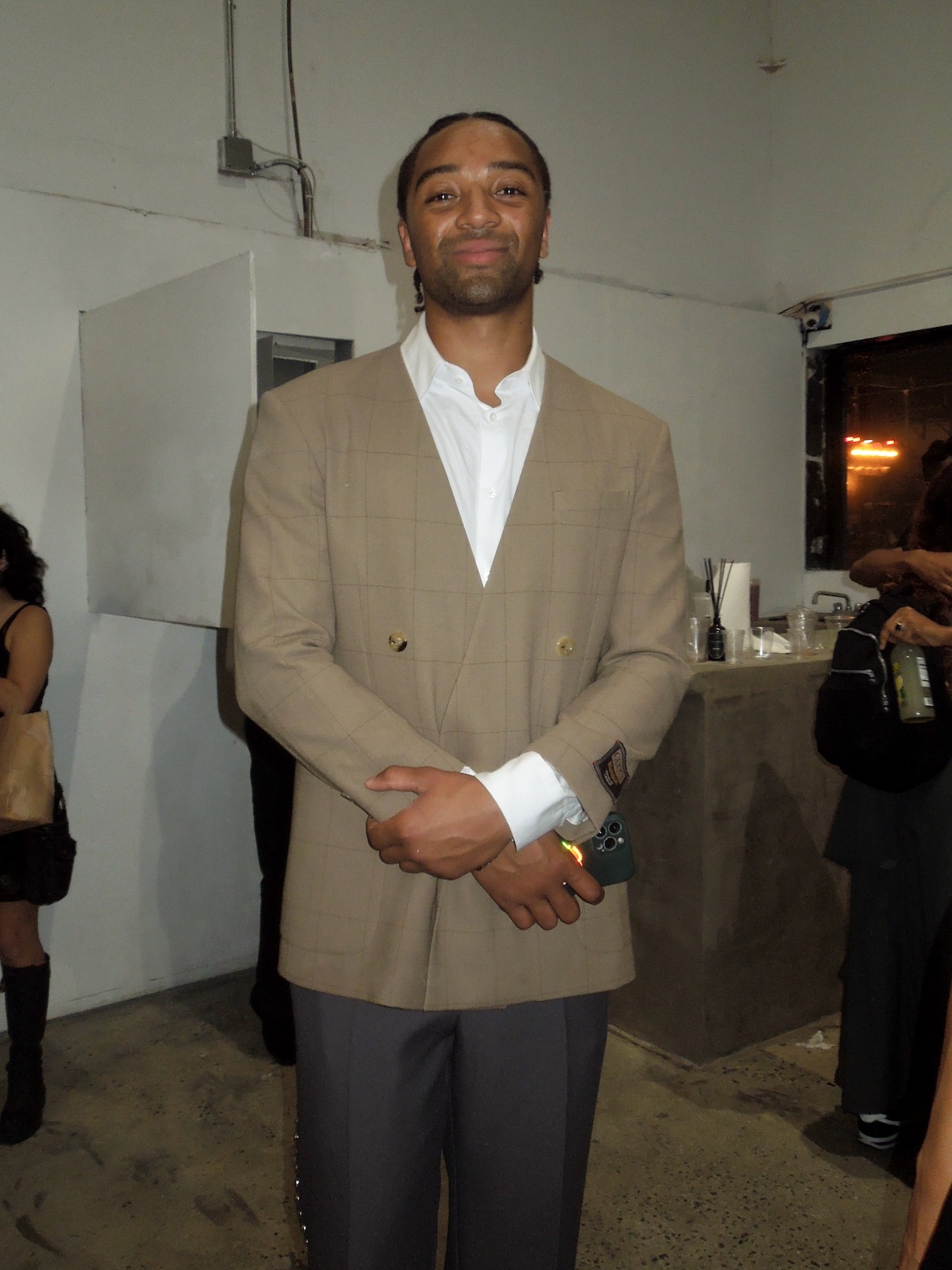
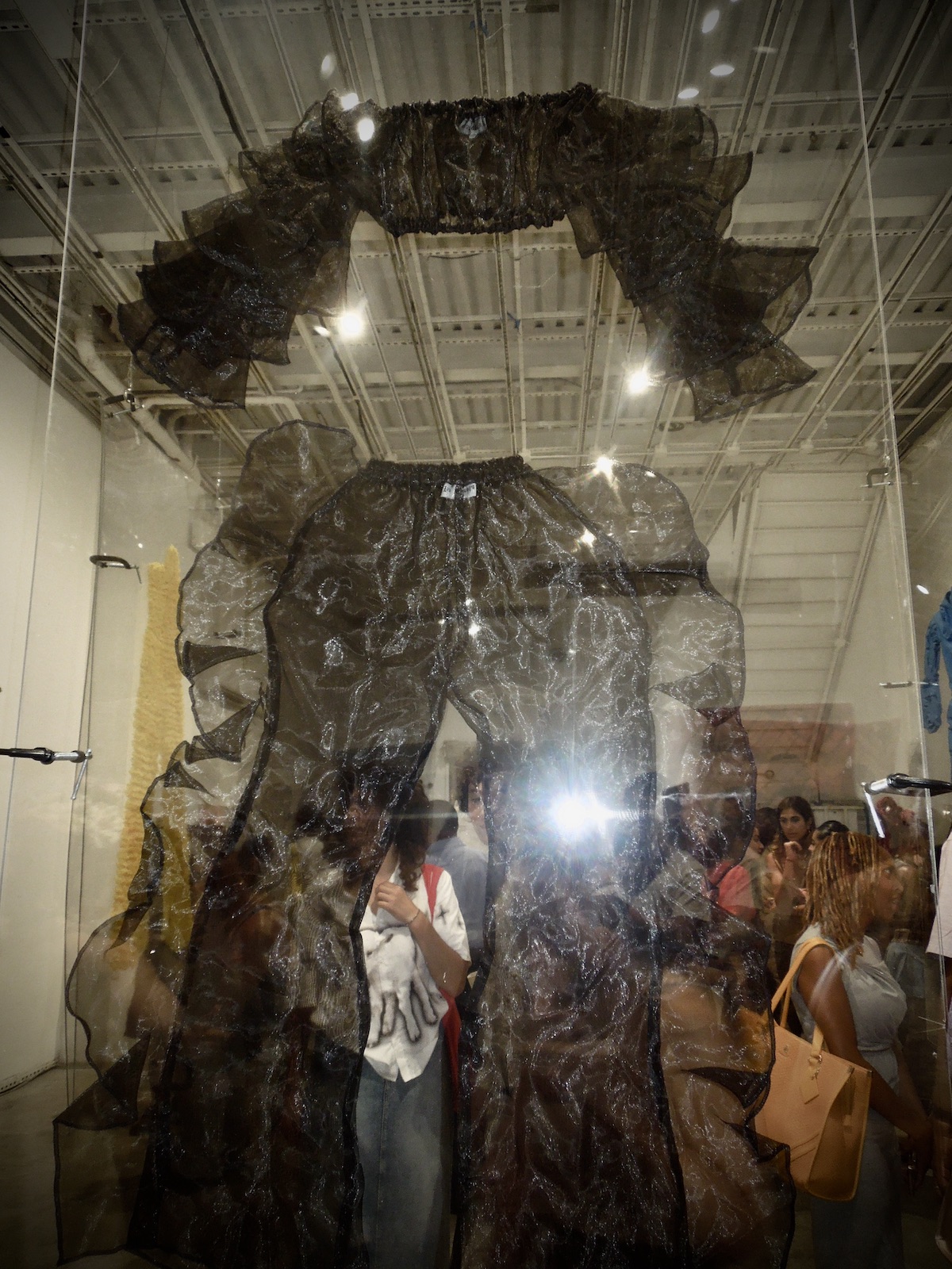
Strada’s commitment to disrupting the art ecosystem through inclusivity and fresh talent was readily on-view. The slate of artists at “Embodies Spaces” reads like a masterclass of unique narrative-building and audacious creative drive.
Drawing from a rich tapestry of disciplines, the works delve into the philosophical, sociological, and cultural dimensions of the body. They breathe life into the perception of how our shared physicality molds our communal understanding.
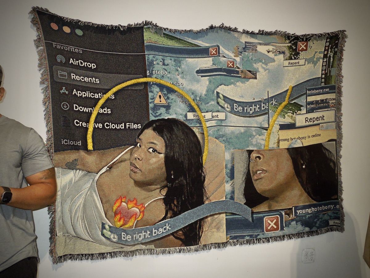
Part one of the exhibition features pieces from New York-based designer, Tia Adeola, as well as works from renowned artists Qualeasha Wood, Milo Davis, Augustina Wang, Obi Agwam, and Thomias L. Radin. Details regarding part two of the exhibition will be released soon, but expect more of an emphasis on architecture rather than versus the bodily study of the first edition.
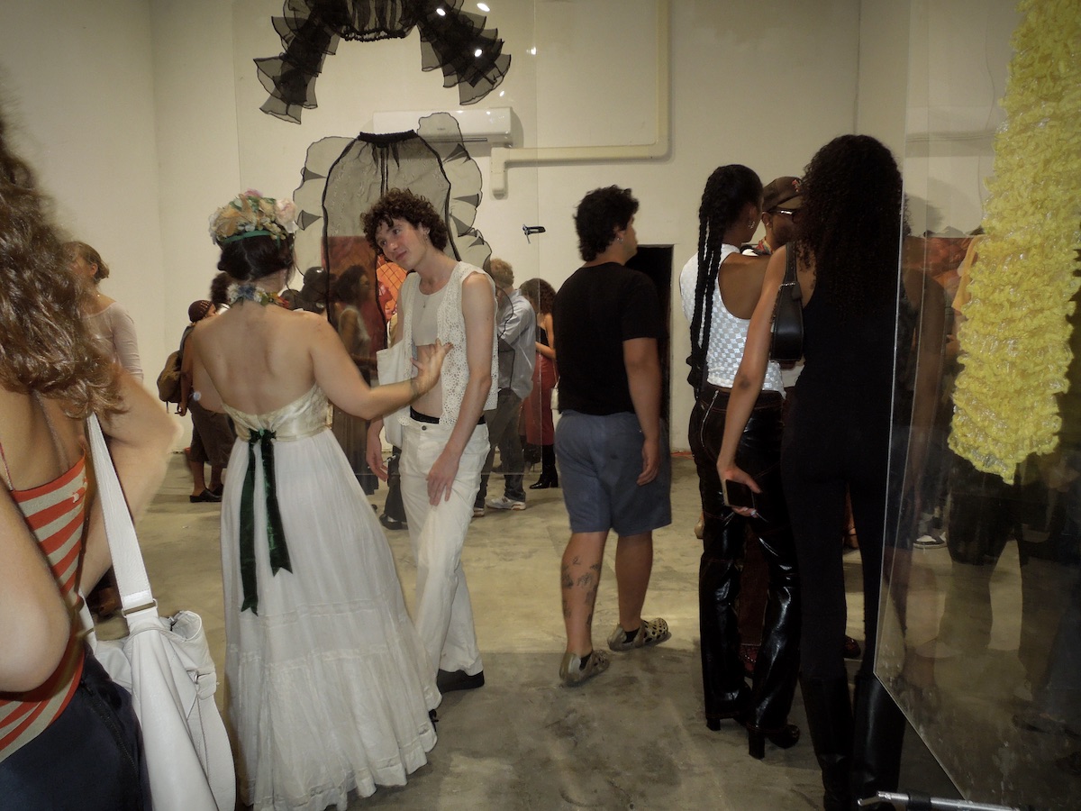
The backdrop of the exhibition launch was the bright, new space that Strada will be calling its permanent home. The goal of building a brick-and-mortar hub is grounded in the continued growth of the group’s art ecosystem.
“We loved the idea of having frequent monthly exhibitions, more time to prepare them and to have them exist in the community. I’m eternally grateful for the pop-up exhibition model we were doing, because it taught us the value of space and how to take advantage of it” chief curator Paul Hill said.
Soaring 20-foot ceilings (in hefty square-footage for a downtown gallery) create an intriguing cocktail of possibilities. At this event alone, substantial glass panels were suspended in the air with grace. Although works were not necessarily cohesive from an aesthetic standpoint, the breadth of space allowed each work to come through in impact and clarity.
A new gallery and exhibition series seemingly aren’t enough for Strada – the team is also looking into how they can disrupt the worlds of art news and auctions through in-house channels built on the unique energy of the collective. Expect more art presentations, more pop-ups, more hanging fixtures (?), and more of the unexpected from the group this fall.
