PRESENTE CONTINUO: the intimate ties between then&now

Starting May 30, PRESENTE CONTINUO will be available to purchase on presentecontinuo.com, cpcompany.com, and at the C.P. Company flagship store in Milan, Corso Matteotti 7.
Stay informed on our latest news!

Starting May 30, PRESENTE CONTINUO will be available to purchase on presentecontinuo.com, cpcompany.com, and at the C.P. Company flagship store in Milan, Corso Matteotti 7.

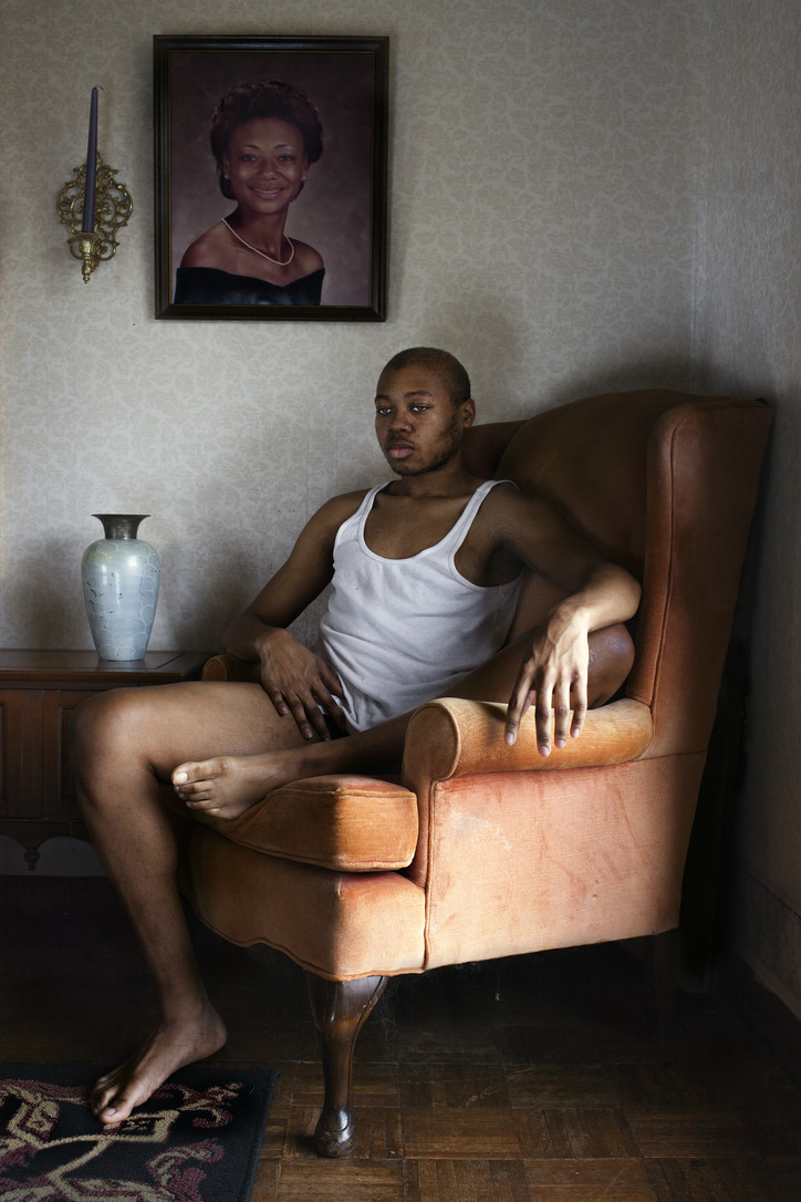
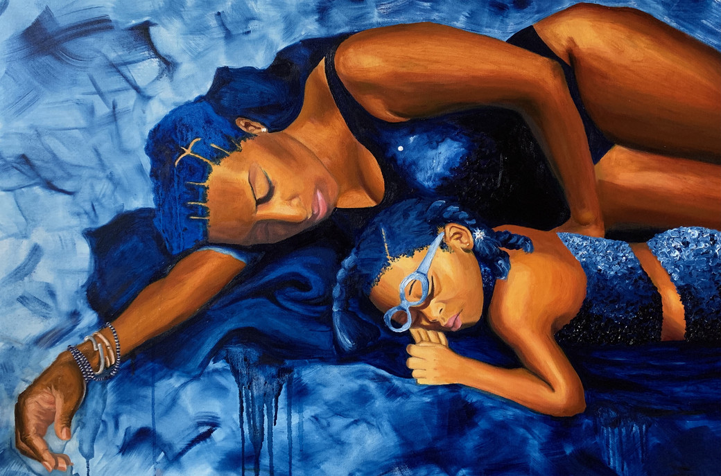
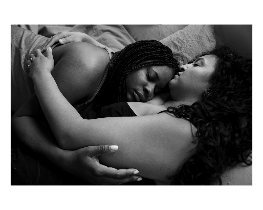
Through photographic portraits, landscapes, and scenes of domesticity, the exhibition features visual interpretations of rest by artists Tyler Mitchell, Allison Janae Hamilton, Daveed Baptiste, Gordon Parks, Carrie Mae Weems, Colette Veasey-Cullors, Cornelius Tulloch, Chester Higgins, Lola Flash, Kennedi Carter, Jeffrey Henson Scales, and Adama Delphine Fawundu, among others.
After the opening, office spoke to two of the curators of Rest Is Power, Dr. Deborah Willis and Dr. Joan Morgan.
Samuel Getachew— I was fortunate enough to see the exhibition on opening night, and first and foremost, I want to say congratulations. It was so moving, and so beautifully curated. I’m heartbroken that I couldn't make it to the artist’s roundtable on the 12th, but I’d love to hear how it went — any highlights you can share?
Joan Morgan— Well, it was really well attended — it was standing room only, which I guess isn't that surprising given who was on the panel. In addition to seeing these amazing artists present on their process and their craft, and give their thoughts and reflections on rest, I think the highlight for me was to have Tricia Hersey actually be able to see how her work is being taken up in the world, and actually have that engagement in real time. Often I think when you create things you hope but you don't necessarily know how it is not just being received but actually being engaged.
The most moving parts were the questions from the audience, about their own breakthroughs regarding issues of race and gender and giving themselves permission to rest. People shared how the art in the exhibition and Tricia's book and some of the artist statements felt like they were giving them permission to heal and to rest and to set boundaries, which of course is our overall goal and ambition with this project.
Deborah Willis— There were actually two doctors in the room that we didn’t know would be there. I was so impressed with them sharing their moments of what the exhibit meant to them. As doctors, people don't see that they need rest too. When a patient comes in, they have to get up and go back to work, if a patient dies, they just have to get up and go back to work.
Some of the questions also talked about the grind culture that we experience as these artists, that we need to keep moving, we need to keep working. In Europe, there's support for the arts, but in the US rarely do our artists have grants or government support from their country. That was another aspect we hadn’t thought about.
I know Tricia’s work was very foundational for the concept behind the exhibition. Can you tell me more about how the idea for the exhibition came about?
JM— Every year thematically, we come up with a topic that we’re going to explore at the Center for Black Visual Culture. Our first one was Black joy as resistance, and our second one was redefining home, but we felt like we actually needed a 3-5 year commitment, and we wanted to come to work collaboratively outside of the walls of NYU.
The exhibition is the launch of our larger initiative, the Black Rest Project, which came about quite honestly because Deb and I had just come out of two years of virtual programming during COVID where we were often running two programs a week virtually. For a time when we were all supposed to be locked down and standing still, we emerged from it pretty exhausted. I noticed that was basically everyone's response: really exhausted and depleted, and even more so for people of color.
DW— We as an academic body needed to focus on rest. Joan, Kira [Joy Williams] and I decided to put together an advisory committee and to invite scholars who we knew were going through the same questioning, ask the questions, “What do we think about it? How do we talk about it?”
JM— The exhibition is our first attempt to amplify visual narratives of Black rest.
Do you see the Black Rest Project exploring non-visual mediums in the future?
JM— Oh, absolutely. That's why we brought in collaborating partners, and we're about to meet with the advisory council again. We're working with various factions — historians, scholars, activists — many of whom don't necessarily work in visual culture but have real ideas about how to bring rest back to their community.
The exhibition features a really diverse range of artists, some much more established like Gordon Parks and Carrie Mae Weems and some who are quite young, like Daveed Baptiste. How did you make those curatorial decisions?
JM— We learned a lot about what we each thought about rest in going through the images. We had some really robust debates about what was restful, because we became very aware that what looks like rest to one person may absolutely not look like rest to another. It expanded our ideas.
With the photo of a barbershop, I was like, “Why is an empty barbershop restful?” The barbershop looked like a place of labor to me. But then Deb explained how much goes on in Black hair care spaces, and also how that moment when there are no customers and you're closing down for the night is the moment right before rest. I learned a lot because I wouldn't have necessarily picked that image, but Deb went right there also because of her experience growing up as the child of a mother who owned a beauty salon. We had to really expand our notion of rest beyond just, like, Black bodies sleeping.
DW— We decided to invite people to send work, as well as look at some of the people that we know and go through their archives. The range started with younger artists that I met in different cities. I travel a lot, speak to a lot of photographers, and they send me portfolios and ask me to review their work. I didn't ever think that I'd be working with them on some projects, but I thought, “oh, this is a good person to keep in mind.”
There’s some images that reevaluate rest from my own memory, from the collective memory of the three of us. There was also the worthiness that I felt of the photographers who took the time to make images, like the Gordon Parks image of a woman looking out the window in Harlem with her dog. I felt that it was necessary for us to explore.
The photo that stuck with me the longest was Kira’s photo, of her father and brother embracing. It was the only work that I saw representing fatherhood, which was striking and thought-provoking in-and-of itself. Are there any works that stand out to you?
DW— One that touches my heart is Daveed’s mother reading the Bible. I unfortunately lost my mom this year, but my mom was 100 years old. She loved her peace and she loved reading her Bible. And one of the projects I had when my mom was in her eighties was that I wanted to photograph all of the women that she went to beauty school with back in the fifties. I rarely show my work in a show that I curated, but I felt that my words and my images needed to be together in this exhibition.
One of my favorite photographs is of my mother's friends, who were caregivers taking care of others even in their nineties, having an opportunity to rest. I love how relaxed the woman looks in the shampoo chair. When I connect my own mother’s experience to Daveed’s mother in this beautiful white slip reading the Bible, it just had a real effect on me as an image that just helped kind of guide me through this process of loss.
JM— The painting is obviously one of my favorites. It's deeply personal to me — the woman in it has been my closest friend since I was 13 years old. It's a portrait of her and her daughter, who is like my niece.
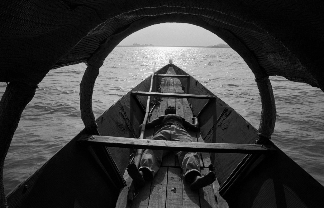
But the standout isn’t just one piece – I would have to say that it's the progression on a particular wall. The way that water sort of flows from the Chester Higgins piece to the piece in the boat over to the wall of Lisa Leone’s portrait of me in the ocean, to Renee Cox, with the reclining in the pool, to Cornelius Tulloch’s work. It spans the diaspora, we're talking about Africa, we're talking about Jamaica, we're talking about Miami. I just love that little section of the exhibit so much, I find myself walking it back and forth fairly often.
That must be so rewarding as a curator, to see works in dialogue with one another like that. What are your hopes for how people engage with it?
JM— We’re not a gallery that’s on gallery row in Chelsea, we’re literally in an academic space. Nothing promotes grind culture more than academia to me. I'm hoping that from now to October 22nd, that it serves as a kind of disruptive reminder to challenge that. And I mean that from students all the way up to the upper echelon of academic power — come in and remind yourself to give yourself grace to rest.
Rest Is Power is open until October 22, 2023 at The 20 Cooper Square Gallery.

Bridge and Tunnel, 2023. Image courtesy of the artist and Tara Downs, New York. Photo: Jason Mandella.
Hi Catherine. How's your day going?
It’s ok. How's yours?
Good. Cool. Are you excited for your show?
Yeah, I'm nervous but excited. It's been a little over a year that I've worked on the pieces so it's just really intense to show them.
How come?
The studio is this safe space to get really weird and follow these stupid threads. The more time you have, the easier it is to forget someone's going to see them eventually.
Yeah that’s weird – your work placed in a foreign space, in front of an unknown audience.
Yeah, it feels like the lights being turned on or an invasion of privacy in a way.
How did you get started with your zombie figuration?
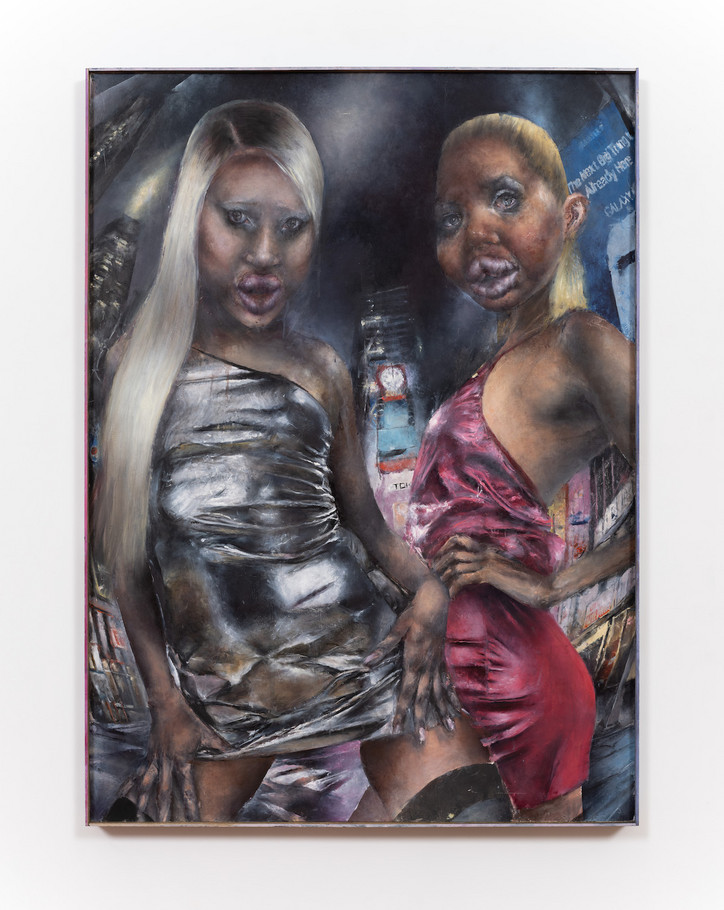
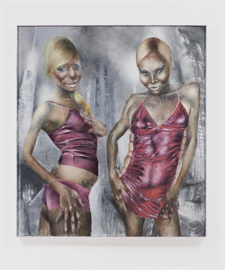
Before this type of work, I was using a lot of appropriated images, found images from the internet or stock photos. And they were being distressed with sanding and paint remover. So I was really thinking about ruins, contemporary ruins, with death and loss as a subtext. And I think these women are creatures born of that world.

Sisters, 2023. Image courtesy of the artist and Tara Downs, New York. Photo: Jason Mandella.
I think it's interesting that you draw inspiration from a lot of pop cultural references – a distant past not so distant.
They are very labored over. They take a really long time, I guess on that point, I think about disposability a lot. So it connects these two bodies of work. Painting is this ancient, archaic practice, and it's also meant to last centuries, especially the style of oil painting I'm doing which predates modernism. There’s a way something from five years ago already feels incredibly dated, and the accelerated speed of trend cycles and technology that I’m trying to embed in the process.
How do you do it?
I make sketches, then a grid, which I follow with a lot of thin layers of paint. So I’ll use a certain color for the under painting and then modulate the temperature over time. They have this sallow jaundiced color both because of these deathly associations but also because that's really the color of an underpainting. If you look at an old painting that's decaying or hasn't been restored, you can see them being this blue-green color that would be typically painted under the top flesh layer to give it a luminous quality.

Blondes, 2023. Image courtesy of the artist and Tara Downs, New York. Photo: Jason Mandella.
How long does it take you to work on one piece?
It usually takes months. For this show, there's a few where I was very particular about the imagery. The painting with the two girls in the football field has three paintings underneath it. And I just wasn’t happy with these versions. If you took an X-ray of the painting, you would see these histories.
Would these paintings always be related to the images coming above or are you just literally painting over something and making it brand new?
They were paintings that just didn't really work for me. The figures need a certain specificity where they feel very real but also otherworldly, and there's no formula to get there. So if something feels just not right, I will paint over it with an oil ground to get a white surface again. If I end up using paint remover, sometimes you can see these other colors from past paintings coming through — it gives them a certain patina.
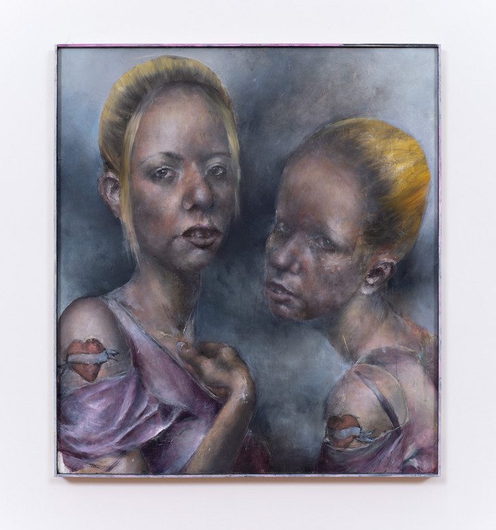
The figures aren’t as menacing as you’d think – being zombies.
Well, it's also a trope of horror films where sexuality is used to disarm the viewer. There will be some seductive woman or scene, you’ll let your guard down and then the menace will reveal itself or the violent action will happen. So the women are both objects and threats in the work.
I notice the facial expressions, some are more flirty, others playful.
It’s a bit playful. They are also bigger than life size, you encounter them in a gallery and it's this 1:1 thing relationship they have with the viewer. They are acknowledging you, flirting with you.
Why Bad Girls Club?
I picked that show in particular because it just felt like this purgatory. There's not really an elimination. There's no real goal. I guess it started with the intention of “reforming” the girls but it's really just a space for these chaotic women to fight, you know. That purgatory makes sense with the work too in this way. Like they're just stuck in this other third space.
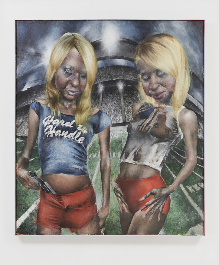
Like a liminality; suspended between humanity and monstrosity, never quite here or there.
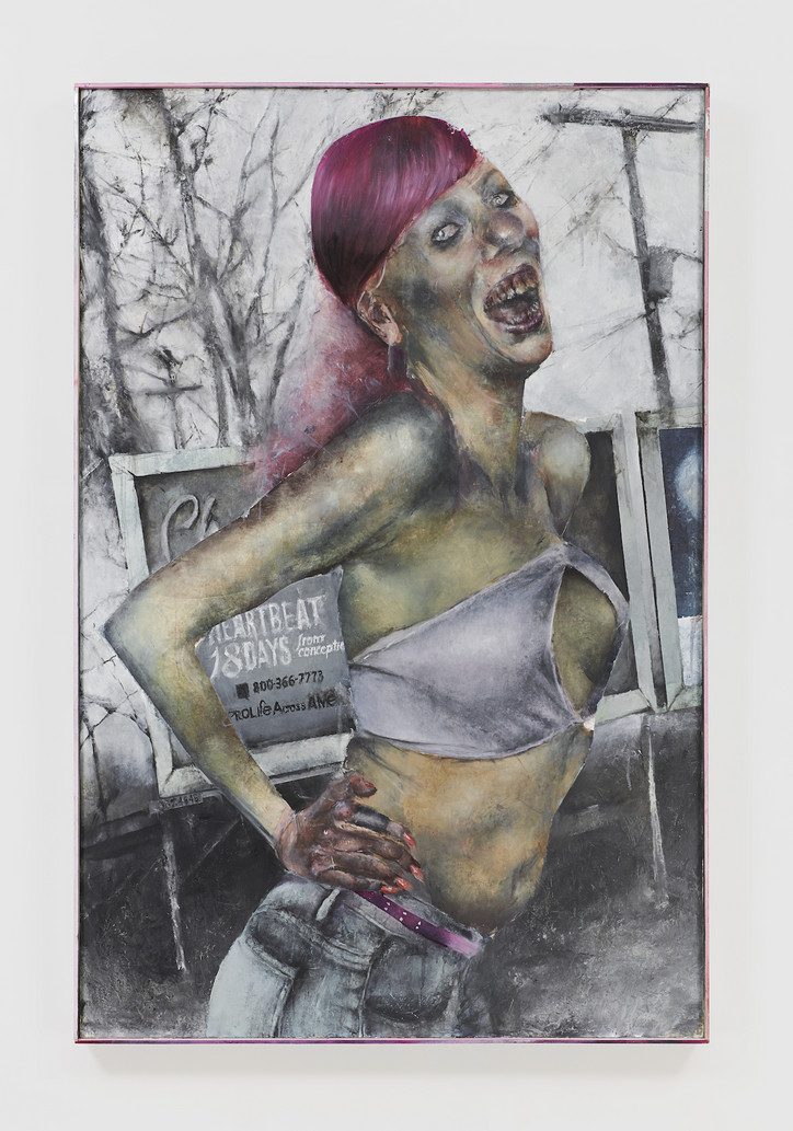
Yeah, totally. The football field is a screen saver image I distorted. I want there to be some mystique, some ambiguity about, “OK, are they actually situated there? Are they in hell or an unconscious space? Is it just pure fiction?”

Hitchhiker, 2023. Image courtesy of the artist and Tara Downs, New York. Photo: Jason Mandella.
I really like the hitchhiker. Tell me about that one.
Oh Thank you. Yeah, that one is actually my favorite. I think it captures the feeling I want the most successfully. Her expression is threatening, but there's something ecstatic about it too. She's on the side of a highway. She has this billboard that references a pro-life organization. I don't really have an answer for why I made that decision, it just felt like it captured the current moment.
I didn’t even notice that, but I’m sure it’d stand out more on a larger canvas. This one feels like a commentary on the way we consume images and how that’s evolved in our digital age – what we wear; how we pose; how we understand beauty; how we understand ugliness.
Yeah, exactly.
How would you describe your own work?
I feel like my work is polarizing. Someone said it was like a car crash. For me, it's more important to make an image that's memorable than an image that you like or know that you like. Sometimes I've hated something at first because I had no reference point for it or it made me uncomfortable. But that's really the work that ended up forming my sensibility or making me think or see things in a different way. I'm playing with these things in a very deliberate way, ugliness and bad taste. And I want it to provoke a visceral response in people. Like a punch in the gut.
The thing about Bad Girls Club, it was hard to look away. It’s cringe but you just keep watching it, and I feel like that’s a feeling translated through your work. It isn’t aesthetically normal.
I think there's a thrill to tastelessness. I also think about how figurative painting has sort of been popular for a few years now. I see people using it in a way that seems very tasteful and restrained or affirmative. That's sort of something I want to push against.

Clubbers 2, 2023. Image courtesy of the artist and Tara Downs, New York. Photo: Jason Mandella.
What are some of the aspects of figurative paint painting that you're trying to avoid?
I think because figurative painting is a pretty easily commercialized art form, people don't take all the risks they could be taking to make something that's truly weird. And whenever I feel I’m censoring myself because of that, or the market, or wanting to be absorbed into the mainstream, that's when I have to stop what I'm doing.
What stands out is this tension between art and culture.
Yeah, I mean, in general, I think art should serve a different function than the dominant culture. But it's hard when you look at who still has power.
I’d describe your work as avant garde, being one of the only art forms that directly challenges the ordinary and the normal. There’s a simultaneous absurdity and familiarity to it.
Yeah. No, actually I like that.
What drives you personally?
I guess curiosity about the world. yeah, I don't know. I feel very privileged to be able to make my work right now.
It's such an interesting time to be an artist. I love that your paintings don’t feel targeted to a male gaze similar to how the show wasn’t. Your audience could even be people that aren't into art.
Totally. Are you gonna be there Friday?
Yeah, I'll probably be there.
Oh, great! Well see you then and thank you.
Thank you too. Take care.

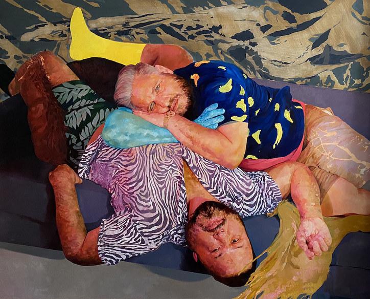
Curated by Monique Long, the show is a reflection of how the city has informed Cruz’s visual language and embraces systems of belonging and homecomings. The scope, in part, expands upon a decade-long dialogue and friendship between Long and the artist, who grew up mere blocks from each other in North Philly but only met in New York.
“That conversation evolved into talking about the ways in which we're born and raised, you know, affects the way we make and how we make,” shares Long. “ When the ICA approached me and invited me to do this project, I did have a lot of ideas, but to work with David Antonio, in our hometown, seemed like the obvious choice, and neither of us had worked in Philadelphia. So it just seemed like a proper homecoming, and in a way to sort of see the ideas manifest in a project together.”
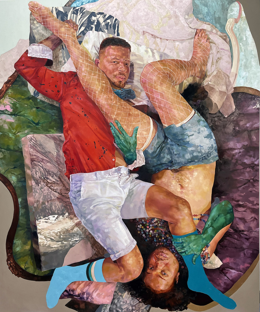
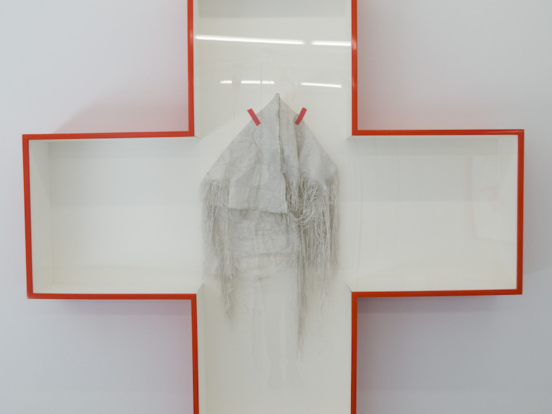
Together, Long and Cruz have created an exhibition that speaks to the artist’s ongoing commitment to community, home and joy. Monumental portraits for which Cruz is best known, offer an extensive representation of highlights and landmark moments in his career. Signifying an importation transformation in the artist’s practice, Puerto Rican Pieta 2006 is concurrently one of the first and last pieces encountered in the exhibition. The painting reinterprets Catholic iconography with tender yet forceful imagery of him and his mother. Intimacy and profound love take shape in details like their intertwined hands over Cruz’s heart and the way their clothing blends into each other.
Decadent chandeliers, custom wallpaper and bespoke fabric hold space for the “Project Room.” Cruz conceptualized the beginning of the exhibition as a passage to pause and reflect through the layers of his work. There’s a sense of performance in the decor, the walls are topographical in their nods to the northern parts of the city, shadows echo throughout, and interplay with the displayed works. There lies an affectionate oil on canvas of Cruz and his childhood best friend. Conversations unfold between his art and his personal history in Philadelphia.
“I find this moment becomes about celebrating with them as much as it is about my work,” shares Cruz.
Queer peers are depicted alongside their chosen families. Cruz paints an extension of their worlds, nesting his subjects in furniture created to hold and support. In thinking about the support systems that hold him up, the artist sought to create art as a historical marker. He documents community making visible queer worldbuilding and people of color in art historical canons that historically excluded them.
“It's almost a thank you to the community in a way for that support in that sense of survival.”
When The Children Come Home will be on view through December 17, 2023.