PRESENTE CONTINUO: the intimate ties between then&now

Starting May 30, PRESENTE CONTINUO will be available to purchase on presentecontinuo.com, cpcompany.com, and at the C.P. Company flagship store in Milan, Corso Matteotti 7.
Stay informed on our latest news!

Starting May 30, PRESENTE CONTINUO will be available to purchase on presentecontinuo.com, cpcompany.com, and at the C.P. Company flagship store in Milan, Corso Matteotti 7.

The platform makes it way easier for Black creatives to update and promote their work, and way harder for headhunters to leave us out of projects and left on the moodboards. Akin and Ousman’s prestigious backgrounds as multi-disciplinary artists have only carved out distinguished lanes for themselves whilst leaving trails for other Black creatives to follow. Pursuing the arts within the African Diaspora has never been a conventional conversation, but it’s getting more familar with the help of BlackTag.
Blacktag's launch on February 9 will only elevate the voices and economic power of Black artists and creators across the globe. In their promotional film, “Black Art is Black Money," starring notable faces including Parker Kit Hill, Jalaiah Harmon, Sage Elsesser, and more, we get a conversation attempting to educate the masses about Black history and how Black culture has been the catalyst for global trends.
Watch below.

Green's ongoing work, "Jewels from the Hinterland," a project featured in the New York Times piece “These Are the Faces of Tranquility,” documents “black and brown people in similar urban green spaces,” a project that feels both necessary yet fresh in its attention to the unexplored casualness of color, since so often when we as Americans are shown Black and brown bodies, they’re forced against landscapes, environments, and hues that are not natural, often because they are depicted by those who don’t understand what it looks like for such peoples to feel comfortable in space.
A breakthrough in the everyday experience and what is expected of the depiction of Black and brown bodies. Naima said on the project, “I wanted these photographs to assert and insert our presence in these tranquil landscapes, to interrupt the predominant narratives about people of color surrounded by urban decay. Beauty here is an entry point — it makes us stop and look, but it isn’t the whole story.” The genius of this project is found in its masterful subtleties. What happens to our minds when we see colors not often depicted amongst one another? What does it do to our realm of imagination when it comes to color and comfort with color? These are questions Naima asks us without words, just images, who taunt with their radiating nature—she makes the natural explicit.
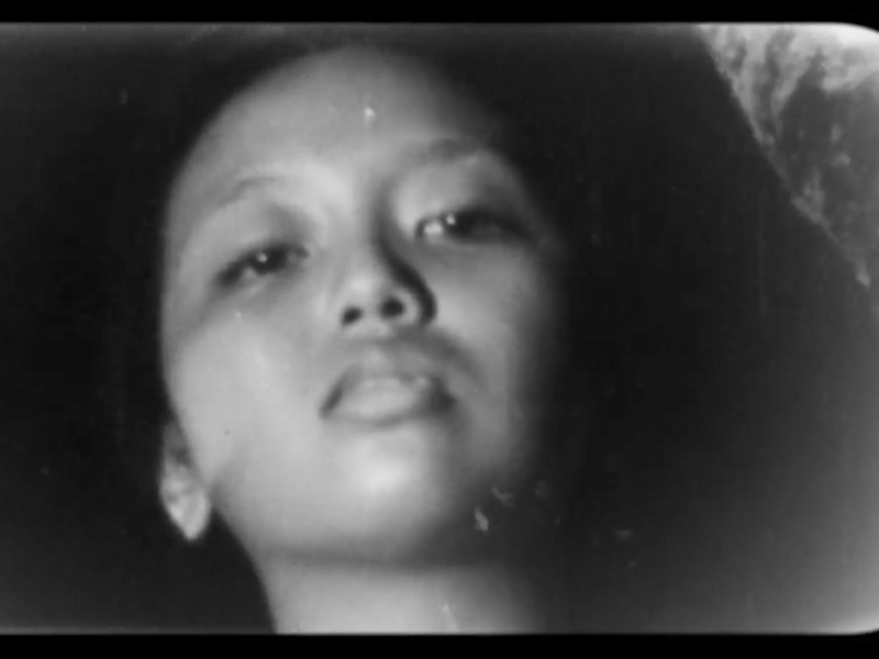
In her latest exhibition, 'Brief & Drenching,' at the Fotografiska New York, on view through April 18th, Naima puts her love and understanding of color on full display in the works on display, including her latest project Pur•suit: a 52 card photo deck depicting portraits of queer womxn, trans, non-binary, and gender-nonconforming people, inspired by the historic Catherine Opie’s historic “Dyke Deck” (ca. 1995). The show also features a film by Green, 'The Intimacy of Before,' a shocking and deeply tender art piece that is better shown not told.
I had the pleasure of speaking to Naima over email about process, shooting with Solange, and her thoughts on water in an interview that will stay with me for a while.
Installation view of Naima Green: Brief & Drenching at Fotografiska New York. Courtesy Fotografiska New York. Photo: Charles Benton
Hi Naima, how are you?
Hi Saam, it’s so nice to be connected.
What does the world around you look like right now?
I love this question. It’s a Sunday afternoon, I’m listening to Leo's Sunshipp after having a delicious and restful morning with my love. I woke up and started making pictures inspired by the light in our bedroom. We made breakfast together. I’m drinking a pot of genmaicha with rose. Right now, my world feels full of possibility. After a long dark spell, I feel encouraged to jump back into my projects again.
I read "Open Tabs Piece", about three times over, a beautiful work. As a writer, it excited me so much with its subtle experiment with word creation. How often do you find yourself living a normal day and wondering how regular action can turn into artwork?
The open tabs pieces are a way for me to keep records of what I’m looking at, what I’m searching for, what I’m seeking. When I’m feeling grounded and centered and open, every day is one where I see something that could lead to a work, an idea, a spark, a color story. But this winter transition is a hard one, and for the past couple of months, I’ve been focused on the pictures I make for other people. Today and the start of this year feels new in that way. This morning we played around with photographing an egg yolk as I was making pancakes. I’m feeling especially attuned to color. The Leo’s Sunshipp vinyl is the color of yolk. It’s gorgeous. And I’ve known it’s gorgeous for some time but today I really paid attention to it.
All that to say, I’ve been coming out of a deep fog and on the other side of it, every day is the beginning of a more intentional way of looking.
You recently shot your friend and collaborator Solange for Harper’s Bazaar in the monumental cover story she wrote in October, a beautiful and ethereal project. It seems that linear time was not an instrument in the creation of this piece—what conversations did the two of you have around the piece’s creation and its relationship with time?
Solange and I didn’t talk about her writing of this piece but we definitely created an environment that day where linear time was insignificant. What I appreciate about our collaboration was the time we took to experiment—she had one idea about the set design, we tried for a couple of hours to work with that idea but she ended up not feeling as connected to it. So we changed the plan, moved to a different area of the apartment, shifted the music, and kept the energy and process open enough for all of that to happen.
I wanted to talk about “Jewels from the Hinterland” an incredible project that was featured in the New York Times. You said in the NYT piece, “When I first started talking about the concept, one of my former classmates asked me how this work would differ from images of slavery. The fact that that was his only framework for imagining black people in nature was exactly what stirred me to make my first portraits.” What impact do you think the project had in reimagining what is possible with Black peoples’ relationship with nature within a recorded context? What did the project do for your imagination?
One of my clients often talks about dreaming as the key to world-making and expansive imagination. 2020 was oppressive in that way, so many of us couldn't think beyond the day or hour. I was too anxious to dream. “Jewels from the Hinterland” was my first long-term series and still remains key to how I remind myself that the worlds and experiences I’ve had and know to be true for me and so many others, need to be seen and documented, and reinforced. That work does so much for me beyond the act of representation. It brings in leisure, play, rest, and the pleasure of existing and being enveloped by nature into conversation with Blackness. While the work is slow in some ways (I think it’ll be a lifelong series), it accelerated my understanding of the need for these types of images and the ways that they can and do create disruptions and glitches in preexisting narratives of Black people within cities.
Making “Jewels from the Hinterland” also co-created an expansive community. I met and became friends with so many fascinating people through the act of picturing them and the experience that happens around that—often a walk and chatting for some time before I start the process of image-making. With this work, I am also interested in the mapping of people and places. I’m going to quote my friend, scholar Remi Onabanjo because she says it eloquently. “Entitled “Jewels from the Hinterland,” the series is informed by an interest in mapping urban sites, but in a manner that is more associative, than cartographic. Featuring landscapes selected for their relation to the lived experiences of her subjects, Green’s pictures render nuanced portraits of Prospect Heights Community Farm, Morningside Park, Brooklyn Botanic Garden, and Central Park as much as they do of poet Morgan Parker, painter Jordan Casteel, writer Collier Meyerson, and editor Jason Parham.”
Left— Self-Portrait (I like you), 2017 © Naima Green
Top right—Pur·suit (detail), 2019. Image by Megan Madden
Bottom right—Cynthia + Travis, 2019 © Naima Green
I looked through many of the photos from Pur·suit and read into your process behind the project, starting with your discovery of the legendary “Dyke Deck” during archival research. What does archival work mean to your process? How does your archive manifest?
My process is almost always in conversation with the historical. I see an object or a photograph and think about what it meant for that time but also how these images, for better and sometimes worse, can reinforce outdated ideas about what communities look like. I love archives and seeing material from times I’ll never be able to touch. From that point is often where my work begins. When I first encountered the “Dyke Deck” it felt like a delicate and glorious time capsule of lesbian life in the Bay Area. I looked around at the queer communities I’m apart of and those I’m not and wanted to hold and interrogate our joys and challenges. Language is critical in that endeavor. Pur·suit is named for its active nature; there will always be new and ever-changing pursuits as culture and policy shifts.
I often photograph the people around me over and over again. I love my friends and seeing how they change as we make pictures over time but Pur·suit allowed me to introduce a new process in how I “cast” people. It was the first time I had an open call. The ask was directed at people who identify as trans, non-binary, queer womxn, and gender nonconforming because the language we use and have now for gender identity is growing.
My personal archive is a source that I’m working with right now for a new project, Skin Contact: an experimental prototype archive that is a conceptual cousin to Pur·suit. It will hold some of the new Pur·suit portraits I made in 2020 while a Session Artist at Recess. My time there was cut short (I only made 9 of the 80+ portraits I anticipated making) because of Covid. So I challenged myself to include more of myself. You’ll find ambient photographs shot on my iPhone, more textural pieces that give glimpses into what life is and was like in 2020 for me and those who opted into sharing some of their life, and how we are getting through this time.
I was interested too in your attention and to intimacy and touch in your work. I read that you gave your subjects some creative freedom in how they wanted the shoot to go. When directing a work like Pur·suit, how much involvement do you have in depicting the tenderness in a piece like this? How have you been surprised by what your subjects chose to do when you built this piece? What was it like shooting the project during quarantine and how did it affect your sense of touch and closeness?
While the work is ongoing, all of the portraits in the deck are from a selection of 100+ people who sat for the project in 2018 and 2019. Fortunately, that was a pre-quarantine experience so I was able to touch and work closely with people on set. Nearly 70% of the people who sat for Pur·suit were folks I was meeting for the first time that day. Creating an intimate and comfortable environment did a lot of the work in the success of those portraits for me. I worked with Toby Kaufmann and Jessie Levandov to create a set that felt both elegant and cozy.
I continue to commit myself to portrait making because it forces a presence of mind and body that pushes me to show up in the best way I can. I also have the opportunity to start anew (in some ways) with each image, to allow people to show up as they are and as they feel in that moment, and to hold that time for both of us. The portrait doesn’t become a fixed representation, it becomes a small part of the story of a person.
I watched your jaw-dropping film The intimacy of before on display at Fotografiska New York with your show Brief & Drenching which includes works from Pur•suit. There is so much to say about the film but I will let folks go see it themselves. I wanted to ask you though, what is your relationship with water and how did you want water to impact the work in The intimacy of before?
You hear the refrain echo throughout the galleries “I need the water. I need the water.” I learned to walk and swim at the same time before I was one year old; swimming and water have always been integrated into my life. I’m also an Aquarius… so there’s that. I can’t fully express at this moment how deeply I love the ocean, the salt, feeling so small, buoyant, and connected while swimming.
But really, when I think about what soothes me and what brings me overwhelming joy, it’s the water. The intimacy of before is my first video piece and we (I worked with longtime collaborator Jessie Levandov who co-directed and edited the film) made it in quarantine. There were a few moments last spring, at the height of the pandemic on the east coast in late March (when toilet paper was sold out in my neighborhood and those nearby), when I hadn’t seen anyone in weeks and was kind of reeling, a friend brought me to the beach and for those few chilly hours, I felt alive again. I want the water to be that source of renewal and throughline throughout the film.
When you imagine a forthcoming dream project, what do you see? Where are you? Who are you with? How do you feel?
I want to make another experimental film in Martha’s Vineyard (a place that has been a longtime home and source of renewal) in the spring or mid-fall. I’m with Jessie (Levandov), I’m with my girlfriend, my closest friends, and we’re in and around the water. I’m beaming, I’m sunkissed, I’m laughing so hard I’m crying.

The show opened at Maximillian William and I feel like we need to acknowledge that it’s virtual even for you because London went back into lockdown the same day. You made the paintings in quarantine, right?
Yeah, they were all made this year. The show that you curated in New York was March, early March?
Mid-March.
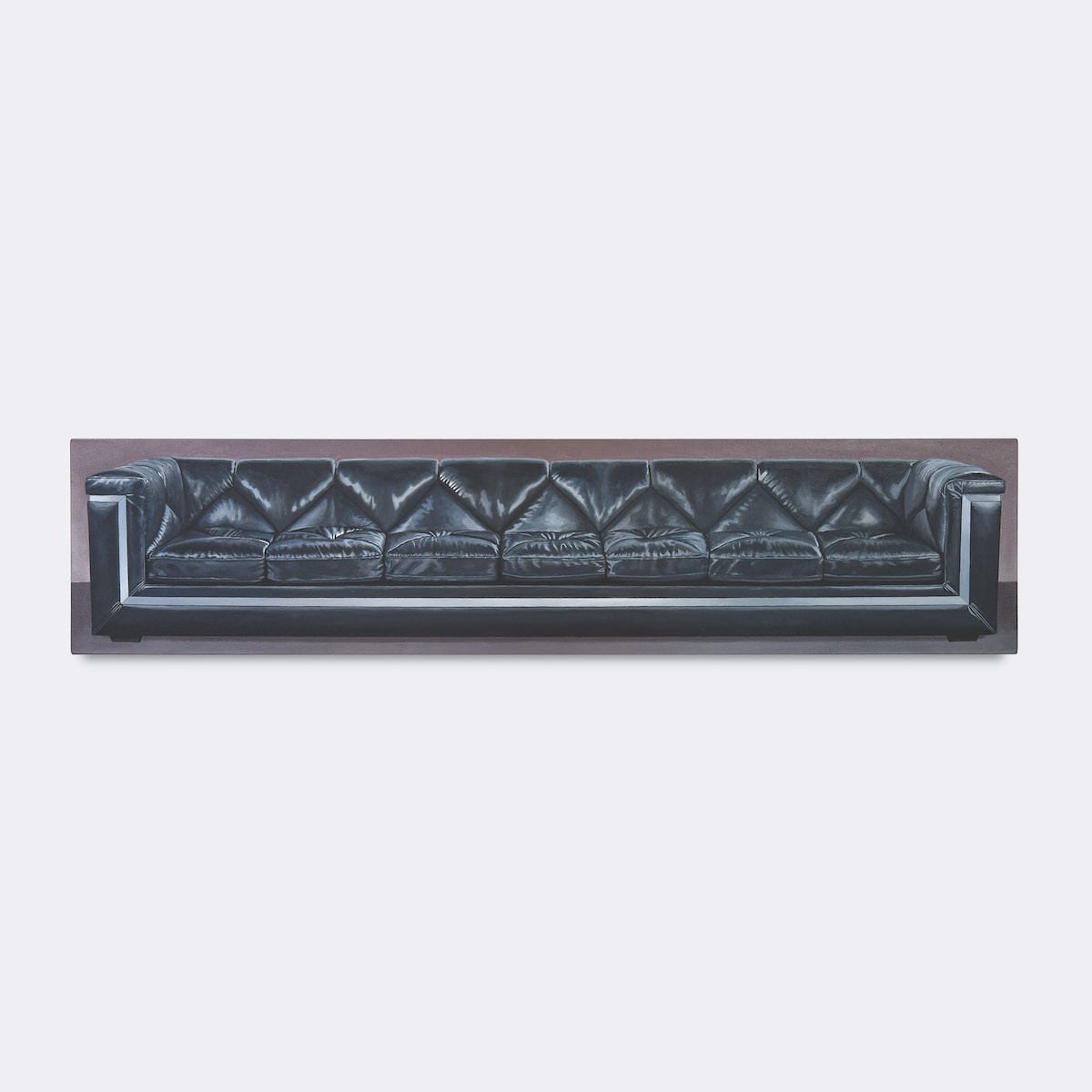
They were made entirely in quarantine, in my house. A lot of the research I did for them, finding reference photos, was done online. So, it wasn’t based on couches I was seeing “in the wild."
You weren’t couch shopping?
I wasn’t going to furniture stores, although I did try taking photos of couches in my own house, but they weren’t the right style, or the photos weren’t good enough. You need really good reference photos to paint something if you want to get details in it.


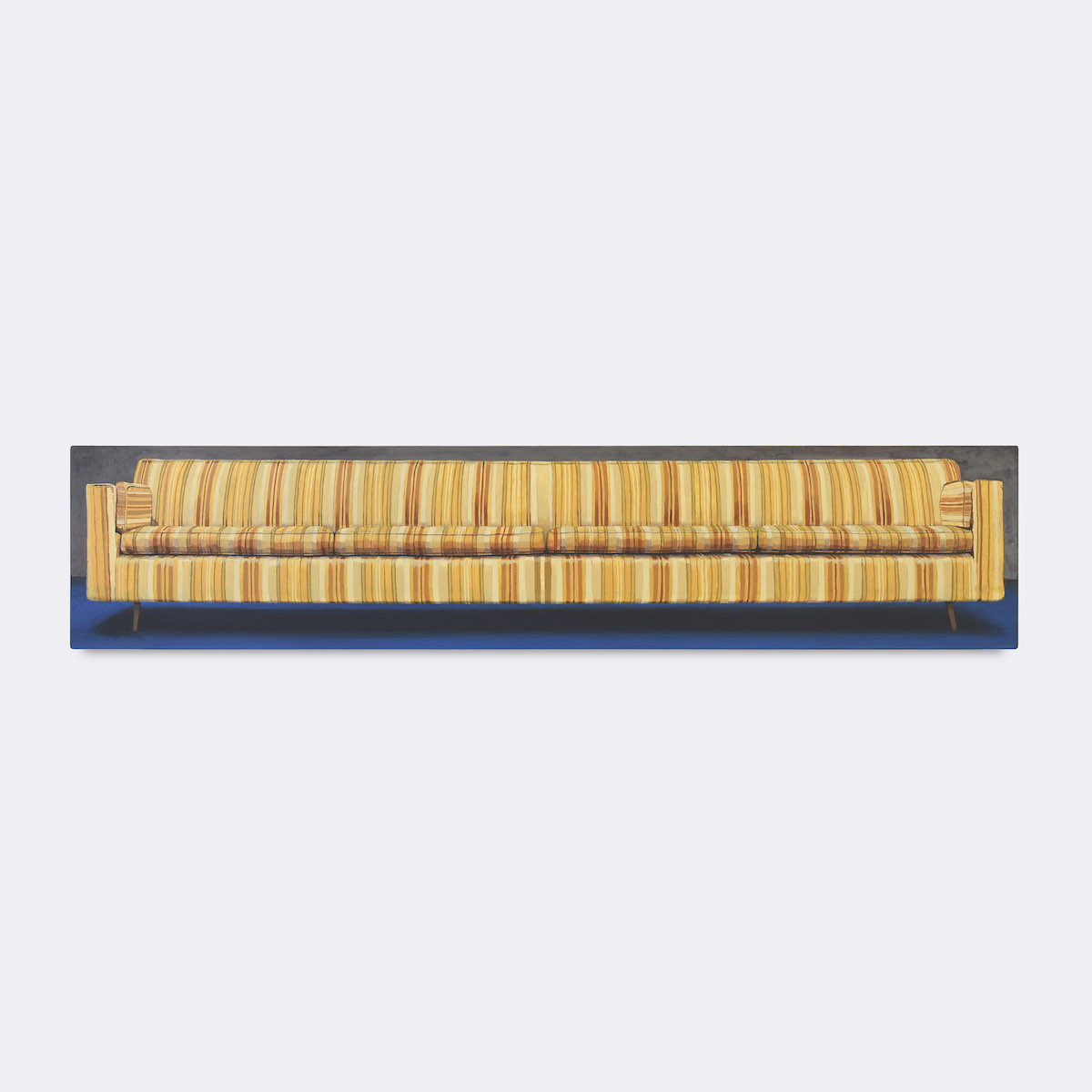
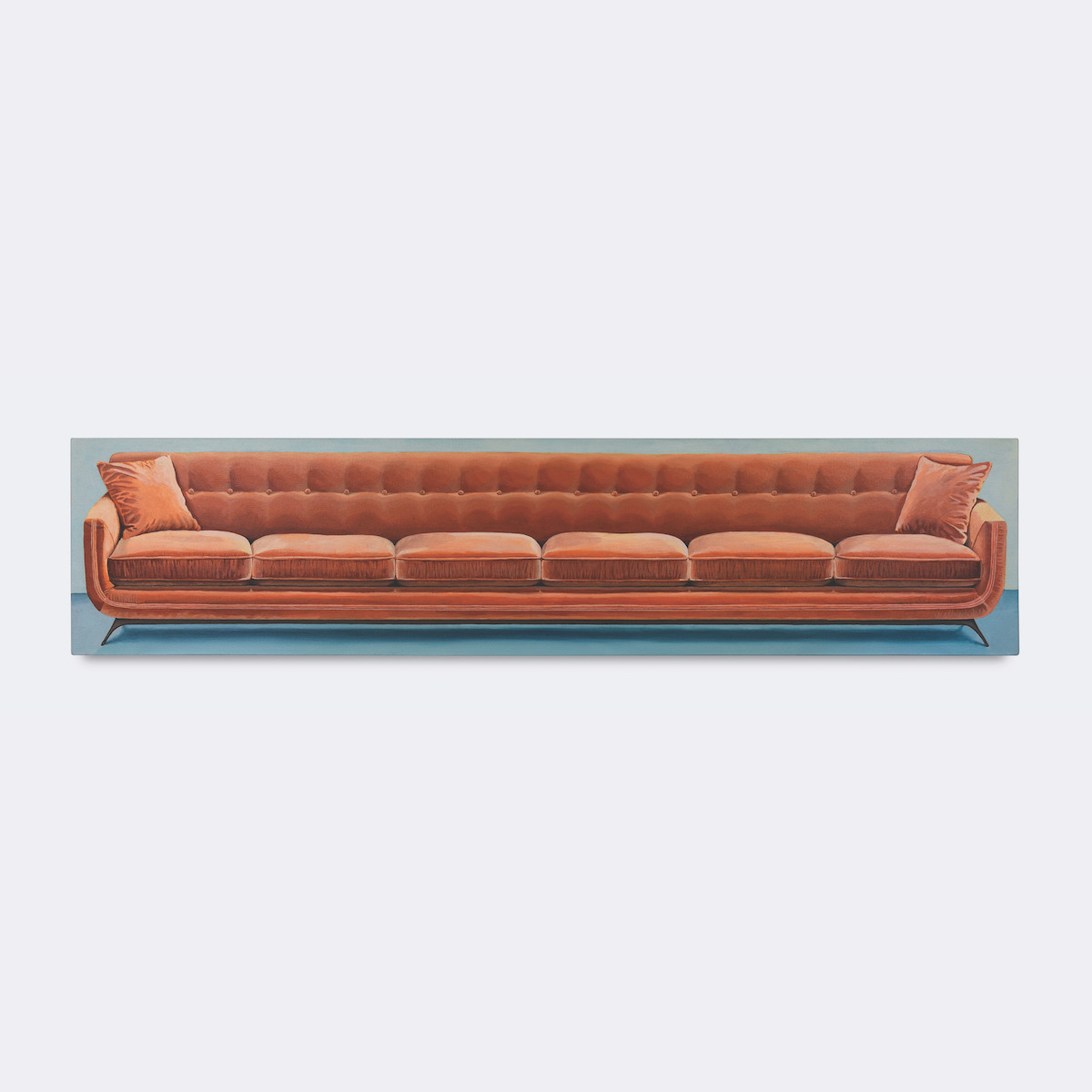
Left — Barcode Couch, 2020, Acrylic on Canvas, 10.27 x 48.07 x 1.57 in
Right — Ear Plug Couch, 2020, Acrylic on Canvas, 11.18 x 48.03 x 1.49 in
The couches in the paintings are mostly drawn from the 50s-70s. Furniture then was a big investment and a statement of personal taste and status. Why that era? What goes in to how you choose which couch to paint?
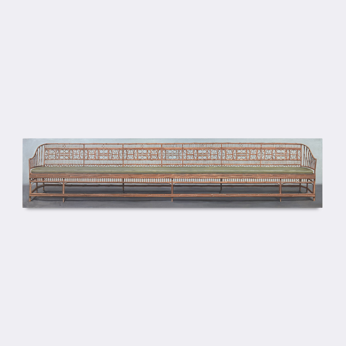
I’ve got written down what style or time period each couch is from and I realized maybe half are vintage and half are contemporary, and I basically skipped the 80s through 2010, just a whole 30-year block of time. Based on the style of the couches I wanted a variety of patterns. The yellow one is the most obviously ‘retro’ because it’s yellow and striped and I don’t know if they really make couches like that anymore. The green one, the yellow one, the blue one and the bamboo one are all older and the other ones are more recent. Maybe the orange one also looks like it’s older too.
That one could be –
It could be either. That one’s contemporary it just looks like a weird style. But one of the main things that narrowed it down was the literal shape of the couch, because I was trying to fit them into the canvas shape. I tried doing one with rolled arms, which is basically when the arms are lower, and they’re curved outside. It works best when the sides of the couch are boxy to match with the canvas. So that was a formal decision of what I wanted them to look or feel like. I don’t know about your childhood home, probably it was the same as mine- the couches I grew up with were very comfortable but very bulky, very puffy, frilly.
Lacy.
Not necessarily lacy, but we had a floral one, I loved it. I don’t think people would pick couches like that now; a little gaudier. I wanted there to be space between the bottom of the couch and the floor for the shadow. It works better for the paintings for them to be a boxier, narrow style than something puffy.
We spoke earlier about how many millennials have a different relationship to furniture—it’s either expendable or in a shared space and not even really ours.
My house has 6 couches. And they’re all... I don’t know where they came from. They’re just kind of there and it’s impossible to move them.
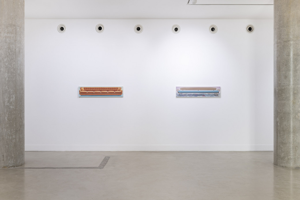
Installation view, I Would Love You If You Looked Like This:, Maximillian William, London, 5 November 2020 - 9 January 2021
The dominant trend in interior design is the “millennial aesthetic”. White walls, gray couch, too many plants. Are these paintings a rebellion against that?
I don’t think of them as being rebellious, they don’t feel like rebellious painting to me. But you’re right, the backgrounds don’t match up with that aesthetic, which can be so blank. I tried to specifically have the couch fill up as much of the canvas as possible and not leave room for anything. I think that aesthetic is about having open space, it’s more about potential—or millennials have this focus on being productive, so the spaces are open for that. I don’t know, I have way too much stuff to have that look for my apartment and everything I buy is off Craigslist.
I think it prioritizes open space because there’s so little of it to begin with.
Yeah, everything’s compact or folds up.
Small, neutral, and that goes back to the paintings being grandiose selections, especially the bamboo one. The paintings are eclectic and it goes totally against what couches are now. They’re either ignored or purposefully unnoticeable.
Yeah, it was nice to actually look at furniture. I never look at furniture because I’m always looking for what is available and cheap. These are all couches that I would never actually buy, but I get to make a decision about what I want to look at instead of the furniture that I actually own, which is based on convenience and availability. It’s nice to actually pick out furniture.
A part of the magnetism of the couch paintings is their unique shape. They have a sense of neat, formal solution. Form and content are merged. Is the canvas long because the couch is long, or is the couch long because the canvas is long?
The couch is long because the canvas is long. The original pink couch painting was that long because it was a text painting before it was a couch painting. And it was a really bad text painting that I just needed to get rid of, and it was just sitting in my studio for years and I thought -- I have to do something with this or throw it away. The couch was a solution to that problem. Haha. Worked out great!
Before these, there was another painting that was text above a couch. A captioned image, if you will.
Oh yeah yeah, that’s how I got the name for this show too. That was originally a sketch that I did in a manically depressed post break-up state. That’s a personal story, but that led to the original combo of the title and the couch where it was a really gross couch mixed with words and I was thinking “She would love me if I looked like a couch," but not a person. I also listen to this dating show. And they have something they say on the show—that you’re competing with someone’s couch when you’re starting to date, because, “I could go on this first date, or I could stay home on my couch and watch Netflix,” which one is more appealing in the moment? Maybe staying home is the better option sometimes.
The paintings are certainly surreal. There’s so much ambiguity to how they could be interpreted. Either room for everyone or a sad distance. To me the art history lodestar here is Magritte. Are the surrealists important to you? What are some influences?
I: I like the surrealists. They’re cool. Magritte’s a cool guy. I don’t think he’s necessarily an influence, but I have some other people that I like a lot. Maybe more of a contemporary surrealist—Seth Alverson, who is a painter that I met in Houston. He’s probably my favorite painter.


Left — Bamboo Bench, 2020, Acrylic on Canvas, 11.18 x 48.03 x 1.57 in
Right — Sawtooth Couch, 2020, Acrylic on Canvas, 11.22 x 47.99 x 1.57 in
He paints the fleshy hands and feet.
He paints a lot of weird, dark—in the past he’d done some amputated limbs which is a mental thing. I think about that too sometimes when I get anxious. I kind of imagine cutting off my hand or something. But that’s just another story for my therapist. I relate to him; he paints really great depressive imagery that’s kind of surreal, and I also love the way that he’ll single out a thing and just paint that one thing with a bullseye composition where it’s something gross in the middle. I was specifically looking at his backgrounds, because I don’t necessarily want the couches to be in any specific space. They’re ambiguously inside, outside, it’s not really clear, it’s more of a mood than a place. I do love his work. And the other guy is Domenico Gnoli, who does, the thing that I like that he does is really close up details. Again, he’ll focus on one thing like a button on someone’s shirt or someone’s hair and the way it curls and look really specifically at one detail. Those are my two favorite people that I’m looking at now.
The common denominator of focusing on one object.
And they’re surrealists, but they’re not like the typical Dali and Magritte.
What is Houston’s art scene like?
The art scene here is good, although I haven’t gone out in the last 7 months. I’ve been to the Menil and they have a nice park. One of the main things that I’m enjoying now is going to sculpture parks and that’s always been the case. Shout-out to Moonmist which is just in this guy’s backyard in Houston. Sweet Pass Sculpture Park in Dallas, The Nasher obviously, and Laguna Gloria is great.