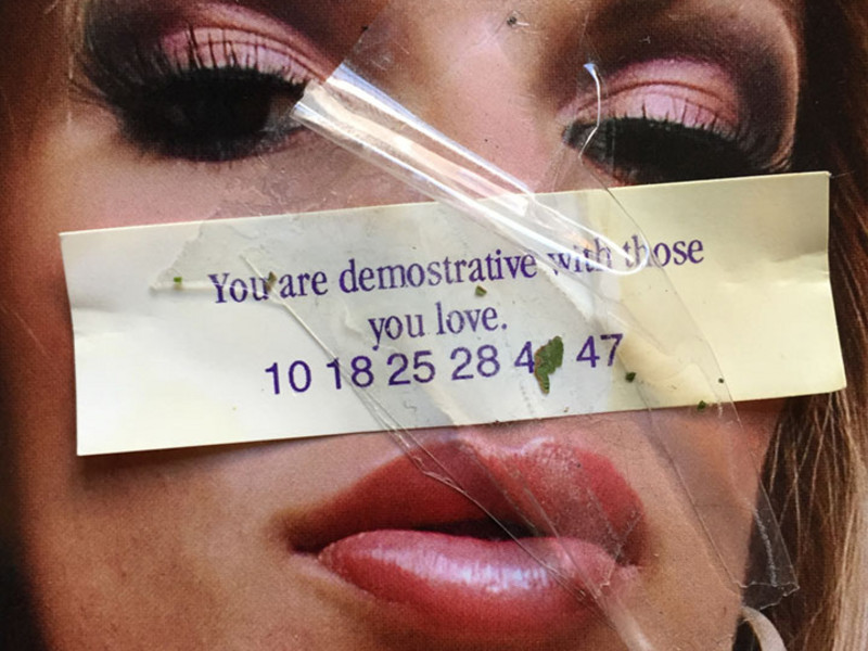
Stored
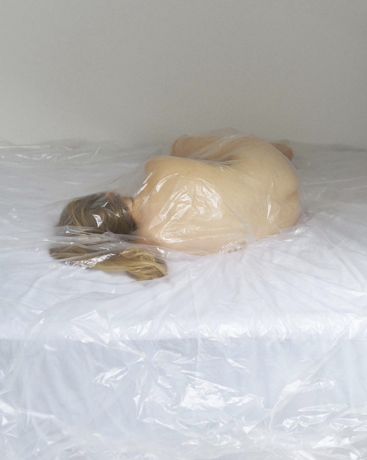
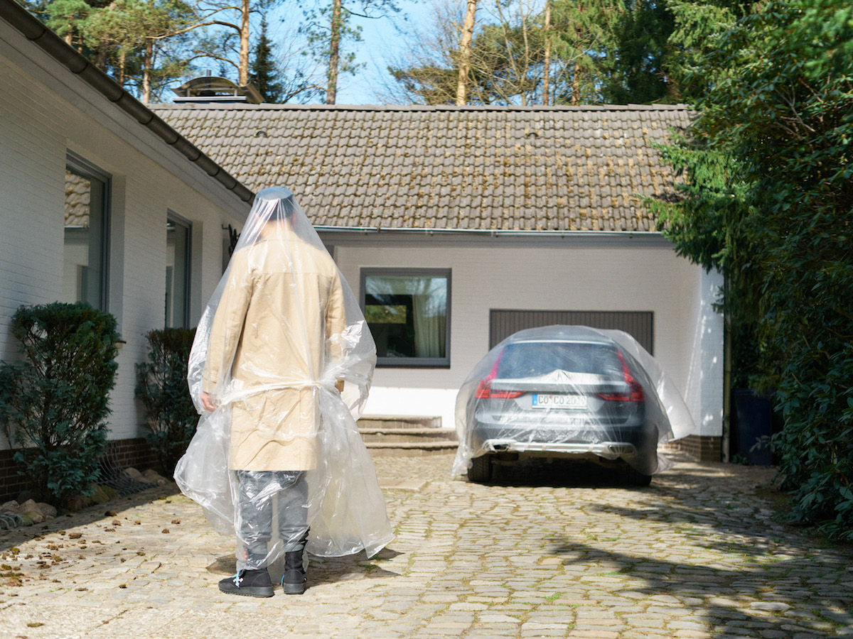
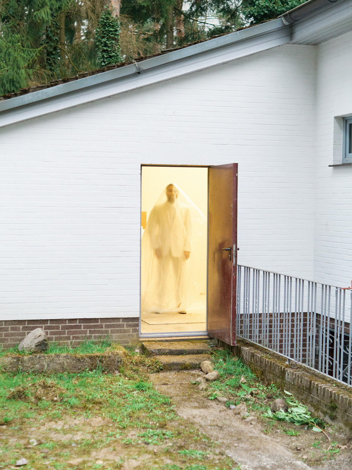
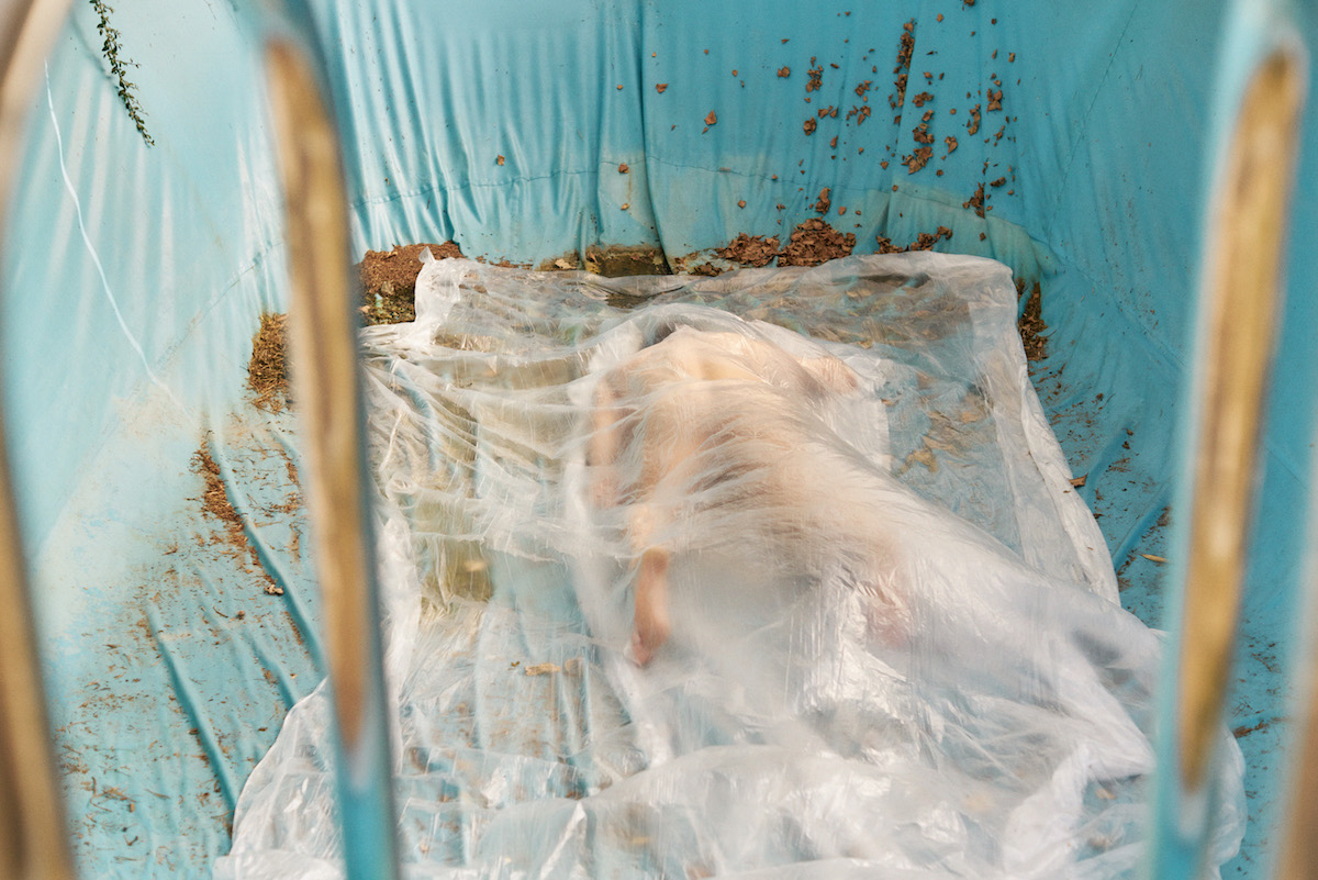
The series produces an eerie prediction for what's to come. "A day in summer 2020. Social isolation has become normal. The new disease is called hypochondria," says Roché.
Check out the rest of the series below.
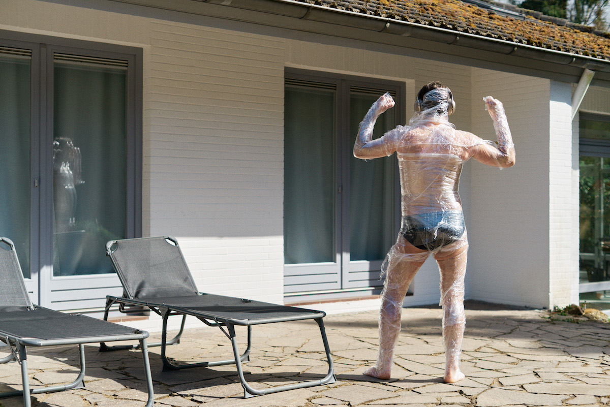
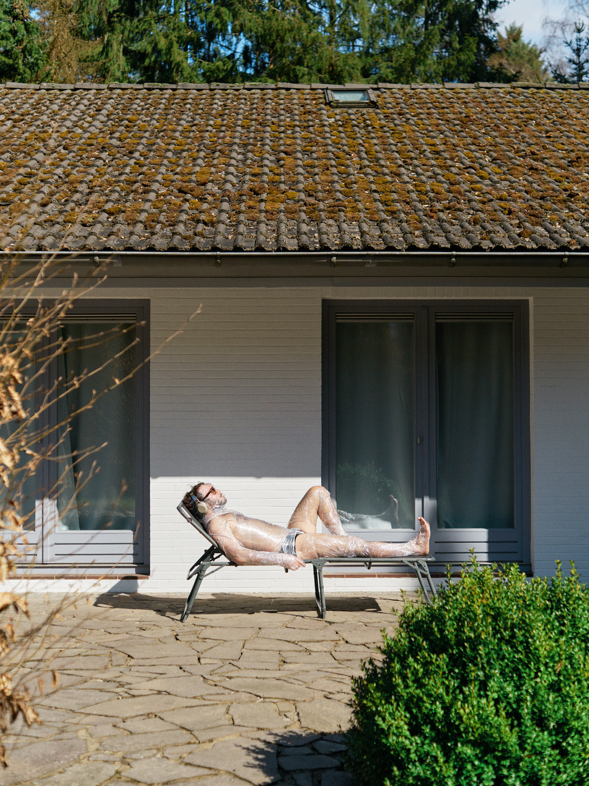
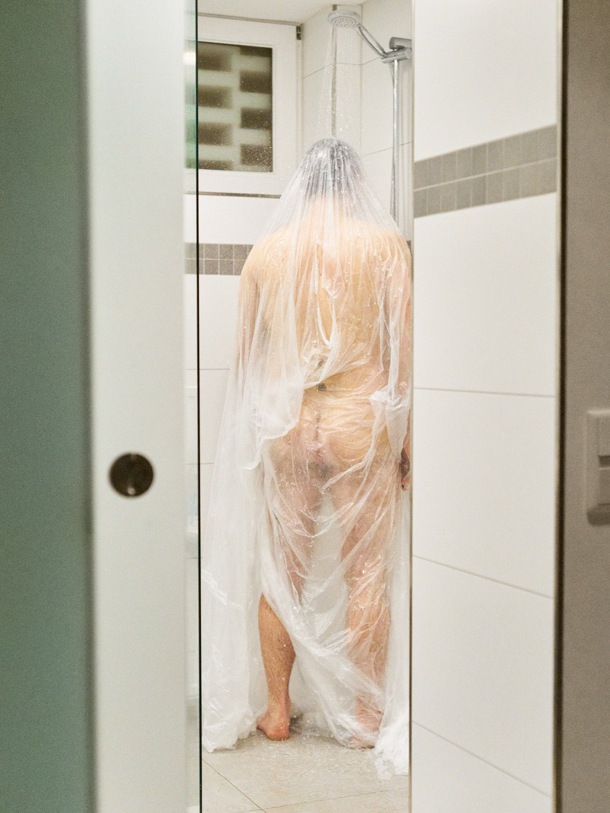

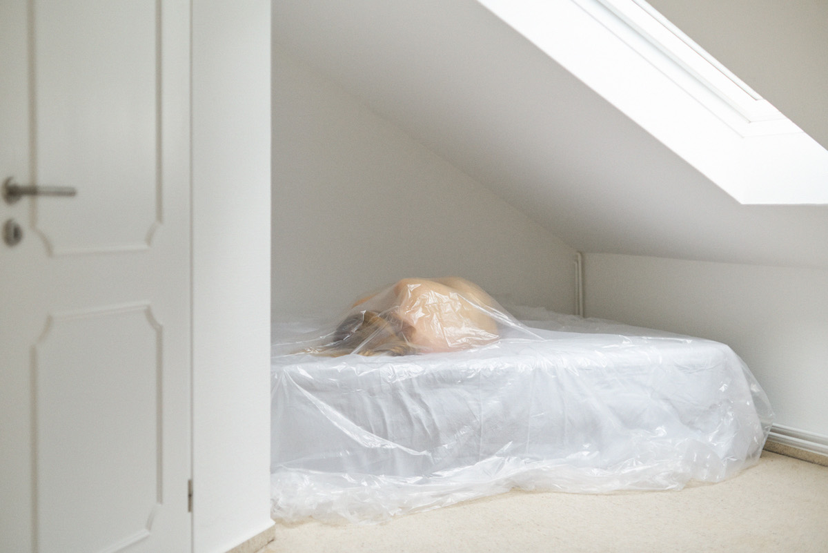
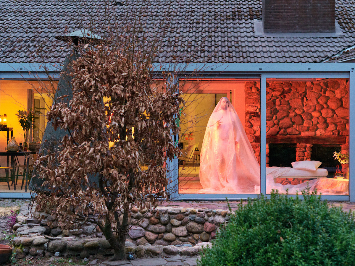
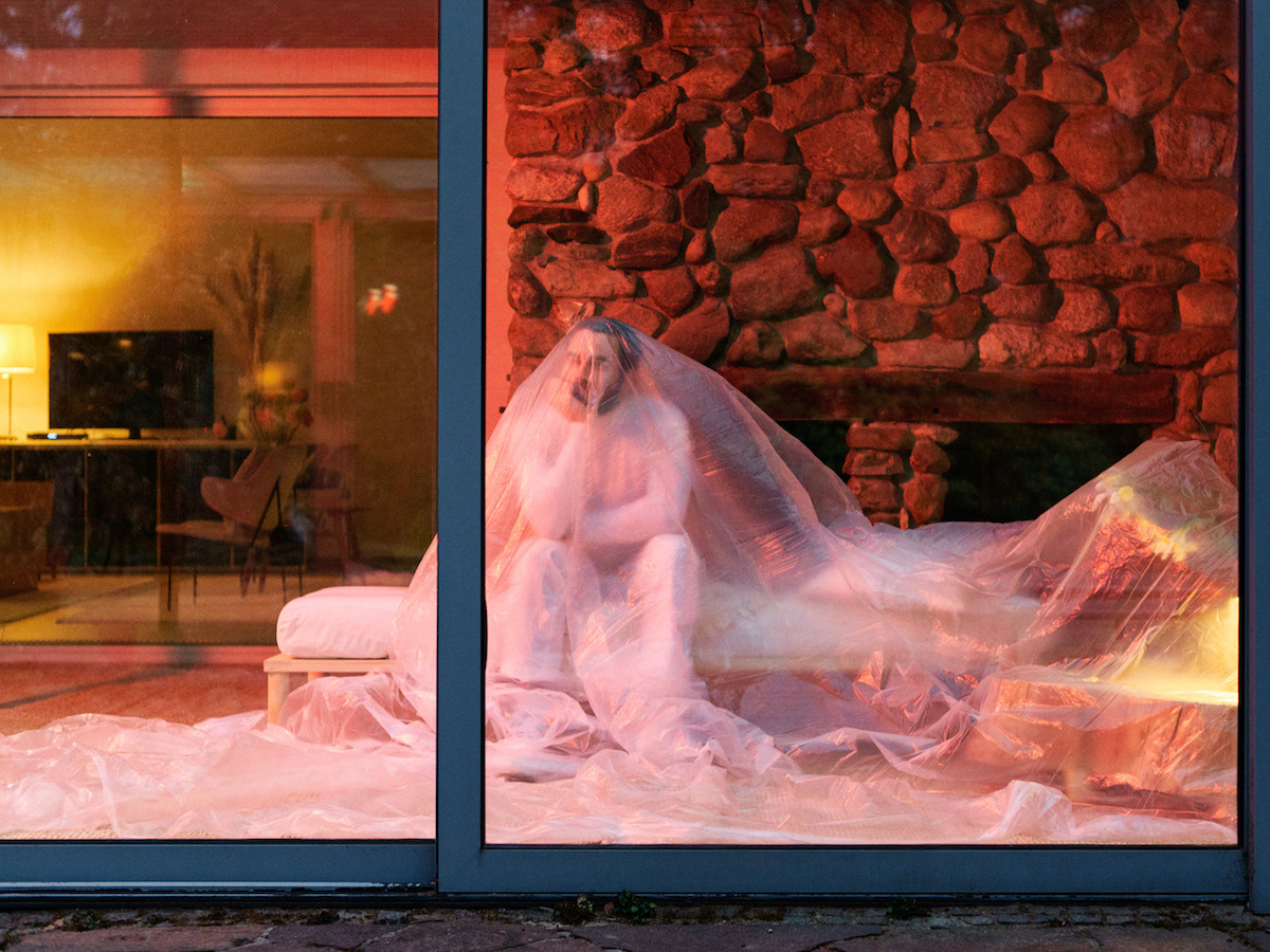
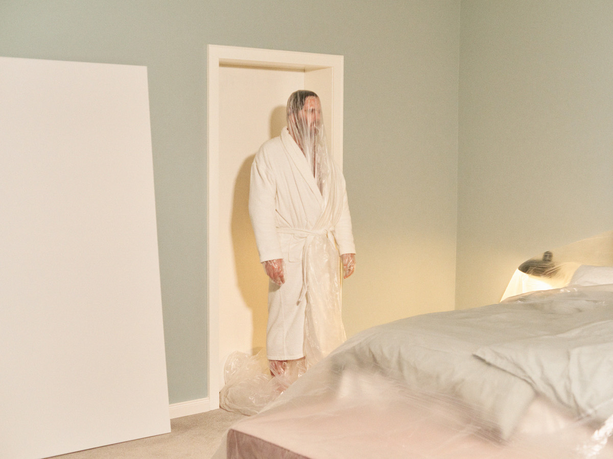
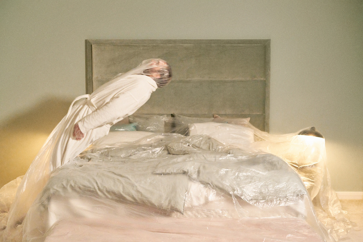

The series produces an eerie prediction for what's to come. "A day in summer 2020. Social isolation has become normal. The new disease is called hypochondria," says Roché.
Check out the rest of the series below.
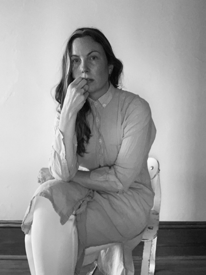
LOVEISENOUGH, whose work has been featured in Vogue, Architectural Digest, T Magazine, and more, has always been something of an enigma. Their identity eschews eponymous branding for a dreamlike title that calls to mind a line from a letter or a film script more than the title of a design firm.
And this is exactly what Daye had in mind when she first named it: “I’ve always felt so comforted behind a pseudonym like LOVEISENOUGH, because it's less of a brand and more of just a message. But it's not even original: It's from a poem by William Morris. So it's kind of invisible. It's like borrowing someone else's identity in a way.”
“Love is Enough” by William Morris
Love is enough: though the World be a-waning,
And the woods have no voice but the voice of complaining,
Though the sky be too dark for dim eyes to discover
The gold-cups and daisies fair blooming thereunder,
Though the hills be held shadows, and the sea a dark wonder
And this day draw a veil over all deeds pass'd over,
Yet their hands shall not tremble, their feet shall not falter;
The void shall not weary, the fear shall not alter
These lips and these eyes of the loved and the lover.
This kind of sentiment — that design can be driven by a message — isn’t new, at least in the context of design history. Highly influential historical institutions like Archizoom Associati and the Bauhaus have always been driven by a message or a feeling: larger ideas like “Superarchitecture” (Archizoom) or “Functionalism” (Bauhaus) guided their work and can be seen to this day in their enduring legacies.


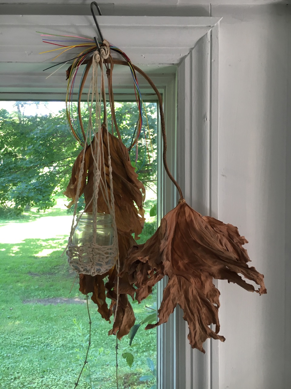
New York residence by LOVE IS ENOUGH — Photos by Marco Galloway
At its heart, design is the embodiment of an abstract concept. Its true magic lies in its ability to crystallize an idea, transforming it into a tangible entity designed for daily life.
But what is this message — this idea of “love is enough”? For Daye, it seems to come down to a generosity of spirit: an orientation toward creating design that embraces the human experience and isn’t afraid to grow alongside it. One look at the studio’s work and you can see this in action: terrazzo made from discarded brick that recycles history into something new, walls that embrace their natural roughness and form myriad shadows when the light hits, wood that reveals its age like a badge of honor.
Texture in its own right is a sign of humanity, as Daye tells it. In the age of “aesthetic”, creating spaces that are meant to be experienced firsthand is something bordering revolutionary.
“If we just think about the human body, in 3D space, and all our sensory aspects of how we perceive space, you get to a deeper intuition: what feels right or wrong or what is right or wrong,” shares Daye. “These instincts have been built over hundreds of thousands of years … and that's what makes someone like Gaetano Pesce’s work [special] — and [the work of] many of our other peers and friends who are making things that are not so much in the realm of like conventional tastes, but have this textural element: you look at it and you want to touch it.”


“I remember teaching at Pratt and one of the students at the end of the semester was like, ‘You know that you pick up every sample and smell it?’ And I was like, ‘Oh my god, I do do that.’”
For the designer, this level of personality in design transcends even the physical. The integration of identity as a core design principle is of high value for Daye, who views our unique self-conceptions and histories as integral to good design. “There’s so much diversity in the world — I wish there was more identity expressed in design. We could bring in so many influences if we didn't just default to the white male European [style], like just Corbusier."
At the end of the day, it comes down to challenging the status quo: having a growth mindset rather than a fixed one. And same goes for the studio itself as they undergo a kind of rebrand. “[We’re trying to] make it reflect more of the spirit [of “love is enough”]. I had made it all very cryptic when I started the studio — now we’re ready to turn a little more outwards, to be more apparently open.” For Daye and the studio, this has looked like sharing a wide range of influences on social media. But as far as the name goes, she still values the message-driven aspect of their identity. “I want to have myself for myself, and not be a commodity. It feels almost sacred to hold [my name] back.”

Hers is a sentiment shared by many. In the midst of all the fluff, there is a very real influx of very authentic design expression, both online and off. Design exhibitions here in New York are just as likely to take place in a Navy Yard workshop or Bushwick loft as they are in a Chelsea gallery. One of our twenty cover stars for this issue was the icon Gaetano Pesce himself. Young furniture makers find themselves invited to fashion shows and downtown parties, and makers eagerly share their DIYs on social media and beyond. The energy is infectious — the future is full of promise.
And the key to it all? Always trying something new. As Daye wisely put it, “Hey, what if I broke that rule?”
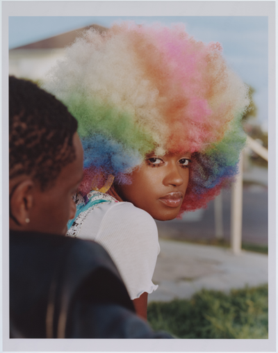
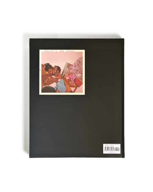
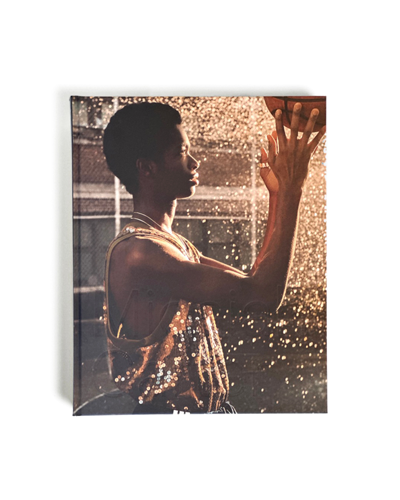
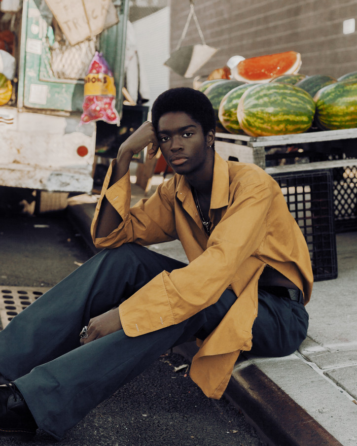
As a force for change, Carter is part of a creative juggernaut that has openly worked to create a more inclusive space for Black people through his work, and his latest photo book is a case in point: titled Micaiah Carter: What’s My Name, it’s a visual anthology that covers over ten years of Carter’s career, drawing his personal and professional trajectory with found family albums photographed by his parents.
Guided by a near-to-real obsession over chronology, Carter carves a path that steps in and out of time, depicting the moments of Black life that characterize his ancestry, past and present. “They have their own power,” he says, “but this book is about uplifting their potential and shining a light on them. I think this process inspired me to do such work because a lot of my family and friends inspired me to shoot photos when we were together, and what I found interesting was that these subjects wouldn’t necessarily be represented in contexts like that of fashion.”
With a deliciously bottomless reservoir of ideas, he speaks unabashedly when translating his experience as a Black man into his photographic practice. “I believe it’s something that I had to learn,” he says, “because growing up there wasn’t a space for me to see people who could have helped in understanding what the color of my skin meant behind the camera. It wasn’t right before I went to New York that I was speaking to a friend who asked: ‘Do you realize you’re a black photographer and how much power that has, for the simple fact that there’s not many out there who speak volumes on representation and have a platform?’ At the end of the day, I feel like I’m just myself and I try to use as many influences from my own childhood and family in my own history and bloodline to create what I’m creating today.”
Grounded in the knowledge of identity and selfhood, the book chronicles a tapestry of photographs that punctuate a through-line between different moments in Carter’s journey, navigating through the 1970’s fashion and palette captured in his mother and father’s snapshots. In one spread, a snapshot of a boy cloaked in a bright yellow barber’s cape poised as a woman shaves his hair—shot for Baby Boy, a collaboration between Carhartt & Manual NYC—is paired with a polaroid from 1982 of a youth sports team, boys huddled around their coach dressed in yellow jerseys and striped knee-high socks.
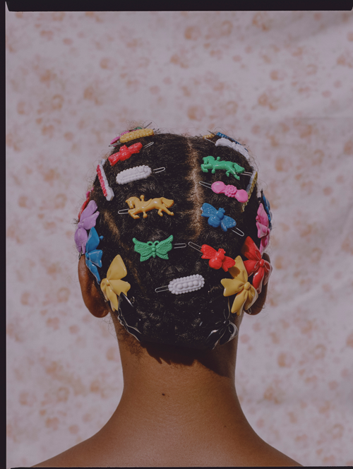
In another, a wealth of school portraits taken between 1965 and 1972 is juxtaposed with a photograph of the back of a woman’s head—her hair ornamented with multicolored berets in the shape of butterflies, horses, and bows. With Carter as their connection, these images spark a dialogue across time, lives, and communities, celebrating the great dimension of black identity in America through the medium of photography.
Truth be told, the portrayal of Blackness has been weaponized by the Western (read: white) gaze for centuries, and it seems like we’re only starting to detoxify the myths around Black people — by way of empowering their truest essence — in recent times. However, at any rate, Carter does not stray from the honest messages he wants to convey through this body of work.
“The main point I want people to take away from this book is inspiration!” he freely admits, with no signs of peacocking braggadocio on display. “I think the photos in the book strongly range from people that no one will really know if you don’t look into the index, to others that are world-renowned; and personally, I think all of the captured subjects are part of a phenomenal scope of Blackness, because America is linked to the ideal that it takes a lot to dream. But when I think about what the country has done to Black individuals over the last century since they got here, I hope this book acts as a tool that doesn’t stop one from dreaming of having the same opportunity and visibility as the rest of society.”
And just like Carter, who by the end of our conversation matured a tone from softly-spoken to downright powerful, I very much hope the same.

I want to hear a little more about the process of your book. What birthed the concept?
I was promoting a scene called “Dos Dos” that I worked on with my friend Joey in Mexico. Then I met Emilie and gave her a copy and invited her to the show. She was living in New York and we became friends. One day, she came to me with the idea of a photography book and so we started the project in 2019, before the pandemic.
What made you choose Harlem?
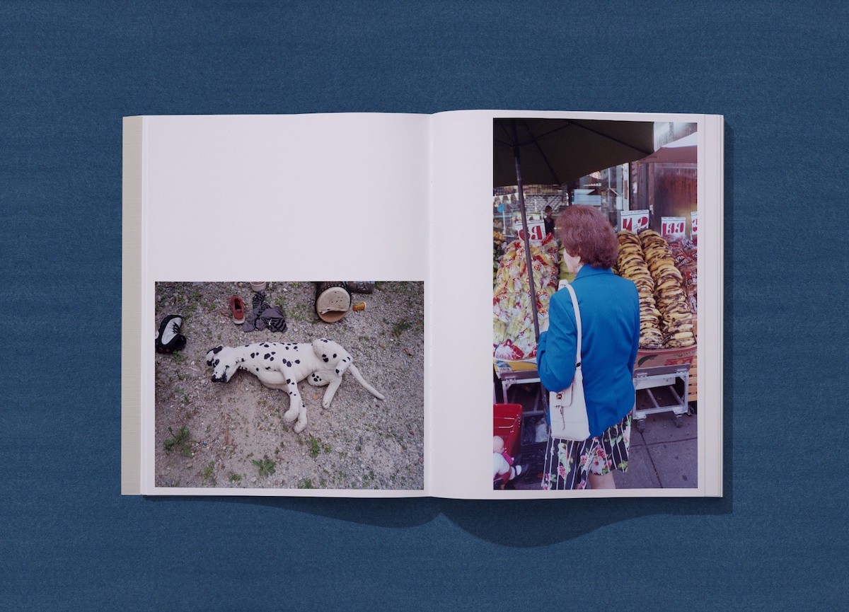
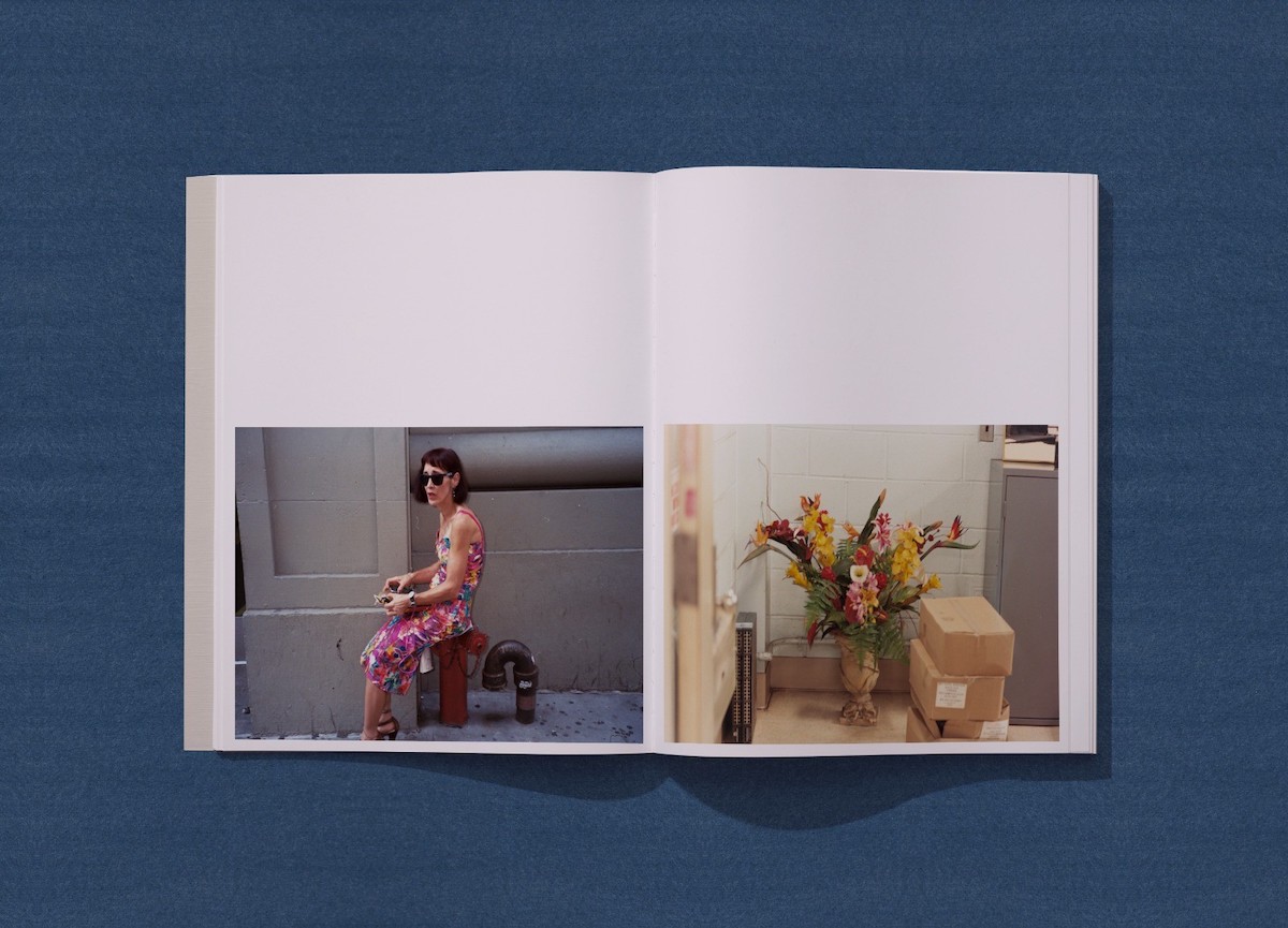
There’s a lot of beauty in Harlem. I lived there for a long time. It’s a neighborhood that's constantly changing. While living there I was photographing everywhere I went, even coming in and out of Harlem. There’s some photos in the book of the train which emphasize the changing beauty of everyday life.
That’s so interesting. Tell me more about “changing beauty.”
Well, subway cars are constantly changing. Who knows? Maybe in ten years, we’re not going to have these cars anymore because they’re getting modernized and more sophisticated. So I wanted to capture that.
Describe Harlem in one word.
Blue.
That leads to my next question. Why “Strong Blue?”
It all leads back to my grandmother. When I was a kid that was the word she used for jeans. So whenever she wanted me to wear jeans she would reference them as “strong blue” in Spanish. Naturally, blue became my favorite color.
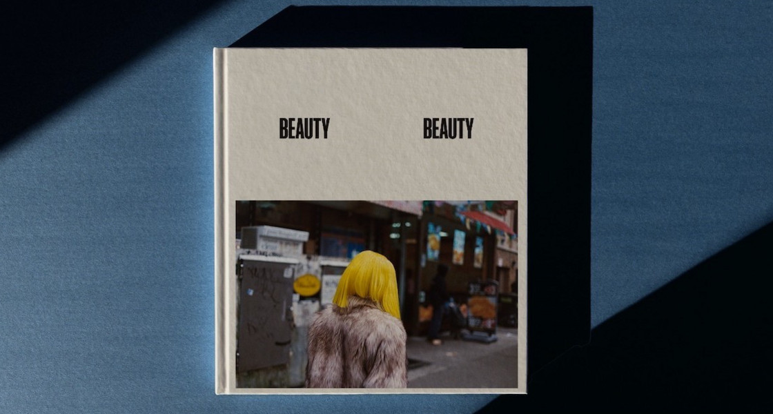
How did you come up with the title, “Beauty Beauty?”
At first, we thought of naming the book “Harlan Days” but then we looked at some of the photos and focused on one in particular. It’s sort of blurry and there’s a lady there with the most beautiful eyes that I always see in the same spot, reading. I’m not sure if she’s homeless. But for some reason, there’s this sign behind her that says “Beauty Beauty,” and I liked how the blurry quality fit with the doubled nature. It worked with the idea of seeing beauty in things that are not necessarily beautiful.
How would you define beauty?
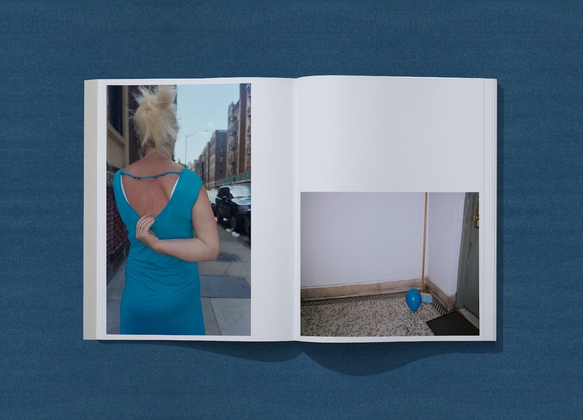
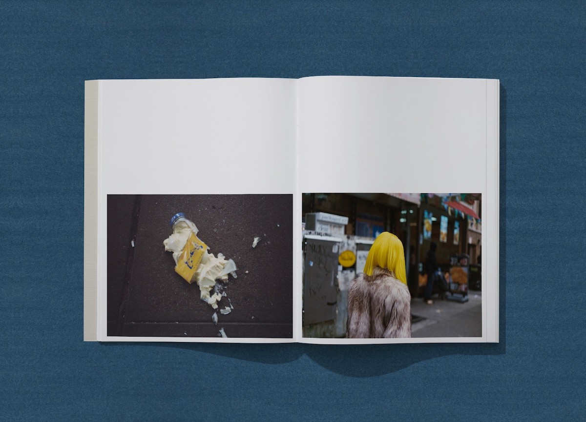
Beauty is different to everyone, right? For me, it’s something with a unique color and texture. For example, today I was walking and noticed this rich, red tomato on the ground. It was broken. There was also an empty box of McDonalds right next to it. I took a picture of it and it all worked together. Tomato… ketchup… french fries. Beauty is sort of like music in your brain, like matching things together to produce a rhythm of things happening.
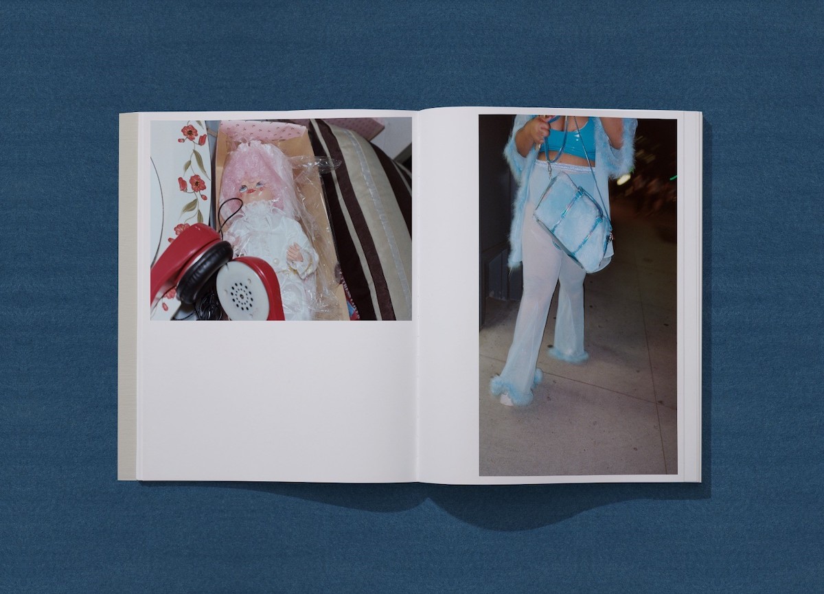
I like how you described beauty as rhythmatic. I’m curious about the photo of someone holding up a toy doll and a beer. Explain that rhythm.
I was coming out of the hospital with my camera and then all of a sudden I saw two people drinking a really cheap beer and playing with dolls. You can see the finger of the other person there. I was very curious about what was going on, myself. They were kind of like big kids drinking and I snapped their photo.
Do you ask people for permission before you take their photos?
I usually get close up to get a read first. Sometimes I introduce myself first but it’s like a combination of talking and taking photos at the same time. It’s a skill that you develop as you go. Some people look back, some people don’t say anything. I actually know someone who took a photo of a lady once and she hit her. You never know what to expect. But in my opinion, it’s better to ask for forgiveness than for permission.