Paul Graham's Seasons
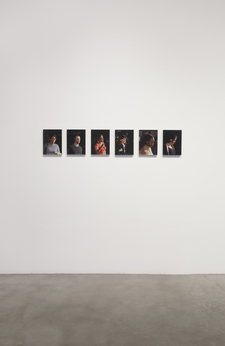
The Seasons will be presented in an online viewing until April 11 on www.pacegallery.com.
Stay informed on our latest news!

The Seasons will be presented in an online viewing until April 11 on www.pacegallery.com.

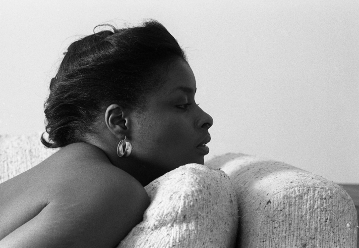
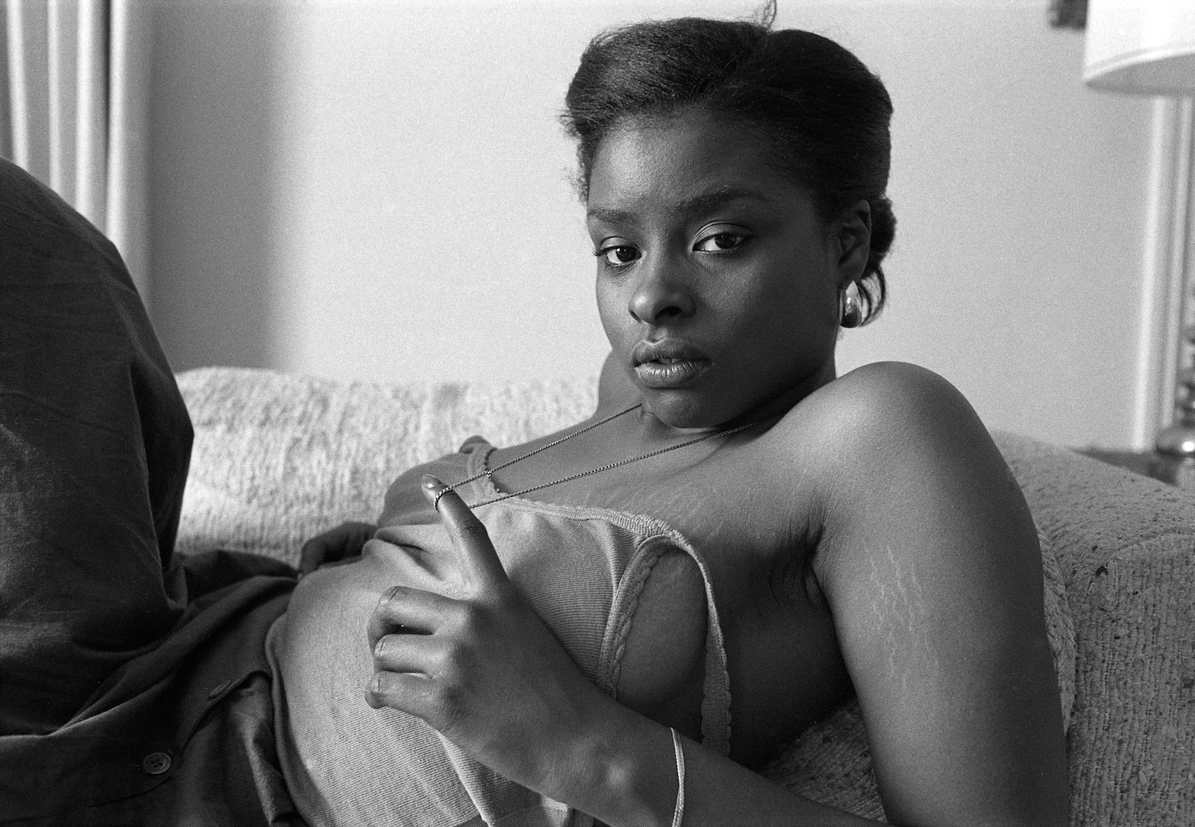
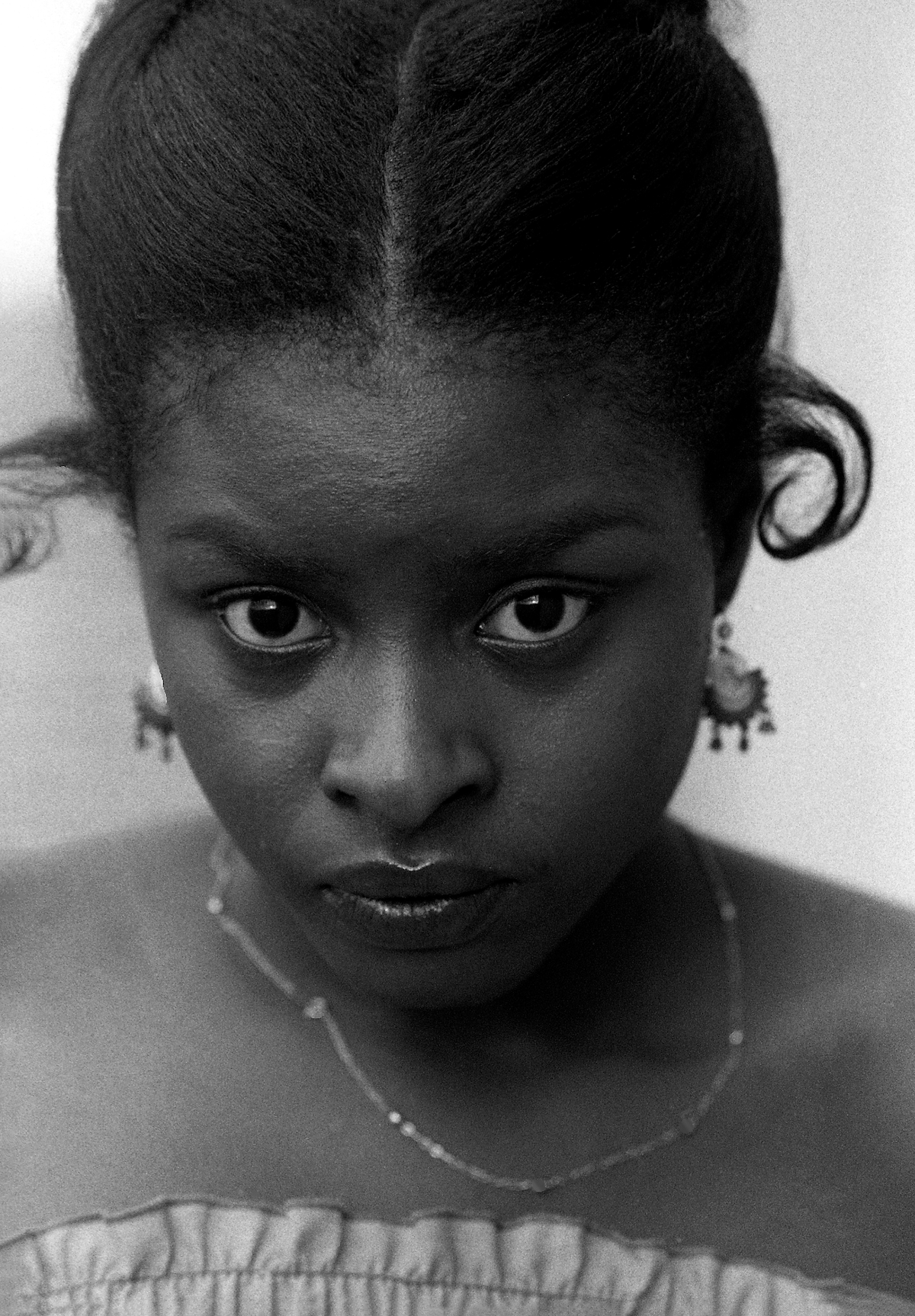
Shot in 1979, the woman in the portrait is identified by nothing other than her first name. Marcus Cuffie discovered this image of Karen alongside a multitude of portraits while they and their sister Morgan were sifting through the extensive personal archive left behind by their late father, Baltimore photographer Steven Cuffie. Save for a few exhibitions in Baltimore before his children were born, the majority of Steven Cuffie’s public facing work was as a photographer for the City of Baltimore, documenting city events, infrastructure damages, crime scenes, and the like. But after his death in 2014, Marcus and Morgan discovered the sheer breadth of his artistic practice, uncovering hundreds of captivating portraits shot in the 1970s and 80s.
In 2022, the pair of siblings worked with the New York Life Gallery to curate the first New York exhibition of their fathers work, in an effort to share their discovery with the world. Now Marcus has partnered with the gallery once again, curating and compiling 26 of Cuffie’s photographs of the eponymous Karen into a zine and exhibiting three of the images and a number of negatives alongside its release. The zine, Karen, is now available for purchase from New York Life Gallery.
Below, Marcus answered some of our questions about the intriguing Karen and their father's archive.
What did your father’s practice mean to you growing up, and if it has changed, how is your relationship to it different now?
Growing up, I knew my dad as a photographer but I didn't exactly think of him as an artist until I was older. The camera was so present in my childhood that it didn't really register to me that the photos he was taking were part of this larger body of work that had been started before I was born. I sort of thought of it like any kid would think of their family taking photos or home videos. He worked for the city as a photographer, so I also knew it was his job, but to me that made it feel more utilitarian than artistic.
That said, my dad was a big supporter of my artistic growth as a child and a big reason I'm able to have focused on being a creative for the majority of my life is because my dad set this standard in his own life. Photo was really all he did since he was younger, and I understood that it made him happy to do that. I think working with the pictures now has given me this kinship with him where I can now see him more as a peer and a point of inspiration. Especially because the work I'm focusing on right now is the work he was making in his late 20's and into his 30's so there's overlap with my own age.
When did you start this process of archiving, curating, and presenting your father’s work to the public? What, if anything, catalyzed it?
The 1st show was in October of 2022 at New York Life gallery, and I started archiving around spring of 2022. My sister had gone down to Baltimore to get some things from our old house around 2018/2019. Christmas of 2019, me and my sister were going through the pictures, a lot of which were images we had never seen before, and I casually posted them on my Instagram and got a lot of feedback from people. Mostly it was people just being positive about the work, I didn't really think at that time that I would do anything with it, and I was doing my own thing in fashion so I didn't really have the time to focus on it. In 2022 my friend Clarke Rudick hit me up about doing a portfolio of my dads work for the 1st issue of his magazine Crosscurrent, and a bit after that Ethan James Green got in touch about showing the work at New York Life as the inaugural show for the gallery. It was really interest from other people that pushed me to make it more of a serious endeavor, I think on my own I felt the images were amazing but I think just getting positive reinforcement from other people made me feel like, ok maybe this can really be a long term project.
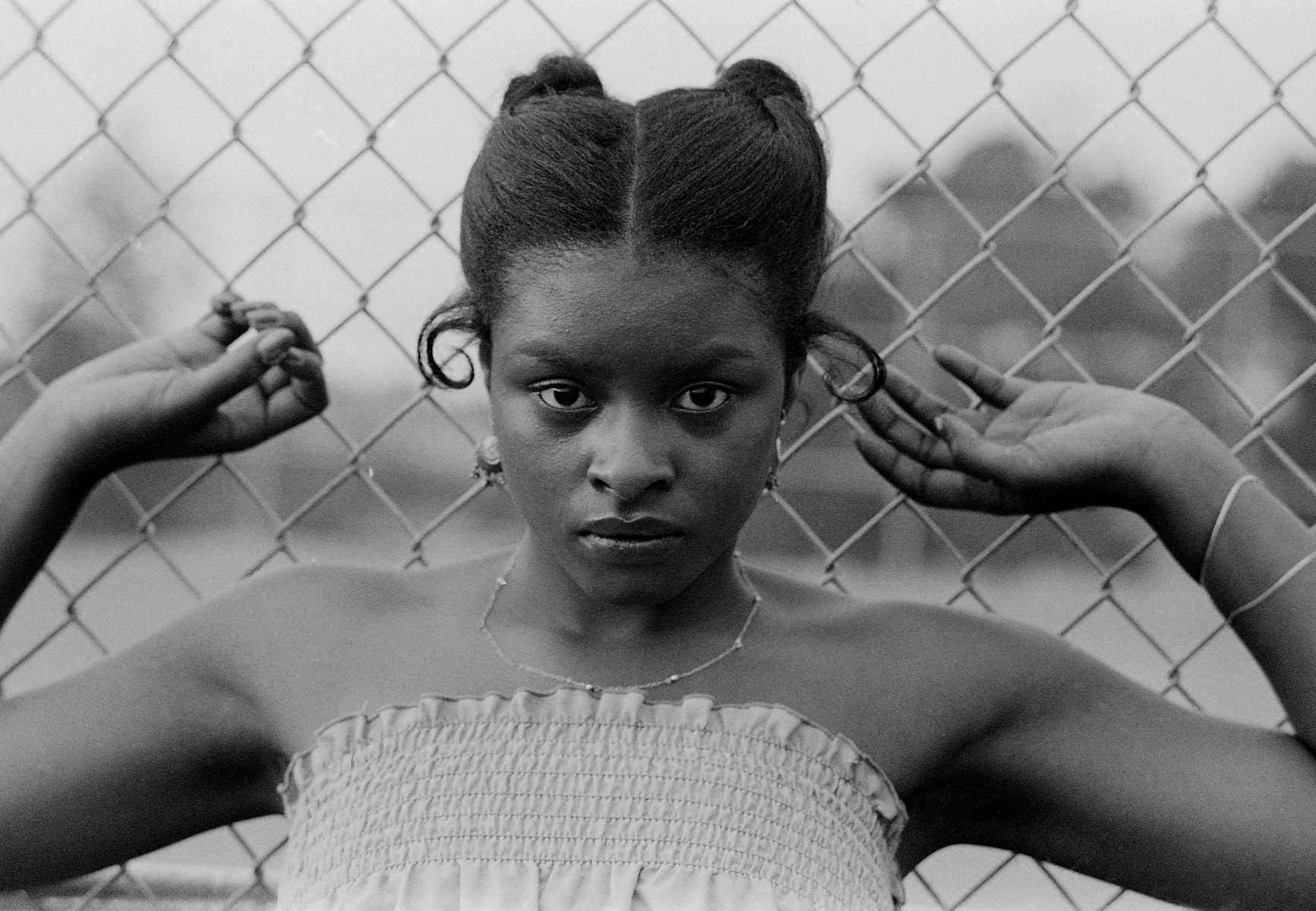
What do you know about the subject in the “KAREN” series? Who is/was she?
Really all I have is her name and the dates the photos were taken. I know that she is one of a number of women who reoccur in my dads work in the late 70s but beyond that the relationship she had with him is a mystery to me. Which is the case with a lot of the women in the photos. My dad didn't leave behind much writing about his work, and because this is work that was made in his younger days he didn't really discuss it with us, and in fact these photos were kind of kept out of sight since they can be erotic. I know that some of the women in the photos were definitely women my dad dated, because some images feature him in tandem with the women. Some are just friends or women he asked to sit, though, so there's a range.
Do you consider yourself an artist or photographer in your own right? If so, how does your father’s practice inform your own?
I definitely think of myself as a creative or artist, but I'm not a photographer. I did play around with photo in high school, but I never really stuck with it. I work in fashion as a stylist now and I think my dad and his relationship with photography definitely had a hand in that. I was just as into looking at photo books as he was, and I'm still always looking at and buying new photo books because I have this long relationship with it. I can't say I have like a full technical understand of the medium but I do feel like my taste and my point of view on photo was formed by my dads work, and seeing this work he was making when he was young I do see how without realizing it we have these similar ideas of what makes a good photo. I can't say it's like a hereditary thing but maybe because I was looking at the same things he was, because I had his library of books growing up, it's given me a similar point of view to his.
What do you think makes your father’s work so relevant to this day?
I think what motivated my father is generally what's at the heart of any photographic practice: he was just searching for a way to understand the world, and his camera was a tool for that. I think the photos definitely have certain details to them that age them, but I think when you really look at the subjects in the photos there's a timeless quality to them. In the same way that like Dorothea Lange or Gordon Parks were making images years before my father that he was looking at for inspiration, I think people can look at these pictures now and understand them. Photos break through time because we as people don't really change radically from decade to decade, the details of our surroundings shift but the way in which we relate stays the same.
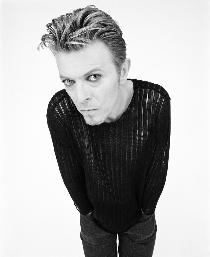
office spoke with Rankin over FaceTime about Back in the Dazed, the first retrospective in the UK showcasing his early work from the 90s. We discuss nostalgia, the ethics around shooting your subjects and critical analysis in portraiture. Don't judge a book by its cover, but what about magazines?
How did the idea for your retrospective come about? What inspired this timing?
Dazed started over 30 years ago and it just felt right, really. Last spring, we had a show called Dazed Decades. It was a really great, beautiful show but people were more interested in the 90s. That decade was the most groundbreaking work in terms of pushing the boundaries. Our photography was very different from other magazines.
I didn't really do any of my famous work from the 90s for Dazed, so my stuff here is specific and more experimental and exploratory. I was 24 when we started doing Dazed. It's quite mad when you think those photos are photographed by a 24-year-old. I was 34 by the end of it. In this show, you see the progression of me and the magazine. I started not being able to afford to shoot or print in color and you watch me grow up as a photographer. Few photographers become successful at that age, unless they’re coming from modeling or generational creativity. We all came from non-creative families. We got together at college, did a college magazine for three years, then did Dazed. I started doing magazines at 20, that's the maddest thing. Jefferson [Hack], the editor, was 18 when he became the editor of Dazed.
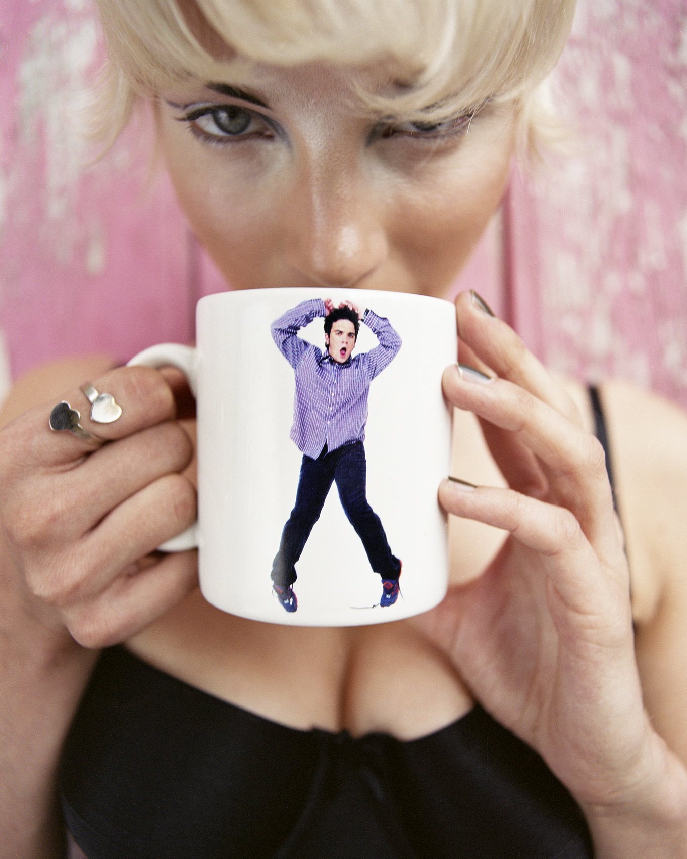
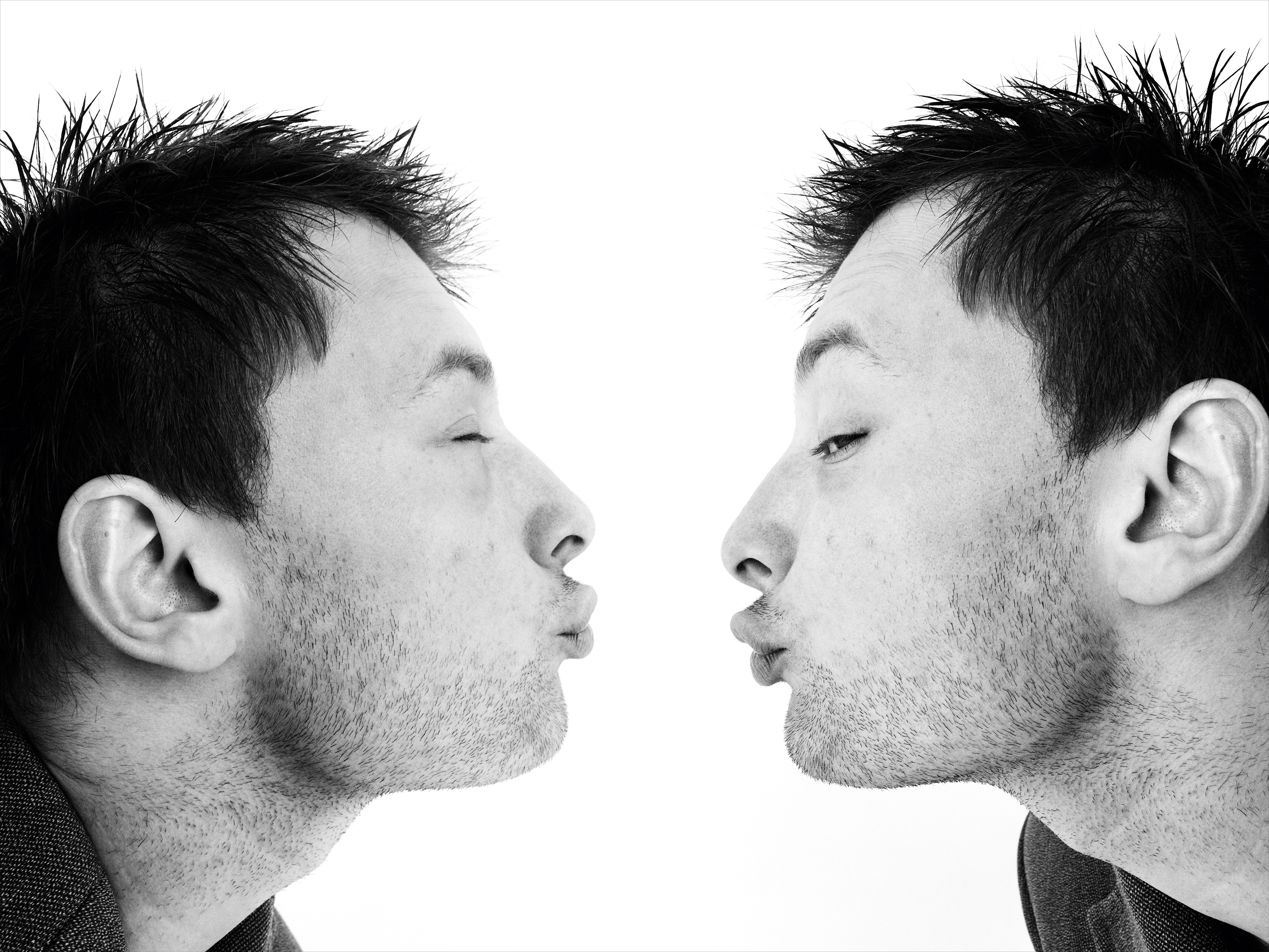
I read that at 28 (nearly how old I am), you laid out all the covers of Dazed you shot, put them on the floor, and thought to yourself, how good your life was. After shooting so many icons, what is it like to revisit those early covers? Does it feel nostalgic? Do you feel more critical of your past work, or mostly proud?
Good question; it changes a little bit. I did a book six years ago about the work from Dazed called Unfashionable. It combined my work in fashion, art and photography. When I looked at that work, it was quite basic technically but I was surprised it included the same themes. The human condition, the manipulation of imagery and media, the idea of taking celebrity and trying to democratize it and make it more accessible. I'm fascinated by the seduction of fashion and trying to make it more human. Those have been the same themes in my work for 35 years. I didn’t think that — until I looked back and went, “Oh God, I'm still banging on about the same stuff.”
Of course, I'm critical. A lot of current work lacks critical thought behind it. I don't mean that just in terms of looking at it and thinking “Is it good or not?” but thinking, “What's the meaning of it in the world?” When critical thought is in the work, you can feel it, \you don't need to ask. It's in your face. I've got that. It's built into me. I'm a 51% positive, 49% critique. You criticize me, I've already done it.
But I've enjoyed putting [the retrospective] together and looking at all the collaborations. I took them for granted then, but now I see how special it was. So many people in the photos or contributing to making the photos came to the show and it was overwhelming to see them all there. I’m not in touch with these people all the time, giving the work credibility beyond me and my relationship to it. I'm frustrated I didn't have a better relationship with some of my collaborators, but that's the arrogance of youth.
What’s it been like interacting with people at the retrospective who haven’t been reading Dazed for the past 20 years? It’s a magazine for youth culture but a lot of 18-25 year olds weren’t even born for these issues. I would love to know what it’s been like for you to witness their reactions to your work.
I have to be honest with you, I haven't really watched people look at it, but I’ve seen the social media response. I use social media to represent my work, not represent me so I'm not constantly on it, being performative. It feels like talking into a vacuum, but it’s been fascinating to see people post about [the retrospective]. People have their favorites and there's something affirming in that. The age range of people reacting to it is broad. I made this work when the magazine was distributed to 5,000 people. By the end of the 90s, we reached millions of people. But by that point, I was drifting away. Dazed was becoming less political and more commercial as a fashion and style magazine. I was more interested in changing things.
What was it like to watch Dazed become something on its own? Do you still feel connected to the magazine?
No, not really. But the ethos now is very similar to the ethos at the start. When we started, myself and Jefferson [Hack] made an agreement that we wouldn't be the editors once we felt like we weren’t the target audience or relating to the target audience anymore. We always said that you should make a magazine for yourself, not for your audience. Then the audience will come, but the minute the audience isn't relating to you, you need to move on. That's why he started AnOther and I started Hunger Magazine.
If you said to them I left because it became commercial, they'd say I was the person that was good at making money and commercialized lots of it. We sold the back cover and I would shoot it. That was completely commercializing but we did it in a unique way nobody had ever done before. Back then we were about creating culture, creating moments, creating what I guess you'd call “breaking the internet.” We were never about reporting or taking photos of culture. We were making it. We started Dazed to be a platform to voice independence, unique thinking and youth. I love it when it still does stuff like that. I'm proud and jealous all at the same time.
Exactly. I love bits of it. There are times when it feels like rinse and repeat. But when you leave something, you leave it. You should never be the back seat driver. I let it go seven years ago. I like to watch it from a distance and hope that they do well. It’s a bit like watching your grown-up child fuck up sometimes or be really successful.
We were international in our outlook. We never thought about just Britain, just England, just London. We always wanted to reach more people. Jefferson was the reason we were one of the first magazines to have a website, do broadcast publishing and have a TV show.
A lot of the things that Dazed talked about preempted a movement in purpose or in identity. We were talking about fluid identity and representation and equity back in the 90s. Vice never did that. They did drugs and parties. We've been criticized for being party kids too, but we were never trying to be sexist, racist or laddish. We were interested in art, culture and music. I read recently the reason Vice failed was because they tried to change with the times. The one thing you should never do is try and change with the times. You should always stick to your unique view. Dazed had that early on. We didn't trust the platforms.
When I left, I just wanted to be a photographer again. I was like, I'm done arguing. I don't want to debate what's going to go in the magazine. I don't want to have to chase the pages, having the fight about if you can get a cover. I got really tired of it. Also, we changed. I always like to think of this as a band. At the beginning of the decade it was just me and Jefferson. By the end, the band had decided to move on and have solo careers. We put a new band at the end of the 90s and I didn't fit in, really. Life goes on, you just have to let it go. It’s a bit like Fleetwood Mac. They have 25 incarnations.
Frankly, we became too successful. We started as kids at college and by the end of the 90s we all became successful on our own. Most of us continued to be successful. It's like not one of us gave up and left to become a gardener.
It always makes sense in retrospect, but in the moment, it must feel like a lot of risk and uncertainty.
We never thought we'd survive more than a couple years. The drive and ambition we brought to [Dazed] was about that early 90s opportunity. A lot of people who hit the 90s wanted success and took lots of risks. We had just come out of recession. They were like, why not? What have I got to lose? I look at that moment now and I'm proud we were there and did it.


For me, the purpose of photography is to reveal, and be a window into a world. But by the time I was becoming a photographer, that insight from the fifties, sixties and seventies with Life Magazine and Picture Post in the UK was almost over. Don McClellan had been around for 30 years — I never thought I could be as good as him. It felt pointless. My dad said to me, “Do something you're good at. Don't fight against what you are good at.”
I was good with people. I realized quickly it was my strength. Documentary was not my skill, but I wanted to talk about societal problems and create insight on it. I thought this through when I was 20. I was doing a degree in art photography, but I was also making a magazine. I was looking to communicate thoughts and ideas I had when I wanted to be a documentary photographer. I’ve always wanted to make work that changes the way that you look at photos or what the photos are about, to break down preconceptions about identity or race, even though I did art photography and portraiture. I was seduced by it.
I’ve heard a great quote, “If you're a really good photographer, you generally love your subject.” I loved my subject, whether that was a portrait of somebody famous I was trying to make more revealing, or a fashion shoot where I was trying to say something. You can tell that I loved it.
But when you take a photograph, you have a responsibility to yourself, to the subject and to the audience. Even if you're doing a commercial image, you have to have an understanding of what you are doing, why you are doing it, and how you can defend yourself to critique. I don't have a real belief in what is right and what's wrong for other people. I just know what's right and wrong for me. And consent around photography is so important. I ask for permission to take the photo, put the photo in a show or in a book or in a magazine. I include the person in editing the picture. I've been doing that for 30 years. When people say no, I respect it. I get annoyed, but I still respect it.
When you think photography is a feeling or capturing a moment, it becomes dangerous. People with cameras go, “Oh, it's art, because I say it's art.” Well, I don't really believe it's art because you say it's art. You can have what's called an eye, and a perspective. But where's your thought? Have you considered what damage or meaning is within that? Have you thought about your audience? If you're making it for yourself, good for you. Photography is an incredibly powerful medium, so it's easy to misuse it or to be too casual. I love the proliferation and democratization of photography, because we can all hear it, see it and speak it because it’s not politically held back. Everybody has the ability to look at something unless they're blind. Add filtering and programs or apps to make massive changes, it’s a whole other thing. That's exciting, but scary. I don't take photography casually.
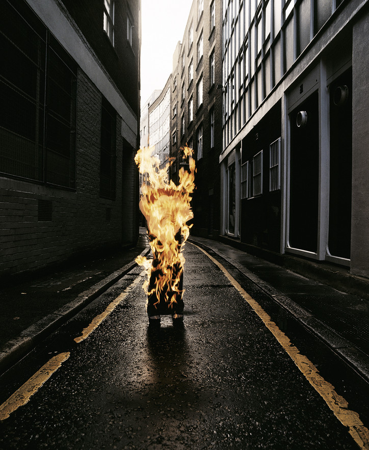
'Highly Flammable', Dazed & Confused, Issue 31, 1997 © Rankin
You can seduce it out of them. There's lots of different ways to get trust from them, but they've got to give it to you. So I try to be more honest about that. Also, photographs are subjective. They're easy to lie with. I'm trying to look for some authenticity or honesty within the lie. I'm using seductive qualities to show and reveal and give something about the person but you want people to feel good about the photograph that you've taken. I'm not trying to give them depth they don't necessarily have. It's much more direct.
Sometimes I work with young photographers assisting me. They don’t understand why I use the same skills and tools to get a reaction out of people. I see them going, “I've seen it a million times.” But, look at the results. You’re just seeing under the hood. It doesn't mean it's the wrong way.
I can't even imagine what it's like to look back on your work from 35 years ago. But if you knew how it would all unfold, what would you tell your younger self who started Dazed all those years ago?
Be nicer. I was so determined to be successful that I was a bit of a dick. Ambition got the best of me and my character was defined by that. My ex-girlfriend, the fashion editor of Dazed at the time, said I was “a show off and a bit of a dick when lots of people were around” but “on my own, I was thoughtful and considerate.” I’d also say the people you work with aren’t going away. I came from nothing really and I had no understanding of the business, the medium or the media. I was performative about being a photographer. I was pushy which wasn’t great for my reputation. I didn’t have knowledge of etiquette. I had an arrogance of naivety.
By 2005, I was like, “that's not what a photographer is.” I wanted to be a captain of a ship, not a dictator. I’d also tell myself to have more self doubt. I learned humility the hard way. It's not a bad thing to learn things the hard way because you definitely never forget them. At the same time, one of the best things about my early work is that I was a blank notebook. I developed my own taste and learned by myself. No knowledge was on my shoulders. Nobody told me this is good or bad. Everything was instinctive.

The sheer number of presentations made it impossible to see it all, and just like a choose-your-own-adventure book, no two tales of design week are alike. Taking part in each design week is a commitment, and it’s together we ke going, until the last show, the last party, the last drink. So we followed our friends and let the stream of openings and parties guide us from one installation to the next, fueled by childlike curiosity and the deep desire to be transported into otherness, even if just for a few moments. The commercial value is, of course, underlying, but during those days, it somehow feels beside the point. Design week might technically span over a week, sometimes two (or three, who’s counting?), but the obsession for that one piece, the way that material caught the light, the feeling of being in that one room, or the memory of that one late-night conversation outside so-and-so’s exhibition lingers on. What follows is just a glimpse of what we saw, loved, and are still reeling from.
Milan
Photos by Sean Davidson
Tbilisi and Paris-based Rooms Studio introduced a series of six sculptural, mix-media beds – their firsts – with their 5Vie installation, Bedrooms, emphasizing the role of these deeply personal spaces and how they carry the most intimate elements of our inner worlds.
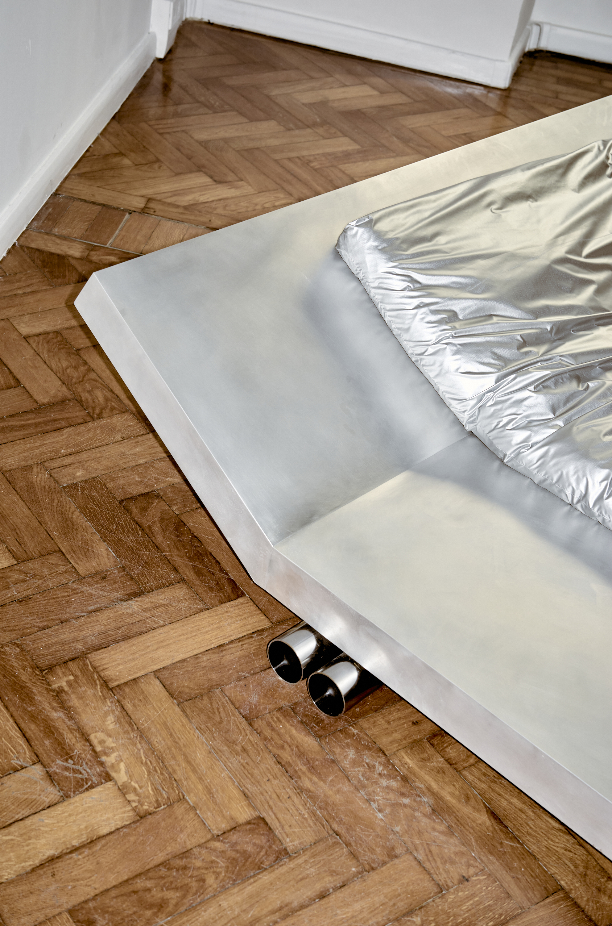
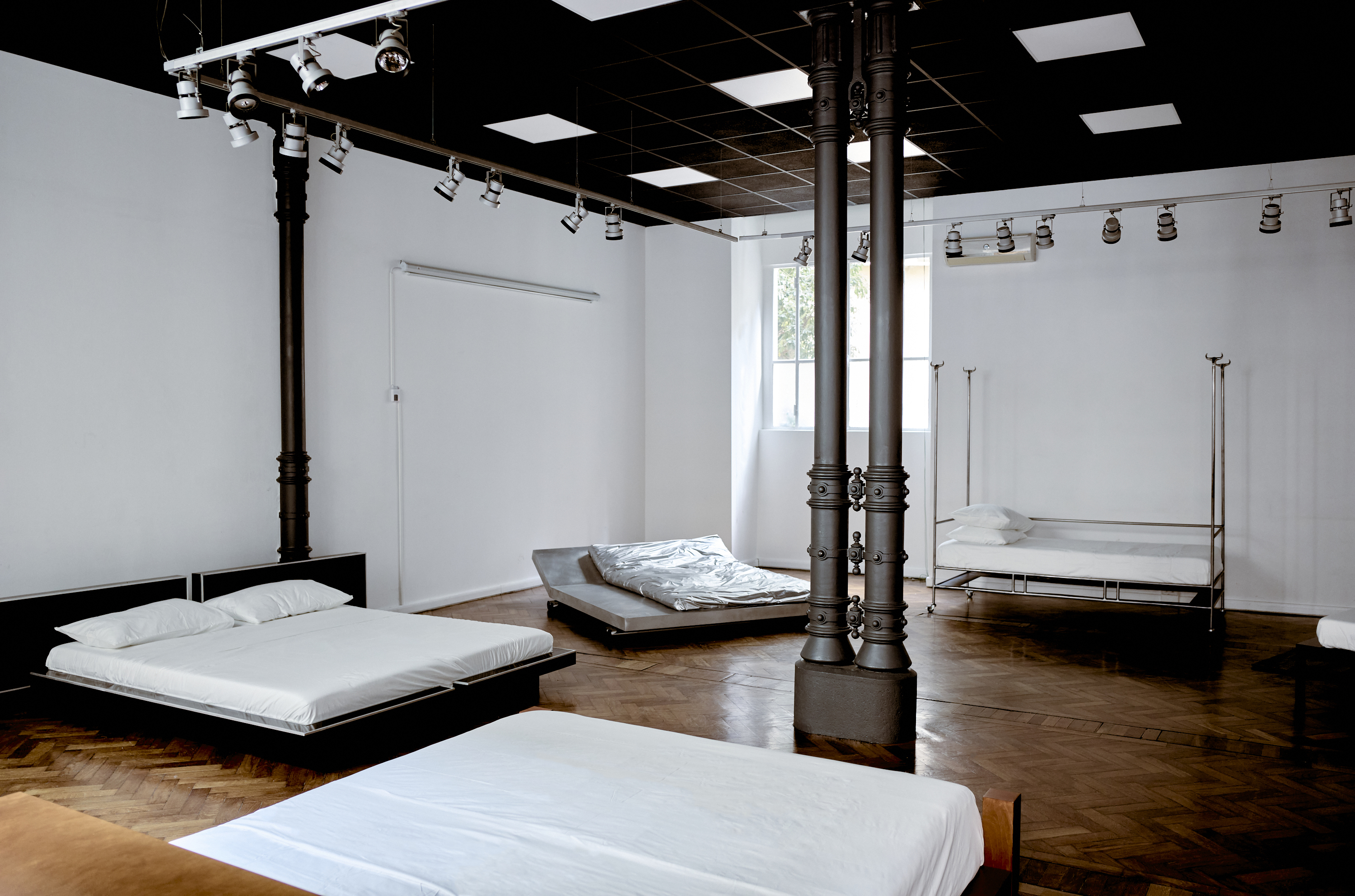
Bedrooms, Rooms Studio
Australian studios Volker Haug and Flack presented Me and You, a lighting collection born from an unexpected mishap: during a Flack installation, a vintage light broke and urgently needed to be replaced. The aesthetic language for Me and You naturally unfolded, showcasing Flack’s artful signature blend of interior and industrial design.
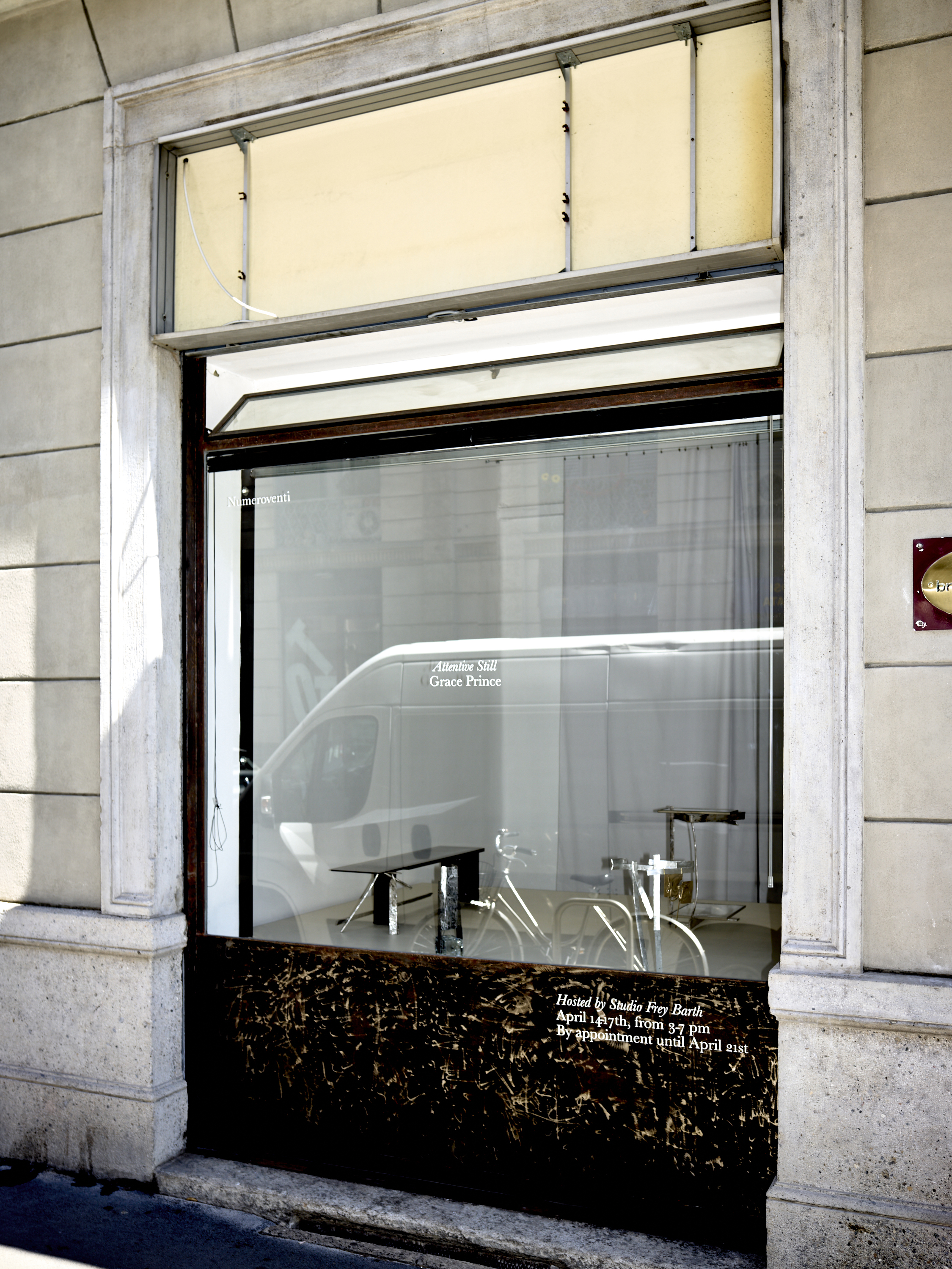
Zürich-based, British designer Grace Prince presented Attentive Still, a series of four new glass and hammered works that explore balance and structure, developed during her Numeroventi artist residency in Florence.
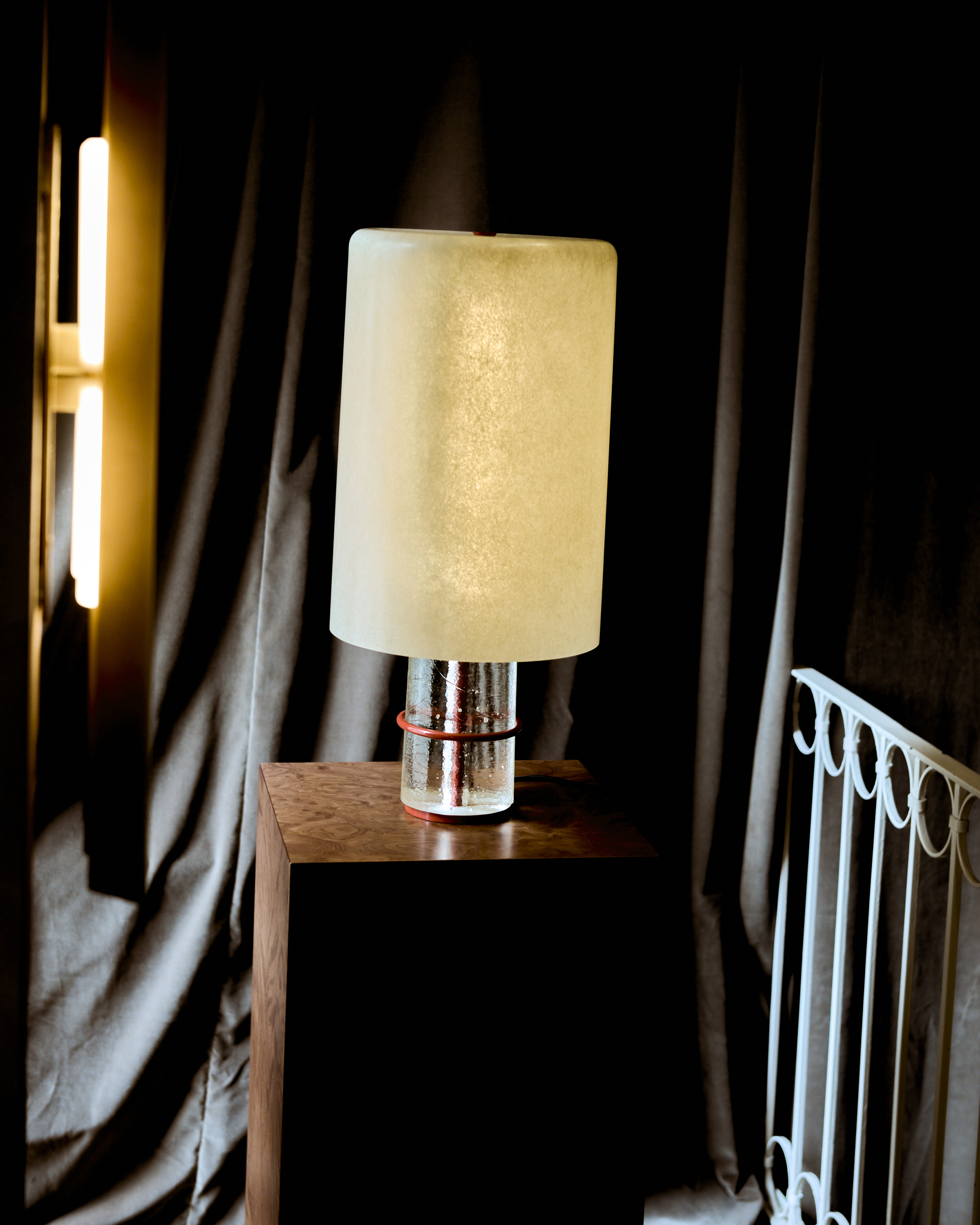
Me and You, Volker Haug and Flack
Attentive Still, Grace Prince
For their first Salone, NYC gallery VERSO’s showcase highlighted the fusion of traditional craftsmanship and cutting-edge design from Palma and Bravo studios, reflecting the cultural identities and material use of Brazil and Chile.
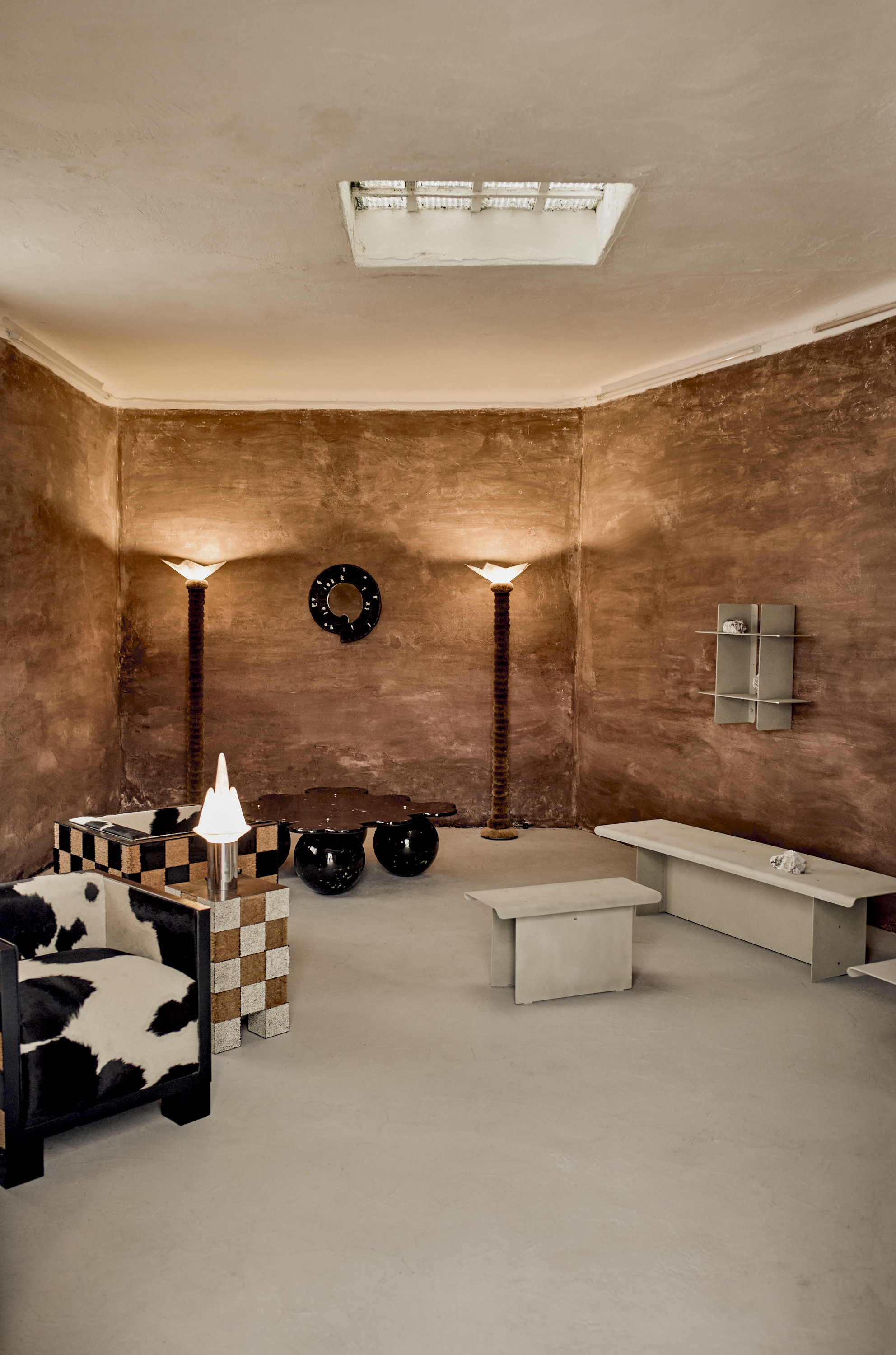
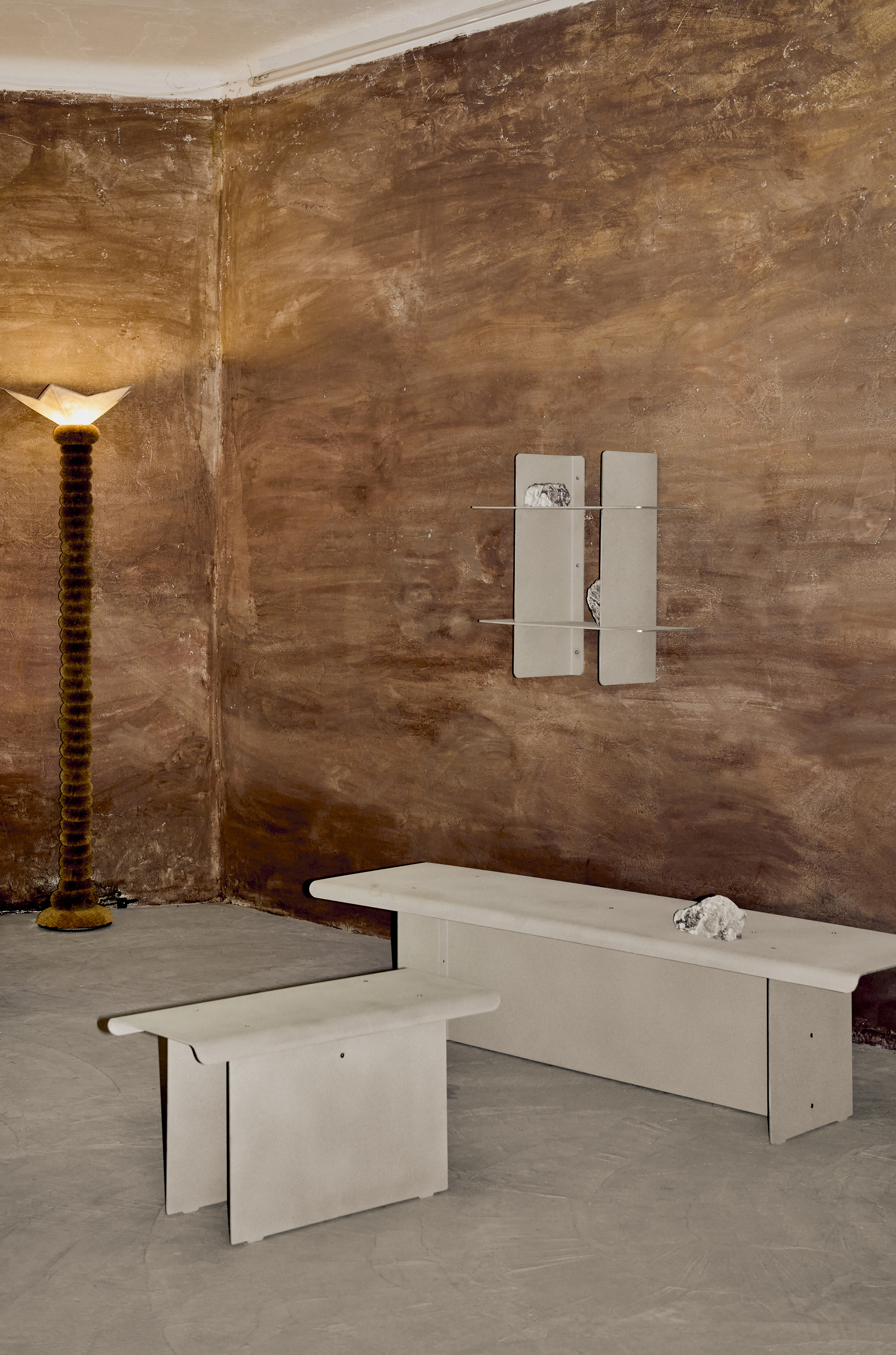
VERSO Gallery Showcase
Montréal lighting studio Lambert & Fils teamed up with Milanese designers from DWA Design Studio to present the third iteration of Caffè Populaire, introducing their latest collection, ISLE, designed by Zoë Mowat, in conversation with UNICO, a series of vessels designed by DWA using recycled plastics from Pedrali. The garden bar concept invited guests to enjoy drinks served in Sophie Lou Jacobsen glassware and snacks by LA-based food art studio, Ananas Ananas.
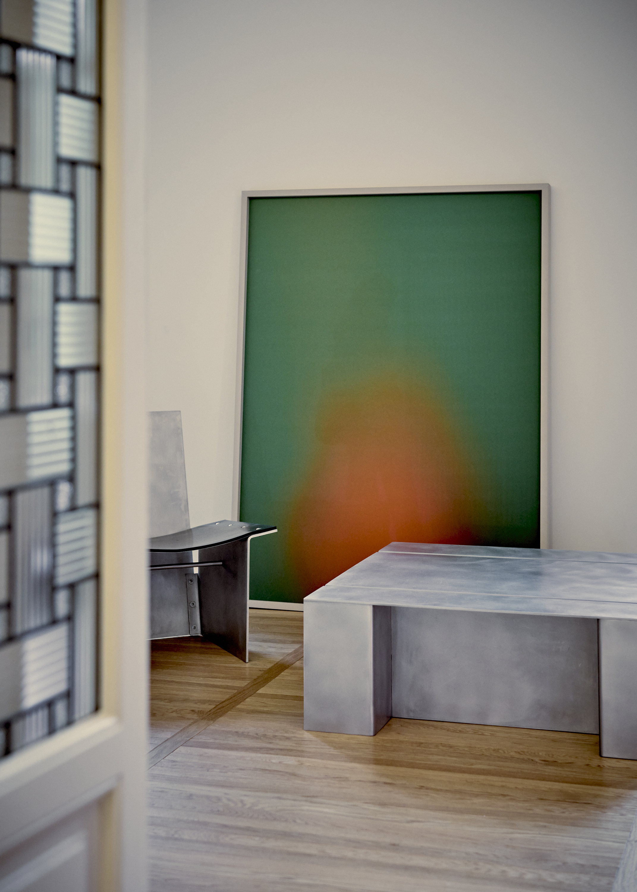
Barcelona gallery VASTO presented sisters Anna and Maria Ritsch's Cup Holder, a photograph from their ‘Dissolving Series’ which transforms 3D printed objects into abstract photographic compositions, alongside a curated collection of functional collectibles and avant-garde stonework by emerging designers, at the newly enhanced Marimar Club.
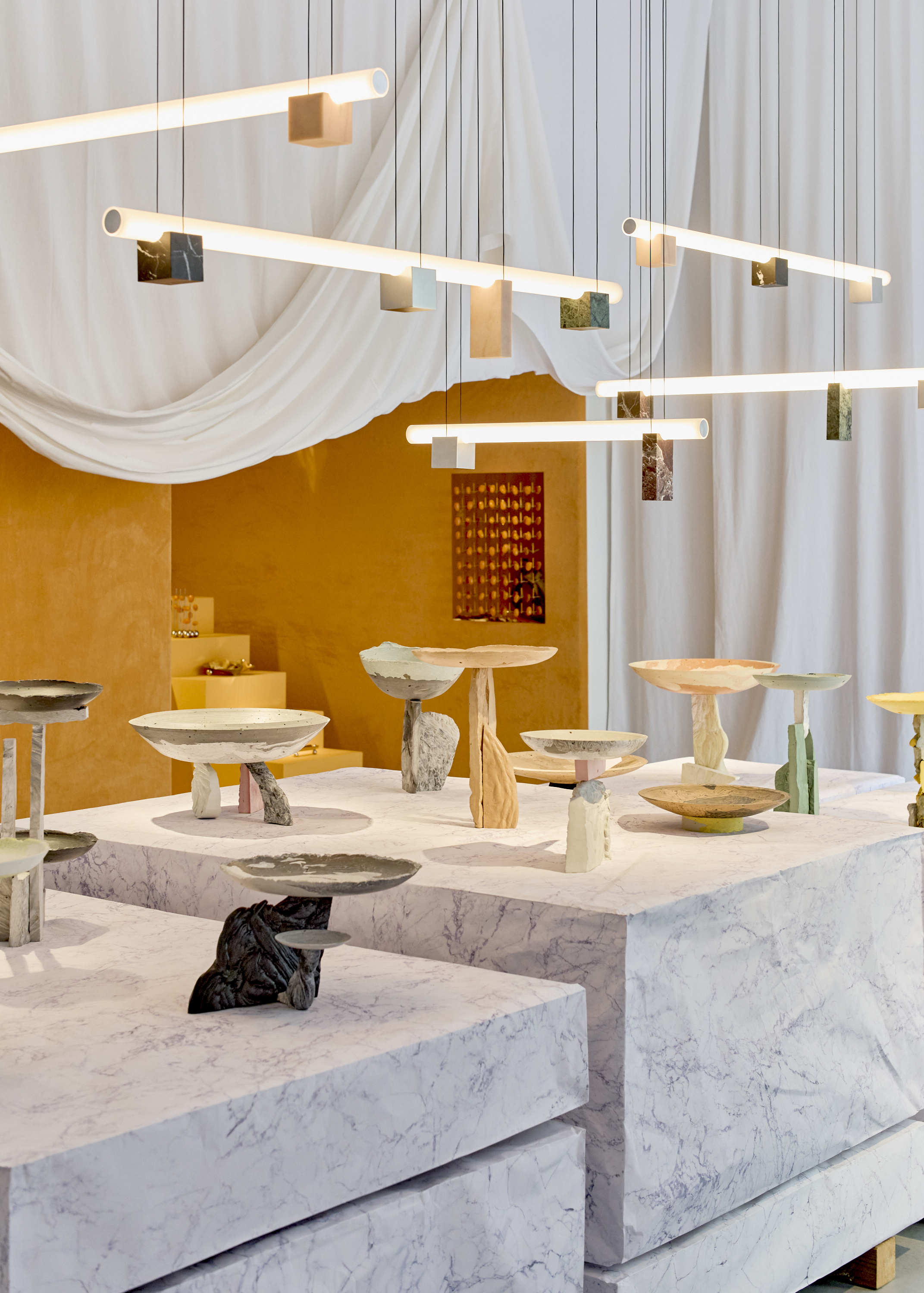
Caffè Populaire, Lambert & Fils and DWA Design Studio
Cup Holder, VASTO Gallery
5VIE presented Omi Iyọ, a powerful installation by Nigerian designer Nifemi Marcus-Bello, curated by Design Miami Editor-in-Chief, Anna Carnick. The polished stainless steel piece, resembling a boat's hull, symbolizes the perilous journeys of undocumented migrants from Africa to Europe. Reflecting on human impact, the installation, filled with salt flowing to form patterns below, honors the memory of those lost and emphasizes our interconnectedness amidst Italy's significant geopolitical role in migration debates.
Itinerant organization CONTRIBUTIONS Design presented Passaggi, a collaborative installation bringing together the voices of designer Sophie Lou Jacobsen, art director Giulia Nardi of COSE Journal and photographer Adrianna Glaviano. Presented at Spazio Martin, Passaggi explored the emotive powers of domestic objects.
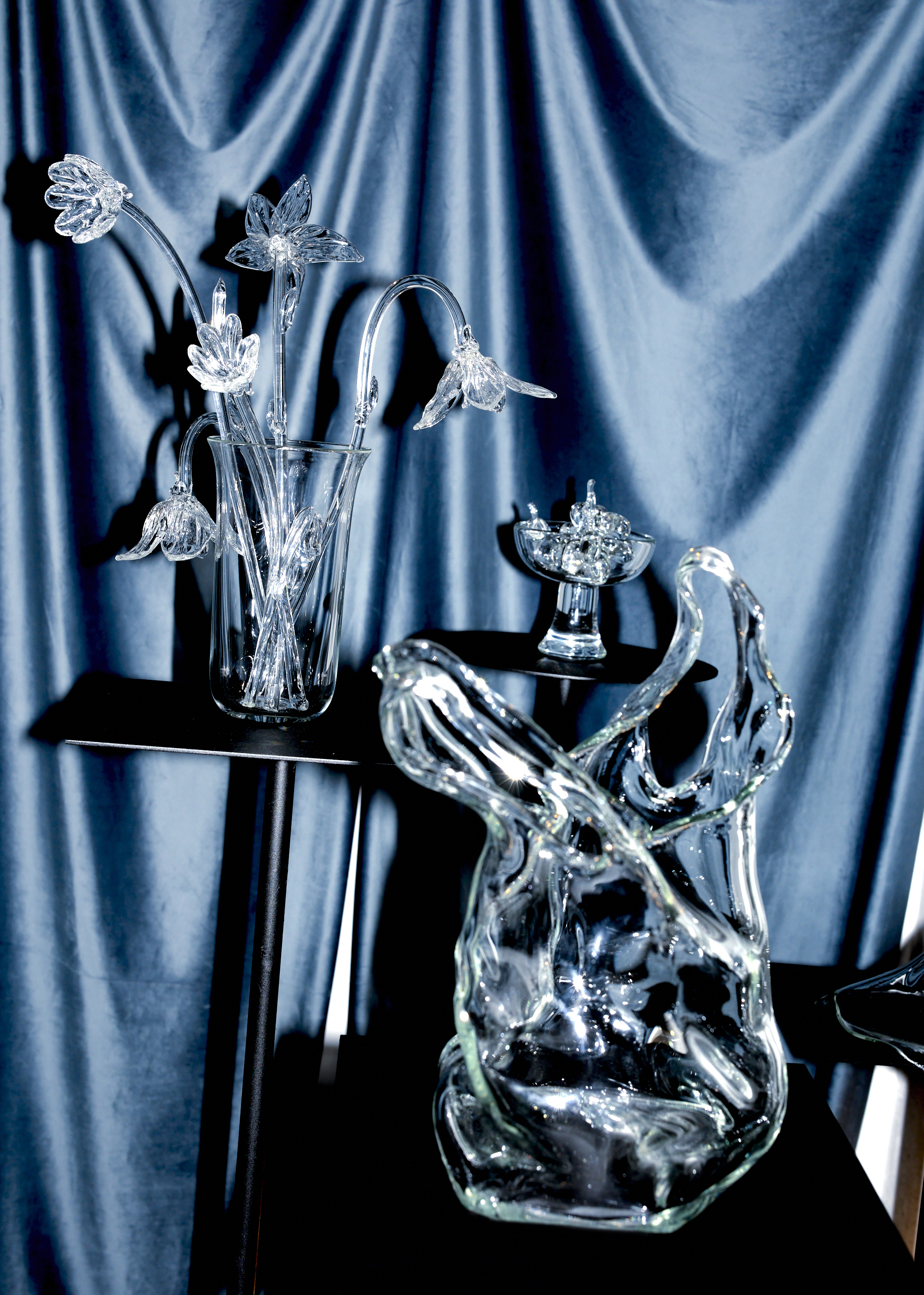
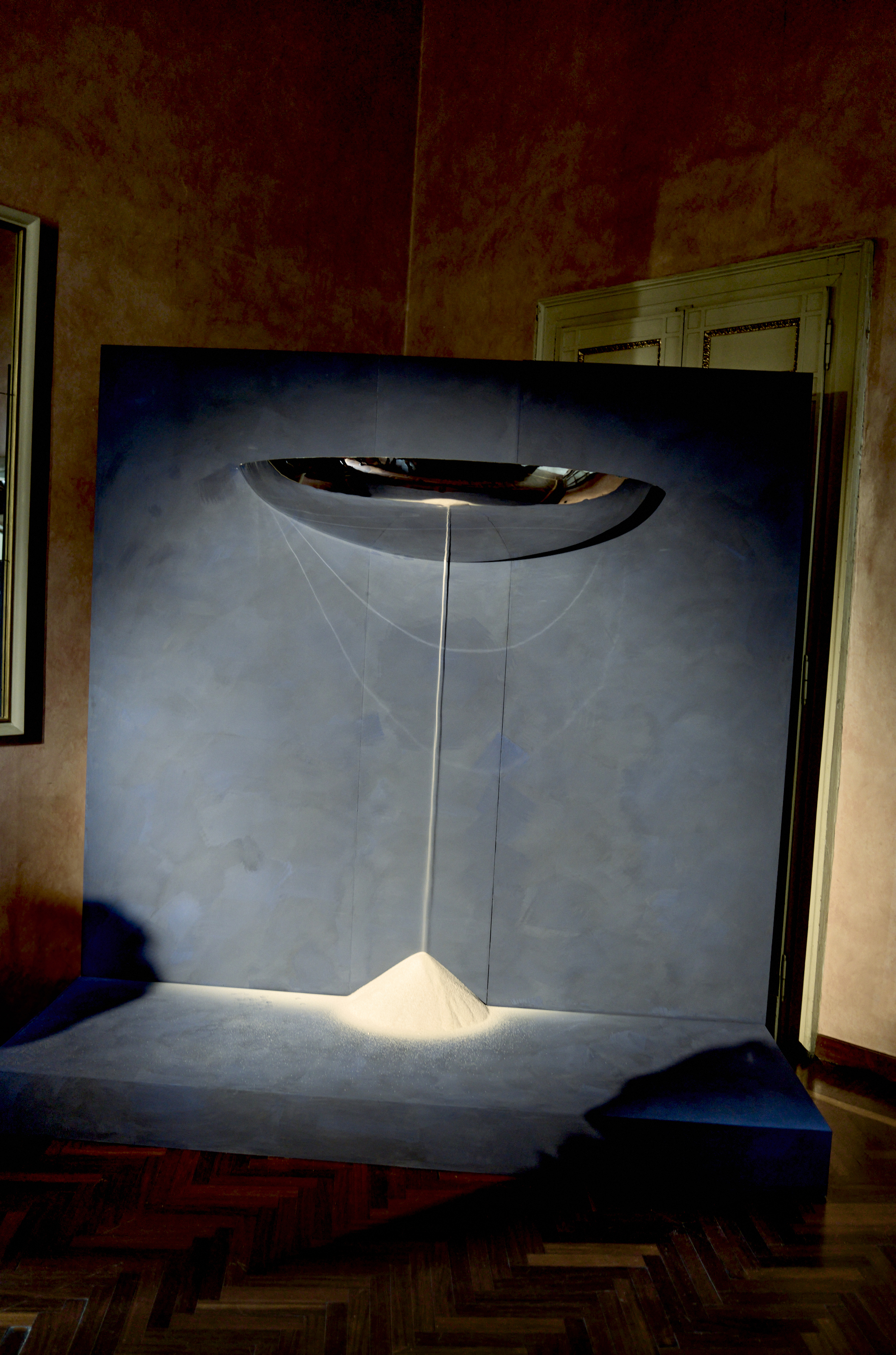
Omi Iyọ, Nifemi Marcus-Bello and 5VIE
Passaggi, CONTRIBUTIONS Design
Milanese giants cc-tapis and Tacchini unveiled the Rude Arts Club, introducing British trailblazer Faye Toogood and Tacchini’s first collaborative furniture collection and the third installment of Toogood's handmade rugs with cc-tapis. The exhibition transformed unique rooms with tactile lights, plush fabric-clad walls, and sculptural furniture, blending wit and style.
FormaFantasma’s La Casa Dentro at Fondazione ICA presented a selection of new works exploring the home as both a physical space and a nexus of personal identity and collective memory. A Salone favorite, the exhibition blended rationalist design elements with sentimental and decorative features inspired by childhood memories.
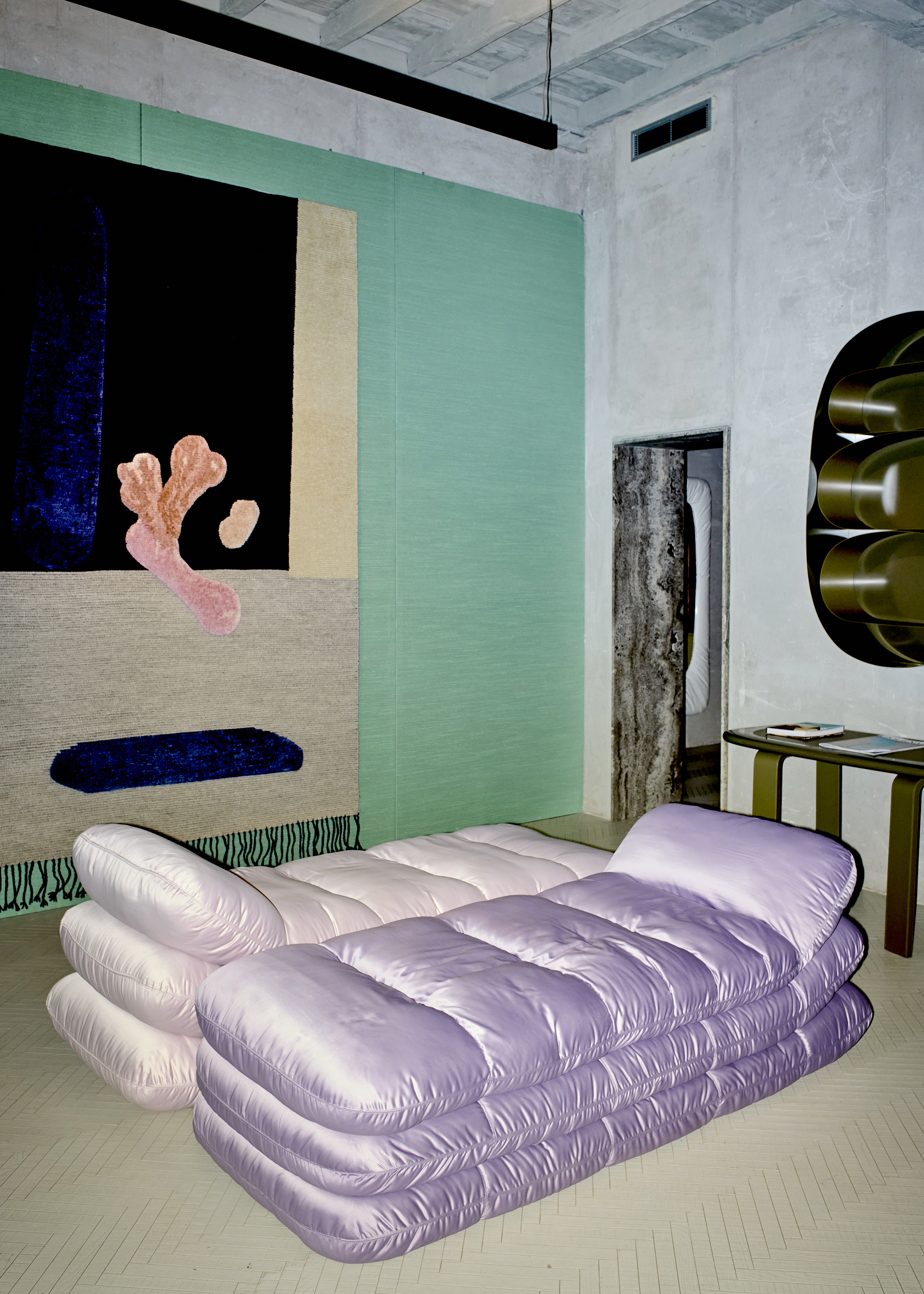
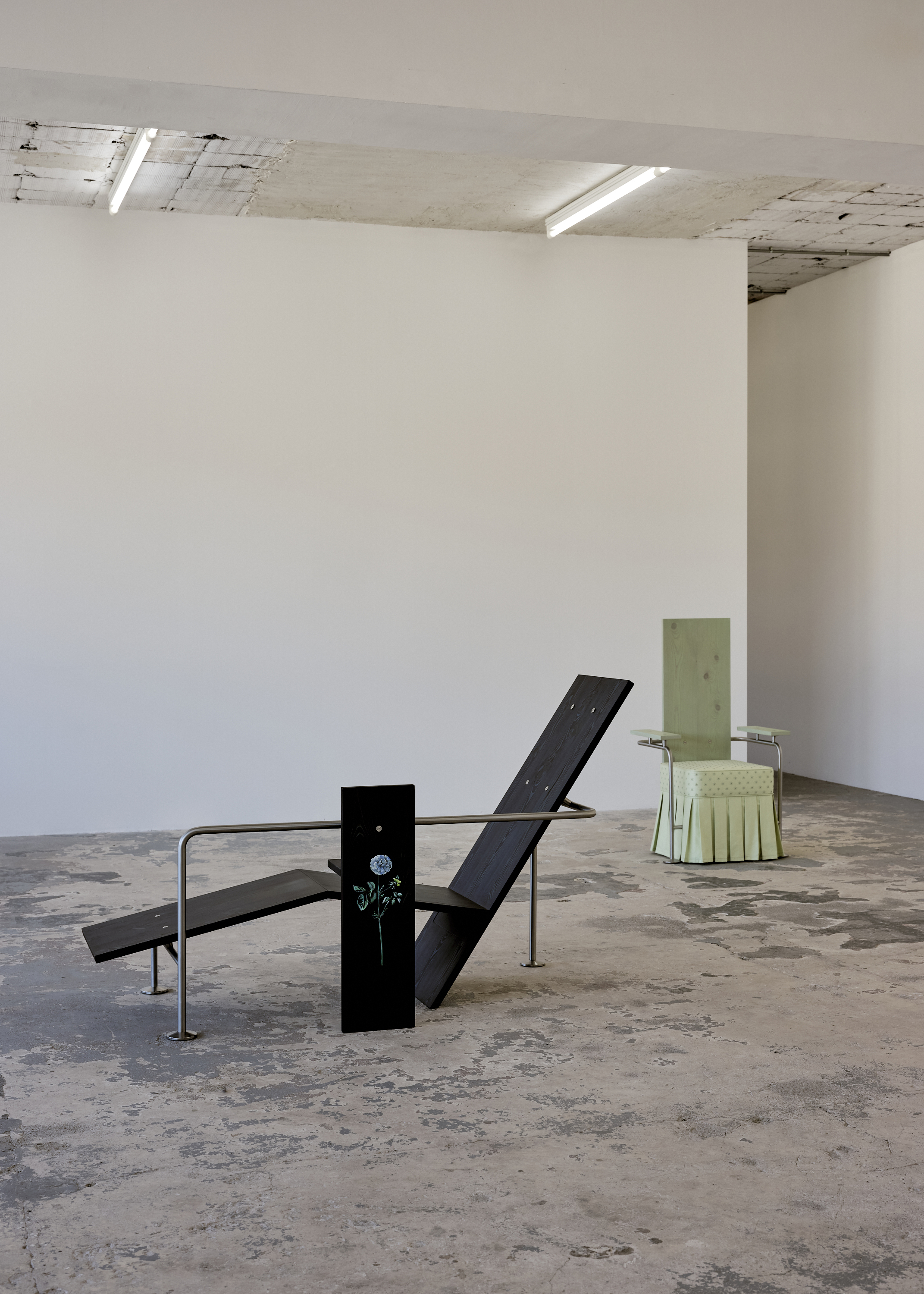
Rude Arts Club, cc-tapis and Tacchini
La Casa Dentro, FormaFantasma
New York
Nick Ozemba and Felicia Hung — the dynamic duo behind Brooklyn-based design studio In Common With — celebrated the much anticipated opening of Quarters, an expansive 8,000-square-foot space designed like a well-appointed home where everything — furniture, lighting, art, and even pantry provisions — is shoppable. The opening night was the talk of the town, with the space being christened with late-night dancing and drag performances, rightly so.
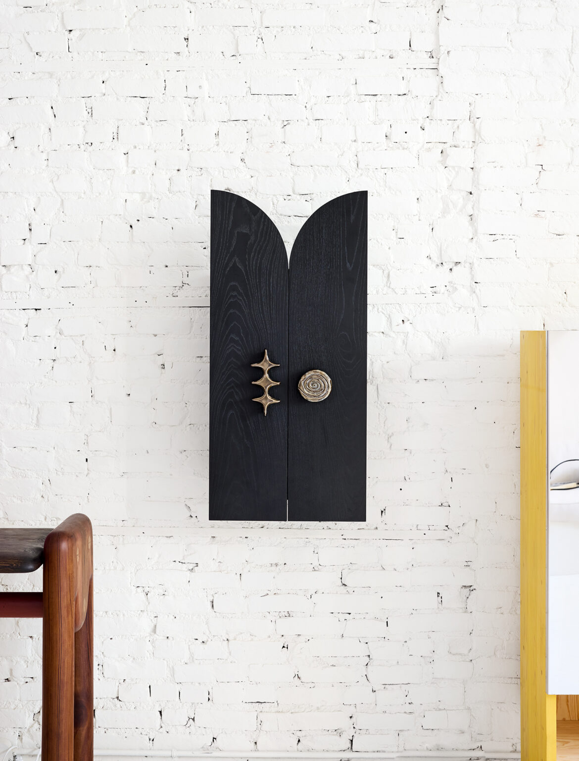
Sight Unseen’s co-founder Monica Khemsurov launched Petra, an online collection of artistic hardware by leading designers at Blue Green Works’ Chinatown showroom. Featuring handmade fixtures by over thirty contributors from around the world, Petra includes exclusive pieces from metal pulls by Chris Wolston to BD Barcelona’s licensed reproductions of Salvador Dalí’s elaborate 1937 ‘Rinoceróntico’ door handle. The design week showcase also included ten cabinets and consoles by ten designers commissioned for the occasion by Khemsurov and Sight Unseen's second half, Jill Singer, including Steven Bukowski, Rest Energy and Studio POA.
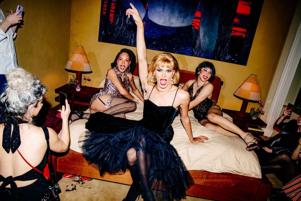
Quarters, In Common With. Photography by Hunter Abrams.
Petra, Sight Unseen and Blue Green Works. Photography by Pippa Drummond.
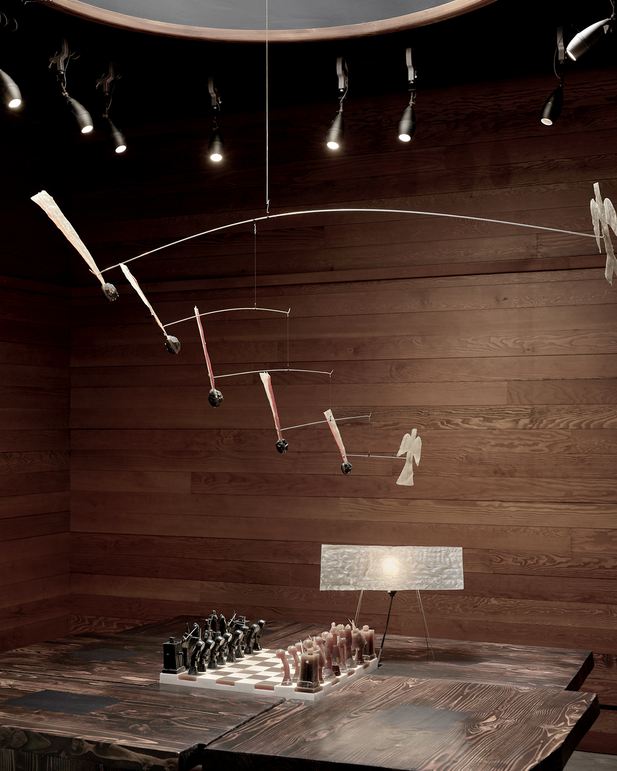
Seoul-born, New York-based designer Minjae Kim presented Arbiters Corner under the sculptural canopy of the Gallery at Ace Hotel Brooklyn. This exhibition marked the final chapter of the year-long A!R partnership between Ace Hotel and multidisciplinary studio FORT MAKERS, and featured Kim’s work conceptualized during his month-long stay at the hotel. The central artwork depicted a chess game in progress, exploring themes of accessibility and conflict.
Spanning lighting, decorative objects and furniture, A Year Without a Kiln — Simone Bodmer-Turner’s latest solo exhibition at Emma Scully Gallery — was a marker in a year when the artist moved her life and practice from an apartment and studio in Brooklyn to a farmhouse and orchard in Massachusetts. During this time, Bodmer-Turner didn’t have access to her kiln, the primary tool behind her clay creations, and with this absence, she was presented with the opportunity to introduce different materials into her practice.
Arbiters Corner, Minjae Kim. Photography by Sean Davidson.
A Year Without a Kiln, Simone Bodmer-Turner. Photography by Dani Case.
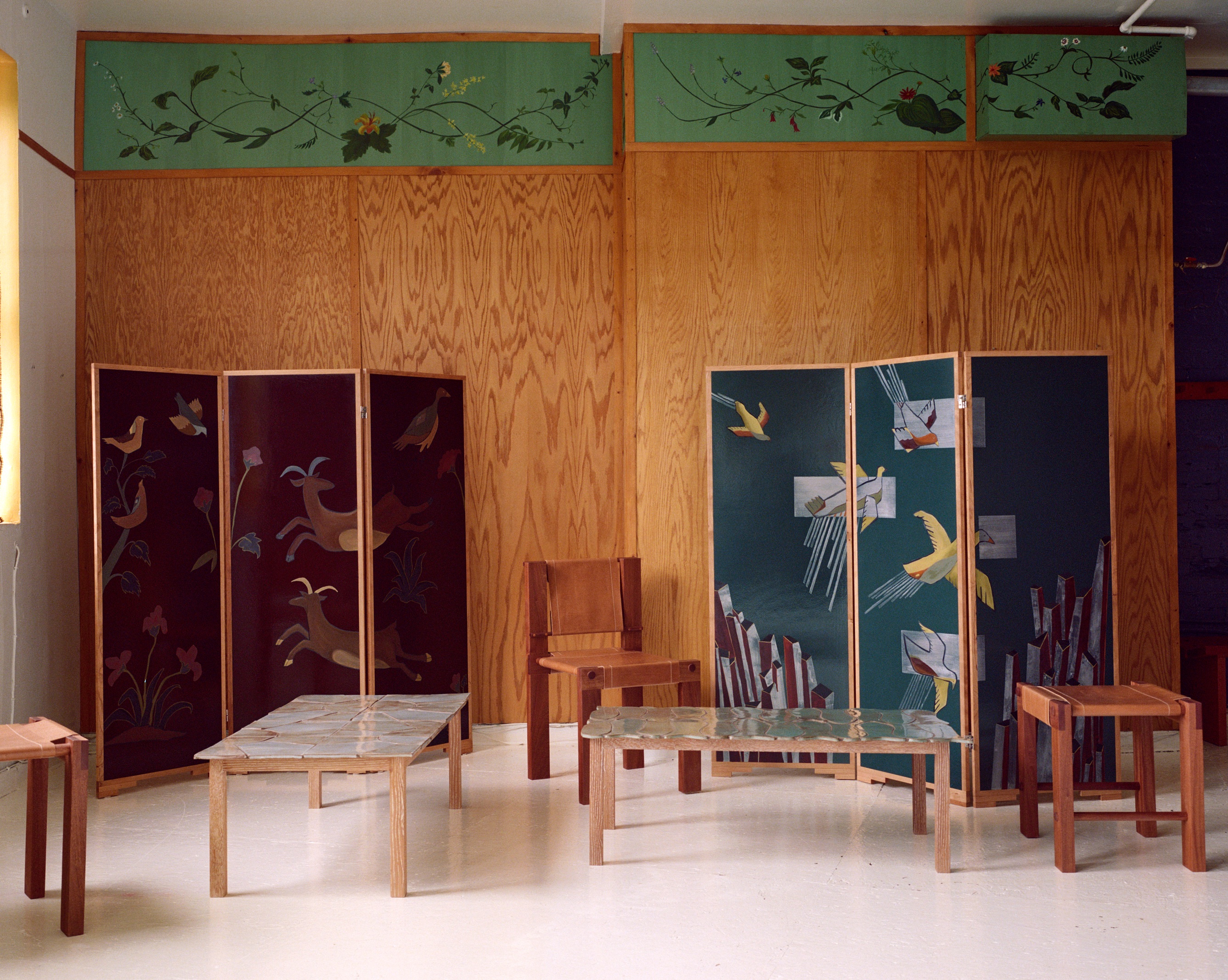
Chinatown duo Sunfish unveiled their spring collection at founders Julia Eshaghpour and Kevin Hollidge’s own home. For this new series, the couple drew influence from techniques and design movements across time and place, teasing at the Art Deco trend with shino-glaze and handcrafted tile-clad tables, and wood-framed screens with hand painted depictions of birds.
David Michon’s excellent weekly décor substack FOR SCALE celebrated its first URL to IRL moment with the publication of an inaugural print newspaper at Colbo. The event coincided with Glamor Butch, an eclectic collection of objects from NYC artists and makers, selected by Michon’s discerning eye.
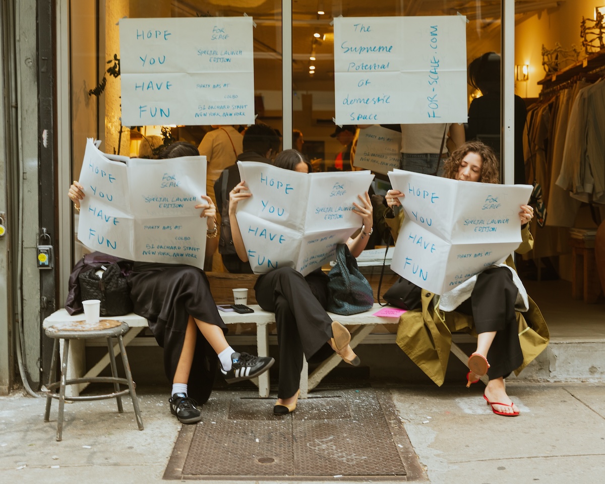
Spring Collection, Sunfish. Photography by Lucia Bell-Epstein.
FOR SCALE, David Michon. Photography by Jason Lê.
SuperHouse's The Odd Couple (on view through August 17), focuses on American art furniture over the past four decades, showcasing the diverse tendencies, philosophies, and narratives of transgenerational American artists. Highlights include historical pieces from the functional art and studio craft movements, as well as contemporary works demonstrating the lasting legacies of conceptual rigor and expert craftsmanship from artists like Pippa Garner, Dan Friedman, Michele Oka Doner, and Kim Mupangilai.
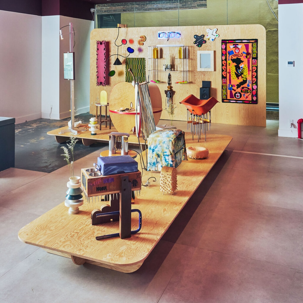
The annual group showcase Jonald Dudd made its return to NYCxDesign, this time curated by Charles Constantine, co-founder and creative director of Bestcase. Held at the former sex shop Contact Sports, the exhibition, titled Forbidden Fruit, offered a freeform exploration of furniture making, highlighting the work of 30 designers and studios.
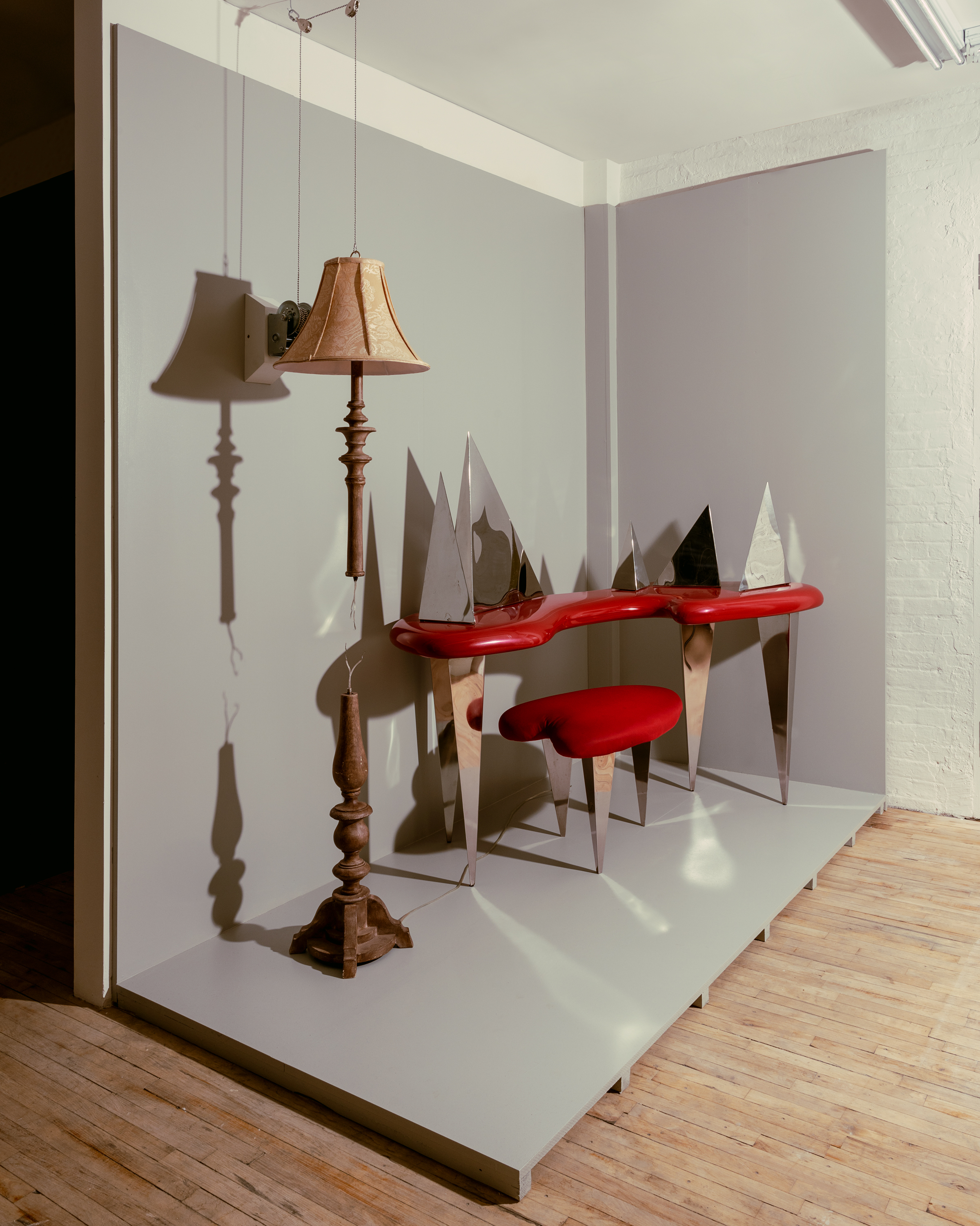
The Odd Couple, SuperHouse. Photography by Luis Corzo.
Forbidden Fruit, Jonald Dudd. Photography by Matthew Gordon.
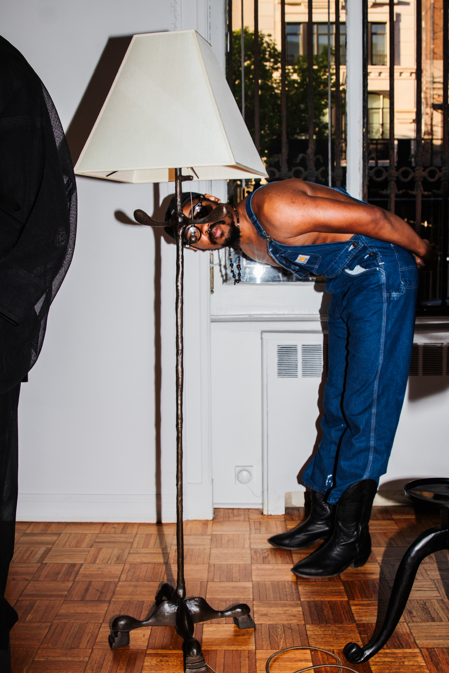
For their design week debut, artist duo Wretched Flowers presented Artifact V.2, their second collection of lighting and decorative objects inspired by historical objects from museum archives. Highlights included the revival of Tramp Art modernized using laser-cut stainless steel, and a tubular chainmail floor lamp with optional cast-pewter stars traditionally found on Amish quilts.
LA’s beloved Marta Gallery made their NADA debut with Correspondence / Coexistence, putting in conversation artists Myoung-Ae Lee, from South Korea, and Isabel Rower, based out of NYC. The dual showcase emphasized generational lineage and the evolving zeitgeist, with Lee's typology-defying canvases and Rower's ceramic works that playfully mimic cardboard structures.
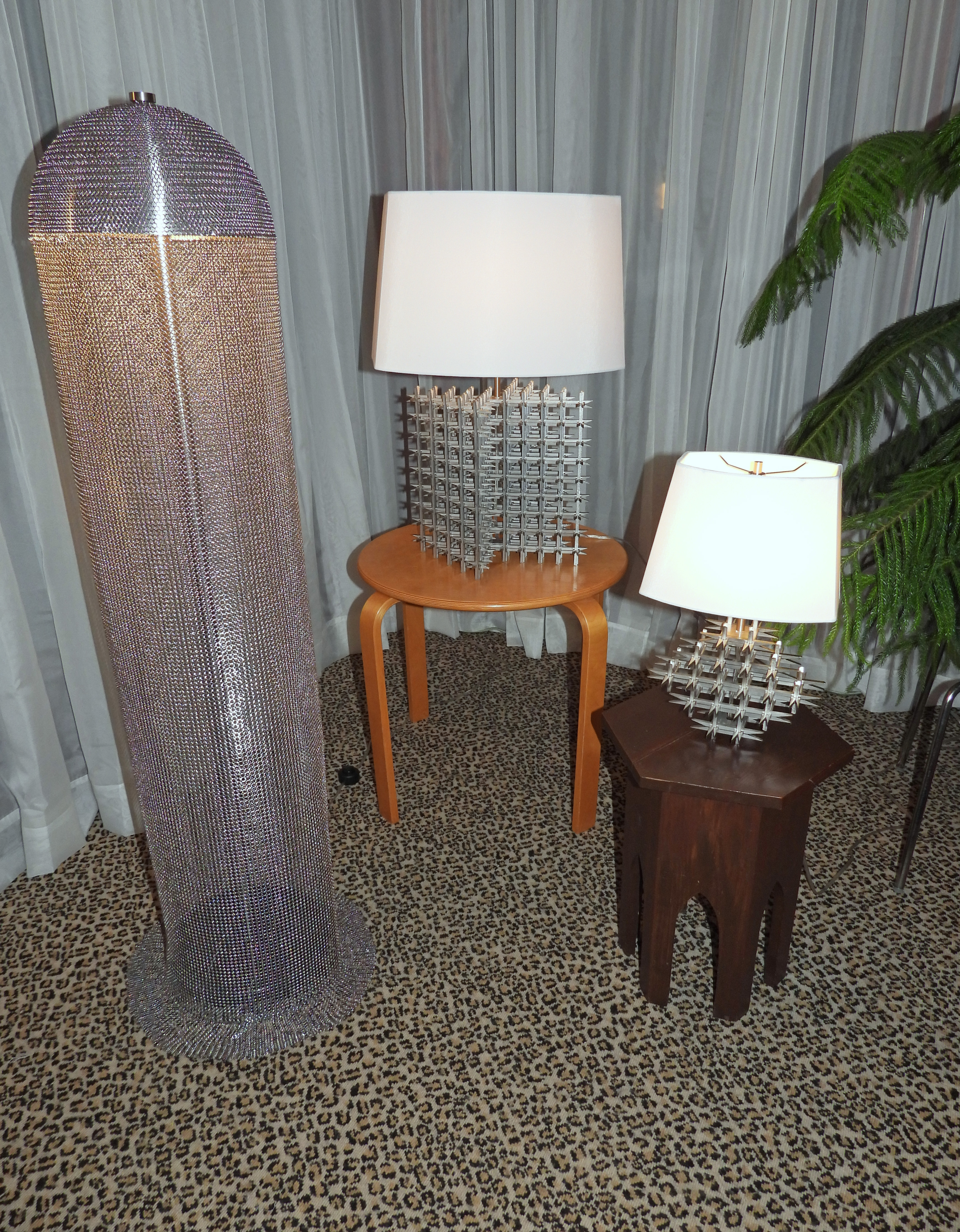
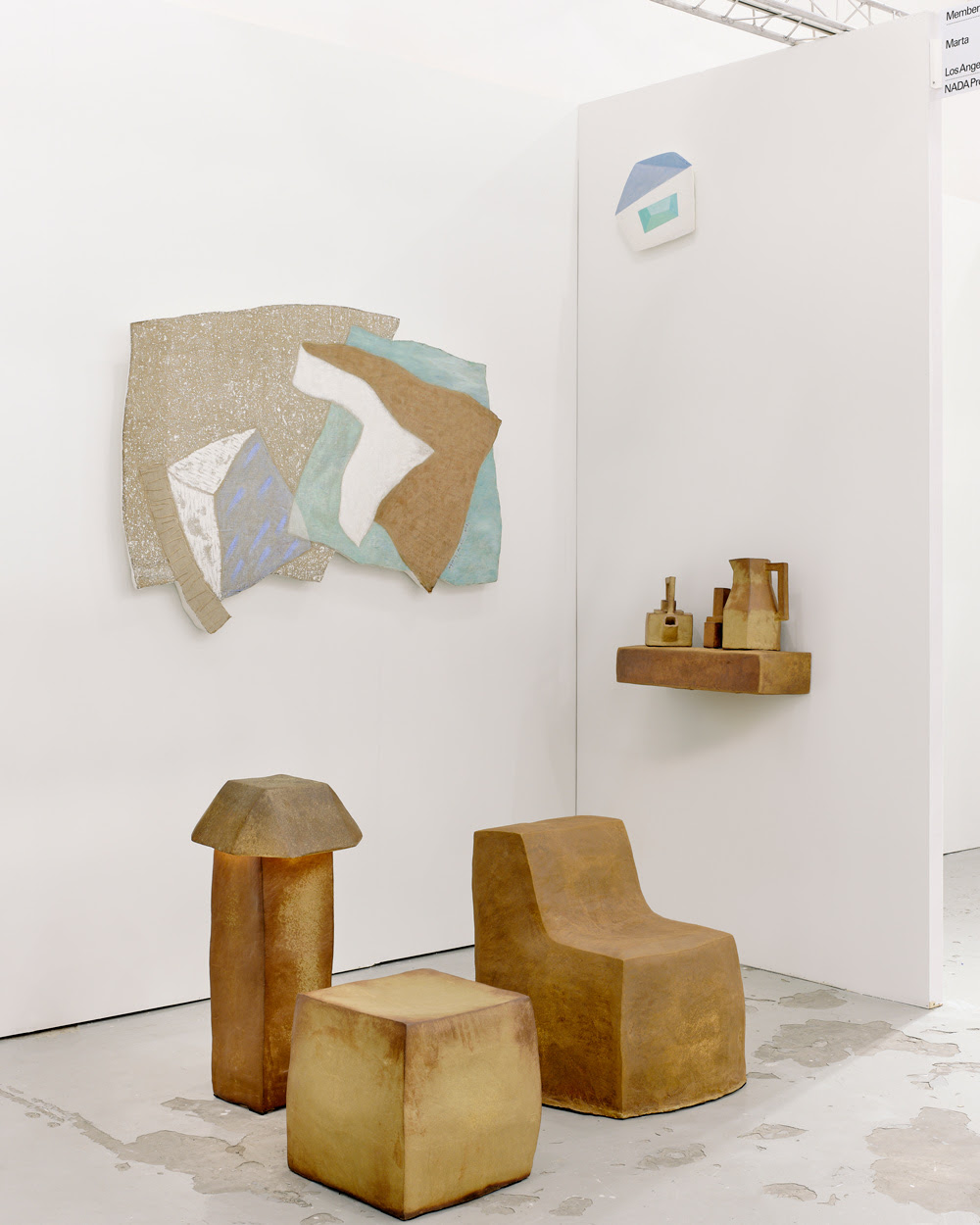
Artifact V.2, Wretched Flowers. Photography by Wretched Flowers.
Correspondence / Coexistence, Marta Gallery. Photography by Sean Davidson.
Lindsey Adelman has long followed the porous border between art and design. A Realm of Light, presented at TIWA Gallery, displayed a constellation of oil lamps — some hanging and others sitting on surfaces — transforming the space into a warm, meditative landscape adorned with hand-stitched hanging panels by textile artist and La Réunion founder, Sarah Nsikak.
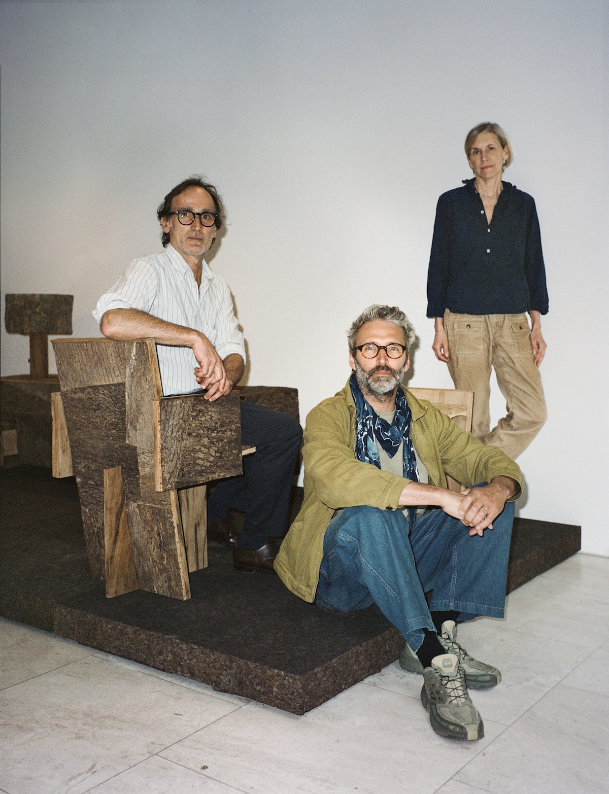
For the second consecutive year, West Village gallery Demisch Danant shone a light on Noé Duchaufour-Lawrance. The Lisbon-based French designer — a rare contemporary amongst the gallery’s roster of historical greats — showcased a selection of works from Made in Situ, a studio project that advocates for a practice rooted in a specific territory, exploring its materials, artisans, craftsmanship and cultural vernacular.
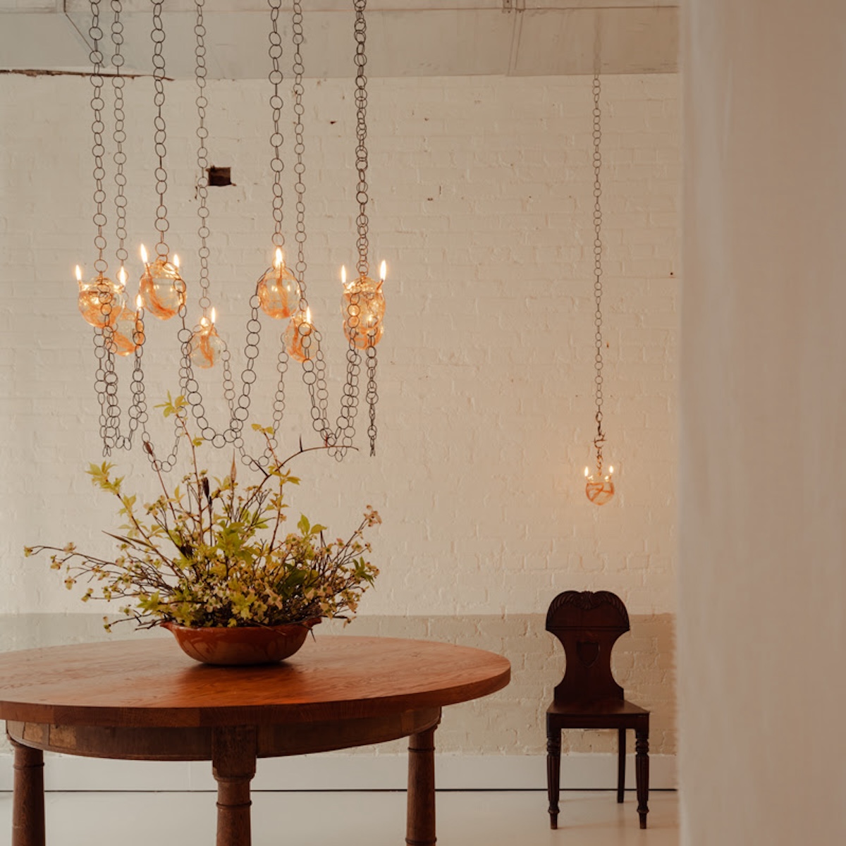
A Realm of Light, Lindsey Adelman. Photography by Brian Ferry.
Made in Situ, Demisch Danant. Photography by Lucas Creighton.
Jacqueline Sullivan Gallery’s A Room is an Archive of Touch, on view through July 20, is an intimate exploration of memory and domesticity, inspired by Lisa Robertson's essay "Atget's Interiors." The exhibition, featuring meticulous textile pieces by Grace Atkinson, pinched clay ceramics by Jennefer Hoffmann, and kiln-formed cast glass (known as pâte de verre) sconces Natalie Weinberger, highlights how the cadence of habit in rooms and objects creates an archive of the past through gestures and intuition, reflecting both the beauty and pain of remembering.
In industry jargon, “time and materials” is a means of telling the story of a finished piece. To honor the design process, Sarah Zames and Colin Stief — of interiors studio General Assembly — asked ten designers to create a piece of furniture or decor with that notion in mind. On view at their Boerum Hill shop, Assembly Line, Time and Materials presented new works by the likes of Bowen Liu, Danny Kaplan, Fern, and Steven Bukowski.
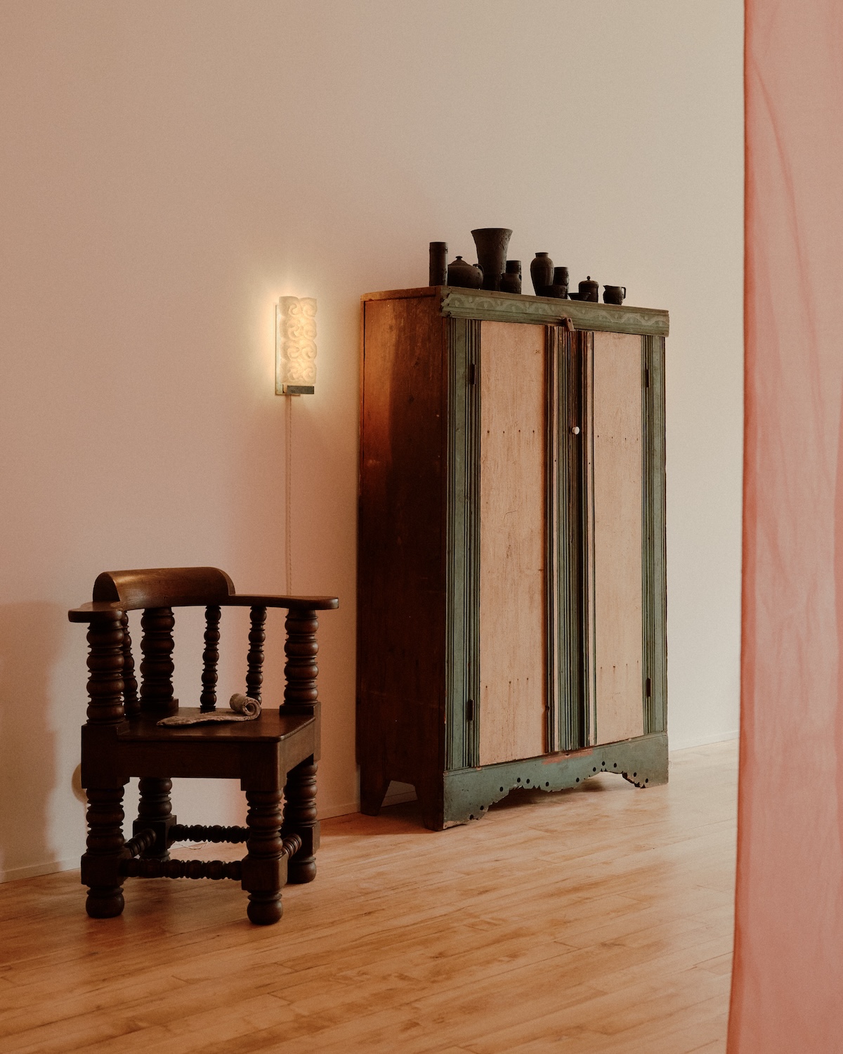
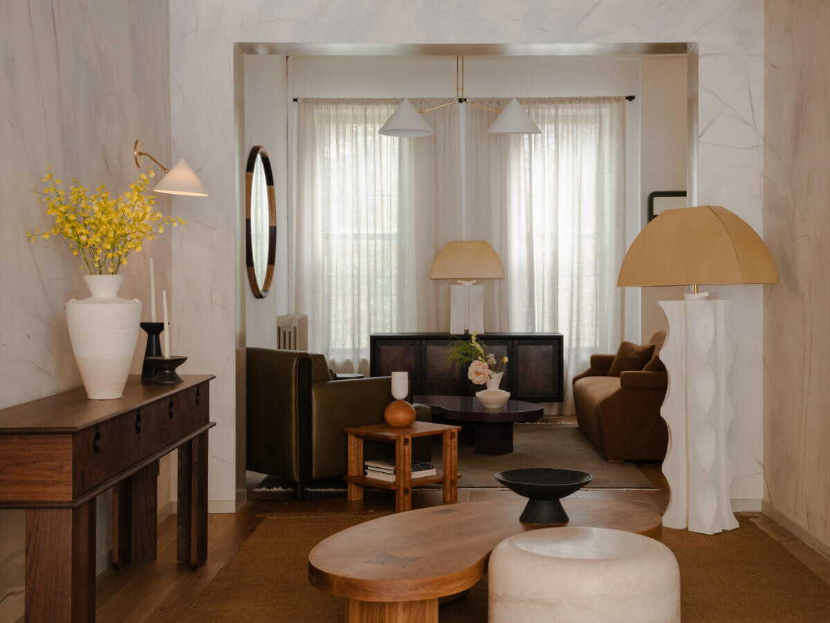
A Room is an Archive of Touch, Jacqueline Sullivan Gallery. Photography by William Jess Laird.
Time and Materials, General Assembly. Photography by Brian Ferry.
Copenhagen
With A Thousand Moons, Danish-Egyptian architect Salem Charabi introduced a body of work developed over the past two years for a single commission, a private residence in California. Before sending them on a transatlantic journey, Charabi enlisted his dear friend and collaborator, art director Owen Dodd, to orchestrate a public viewing and celebration. The thirty-eight pieces of furniture stood proudly atop their respective shipping crates, marking their final moments in the workshop where they were crafted.
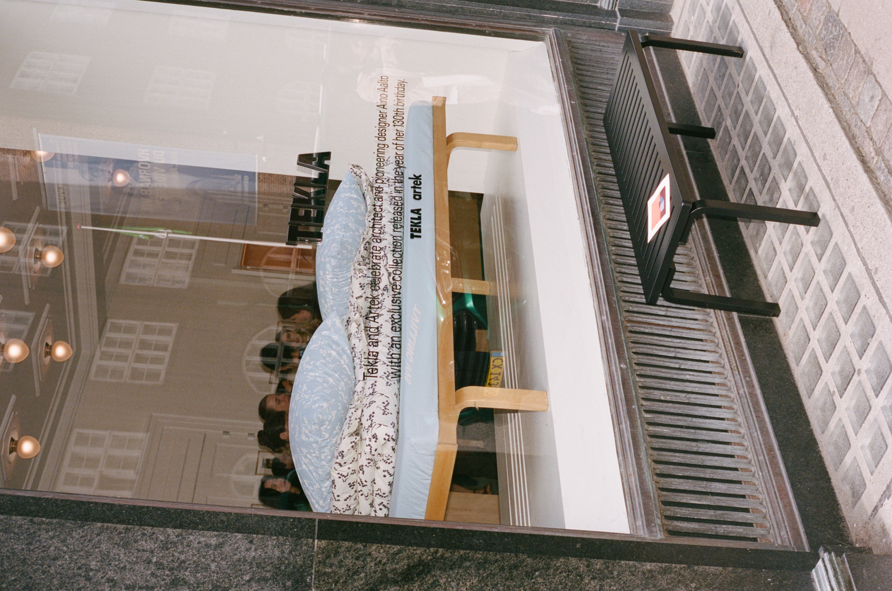
Danish textiles brand Tekla in collaboration with Finnish furniture manufacturer Artek debuted a textile collection, celebrating architect, designer and Artek co-founder Aino Aalto, commemorating her 130th birthday. Adorned with Alto’s iconic Kirsikankukka, or cherry blossom, pattern which she created as an homage to Japanese art and design, the collection honors "the beauty of the every day".
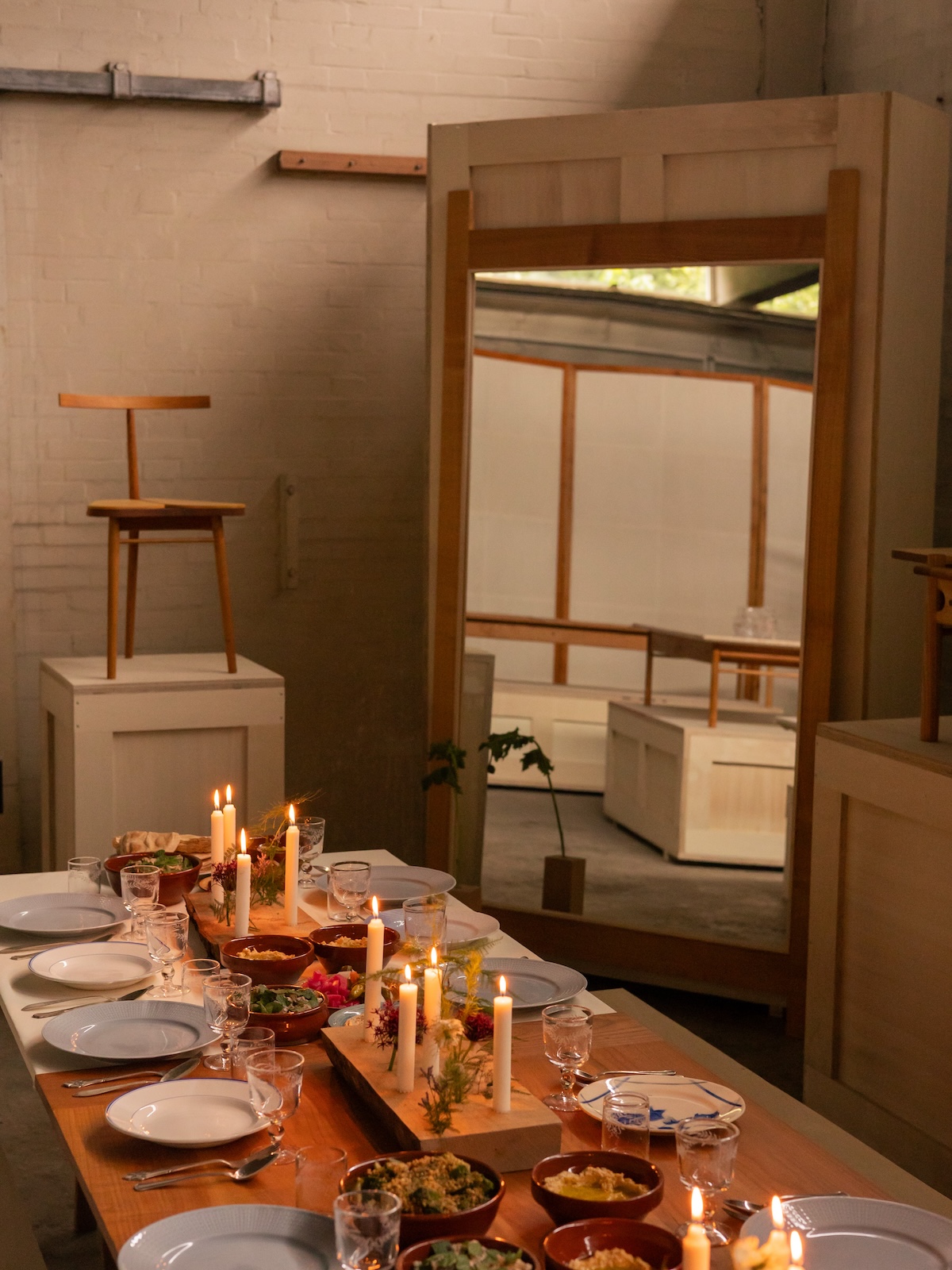
With A Thousand Moons, Salem Charabi
Tekla and Artek Textile Collection
Milan-based designer Natalia Criado showcased a selection from her surrealist, jewelry-like tableware collection in RESILIENCE, a group show exploring the enduring flexibility, reliability and strength of wood, metal and concrete, alongside Danish architect designer Danielle Siggerud, artist Susanne Storm at rug studio Knothouse’s showroom.
Serbian-born and Paris-based artist and designer Ana Kraš celebrated the launch of her objects brand, Teget. After years spent responding to project briefs, Kraš is now able to give her vision full freedom, letting go of any commercial constraints. In conjunction with the showcase of Teget’s first collection, Static Noise, Kraš also presented a capsule collection of mesh garments with her longtime collaborators from Danish fashion brand, Saks Potts.
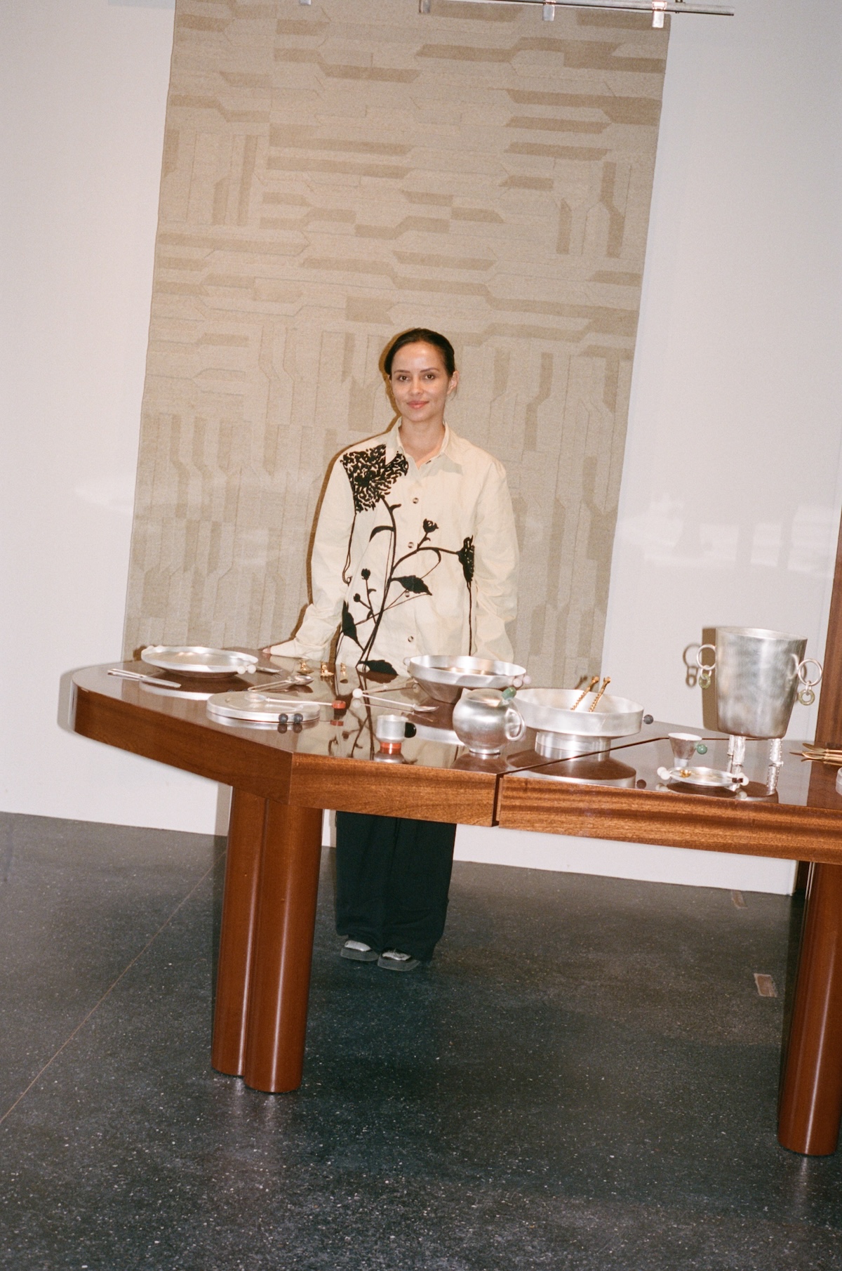
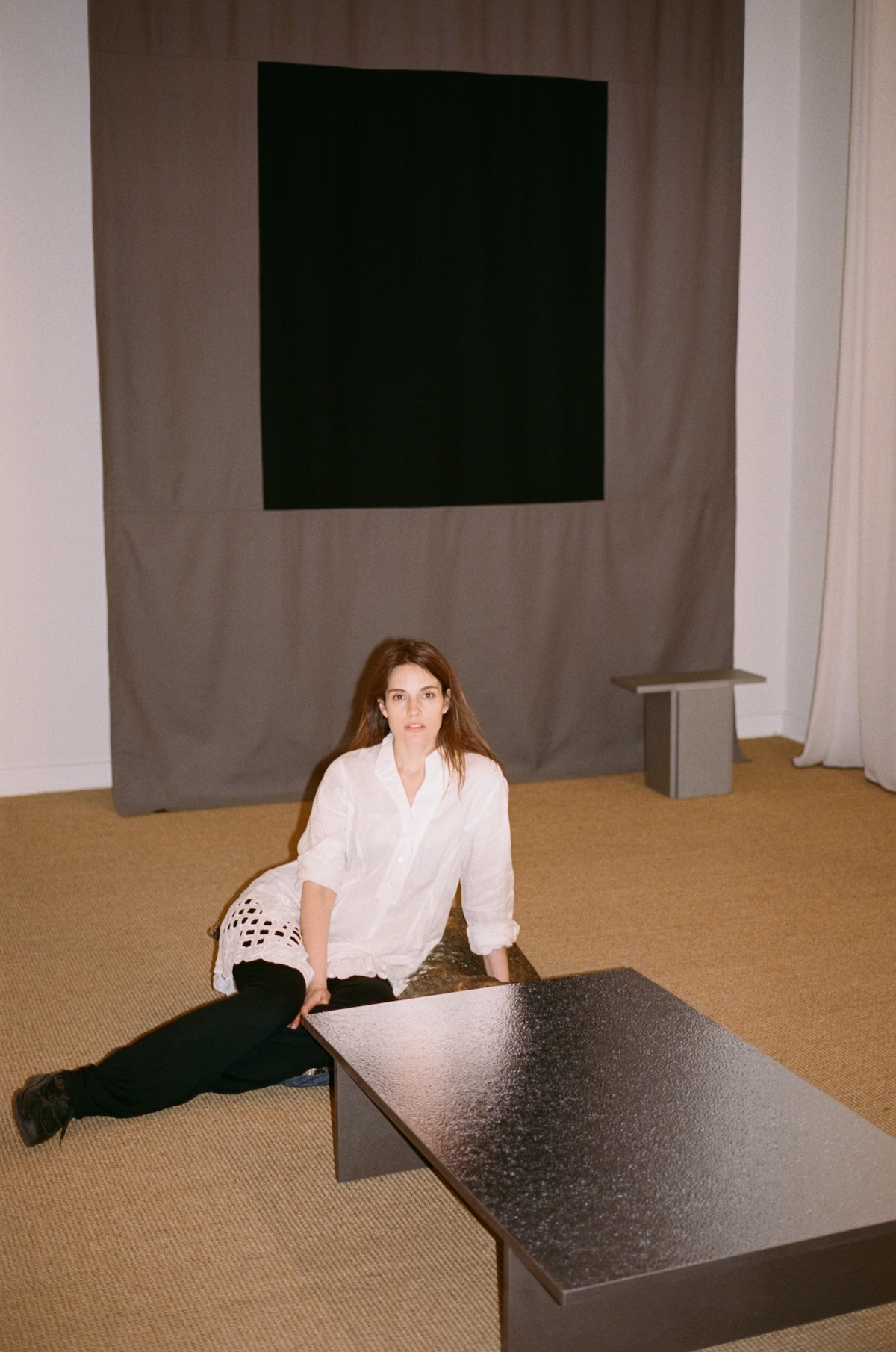
RESILIENCE, Natalia Criado, Danielle Siggerud, and Susanne Storm
Static Noise, Teget by Ana Kraš
Exploring the intersection of art, design and food, FRAMA and Faye Toogood came together for the first time with COLLAGE, an amplified view of one of our most human experiences: sharing a meal. Toogood’s spatial intervention in FRAMA’s Copenhagen HQ brought color and extreme proportions into the historic 1878 building, inviting visitors to dine throughout the space amidst playful tactile sculptures.
With Shaping the Future, Carl Hansen & Søn — the third-generation family-run company and warrants of Scandinavian design — presented new lighting and furniture launches by Børge Mogensen, Kaare Klint, Rikke Frost, Vilhelm Lauritzen and Henning Koppel while celebrating the 110th anniversary of Hans J. Wegner. The showstopper was the reedition of Kaare Klint’s Spherical Bed, a masterpiece originally introduced in 1938 at the Cabinetmakers' Autumn exhibition, under the title A Lady’s Boudoir.
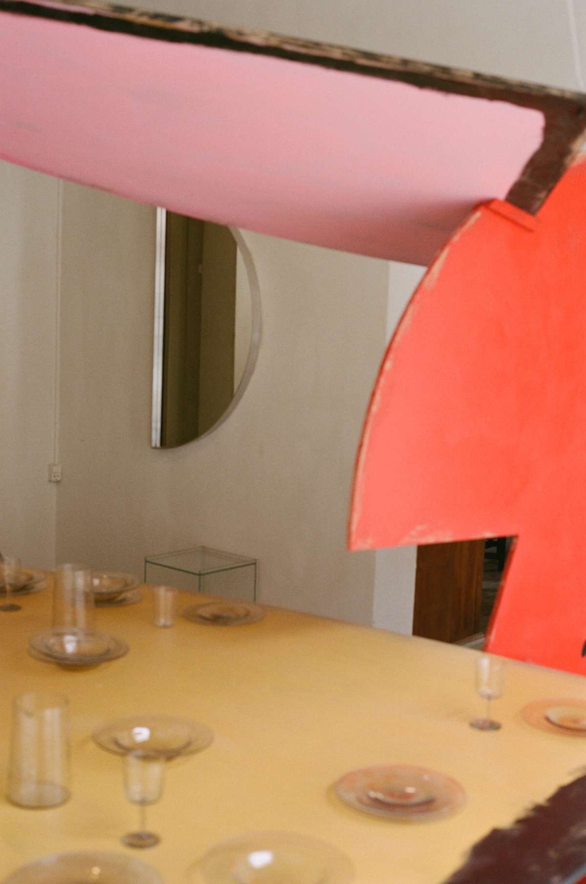
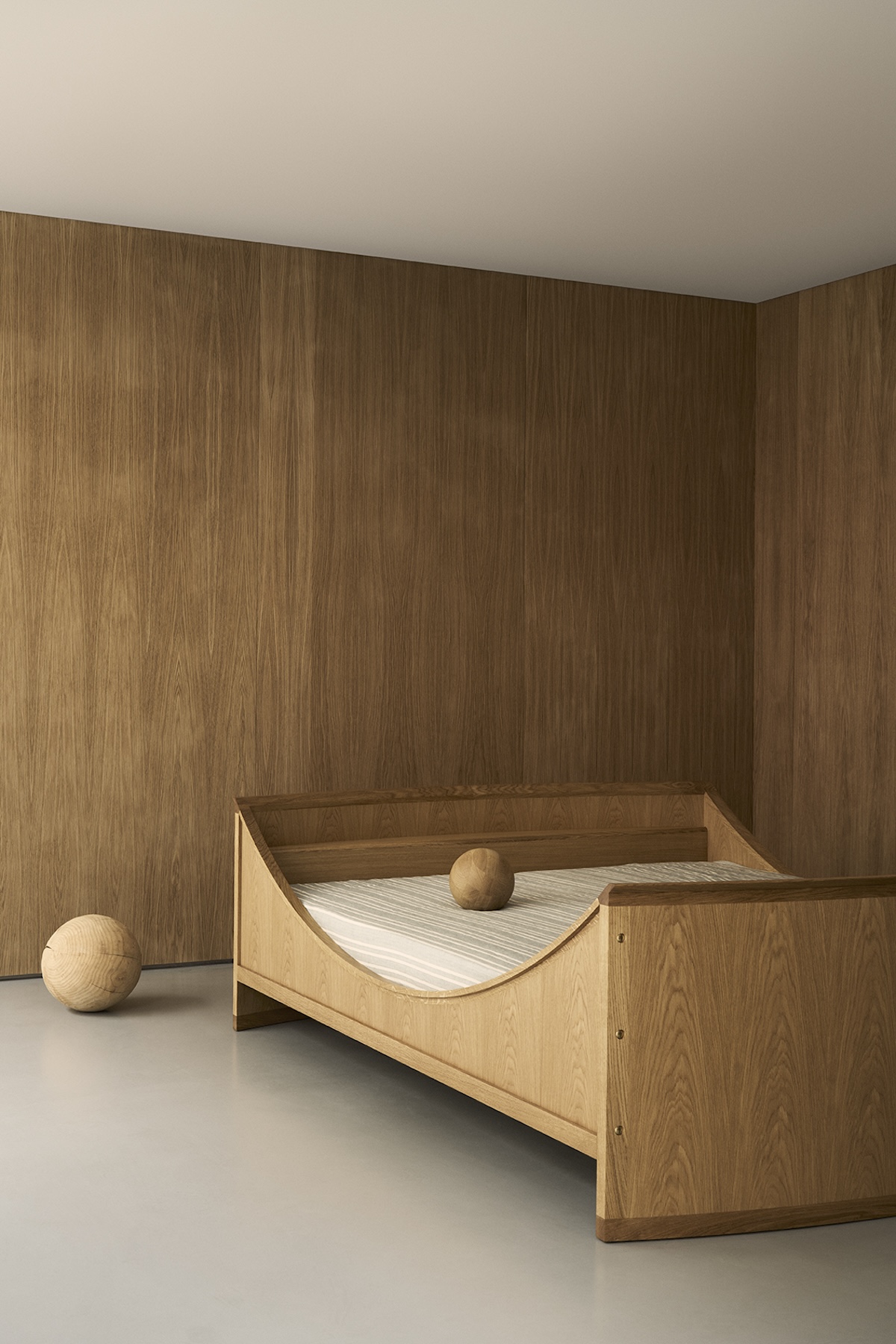
COLLAGE, FRAMA and Faye Toogood
Shaping the Future, Carl Hansen & Søn
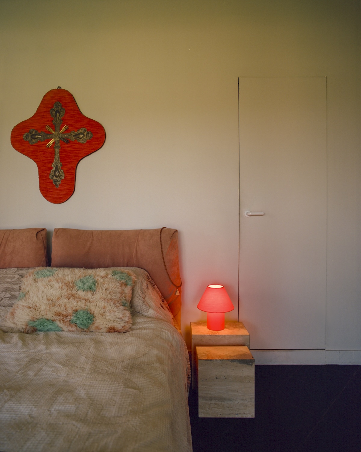
Emerson Bailey, the design and antiques gallery based out of Bozeman, Montana and Kullabygden, Sweden debuted Centuries, an exhibition of Scandinavian design from the 18th Century to present day. Alongside the antiques, the exhibition also highlighted contemporary pieces, such as lighting from Sekt, the first reproduction of the Folke Bensow table by Näfveqvarn, the Christianborg tap series by Toni Copenhagen and rugs by Cappelen Dimyr.
In collaboration with French-born and Mexico-based designer Fabien Cappello, known for his vibrant pattern combinations, Swedish design brand Hem launched the Toto lamps — joyful and covetable pieces bursting with color and light.
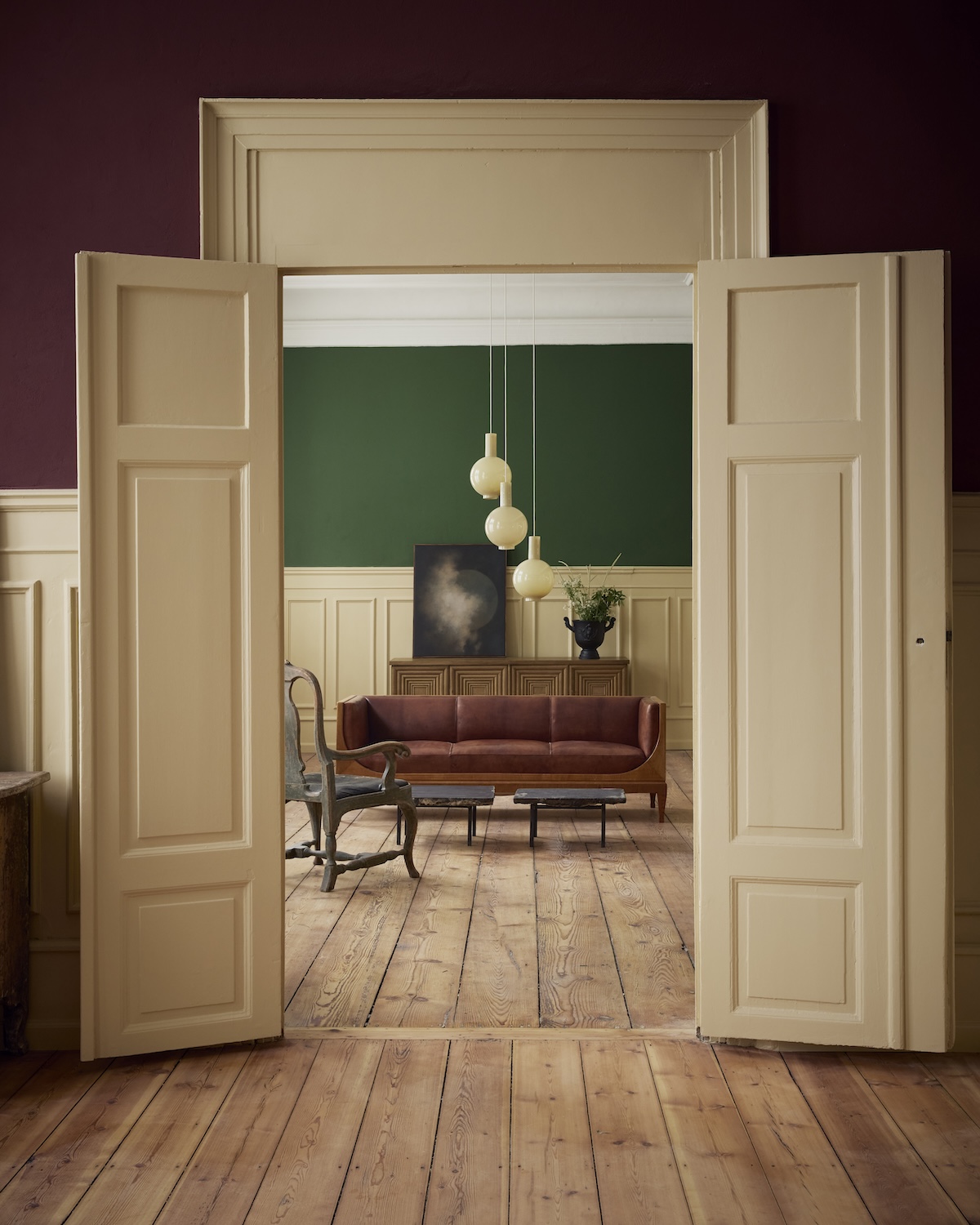
Centuries, Emerson Bailey
Toto Lamps, Hem and Fabien Cappello
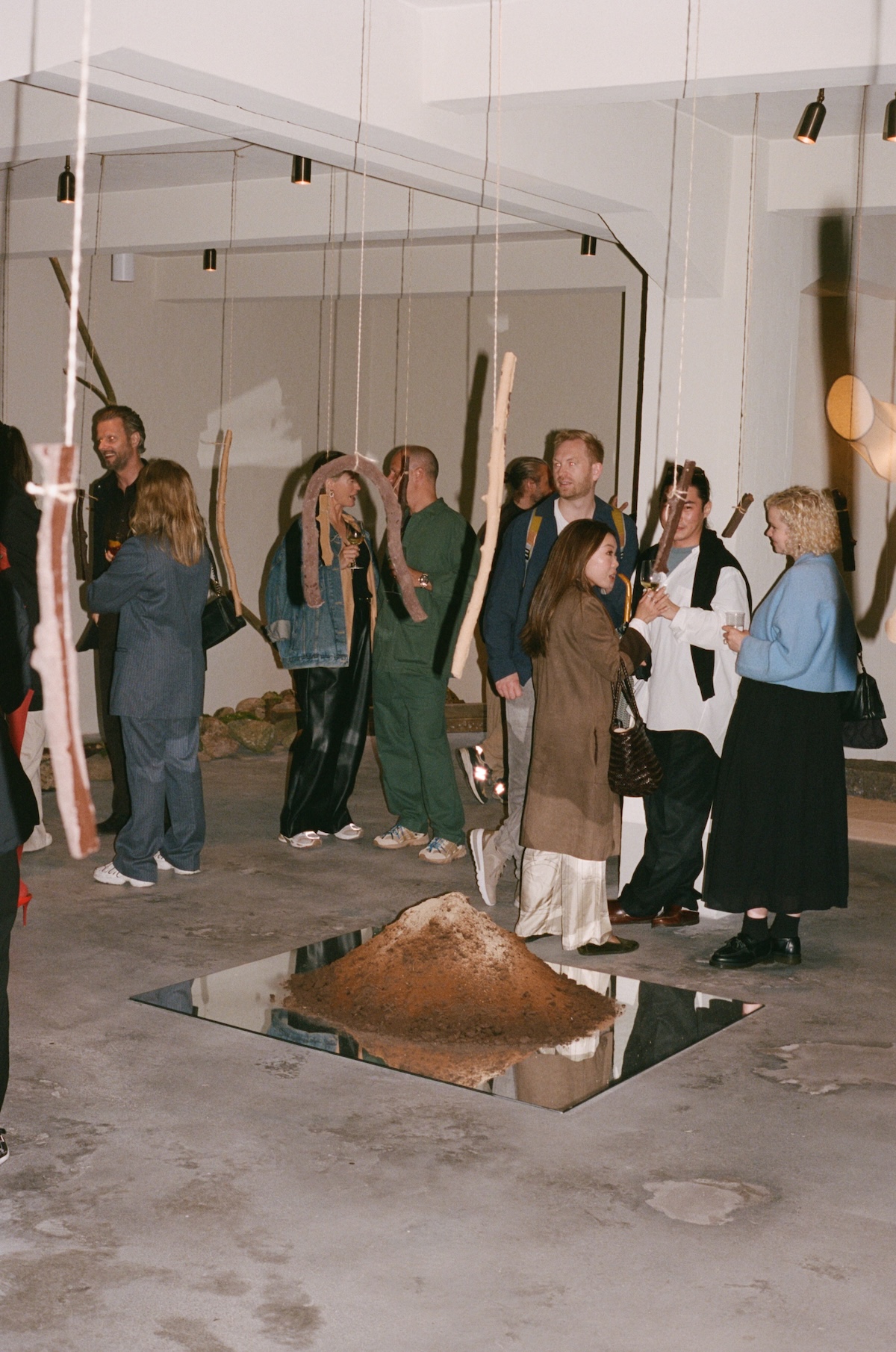
St. Leo, the eco-friendly paint and plaster company, hosted a gourmand installation by NYC-based designer and art director Rafael Prieto in collaboration with local chocolate makers Svend Michelsen. Interpreting a passage from British astrophysicist Arthur Eddington’s book from 1928 The Nature of the Physical World, Prieto’s The Real and Concrete illustrated how substances – in this case chocolate – are viewed in our everyday experiences as the primary constituents of reality, characterized by tangible properties like form, color, resilience.
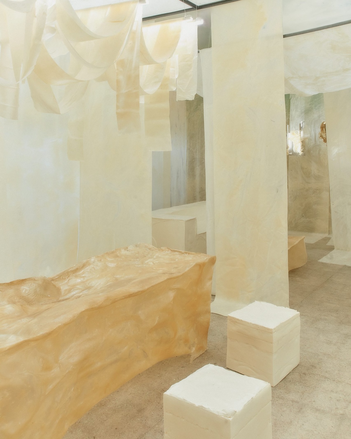
Local star Bonnie Hvillum’s Natural Material Studio debuted White Utopia, a milky-white installation embodying the studio’s core philosophy of adapting to a world in constant movement. For their most ambitious project to date, Natural Material Studio responded to the theme "Dare to Dream," taking over a full house on the island of Refshaleøen, and adapting their Procel bioplastic to form massive functioning furniture pieces across three separate rooms—a dining room, a lounge, and a bedroom with a walk-in wardrobe.
The Real and Concrete, Rafael Prieto and St. Leo
White Utopia, Bonnie Hvillum and Natural Material Studio