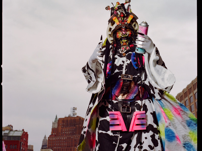
PRESENTE CONTINUO: the intimate ties between then&now

Starting May 30, PRESENTE CONTINUO will be available to purchase on presentecontinuo.com, cpcompany.com, and at the C.P. Company flagship store in Milan, Corso Matteotti 7.
Stay informed on our latest news!

Starting May 30, PRESENTE CONTINUO will be available to purchase on presentecontinuo.com, cpcompany.com, and at the C.P. Company flagship store in Milan, Corso Matteotti 7.

Bringing life to ideas and developing drawings into tangible objects, BD Barcelona literally elevated its repertoire and exhibited its design prowess with a palpable strength. 50 Years of Design at Peres Projects Milan ran from 17-22 April 2023, and it was no ordinary furniture showroom inside. As it has done since its conception at Club Boccaccio in 1972, BD Barcelona has taken influences from Milanese architects, artists, and Italian design as a whole. They stimulate a see-saw effect, their designs held in motion by a pendulum of practical necessity and aesthetic sensibility.
Bouncing between these planes is no easy feat, and thanks to the founders (Pep Bonet, Cristian Cirici, Lluis Clotet, Mireia Riera and Oscar Tusquets), their personal influence and architectural backgrounds have seeped into sofas and showrooms with a visual and tactile intensity that has kept them going for half a century. Last year, the brand grew, and its doors opened to fresh ideas and new people. BD Barcelona continued its story with a brilliant example of how the collective is both contemporary and deferential to its history.
They exhibited the tangible in an unimaginably close, frenetically desirable, yet accessible space. They showed off, but they didn’t boast. Curated by Apartamento Studios (who were a part of last year’s refresh), the collection featured an extensive list of BD’s most significant works — but they were mounted upon something new.

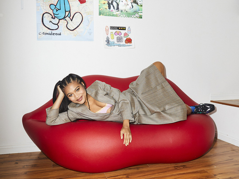
Designed by the member Igor Urdampilleta’s studio, Arquitectura-G, aluminium beams ran across and below the furniture like bands of skeletal limbs under muscles. The streaks rose, and pieces such as Konstantin Grcic’s ‘Chair B’ peeped over ‘Dalílips’ (designed by Salvador Dalí and Tusquets). Jaime Hayon’s iconic ‘Multileg’ rested upon thin rectangular bars, its solid alder limbs all modular and rippling, finished in a glossy, lacquered blue. The steel grasped the pieces into place like industrial prototypes. They echoed the analogue machine, playing the part of rigid grammar in the creative language of furniture design.
The chairs (or ‘artworks’ depending on your perspective) sit upon contemporary creativity and insist upon a precision that works excellently with its location at the Peres Projects’ art gallery in Palazzo Beligioioso. The nonconformist structures float between the painted backdrops of colour and abstract shapes created by Beth Letain, whose vivid palette adds to the harmony of the space with unintrusive lines and flat blocks of reds, greens and blues. Standing out against the red forms in Letain’s Obstacle (2023) is Ettore Sottsass’ table, ‘Mettass’, created the same year as BD and reintroduced in 2012 at Salone del Mobile during Milan Design Week 11 years ago. The bulging tables, stools, lights and couches punch through the centre of the space, pumping three-dimensional awe into the room. As much as they are inspiring, the furniture is still highly functional, and this combination supports the critical balance required for Design Week.
Of course, they still pertain to the artistic realm of design. However, the authenticity of its designers and the uniqueness of its products cements the eclectic into the now and the visible into the desirable. Beyond all the armchairs, beams and decorative infrastructure, BD showed Milan and the design sector its true refinement of ideas and functions.

The forms that follow such functions may vary, but the quality is premium. Their work has a curated rhythm with undertones of the modern world. Their showcase last week turns the page and continues the story: now it’s the world of tomorrow, and with these examples, Design Week shoppers are probably going to buy a couch before a home.
Just maybe more down-to-earth.

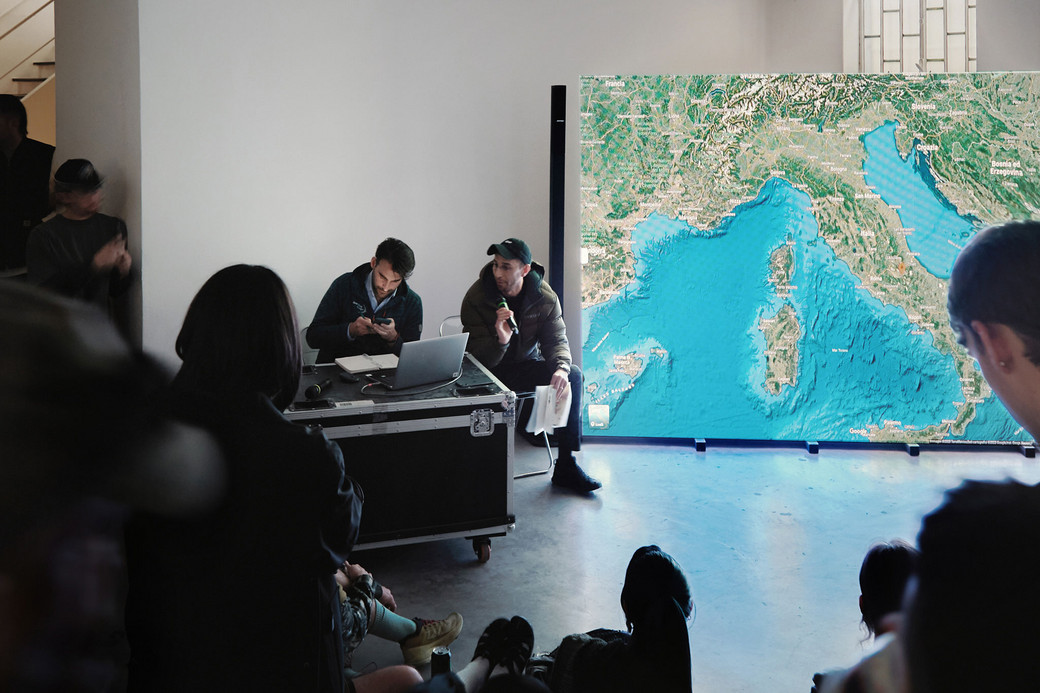
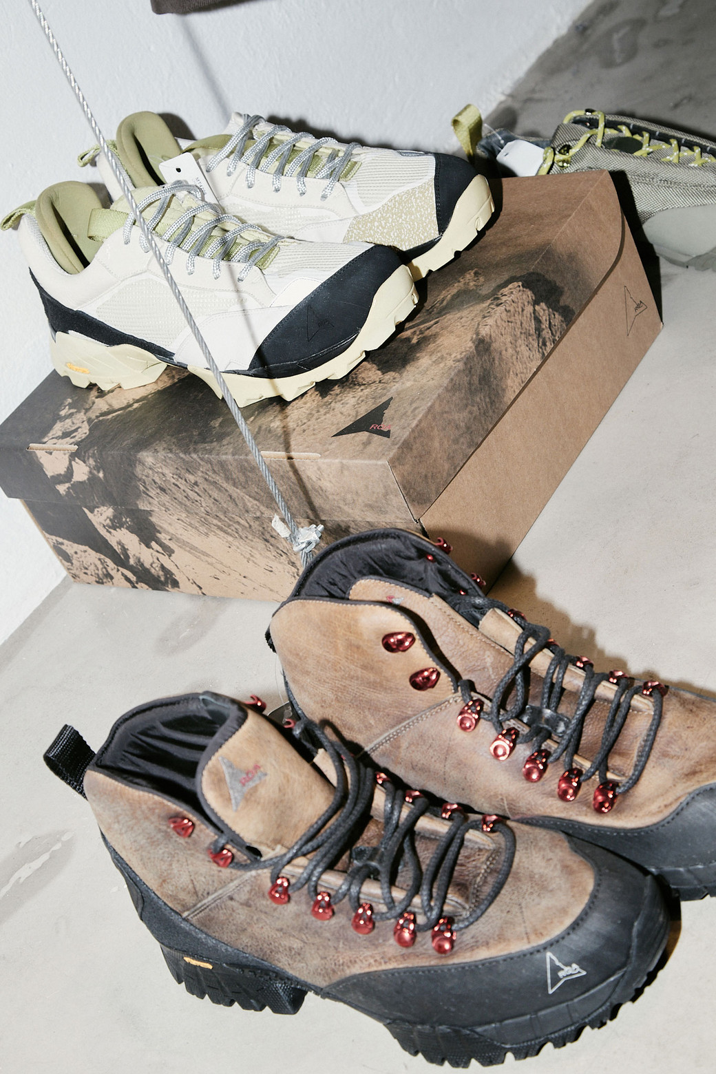
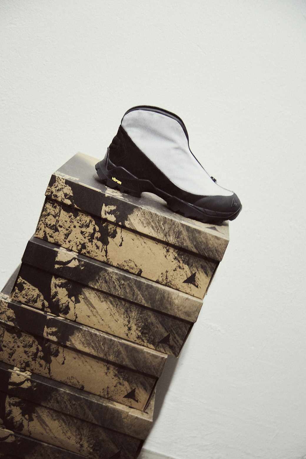
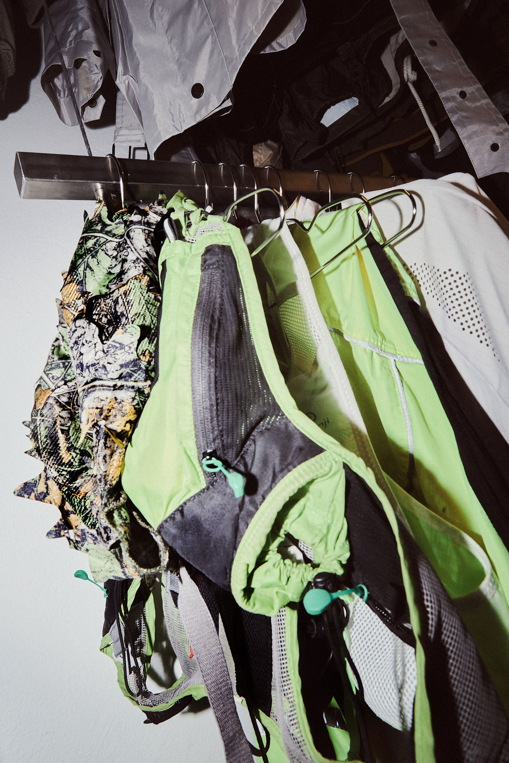
Plenty of ROA’s research since its conception in 2015 has been based on the needs of the everyday person and their ever-changing environment. Whether on rubble or carpet, mountain or floorboard, ROA holds hybridity at its core. Much of the intriguing patterns and elements from ROA’s design team (and their placement between the human co-existence with nature) play across these lines — their research replaces reliance on images with physical exploration and environmental immersion — and their fascination with the craft of creation would suffer without such passion.
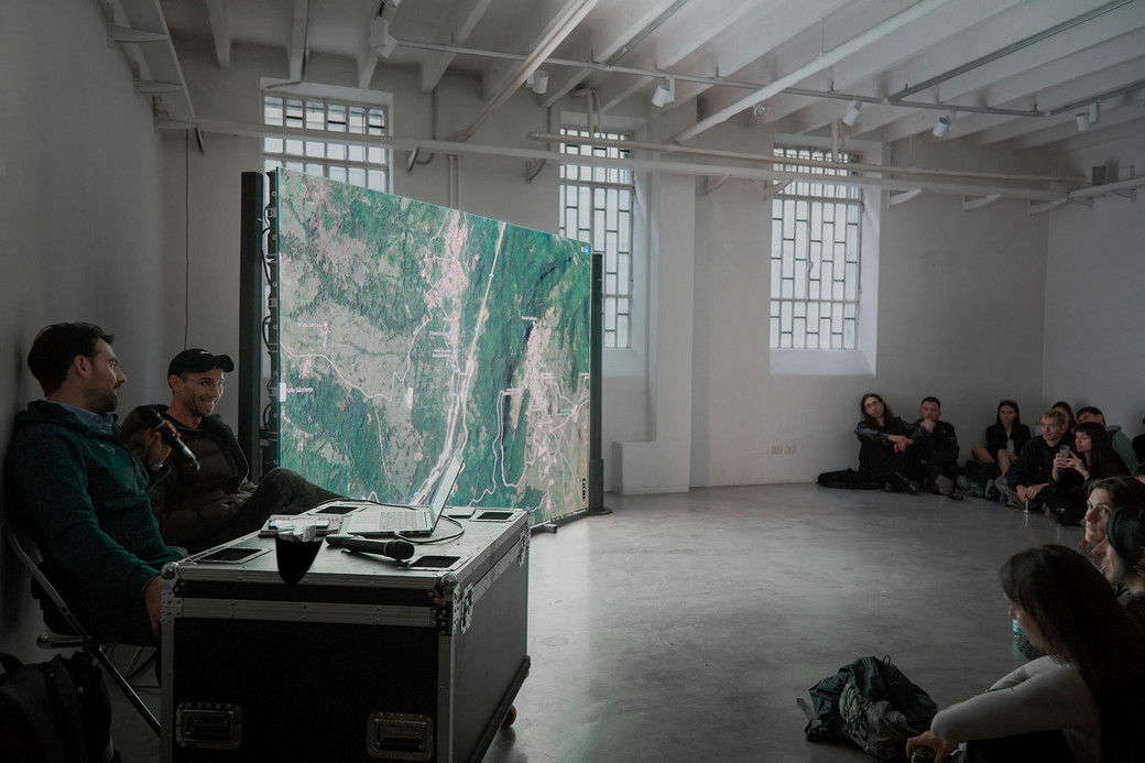
However, this presentation was not about clothes — not as an end product. Insofar as the design of garments was concerned, ROA and DEEP went into the wild, exploring ecological intervention and analysing methods such as the seasonal burning practice of Noyaki in the hills bordering Mount Aso in Kyushu, Japan. Like Indigenous backburning practices in Australia, this form of swailing aids in managing forests and their surrounding environments. Another example of such intervention is closer to home for ROA: The Apennines that spread from the shin to the toe of the Italian peninsula. In the mountain ranges, rewilding is a preventative necessity that digs into landscape and ecosystem protection.
Even in a White Claw Crayfish breeding site, some changes can alter the framework of a forest or the face of a mountain. Reintroduction programs (such as the ones shown in the documentary displayed in ROA’s head office) offer glimpses of the labor and intense engineering nature that sometimes needs to keep thriving. Seasonal heatwaves and fecund hills shift like wind currents, and dry grass needs to be shed before new grass can grow. Human intervention can support this revitalisation, and as shown in the video, there are ways that this ‘interference’ can help. Promoting a biodiverse environment requires awareness and management.
The documentary footage flies over, around and inside natural landscapes in Japan and Italy. The searing yellow and red of the fires smoked into a birds-eye view of the charcoal rocks, the sloping ridges, and an honest, potent scene. The small crayfish are swaddled in the white bucket of a wildlife conservator, and the strands of sediment we call cills stretch around the open air in perfect silence. The tiny animals and the fresh grass following a burn are symbols and fragments of a bigger picture. One that DEEP and ROA explore to both educate and inspire them in making material changes, crafting with a corpus and direction in mind.
The effect of the presentation goes far in showing the audience a glimpse of insider knowledge. There’s more to fashion than meets the eye and more on a designer's mind than the clothes at hand. While the design team works away upstairs, the audience breathes in. There is a refreshing sense that the brand makes more than just ‘practical’ and ‘functional’ clothing. They are designed by experience in the real world and are reactionary. The forms and dictum respond to the environment in palette and purpose, and the brand wants to give back.

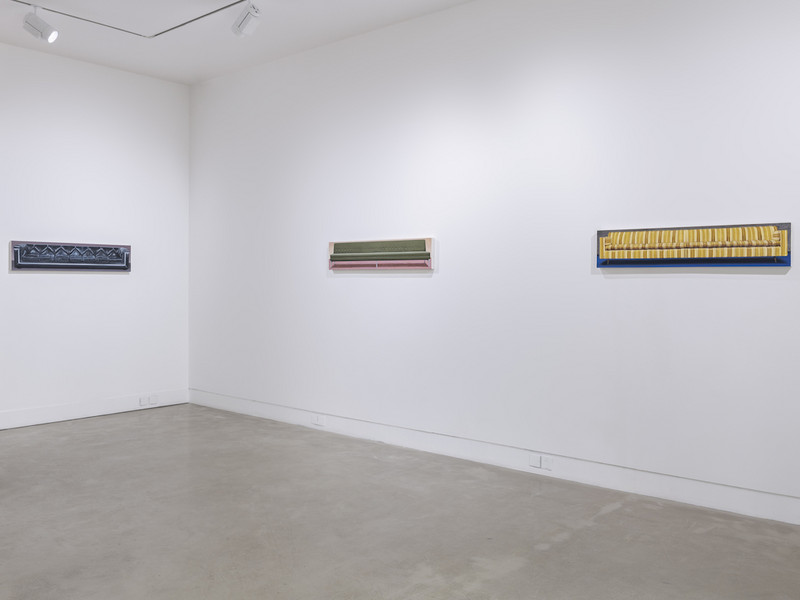
At a glance, many of Nesterova’s paintings depict a sort of peaceful mundanity, her subjects shown attending the circus, reading novels, and frolicking through forests and on beaches in a folk-adjacent, somewhat primitivist style. Perhaps it’s the cursory impression of idyll this subject matter leaves the viewer with that allowed Nesterova to not only elude political persecution for much of her life but to achieve acclaim both within and outside of the USSR in a manner similar to that of composer Dmitri Shostakovich. Having received many awards and titles in Russia, Nesterova was considered a valuable cultural export, her work then being featured in over sixty exhibitions throughout the United States and Europe. Fearing retaliation for her outspoken stance opposing war in Ukraine, she did eventually leave Russia in March 2022 and passed away shortly after in August.
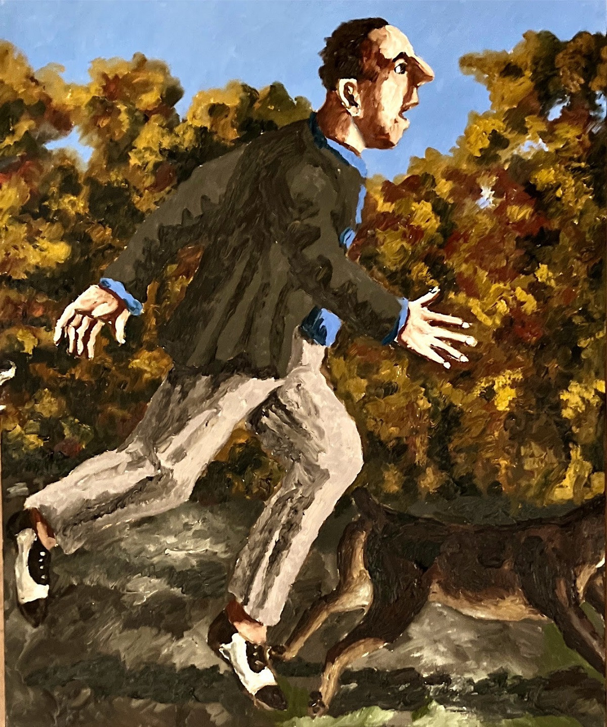
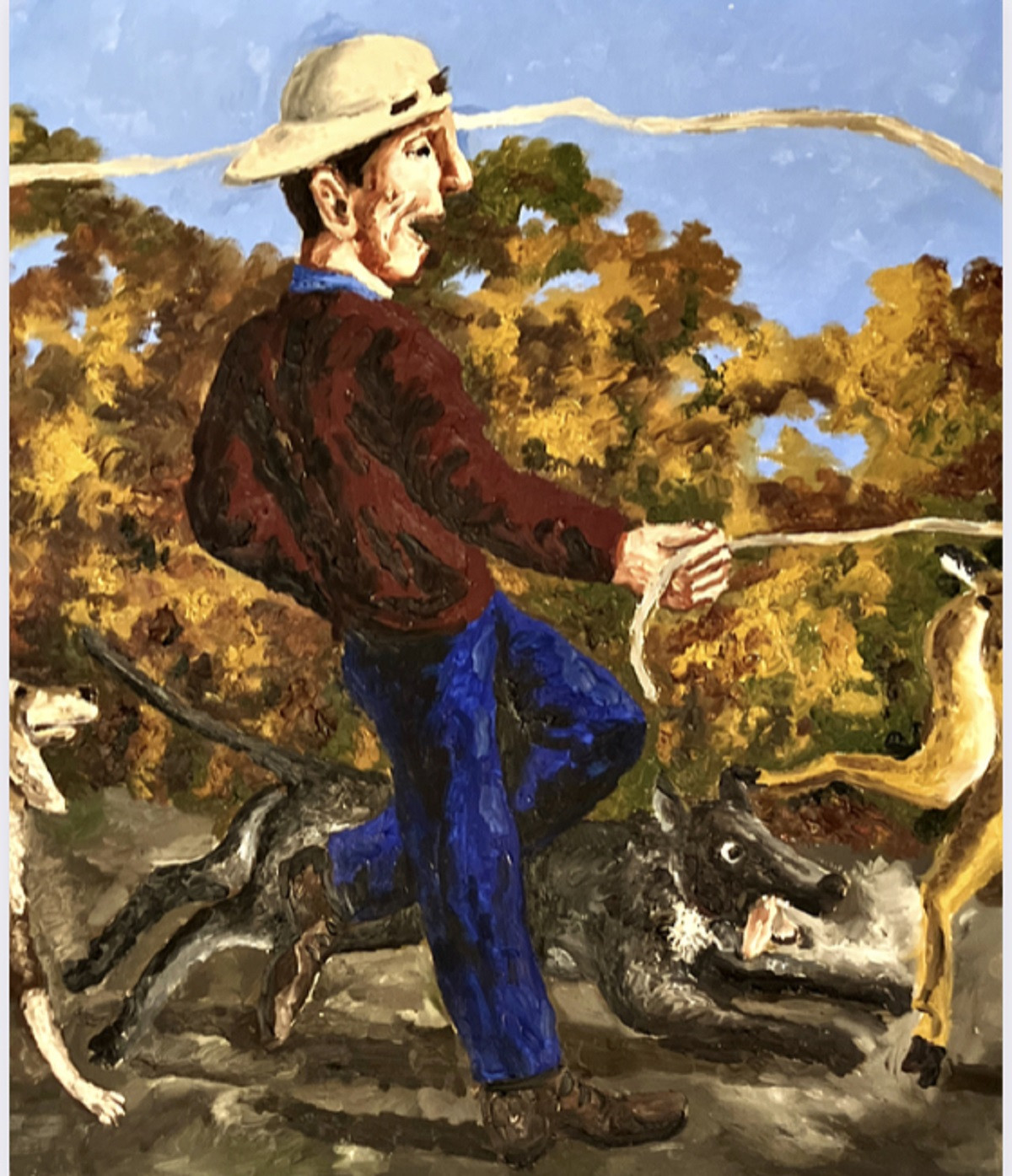
Though Nesterova was understandably reticent when it came to making definitive claims about the meaning of her art, once saying that her work is simply “about what you see,” her paintings belie themes of interpersonal and environmental alienation in both their content and form quite clearly. Or at least—that’s what I “see” in them, and is what I expect will resonate acutely with present-day New Yorkers when her first posthumous exhibition opens on April 20 at Hal Bromm Gallery (the site of her first-ever American exhibition in 1988). View some of her pieces below and consider Nesterova might have been aiming to convey beyond the surface.

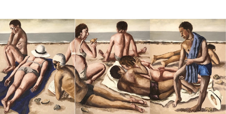
This triptych depicting a seemingly ordinary day at the beach makes use of a slight misalignment of the three individual paintings within it, one of Nesterova’s stylistic motifs. Though subtle and plausibly unintentional, the motif of slightly misaligned diptychs and triptychs is consistent with the vaguely unsettling flavor of Nesterova’s paintings and enriches its thematic potential as it renders those depicted along the seams quite literally disconnected from themselves.
This choice emerges as a more clearly intentional one as you consider that not one of the nine people in the triptych is facing either us nor each other fully head-on—not even the only two people who appear to be visiting the beach together. This couple, the only pair in the painting sharing a towel and making physical contact, is ignored by most of the other beachgoers and given suspicious sidelong glances by another man and woman (who themselves are separated by a facedown sunbather between them). The woman looks down her nose at the couple—or maybe just at the pear she is about to consume. Just another day at the sunless, grey-watered beach of Nesterova’s creation.


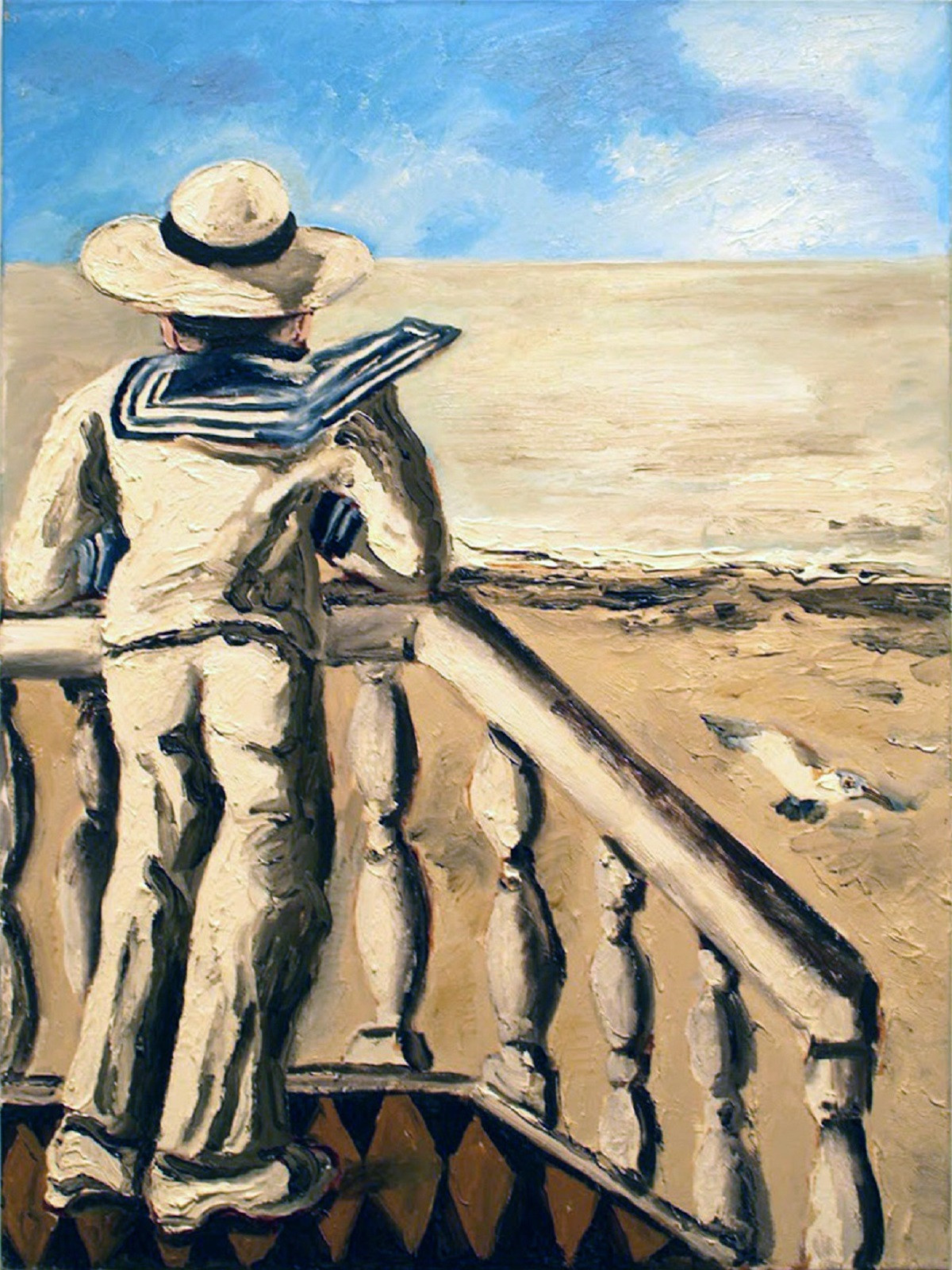
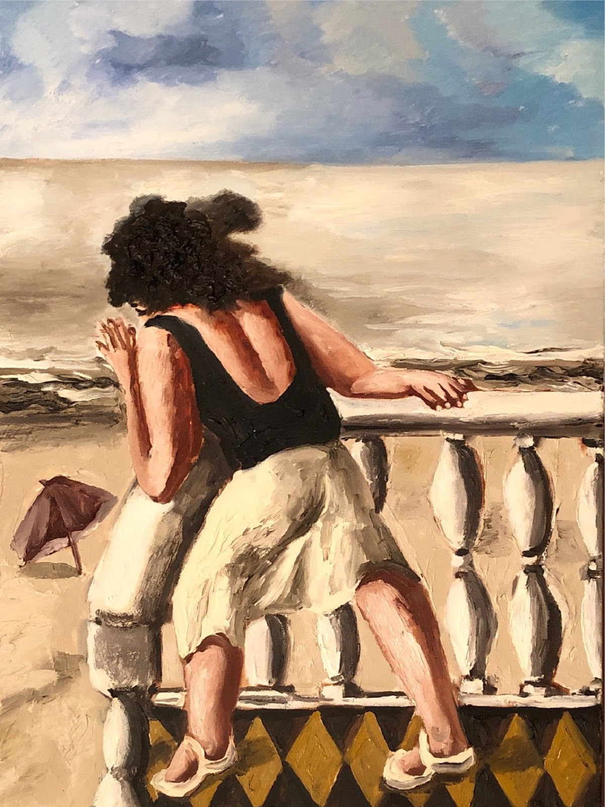
Nesterova narrows focus on a pair of beachgoers in her breeze paintings, one man and one woman. We can only see them from behind as they stare out onto the horizon, both off-center and seemingly occupying opposite sides of the same viewing deck--though the sky that the man looks out at is much brighter and clearer. It’s not clear who or what is between them, if anything.

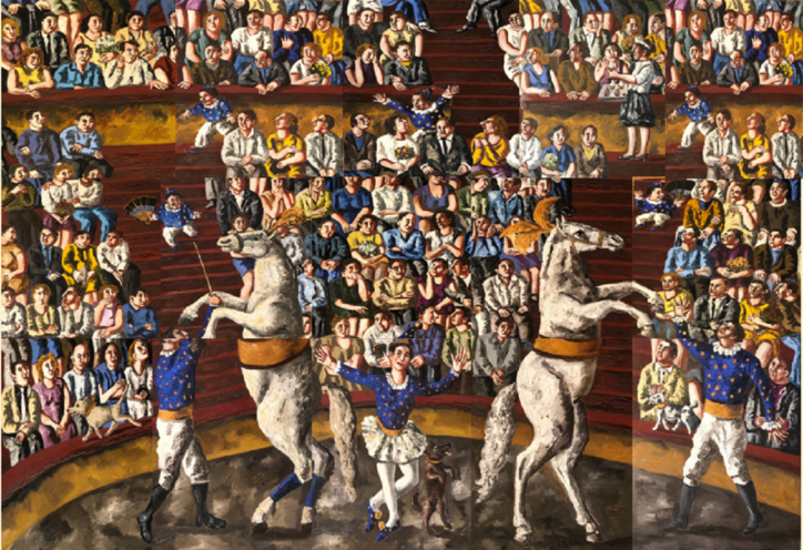
This polyptych depiction of a circus, immediately aggravating to the eye with its juxtaposition of opposing blue and gold tones, makes use of misalignment along the seams of the individual paintings similar to that of the beach triptych. In spite of the horses being our focal point, very few of the circus attendees within the painting are looking directly at the show, preferring instead to look at each other, the jesters in the aisles, or seemingly nothing in particular and again preventing the viewer from seeing any of their faces from a fully frontal angle. The horses’ subjugation at the hands of the circus ringleaders is emphasized by their fragmentation along the lines of both the polyptych and their bisection by the festive garb they are adorned with.


The dogs of Nesterova’s hunting series suffer a similar fate, fragmented into limbs from the viewer’s perspective by human legs and the limits of the canvas. The human hunters are visible only from the side, all striving towards something just out of our view.

The composition of the hunting series presents an intriguing parallel with Entreaty, in which a humanoid figure is depicted in full profile, similarly looking and reaching toward something we cannot see. The cool tones stand out in comparison to Nesterova’s usual color palette, and the depiction of this figure as both all-white and dappled with eyes suggests that the ability to truly see comes with a cleansing of the self from the usual trappings of public life. Whereas the human hunters are always in a position above the dogs they employ in the hunt, the figure in Entreaty has sunk to the grassy floor, pursuing something not in front of nor beneath but above themselves.
Nesterova’s work strikes the kind of delicate balance between the real and surreal which can evoke a feeling that something is not quite right even before one has the chance to figure out why. Her ability to subtly convey discontentment with the state of public life and our isolation from the natural world in a manner relevant to audiences across decades and nations is a powerful one. It’s the kind of power that makes it difficult to be forgotten; Nesterova has already stirred controversy in death when a museumgoer complained in February 2023 that they could not identify Judas in her depiction of The Last Supper, leading to the removal of longtime museum director Zelfira Tregulova from her position. It is also the kind of power that makes it worth it to see her paintings while you can, and to consider what circuses we ignore and entreaties we make in the context of our own lives and milieu.
Natalya Nesterova: Counterpoint opens at Hal Bromm Gallery on April 20 and is on view until June 28, 2023.